Hello Fellow ChartWatchers!
First off I just want to take a second and say "Welcome" to all of our new members. Since January 1st, almost 1,000 new members have joined StockCharts.com(!). That's almost triple the rate at which we normally get new members and we are very glad that more and more people are using our service.
Given all those new members - and all the "old-timers" like myself who may have forgotten some things - I wanted to point out a couple of under-utilized sources of information on StockCharts.com that can really help you get the most out of our site:
The Newcomer's Guide - If you are really new to the website (or never really "got" how things work here), be sure to read the Newcomer's Guide that we put together. It explains at a high level where things are located on the site. Don't let the name fool you - even if you are an "oldcomer", there may be a gem or two on this page for you.
Getting Started with StockCharts - The is our "Hello!-Glad-you-could-make-it!-Lemme-show-you-around" hands on tour of the site. Originally written by John Murphy, Getting Started with StockCharts is a tutorial that is meant to be printed out and then - when you have 10 minutes of uninterrupted time - worked through using your computer. If you have not worked through this tutorial, you are doing yourself a big dis-service! While we'd love to come to your home and show your around the site in person, we can't and so Getting Started with StockCharts is the next best thing.
Getting Started with Stock Scans - Stock Scanning is deceptive. It looks easy but to get good at it takes time and discipline. Getting Started with Stock Scans is our scanning tutorial. Print it out, find some time, and work through it. You'll be very glad you did.
Our FAQ Pages - Many people are allergic to Frequently Asked Questions (FAQ) pages. If they look at them at all, it's only when they have a problem - and then they look at them in a panic, skipping over lots of valuable info. Don't make that same mistake here. Our FAQ Pages may seem long and intimidating at first but they are chock full of very useful information! Find some time (20 minutes max - I promise!) and just read through them. Each one is a potential pitfall that you can easily avoid. Read them when you aren't panicked about some problem and you'll learn at least one thing you didn't know about StockCharts - I guarantee it!
ChartWatchers Archives - I've saved the best for last. Our ChartWatchers' Archives contains every newsletter we've ever sent out (even this one!) going all the way back to 1999 when we were founded. There is TONS of great info in there too. While some articles focus on market conditions at the time, all of the articles have timeless lessons on investing and using the website that many people don't know about. Granted, you'll need more than 10 minutes of time to comb through everything, but there is a gold mine of great info just waiting to be discovered.
So again, to our new members I say "Welcome!" Here are five ways to really get into StockCharts.com and get the most out of your membership.
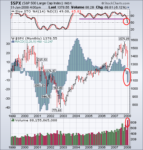
I haven't heard anyone in the media talking about the January Barometer, which is based on the view that "as January goes, so goes the year". That's probably because they only talk about it when the market has a strong January, which predicts a good year. Unfortunately, this January was a very bad one. The 6% loss in the S&P 500 makes it the sixth worst January on record. According to the Stock Trader's Almanac, "the January Barometer predicts the year's course with a .754 batting average. It goes on to state that "every down January on the S&P since 1950, without exception, preceded a new or extended bear market, or a flat market". In addition to a bearish January Barometer, the market had a bad chart month as well. The monthly bars in Chart 1 show the S&P 500 falling -6.12% since the start of 2008 on the heaviest volume in a decade. The monthly stochastic lines (above chart) have fallen to the lowest level since mid-2003. The monthly MACD histogram has been negative for two consecutive months.
With an oversold bounce over the last two weeks, the Russell 2000 ETF (IWM) is nearing a resistance zone from broken support and the 50-day moving average. Before going further, I should emphasize that the overall trend remains down for two reasons. First, the ETF broke down in January with a decisive move below its 2007 lows. Second, the 50-day moving average is below the 200-day.
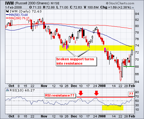
This oversold could fizzle soon because the ETF is nearing resistance from broken support and RSI is nearing its December highs (red arrows). The November and December lows marked support and these now turn into resistance. This resistance zone is further confirmed by the falling 50-day moving average. RSI bounced twice in December, but peaked just below 70 each time. The indicator got another oversold bounce this week and is nearing the spot of its prior reversal. The moment of truth is approaching.
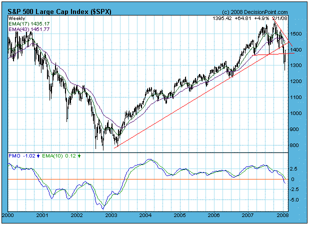
In my January 18 article I asserted that we had entered a bear market based upon long-term sell signals generated by downside moving average crossovers on the daily and weekly charts of the S&P 500. My bottom line summary was as follows: "Probability is very high that the bull market top arrived in October 2007 and that we are now in a bear market that will continue for another year or more, possibly until mid-2010. Until we have evidence to the contrary, remember that bear market rules apply. The next thing to expect is a reaction rally back toward the recently violated neckline support, which is now overhead resistance."
Just a few days later the expected rally began, and the neckline resistance has been penetrated, albeit not decisively. While the market's recent performance has been good for bulls, you can see on the chart below that strong overhead resistance in the form of the long-term rising trend line lies dead ahead.
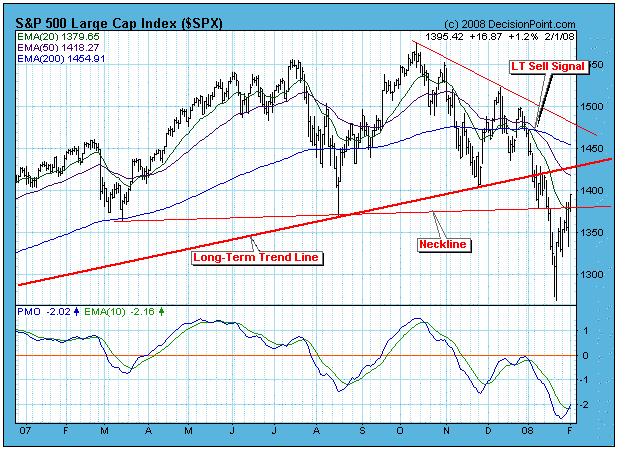
The next chart shows the S&P 500 on a weekly basis. Note that the weekly PMO (Price Momentum Oscillator) has dropped below the zero line for the first time since the bull market began. Observe also that the recent moving average downside crossover is the first since the last bear market began.
Not only is there a lot of resistance to overcome, our short-term indicators show that the market is becoming overbought. Two of my favorites, the CVI and STVO, are shown on the chart below. Both are well into the overbought side of their range, and we should be expecting a short-term price top very soon. Once that top is in place we should expect the recent lows to be retested. Since we are in a bear market, the retest is likely to fail.

Bottom Line: We are in a bear market, and we should expect that most situations will resolve negatively. The recent rally has pushed into a heavy resistance area, and short-term internals are becoming overbought. It is likely that the market will top soon, and that a retest of the recent lows will commence.
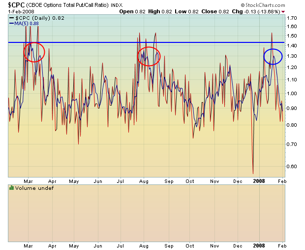
want to recap what was discussed in the last ChartWatchers newsletter. We were approaching significant long-term price support on the Dow and the lower trendline on the NASDAQ while pessimism was starting to ramp up. I discussed the possibility of a significant bottom approaching and to watch for the put call ratio to spike near the levels we saw in March and August of 2007.
First, let's take a look at the Dow chart.
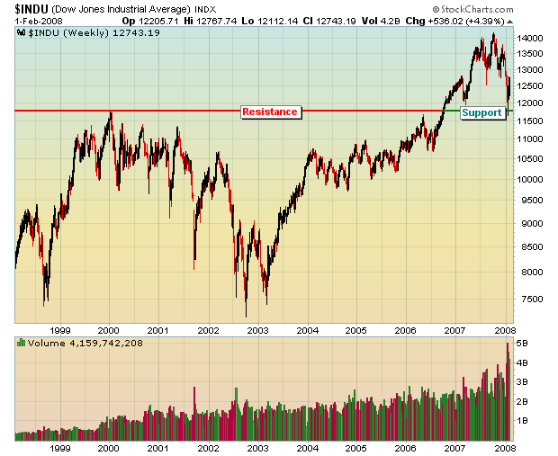
The Dow touched critical support and bounced 1000 points. The 13,000 area is a bit congested and will provide the bears some ammo as they attempt to fight back the bulls. If the market weakens, the recent lows and that long-term support area near 11,700 become HUGE. So for now, I'm looking for the Dow to be range-bound though I do maintain a slightly bullish bias with respect to the market overall. Economic supply and demand favors the bulls - just ask the shorts in the financial, homebuilding and retailing sectors.
Next, let's look at the NASDAQ uptrend channel that I discussed two weeks ago.
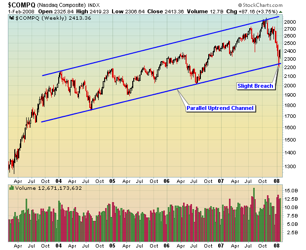
The NASDAQ moved down and briefly broke the trendline support level near 2240. Trendlines are not an exact science, however, so we must give a little room. In this case, the NASDAQ dropped down near 2200, but quickly recovered back into the channel. If you're in the bullish camp, you do not want the NASDAQ to lose 2200 as we move forward. That would result in a long-term trendline break AND violation of price support. We would likely see another 200 point decline to 2000 if that were to happen. I don't believe we'll see it.
Finally, did the pessimism ramp up as measured by the 5 day put call ratio? We've used this tool with tremendous success in helping to spot long-term bottoms. It's one of our key long-term sentiment indicators. Look at the chart below to see how the 5 day moving average of the put call ratio spiked as the market found a bottom. The red circles below indicate the 5 day moving average of the put call ratio in March and August of 2007. The blue circle shows us that the fear did in fact jump at the recent market bottom to suggest the last few sellers made it to the party just as it ended.
Happy Trading!
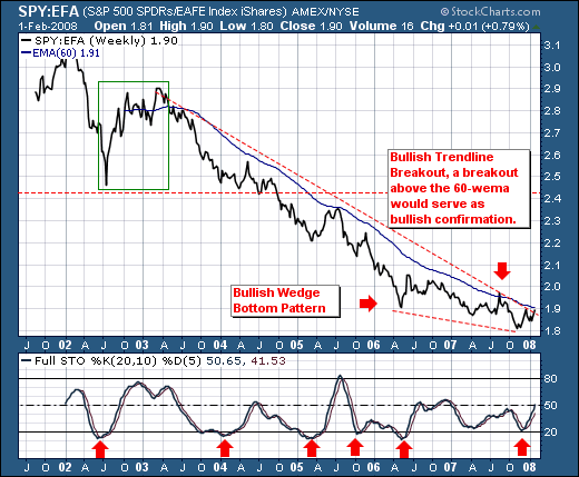
We recently noted the US had in our opinion entered into a bear market; hence we believe rallies are to be sold in the coming weeks/months as prices enter into resistance. However, we continue to hear how other world markets such as the European, Asian and Emerging markets will be 'immune' from the US-led slowdown, and thus funds should flow from the US towards more international markets. We think this to be patently wrong, for the time to be long international markets at the expense of US markets has past. With the US Federal Reserve addressing the problem - however futile this may prove or not prove - the international central banks are not addressing the looming crisis. Hence, we will posit that the US is poised to outperform the international markets for months if not years into the future given the 'lead' the Federal Reserve has created via lower interest rates.
Technically speaking, we look at the ratio of the surrogate ETFs for the US and international markets - the S&P 500 Spyders (SPY) and the World ex-US (EFA). It is quite clear the trend has been lower since the world pulled out of recession in 2003, and the clear trade has been to be long International versus a short US position. But the emerging bullish wedge pattern suggests a trend change is in progress. A breakout above the 60-week exponential moving average would solidify this in our minds, and cause to err upon the side of being long US large caps at the expense of International markets.
This isn't the common prevailing wisdom; but given the contrarian nature of the trade... it shall catch everyone wholly off-guard and scrambling to make amends. So, for those overweight International Funds... this should serve as fair warning.
