StockCharts.com has an extensive collection of Market Breadth indicators. Many of them can be found under the "Breadth Charts" link on the left side of our homepage. However, one of the best places for studying market breadth on our site is - surprisingly - our Predefined Scan Results page. The page is easy to overlook but - fortunately - easy to get to. Just click on the "Stock Scans" link on the left side of our homepage and it will take you to the page I'm talking about. Here is a screenshot:
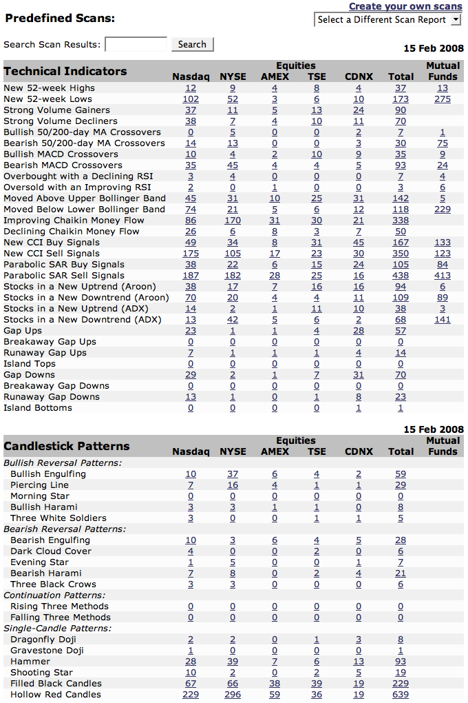
Now, the magic is in studying the ratios between various pairs of bullish and bearish scan results. It's up to you to determine which ratio(s) you trust the most - personally, I use these to try and confirm any signals I see on the "major" breadth charts. But one ratio I always keep an eye on is the ratio of Filled Black Candles to Hollow Red Candles (at the bottom of the screenshot above). It's probably the quirkiest ratio invented, but that's why I like it.
For those that didn't see my previous rantings about them, filled black candles and hollow red candles are what I call "Oxymoronic" candles. They arise whenever the market opinion about a stock dramatically reverses course in the course of one day. Usually candles that are colored black are hollow - that indicates that the stock closed higher than it did yesterday (black) and closed higher than its opening price (hollow). Conversely, red candles are typically filled in indicating that the stock moved lower during the day (filled) and closed lower than it did yesterday (red).
The "oxymoronic" candles appear when a stock gaps up (or down) on the open but then moves in the opposite direction during the day. The indicate "buyer's remorse" (or "seller's remorse") about a stock. The market is really confused about the stock's prospects - often it signals a change in the stock's current trend. The ratio of filled black candles to hollow red candles shows just how confused the market is and in which direction. If there are large numbers of filled black candles and few hollow red ones, then there were lots of stocks that gapped up and then fell back - overall that's a bearish signal. Conversely, lots of hollow red candles with few filled black candles indicates a bullish upturn might be on the way.
Other ratios on that page can be informative: Stocks in an New Uptrend / Stocks in a New Downtrend for example. Experiment with them - I bet you will find a useful tool or two.
In the 15-December issue of ChartWatchers, I pointed out the possibility of a head-and-shoulders top in the Dow Industrials ETF (DIA). The ETF formed a weekly bearish engulfing pattern that week and this marked the mid December high. Subsequently, DIA moved lower over the next several weeks to confirm this bearish reversal pattern.

This pattern remains in play and broken support is now acting as resistance. This is a basic tenet of technical analysis (broken support turns resistance). The ETF bounced back to broken support at the end of January, but this level turned into resistance as DIA fell back in February. This decline reinforces resistance around 128. More importantly, the head-and-shoulders reversal still dominates the landscape with a downside target around 112.5. The length of the head-and-shoulders is subtracted from the neckline support break for a target.
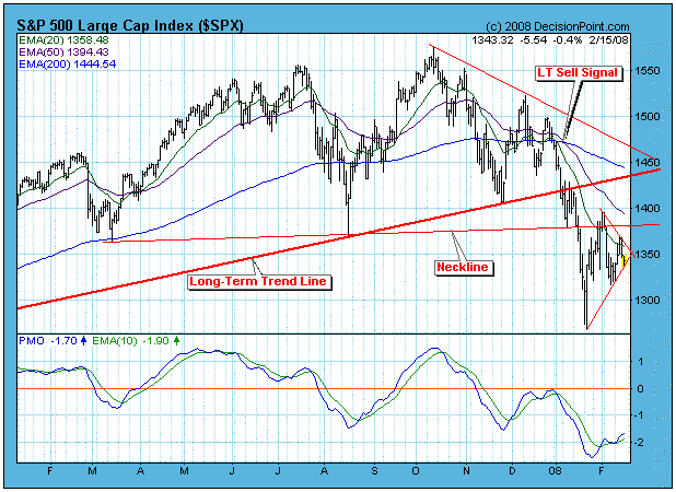
When the market began to rally this week, it looked as if a successful retest of last month's lows had occurred and that another up leg had begun; however, what looked like the start of a new rising trend, has now morphed into a triangle formation with the price index trying to break through the bottom of the triangle. While the triangle itself is a neutral formation, we are in a bear market, so the odds favor a break down from the triangle and another retest move on the January lows.
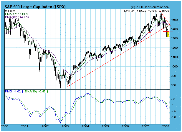
The next chart, a weekly-based chart of the S&P 500 Index, continues to confirm that we are in a bear market. There has been a moving average downside crossover, and the moving averages and PMO (Price Momentum Oscillator) continue to move downward.
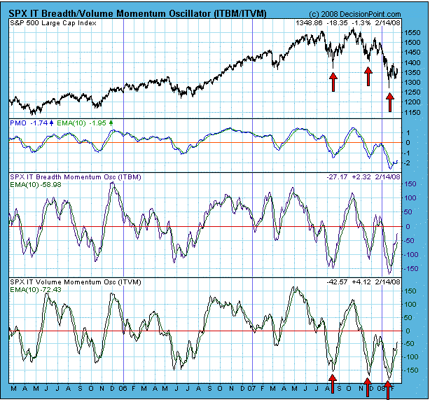
The following chart illustrates how oversold conditions in a bear market do not provide the degree of internal compression we normally see in bull markets. Note how the two most recent oversold lows on the price, breadth, and volume indicators failed to produce the kind of price gains that we see from the August 2007 lows. You can also see other examples of bull market reactions to oversold conditions on the chart.
Bottom Line: Whereas the charts had begun to look as though we had a short-term bottom in place, we are now faced with an unresolved triangle pattern in a down trend. Odds favor a downside resolution, but, even if it resolves to the upside, it is doubtful that there will be enough steam behind the rally to overcome bear market drag and penetrate major overhead resistance.
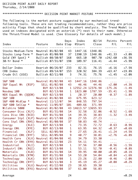
Regardless of my personal opinion, we rely on the mechanical trend models to determine our market posture. Below is a recent snapshot of our primary trend-following timing model status for the major indexes and sectors we track. Note that we have added the nine Rydex Equal Weight ETF versions of the S&P Spider Sectors. This may seem redundant, but the equal weighted indexes most often do not perform the same as their cap-weighted counterparts, and they provide a way to diversify exposure.
This is a rarity. I am proposing that you use line charts - in one instance. A line chart simply connects one closing price to the next closing price. Intraday activity does not appear and is ignored. How in the world can line charts have an advantage over bar charts or candle charts? Well, there's one instance and I'm going to show you.
We discussed a couple of weeks ago how the recent lows in the market were accompanied by extreme bearish sentiment readings that many times mark significant long-term bottoms. So far those lows have held. Since that time, long-term positive divergences have appeared providing bulls with evidence that selling momentum has begun to slow. At first glance on a candle chart, it doesn't appear that a long-term positive divergence has printed. Take a look at the NASDAQ candle chart below:
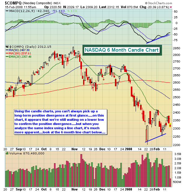
Ahhhh, but wait a second! MACD = Moving Average Convergence Divergence. The MACD represents the difference between two moving averages. We use the standard 12 day and 26 day EMA's (Exponential Moving Average). Moving averages are calculated using closing prices. So if you're looking for a long-term positive divergence on a daily chart, you need to compare the CLOSING prices to one another. That's where the line chart comes in handy because it only connects closing prices. Take a look at that same NASDAQ chart, but this time on a line chart:
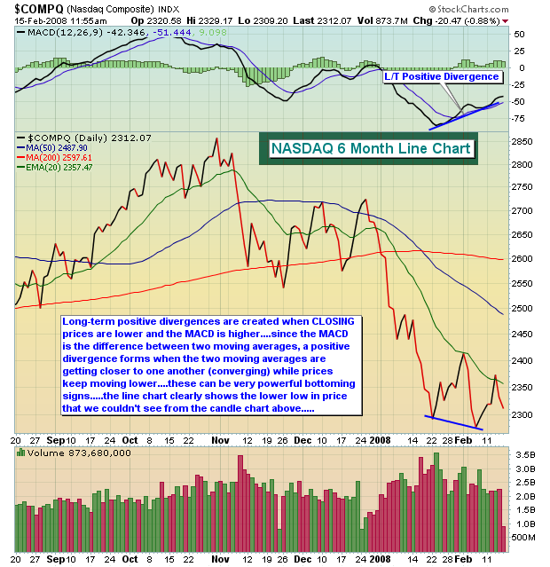
The line chart clearly has one advantage. This was an unusual circumstance because of the large gap downs and subsequent rallies that we experienced as the major indices put in their recent lows. We knew there was a reason why line charts were created and this is it!
The long-term positive divergences are yet another technical sign that indicates a bottom may be in place. However, the price/volume combination is our highest ranking technical indicator and it trumps divergences. If the major indices lose their recent lows as support and heavy volume accompanies the selling, that breakdown must be respected. In the meantime, we believe the market is range-bound as it attempts to develop a base from which to rebound longer-term.
Best of luck and happy trading!