Hello Fellow ChartWatchers!
The Real Estate industry is undergoing lots of challenges right now. Let's see how those challenges are affecting the REIT charts. Check out the current chart for the Dow Jones REIT index:
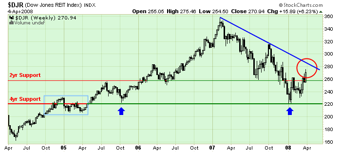
The problem with REITs is clear here - the blue downtrend line that started back in early 2007. It was created when the spike in October faltered around the 315 level.
The other problem is the break in the thin "2yr Support line" (just below 260) that happened back in December. That support level was created in mid 2005 and confirmed in June on 2006. It provided support in August of 2007 after the collapse began, but failed spectacularly last December. Since then, it's been a resistance level for the index - that is, until last week...
The longer term picture focuses on the 220 support level - the "4yr Support" line that I added. That level was created in late 2004 and confirmed in Oct. 2005. Recently, it halted the free fall at the start of 2008 and continues to look pretty strong.
The short-term question is "Will the index be able to break through that blue downtrend line? Or will it bounce lower and retest those two support levels again? ChartWatchers should be paying close attention to these key tests in the next couple of weeks.
Throughout the market problems of the first quarter, stocks tied to basic materials have been the top performing sector. That's also been true over the last week. The chart below shows the Materials SPDR (XLB) trading over 43 today for the first time this year. That puts in in striking distance of its fourth quarter highs. The rising relative strength line below the chart shows the group's superior performance since last autumn. Three of the top performing stocks in the XLB are Alcoa, Freeport McMoran Copper & Gold, and U.S Steel.

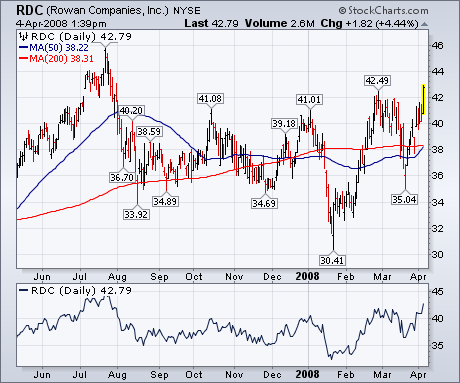
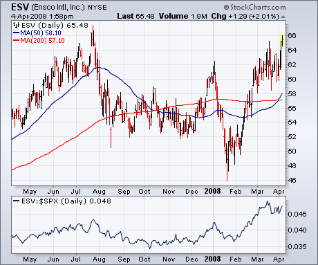
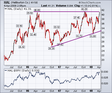
One of the top performers in the Oil Services Holders is Rowan Companies (RDC). The chart below shows the stock breaking out to the highest level since last July. Its relative strength ratio is doing the same. Beneath it, is a chart of ESV. It shows Ensco Intl already nearing a test of last summer's highs. Its relative strength ratio is in a strong uptrend. The strongest chart of all may belong to Halliburton (HAL). It shows that oil service leader nearing a challenge of its 2006 and 2007 highs in what appears to be a two-year "ascending triangle". (An ascending triangle is defined by two converging trend lines with a flat upper line and rising lower line. It's a bullish pattern.) A number of readers have asked where to start putting new money to work in the stock market. At the moment, two good choices seem to be basic material and energy stocks.
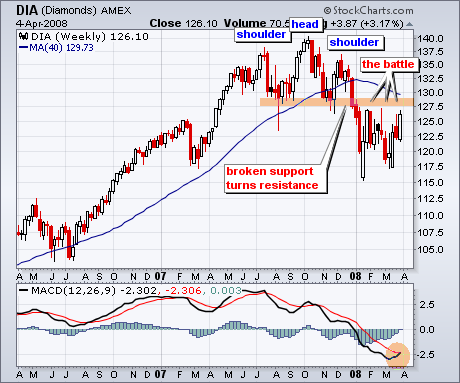
Despite some volatile price action the last few months, the Dow Industrials
ETF (DIA) remains below a major support break and has yet to win the battle
at resistance. DIA formed a rather large head-and-shoulders pattern in 2007
and broke support with a sharp decline in January. This support zone then
turned into resistance and the ETF failed to break back above this zone in
February.
DIA is making another challenge to resistance with a surge over the last
three weeks. The prior surges fizzled around 127.5 and this is the first
level to watch. A close above the February highs (127.5) would be positive
for DIA. The bottom window shows MACD moving towards its signal line with an
upturn over the last few weeks. A signal line crossover would be positive
and show improving upside momentum.
As a technician I rarely look at fundamentals, primarily because they are not directly useful in making trading decisions; however, while fundamentals are not primary timing tools, they can be useful in establishing a broader context within which technical indicators can be interpreted. For example, one of the reports the Decision Point publishes daily is The Overview of Market Fundamentals. The following is an edited excerpt from that report.
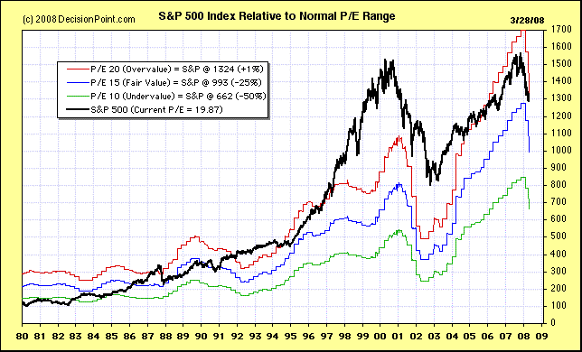
First, notice that, in spite of a substantial market decline, the current P/E is 20.7, which is slightly above the overbought limit of the historical range. Notice also that GAAP earnings are projected to drop to 55.15 by the end of 2008 Q2. Compare that to earnings of 84.92 at the end of 2007 Q3. In spite of the fairy tale projections of "operating" earnings, real earnings are crashing.
*************************** S&P 500 FUNDAMENTALS ****************************
The real P/E for the S&P 500 is based on "as reported" or GAAP earnings
(calculated using Generally Accepted Accounting Principals), and it is the
standard for historical earnings comparisons. The normal range for the GAAP
P/E ratio is between 10 (undervalued) to 20 (overvalued).
Market cheerleaders invariably use "pro forma" or "operating earnings,"
which exclude some expenses and are deceptively optimistic. They are
useless and should be ignored.
The following are the most recently reported and projected twelve-month
trailing (TMT) earnings and price/earnings ratios (P/Es) according to
Standard and Poors.
| 2007 Q4 | Est 2008 Q1 | Est 2008 Q2 | Est 2008 Q3 |
|---|
| TMT P/E Ratio (GAAP) | 20.7 | 22.5 | 24.8 | 23.6 |
| TMT P/E Ratio (Operating) | 16.6 | 16.9 | 16.9 | 16.1 |
| TMT Earnings (GAAP) | 66.18 | 60.95 | 55.15 | 57.92 |
| TMT Earnings (Operating) | 82.54 | 81.08 | 81.17 | 85.20 |
Based upon the latest GAAP earnings the following would be the approximate
S&P 500 values at the cardinal points of the normal historical value range.
They are calculated simply by multiplying the GAAP EPS by 10, 15, and 20:
Undervalued (SPX if P/E = 10): 662
Fair Value (SPX if P/E = 15): 993
Overvalued (SPX if P/E = 20): 1324
The following chart helps put current events into an historical perspective, showing the earnings crash that accompanied the last bear market, as well as the current earings decline. I don't know how anyone could be optimistic about this picture.
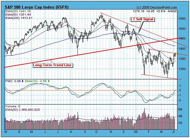
Now let's turn to the technical market picture. The chart below shows that the long-term sell signal is still in force; however, a nice looking bottom has formed and could be a solid base for a medium-term rally. As I write this the market is still open on April 4 and the S&P 500 is trying to break out of a three-month trading range. Also, most of our medium-term indicators (not shown) have reached very oversold levels and have formed positive divergences. Finally, we have medium-term buy signals on most of the indexes and sectors we track. Evidence is pretty strong that we are beginning a rally that will challenge important overhead resistance, possibly around the area of 1450 on the S&P 500.
Bottom Line: The earnings picture is abysmal, and there is a solid long-term sell signal in progress. Playing the long side looks promising, but keep a tight reign on long positions because we are in a bear market until proven otherwise. Remember: "Bear market rules apply! The odds are that support levels will be violated, and, if against those odds the market manages to rally off support, odds are that the rally will fail before it can change the long-term trend."
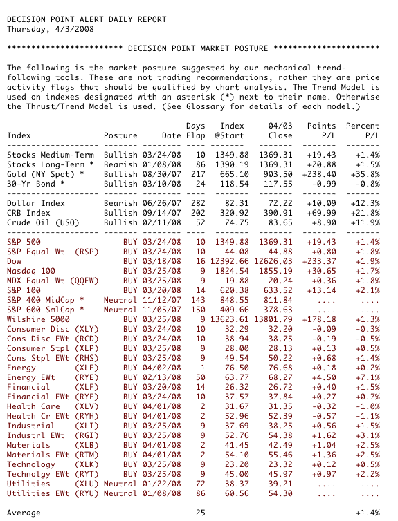
We rely on the mechanical trend models to determine our market posture. Below is a recent snapshot of our primary trend-following timing model status for the major indexes and sectors we track. Note that we have included the nine Rydex Equal Weight ETF versions of the S&P Spider Sectors. This may seem redundant, but the equal weighted indexes most often do not perform the same as their cap-weighted counterparts, and they provide a way to diversify exposure.
