| |
|
|
|
|
| |

|
ChartWatchers
the StockCharts.com Newsletter
|
|
|
|
|
|
|
|
StockCharts.com is pleased to announce that we have just added Kagi and Renko charting formats to our site. Go. Check em out.
Hmmm... Why are you still here? Oh, right. Not everyone knows what Kagi and Renko charts are. Well, lemme show you what a Kagi chart looks like first:
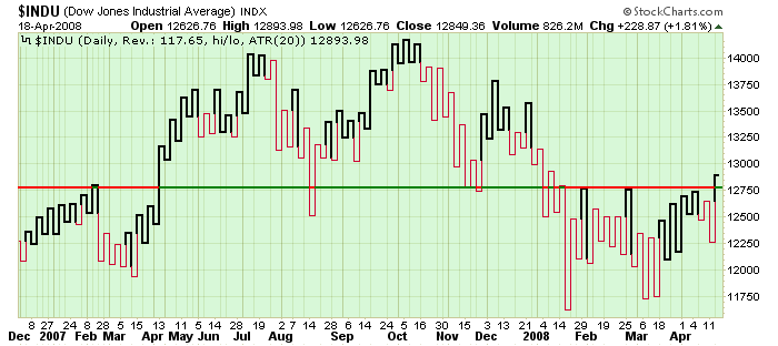
Pretty different eh? It's actually more like a P&F chart than a OHLC or Candlestick chart. For one thing, notice that the horizontal time axis isn't uniform. Just like a P&F column of X's, the thicker lines will go up until a reversal occurs. Similarly, thin lines go down until prices move up again significantly. Notice how the Kagi display makes the support/resistance level clearer on the chart above?
Renko is similar only instead of vertical lines going up and down, boxes are filled at a 45-degree angle during each uptrend and downtrend. Here's the same chart in Renko format:
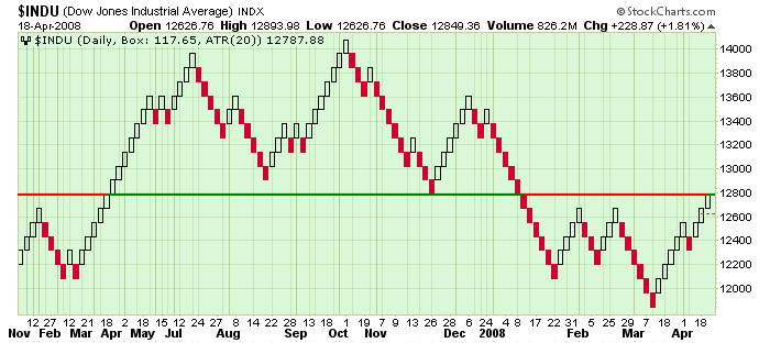
We are still working on creating detailed ChartSchool articles for Kagi and Renko charts. Until those are done, you can refer to these great discussions on Investopedia.com - one for Kagi and one for Renko.
What? You're still still here? Go play with Kagi and Renko like everyone else! Oh, right. I forget to tell you how to create them. It's really easy. Just select Kagi or Renko from the "Type" dropdown in the "Chart Attributes" section of the SharpCharts workbench. You can even add indicators and overlays - although please be very careful about using those until you fully understand what they are telling you (for instance, a 20-period moving average becomes a 20-reversal moving average).
Have fun learning about these new tools - take time to learn about them and slowly incorporate them into your chart analysis if they work for you.
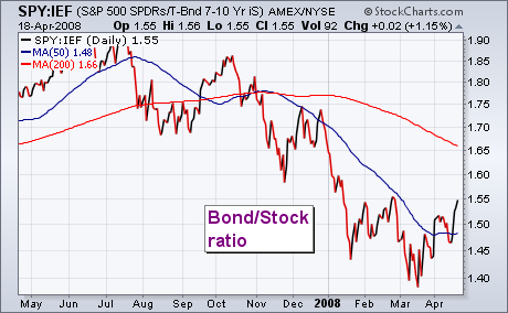
PENDULUM SWINGS BACK TO STOCKSby John Murphy | The Market Message This week's market action has been characterized by stock buying and bond selling. The change in the relationship between those two markets is shown in the chart below which plots a ratio of the 7-10 Year Treasury Bond Fund (IEF) by the S&P 500 SPDRS (SPY). The falling ratio since October shows that investors have favored bond prices over the last six months. Since mid-March, however, the ratio has turned up. That means that investors are rotating out of bonds and back to stocks. The rise in the ratio isn't enough to signal a major trend change between the two asset classes. But it does show that investors are feeling a bit more optimistic. Rising bond yields gave a boost to the dollar today and caused heavy profit-taking in gold.
Despite a big advance over the last few weeks, the Russell 2000 ETF (IWM) entered a resistance zone and has become overbought. There are two reasons to expect resistance around 72. First, the three February highs mark resistance in this area. Second, a 50% retracement of the December-January decline would extend to around 72. Corrective rallies normally retrace 38-62% of the prior decline. 50% marks the mid point and a good area to
start expecting resistance.
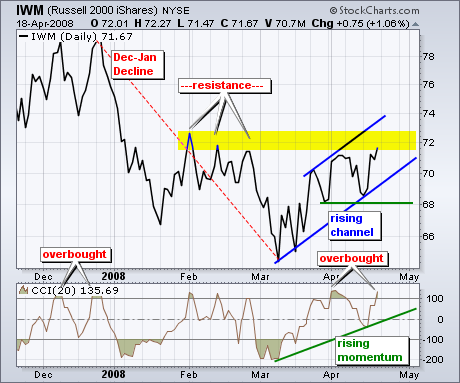
As far as oversold conditions, the Commodity Channel Index (CCI) moved above 100 for the second time this month. IWM remains both overbought AND strong as long as CCI holds above 100. I drew a trendline extending up from the March lows. A move below this trendline would signal trouble and a break into negative territory would be bearish for momentum.
Overall, a rising price channel is taking shape in IWM since mid March. As with the CCI indicator, this advance is in good shape as long as the lower trendline holds. I am marking key support at 68 from the late March and mid April lows. A move below the channel trendline and key support would reverse the uptrend that has been in place since mid March. Until such breaks, the bulls have the edge. SUSPICIOUS GAPSby Carl Swenlin | DecisionPoint.com
On Wednesday and Friday of this week the market opened up with large gaps from the previous closing price, and I think this activity is suspicious, possibly contrived. It is, after all, options expiration week, and weird market action can be expected. This week it is likely that the big money wanted to stick it to the bears and put holders, as usual, and they did so quite skillfully.
These large up gaps can be contrived by heavy buying of S&P futures just before the market opens. There is usually a bullish cover story available to use as justification for the initial buying spree. When the market opens, many bears are forced to cover in order to limit losses, so the price advance is supported by real buying. Next, the reluctant bulls are sucked into the move as they begin chasing the market.
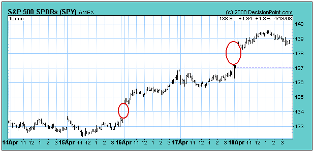
While I tend to believe that price action speaks for itself, we are in a bear market, and I expect that volume should confirm such enthusiastic price moves. In these two cases, I don't think it does. As you can see on the chart below, volume is only average, not explosive like price movement. So what we have is a breakout on modest volume, and strong overhead resistance dead ahead in the form of the 200-EMA, the declining tops line, and the long-term rising trend line.
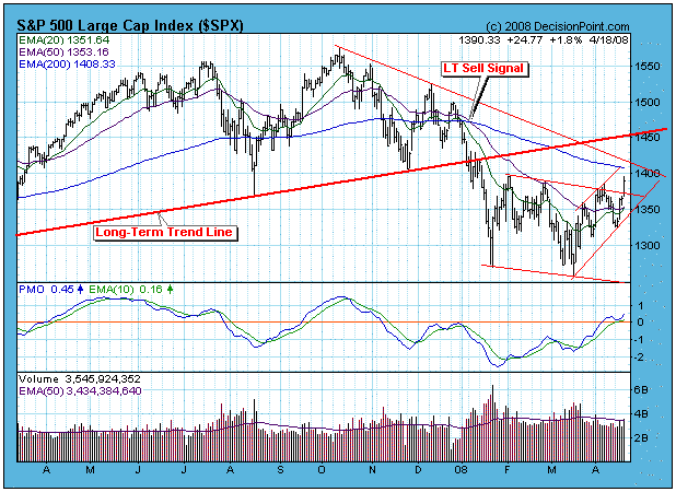
Bottom Line: We are in a bear market, and the 6-month period of negative seasonality begins at the end of this month, so we should expect bearish outcomes. In this case, the rally should fail before it penetrates the 1450 level. Having said that, you will note that all but one of the 27 market and sector indexes are on intermediate-term buy signals. That is because our primary model is designed to enter rallies relatively early. Because the long-term model is still on a sell, we should expect that the intermediate-term signals will fail in a short time. When the PMOs (Price Momentum Oscillators) begin to reverse downward, that would be a good time to consider closing long positions. THE GAME HAS CHANGEDby Tom Bowley | InvestEd Central In the February 3rd edition of ChartWatchers, I made a bold prediction that the market had bottomed with the January lows. I did so because of the extreme pessimism in the options world. If you go back to 1995, the year that the Chicago Board Options Exchange began providing investors with historical put call readings, and average the daily put call readings, you'll find that 0.75 is the "norm". That's been the average end of day reading over the past 12-13 years. A .75 reading on the put call ratio means that for every 3 puts bought, 4 calls are bought. 3 divided by 4 = .75. When the ratio moves above 1.0, it indicates that more puts are being bought than calls. Now let's take it one step further - let's looks at the "equity-only" put call ratio. This strips out the index options used as part of more complex trading strategies employed by portfolio and hedge fund managers, and other investment professionals. The "equity only" put call ratio gives us much more of a sense of the individual traders' psyche.
Since October 2003 - the CBOE began breaking out equity options vs. index options at that time - the "equity only" put call ratio has hit or topped 1.0 on just 16 occasions. 3 of those occasions came on consecutive days from August 14-16, 2007. That marked a very significant bottom in the market. Then a month or so ago, it happened again. The retail investor couldn't take the pain any longer and jumped in on the "sure-fire" bet that the market would fall into oblivion. The "equity only" put call ratio spiked to 1.35 on March 17, 2008. That was the highest reading ever recorded at the CBOE since it began providing the "equity only" data. The 5 day moving average of the "equity only" put call ratio hit 1.01 that same day, also the first time we've seen that.
Would you like to take a guess as to which day the Dow Jones, S&P 500, NASDAQ, NDX, Russell 2000, and SOX all mysteriously hit their lows to launch the recent bullishness?
March 17th.
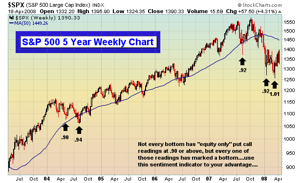
The chart below reflects the 5 times since 2003 that the 5 day moving average of the "equity only" put call ratio has exceeded .90. In every single case, that bearishness by the retail investor marked a very significant bottom.
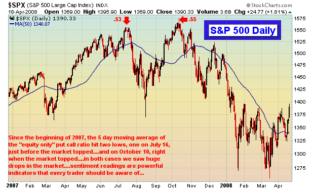
And in the event you're wondering what happens when the "equity only" put call ratio declines to an extremely bullish level, check out the market's reaction in 2007 when the 5 day moving average of the "equity only" put call ratio hit its two lowest levels:
Clearly, the market has a renewed sense of bullishness as we've entered spring. The season has changed and so has the game. There's a reason the market is so resilient. The economy hasn't magically improved. We've simply run out of sellers.
Happy trading!
Join Tom and the Invested Central team at www.investedcentral.com. Invested Central provides daily market guidance, intraday stock alerts, annotated stock setups, LIVE member chat sessions, and much, much more. Also, listen to Tom throughout the trading week on The Invested Central Financial Hour, a business talk radio show focused on technical analysis of the stock market. The shows can be heard LIVE or archived at www.washingtonbusinessradio.com. STORM ON THE HORIZONby Richard Rhodes | The Rhodes Report
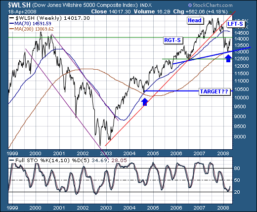
The intermediate-term broader market technical condition is improving; however, we believe that this "improvement" is nothing more than a respite before the larger storm develops. First, letâs note that the Wilshire 5000 has broken its bull market trendline off its 2003-2006 lows, and remains on the defensive below its 70-week moving average. Secondly, a countertrend improvement has developed from the longer-term 200-week moving average, which did indeed provide support back in 2004 in tandem with the 70-week moving average. We would posit - and perhaps it is too early to do so, but we certainly want to keep all options on the table - that the current improvement is nothing more than a "right shoulder" forming of a larger "head & shoulders" topping pattern. Obviously overhead resistance at the 2007 previous low at 14,100 and the 70-week moving average at 14600 must prove its merit with lower prices - and break below neckline support. If this is the case, then we could very well see prices falter sharply as low as 10,000.
Certainly one must be concerned with the credit crisis/contagion to be sure, for it is the "great unwinding" that took years to put in place - and we would be rather naïve to believe that it is to be solved in a matter of 6-8 months. If this bear market is over, then it would be the second shallowest on record - and given the largest debt bubble in history is unwinding - then we remain very skeptical the decline is over. Moreover, unprecedented stresses in the money markets have developed this past week; stresses which the stock market is ignoring at is own peril. This is our roadmap; we short sellers of rallies.
|
|
|
|
|
|
|
|
|
|
|
|
|
|
|