CLOUDS GATHERING ON THE HORIZONby Chip Anderson | ChartWatchers
Clouds are gathering on your charting radar - can you see them? No, no - I'm not talking about the recent bad news on the US economy or the price of oil or any of that stuff. I'm talking about another new kind of chart that StockCharts.com will soon be offering to all our users - Ichimoku Cloud Charts!
Ichimoku charts are similar to traditional candlestick charts but with several additional lines added to them as well as the unique "cloud" area. Here's an example of what one looks like:
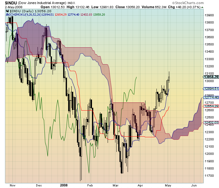
(Note: These are not available yet! We are putting the finishing touches on them this week. Watch for an announcement in the "What's New" section of the site later this week.)
In the example chart above, the shaded area is called the "the Cloud". It serves as a dynamic support/resistance zone that prices tend to bounce off of. The thickness of the cloud is an indication of its "strength" - prices are more likely to break through thin cloud areas, than thick ones. The Cloud also can "trap" prices for a period of time - for instance from mid-March to mid-April. Finally, the thick green line that ends in late March is called the "Chikou Line" ("Lagging Line") and right now it is looking bullish since there is nothing above it (no clouds, no candlesticks, etc.).
There are lots of other aspects to interpreting Ichimoku charts which I can't get into in this article. Look for our ChartSchool to include a detailed article on the topic soon. Until then here are two resources you may want to look into to:
Here is a link to a nice article on FXWords.com about Ichimoku charts. And here is a link to a great book on the topic which we sell in our online bookstore.
Again, we hope to have live Ichimoku charts on our website in the next week or so. Stay tuned...
Chip Anderson
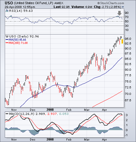
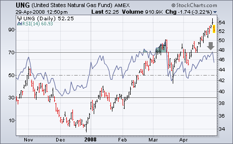
When only one commodity group is hitting new highs, that's usually a sign that it's out of step with the others. That seems to be the case with energy. I still believe that the energy complex is due for some profit-taking. Chart 1 shows the United States Oil Fund still in an uptrend. The 14-day RSI line, however, (top of chart) is backing off from overbought territory over 70. The daily MACD lines (bottom of chart) may be stalling at their March high. That's not a lot to go on. Add in the fact that energy shares are among the day's biggest losers, however, and we see a market group ripe for profit-taking. Chart 2 shows a negative divergence between the 14-day RSI (solid line) and the United States Natural Gas Fund. That's another sign that the recent energy runup is on weak technical footing.
The U.S. Dollar Index ($USD) remains in a long-term downtrend, but the index is showing signs of strength with a consolidation breakout this week. After becoming oversold in March, the index firmed for 6-7 weeks and surged above its mid March highs this week. StochRSI moved below .20 in late February, firmed a few weeks and then broke above its mid point (.50). These breakouts opens the door to an oversold bounce that could extend to the 75-78 area.
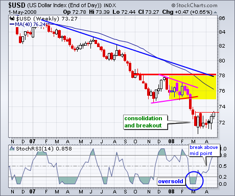
There are a number of factors pointing to resistance around 75-78. First,
the trendline extending down from January-February 2007 comes in around 78.
Second, the December 2007 high marks resistance around 78. Third, the
falling 40-week moving average marks resistance just above 76. And finally,
the January-February consolidation can also act as resistance around 76.
Taken together, I am marking a resistance zone around 75-78 for the upside
target.
Something you will be hearing a lot about for a while is that for the next six months the market will be carrying extra drag caused by negative seasonality. Research published by Yale Hirsch in the "Trader's Almanac" shows that the market year is broken into two different six-month seasonality periods. From May 1 through October 31 is seasonally unfavorable, and the market most often finishes lower than it was at the beginning of the period. November 1 through April 30 is seasonally favorable, and the market most often finishes the period higher.
Back testing of a timing model using the beginning of these periods as entry and exit points shows that being invested only during the favorable period (and being in cash during the unfavorable period) finishes way ahead of buy and hold. As I recall, the opposite strategy actually loses money. (See Sy Harding's book "Riding the Bear" for a full discussion of this subject. Seriously, I really, really recommend this book.)
While the statistical average results for these two periods are quite compelling, trying to ride the market in real-time in hopes of capturing these results is not always as easy as it sounds. Below is a chart that begins on May 1, 2007 and ends on April 30, 2008. The left half of the chart shows the unfavorable May through October period and the right half shows the favorable November through April period. As you can see, the seasonality periods performed exactly opposite of the statistical average. The point to be made is that, regardless of how the market performs on average, every year is different and presents its own challenges, and there is no guarantee that any given period will conform to the average.
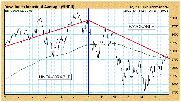
Whether or not you find the seasonality strategy compelling enough to use, the statistics tell us that the next six months are apt to be dangerous, and that is something to keep in mind when evaluating the overall context of the market. The fact that this negative seasonality period is taking place during a bear market, makes it even more dangerous.
Bottom Line: We are in a bear market, and the 6-month period of negative seasonality has begun. Expect price reversals when the market gets overbought. When the PMOs (Price Momentum Oscillators) begin to reverse downward, that would be a good time to consider tightening stops and/or closing long positions.
It's been a long time since we've spoken about semiconductors or financials in a positive light. But times have changed and so have the charts for these two influential groups. Semiconductors are showing clear relative outperformance, but have now reached a critical resistance area. Check out Chart 1 below to see how the recent rally in semis have left them vulnerable as key resistance is tested. A break above would be quite bullish, but we'll need to see it first.
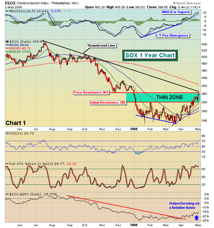
Once the SOX broke through 380, there was very little resistance until the 404 level. We tested that on Friday and are now watching to see if this group can gain additional momentum by taking out key price resistance and the long-term downtrend line.
Financials are not quite as strong as semiconductors on a relative basis, but we are seeing signs of technical strength from that group. On Thursday, the XLF cleared 27.00 after battling resistance there on several occasions. Chart 2 shows the technical significance of this move.
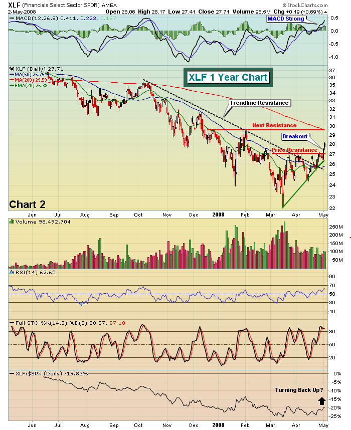
The XLF first broke downtrend resistance and finally took out price resistance at 27.00. Based on the chart, it appears that the XLF won't run into serious resistance until the 29.60 area. 26.90-27.00 should act as solid support on pullbacks during consolidation.
Financials and technology shares were leaders as the major indices broke above key resistance areas. Below in Chart 3 is a snapshot of the NASDAQ as it broke not only critical price resistance, but also the multi-month downtrend line that had been difficult for the bulls to conquer during prior attempts.
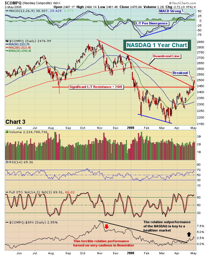
We remain optimistic and bullish until technicals suggest otherwise. Ignore the CNBC noise and follow the money.
Happy trading!
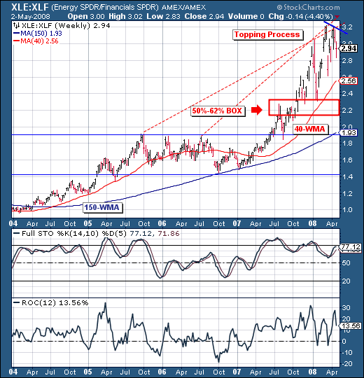
It is rather clear there are ongoing "rolling corrections" beneath the surface in today's markets. In terms of performance, whether one is bullish or bearish on the broader market hasn't made as much of a difference as we would have thought. But understanding where the 'funds' currently stand and where they are likely to 'move' makes a great deal of sense in terms of trading allocation.
To that end, we want to look at the "long in the tooth" and very profitable pairs trade of Long Energy/Short Financials. In recent weeks, we have begun to see a topping process take place in spread as the 14-week stochastic and 12-week rate-of-change are trading at near overbought levels and more importantly - showing signs of negative divergences - indicating a loss of momentum. Hence, we would posit that this mean reversion trend towards lower prices have quite a bit of downside left in front of it. At a minimum, we expect a test of the 40-week moving average - and at most a test of the 200-week moving average. Or, we can target the 50%-62% retracement box in between. In any case - there remains substantial downside remaining. In our portfolio - we currently have the trade currently on; and are looking to add more.
