Last week, we started getting disturbing reports from several users about seeing the wrong name at the top of the page after they logged in to StockCharts.com. That set off HUGE RED WARNING LIGHTS here. We have numerous safeguards in place to make sure that people only see their own information. And yet here were credible reports showing that somehow those safeguards weren't working. Yikes!
After scratching our heads for a while, we set us some "sniffing computers" on our network that recorded ALL of the "Welcome..." messages that our site was sending out. These "sniffers" were positioned to record that information at the point immediately before the data was handed over to the Internet. If we were sending the wrong information to the wrong users, these "sniffers" would show us exactly what was going on.
But then something really strange happened. Several users reported the problem again but the sniffers didn't record any problems! That meant that something else was sitting between our website and the users' computers and mixing things up! But that was impossible - wasn't it?
It turns out that there is one category of program that does exactly that. So called "Web Accelerators" work by intercepting requests from a user's browser, sending us the request via a high-speed link, and the storing the results in their own servers and then sending the results back to the original user. They store the results locally so that, if they see the same request from a different user later, they can send the stored results instead.
Some more checking on our end revealed that, sure enough, the "Google Web Accelerator" was being used by all of the users that were reporting problems.
Some more checking revealed that the Google Web Accelerator was mistakenly saving the "Members" page for anyone that had it installed and then sending that saved version to the next people that had the Google Web Accelerator installed.
So who's at fault for this problem?
1.) Google maintains that their Web Accelerator adheres to several published standards for "caching" content. We (along with several other web sites that have been bit by this) don't agree. The "standard" that they point to is vague on several points and they make some questionable assumptions about what to do in those cases.
2.) Google also maintains that their Web Accelerator is still in "Beta" and that there may be bugs. We consider this to be a significant one.
3.) Users that installed the Google Web Accelerator are cautioned during the installation process that some data sharing might occur - but that warning is buried in a chunk of text that is rarely read.
Once we understood what was happening, we were able to come up with a fix that prevents Google's Web Accelerator from storing the "Welcome" page. After more testing, we are now confident that people using Google Web Accelerator won't see other people's information again.
So, problem solved right? WRONG!
People who are using Web Accelerators, regardless of who wrote them, need to be aware that their personal data can leak from those programs. Web Accelerator software makes several assumptions about how web sites protect private data and those assumptions are NOT universally correct. Just because we've fixed this problem with the Google Web Accelerator, that doesn't mean that other web sites out there don't have similar problems. It also doesn't mean that other non-Google Web Accelerators will work correctly.
Based on our findings, we strongly recommend that people avoid these programs - or at least understand that using them may unintentionally expose your private information to other people.
For more information on Web Accelerators, see this article from Wikipedia:
http://en.wikipedia.org/wiki/Web_accelerator
Sorry for not talking about charting or the stock market this week, but I wanted to make sure everyone was aware of this important issue.
Be safe out there,
Chip
Note: It is always very risky talking about these kind of issues publicly. People may turn this around and say "StockCharts isn't safe." It's not a black/white situation. We decided to tell everyone about this issue because we feel it is important and the danger is real. If it helps our users become safer netizens then the risk of talking about this issue was worth it.
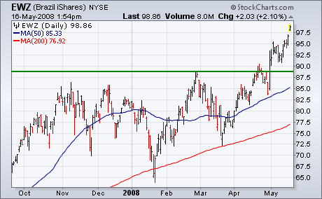
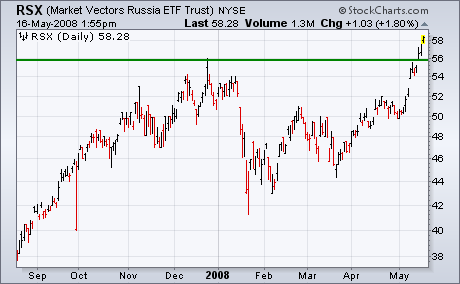
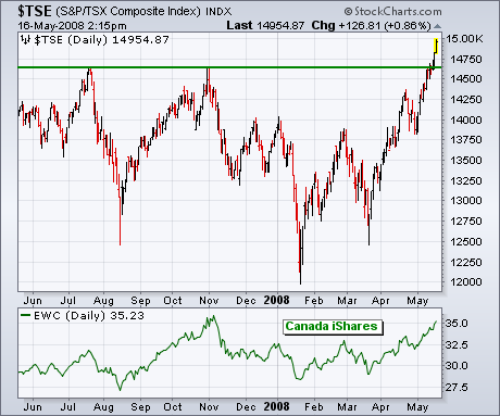
On Monday, I wrote about three foreign stock markets that were at or close to new record highs. Those three markets are Brazil, Canada, and Russia. What all three have in common was that they are producers and exporters of commodities. By the end of the week, all three markets had hit new records. Chart 1 and 2 show Brazil iShares (EWZ) and the Market Vectors Russia ETF (RSX) hitting new highs. Both cash indexes have done the same. Chart 3 shows the Toronto Composite Index (TSE) hitting a new record high as well. Canada iShares (bottom of Chart 3) have not reached new highs yet. As I explained on Monday, a flat Canadian Dollar is causing the iShares to lag behind Canadian stocks. Not surprisingly, the top sector in the Canadian market is basic materials. That's also true in the U.S. as commodity markets have a strong day.
Money may be moving into Technology, but it is avoiding Finance and Healthcare. While the Dow Industrials ETF and S&P 500 ETF both touched their 200-day moving averages in May, the Finance SPDR (XLF) and the Healthcare SPDR (XLV) fell well short of their 200-day lines. The inability to keep pace with the broader market shows relative weakness.
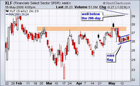
On the price chart, the Finance SPDR (XLF) broke down last week and then stalled this week. With a slight rise over the last 6 days, a mini-flag formed with support at 26. Support here is also reinforced with the 50-day moving average. A break below 26 would end this rise and call for a continuation of the early May decline.
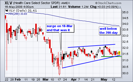
The Healthcare SPDR (XLV) is in even worse shape than XLF. After a bounce on 18-March with the rest of the market, XLV traded flat the last two months and went nowhere. In the process, a rising wedge formed with support just above 31. A move below the May lows would break wedge support and signal a continuation lower.
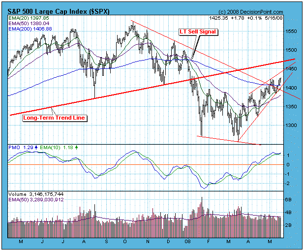
Our long-term model remains on a sell signal, so we have to assume that we are still in a bear market; however, the rally from the March lows has taken prices far enough to cause important bullish signs to appear: (1) The intermediate-term model for the S&P 500 is on a buy signal and has a gain of +5.6%; (2) all but one of the 27 sectors and indexes we track are on buy signals with an average gain of +6.6%; (3) prices have moved above the declining tops line drawn from the October top; and (4) the weekly PMO has bounced from oversold levels and generated a buy signal by crossing above its 10-EMA. I can put up a pretty good argument for the bullish case, but the long-term sell signal stands in the way of excessive optimism -- it takes a lot of negative energy to generate the sell signal, and it will take a lot of positive energy to reverse it. Fortunately, our medium-term model lets us be cautiously long early in the rally just in case a new bull market really has started.
While things are looking pretty positive, a few negatives are beginning to appear. One is an ascending wedge formation that you can see has formed since the March low. I have observed that this formation is one of the most reliable there is -- it most often resolves to the downside. Another negative is that the market is getting overbought. Note that the daily PMO is in the overbought zone.
More evidence of the market's overbought condition is the OBV (on-Balance Volume) suite of indicators on the chart below. Note that the CVI has topped and the STVO has reached the top of its range. Combine this with the ascending wedge price formation, and the overbought PMO, and I think the market is setting up for a short-term pull back at the very least.
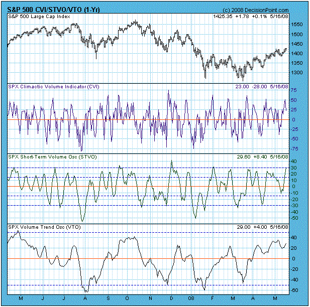
Bottom Line: The market is showing many positive signs, but it is getting somewhat overbought and we should be looking for at least a short-term correction.
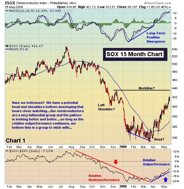
I've been bullish since my earlier bottom call in January. There were several reasons for the call, but in particular there were contrarian indicators moving off the charts in the bearish direction. That suggested that the next move in the market would be higher - and it was. After a retest in March with an incredibly bearish put call ratio in place, the market soared. There have been many positive technical developments since that time, with perhaps the most notable being the relative outperformance that the semiconductors have enjoyed. Below in Chart 1, I'm highlighting the relative strength of that group. Nearly every bullish move in the semiconductor group has lifted the overall market and this time has been no different. In fact, the semiconductors have been the reason for the outperformance of the NASDAQ and NDX over the last several weeks. At Invested Central, we were in the minority in calling a market bottom, but that's exactly where we prefer being - in the minority. Take a look at the relative strength of the semiconductors. It will be very important to follow this group in the weeks ahead for clues as to the direction of the market.
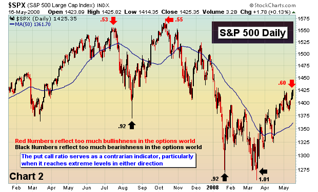
I mentioned above the put call ratio. This very important sentiment indicator is checked every trading day and I follow the 5 day and 21 day moving averages as a gauge of investor sentiment. When I see extreme readings in either direction, it sends up red flags that a directional change is approaching. We're nearing one of those times right now. After having been very bullish for weeks, I've moved more to a neutral or even bearish stance in the near-term. It's too early to make any long-term calls based on current developments, but clearly the bullishness that we've recently enjoyed could be waning. Why? Well, here's a couple of reasons. First, the "equity only" put call ratio (which ignores index options) hit 1.35 on March 17th, the highest reading at the CBOE since the equity only reading was broken out. That marked extreme bearishness on the part of individuals and VOILA! a bottom was in place. We're now on the opposite side of investor sentiment. On Friday, the equity only put call ratio printed its third consecutive daily reading below .60. There have only been 8 such readings during all of 2008. Obviously, options traders are beginning to think the water is safe again. That bothers me. You may recall Chart 2 below as it demonstrates the importance of tracking investor sentiment via the put call ratio (the numbers on the chart represent the 5 day moving average of the "equity only" put call ratio). Note the readings at significant tops and bottoms and then check out the current 5 day moving average. There is no denying that we've seen a HUGE swing in investor sentiment in the last 8-9 weeks. We may not be exactly at a top, but we're getting close.
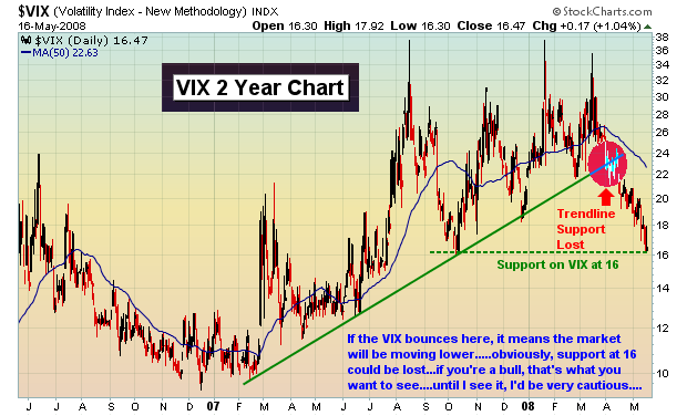
Finally, let's review the VIX. The VIX is designed to measure the implied volatility of S&P 500 index options. As fear ramps up, the VIX normally rises indicating that volatility will be picking up as well. A rising VIX is synonomous with a falling equity market. A falling VIX is synonomous with a rising equity market. As the VIX falls too far, complacency becomes an issue. On the flip side, as the VIX skyrockets, fear is elevated and a panic bottom generally forms. When the VIX lost its rising trendline in late March/early April, it was further evidence that the market was going higher. Currently, the VIX has reached a support level. A bounce off of this support level would likely coincide with a drop in the stock market. We have to respect that support area until it's lost. Check out Chart 3 below.
I would definitely stay away from the underperforming groups like financials and consumer discretionary stocks. Another bout of selling would likely take a toll on both of those groups. Put insurance or adding the Ultra Short ETFs that track the various indices would not be a bad strategy to hedge during this period of uncertainty.
Happy trading!