How high is "too high?" How low is "too low?" Think back to any time that you've owned a stock and think about when you started to get worried about it's performance. At what point did "your gut" start to tell you that you needed to sell? Chances are your gut started talking to you after the stock had moved up (or down) by 38.2%.
Wow, that's a really specific number - "38.2." It seems kind of arbitrary also. There's no way that could be correct, right? I mean, without knowing anything about the stock you were trading, or the amount of money involved, or the overall market conditions, or anything else - how can we stand here and tell you that you got nervous right at 38.2%?
The reason is because 38.2 appears to be programmed into the human psyche (as well as many other parts of nature). 38.2 is one of a set of numbers called "Fibonacci Percentages." They are derived from the "Fibonacci Sequence" which is a list of numbers where each number equals the sum of the previous two. i.e.,
1, 1, 2, 3, 5, 8, 13, 21, 34, 55, 89, 144, 233, 377, 610 etc.
The branching in trees, arrangement of leaves on a stem, the flowering of artichoke, an uncurling fern and the arrangement of a pine cone - all these things exhibit Fibonacci characteristics . In addition, if you take any large Fibonacci number and divide it by the previous number, you'll get something very close to 1.6180339887 (the larger the number, the closer you'll get). Now, 1.6180... has been known for centuries as "The Golden Ratio" - mostly because we humans tend to prefer things - art, sculptor, architecture, etc. - that have proportions that equal the Golden Ratio.

Which of these picture looks the most "natural" to you? The middle one has Golden Ratio proportions.
Getting back to stock charting, R.N. Elliott made the first well-known connection between price movements and the Golden Ratio. He noted that many reversals occurred around 61.8% or its compliment 38.2% (i.e., 100 - 61.8). Combined with 50% and 100%, they make up the standard set of Fibonacci Percentages.
Regardless of how the numbers were arrived at, chart analysts have observed that prices often will reverse after moving up (or down) by one of those percentages. Basically, those percentages are where something tells many people that it is time to take action - and thus prices reverse. Strange but true. Check it out:
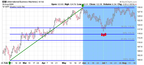
The Fibonacci Lines on this chart were created based on the move from Feb. 9th to May 30th - so just focus on the shaded blue area of the chart. Like a weatherman, the lines "forecast" that support for IBM would occur around 118.35 essentially because lots of people would probably feel that IBM had "fallen enough" and would start buying it again. That is precisely what happened at the end of June (red arrows).
Unfortunately many people have gone on to claim that Fibonacci lines (and their variants) have almost "magical powers" to predict price movements. Like most Technical Analysis tools, we think Fibonacci Lines are useful forecasting tools - but not magical.
You can add Fibonacci Lines to your charts using our ChartNotes annotation tool. To get started, simply click on the "Annotation" link below any SharpCharts.
Chip
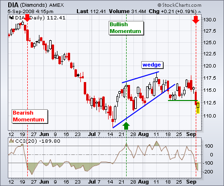
Stocks opened weak after Friday's employment report, but the bulls found their footing late morning and rallied for a mixed close. While it may seem positive that stocks firmed after bad news, keep in mind that stocks already priced in a lot of bad news with Thursday's sharp decline. Chart 1 shows the Dow Industrials ETF (DIA) firming just below 112.5 and closing with a small gain on Friday. Despite Friday's firmness, the rising wedge break and support break remain in play. One day of firmness is not enough to undo such a sharp decline. Also notice that CCI (20) moved below -100 to turn momentum bearish. In general, a move above +100 reflects bullish momentum that stays in effect until a move below -100. While this is not meant as a stand-alone trading system, I consider the move below -100 to be bearish and it confirms the bearish signals on the price chart. These bearish signals remain in effect until proven otherwise.
There is also a video version of the this analysis available at TDTrader.com - Click Here.
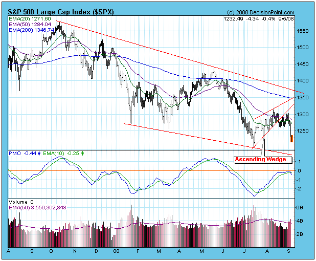
On August 15 I wrote an article pointing out that an ascending wedge had formed on the S&P 500 chart. I noted that this is a bearish formation, and that the most likely resolution would be a breakdown from the wedge followed by a price correction. The breakdown did in fact occur two days after I made my comments, but the correction did not immediately follow. Instead prices moved sideways for about two weeks before finally breaking down again on Thursday, belatedly fulfilling the expectation of a correction. Now we must ask if this is the beginning of a deeper correction or if it will merely end as a successful retest of the July lows.
The first evidence to consider is that we are still firmly in a bear market, and the down trend is clearly visible on the chart below. Another worrisome sign is that the PMO (Price Momentum Oscillator) has topped below the zero line, which should always be viewed with apprehension, particularly when it occurs at the end of a rally.
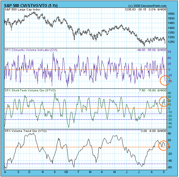
The next chart shows our On-Balance Volume (OBV) Indicator Set. The Climactic Volume Indicator (CVI) measures extreme OBV movement within the context of a short-term OBV envelope for each stock in the index. The Short-Term Volume Oscillator (STVO) is a 5-day moving average of the CVI. The Volume Trend Oscillator (VTO) summarizes rising and falling OBV trends. These charts tell us if the index is overbought or oversold based upon volume in three different time frames. All three are giving us useful information at present.
The CVI recently hit a climactic top just before the price break forced a climactic CVI low. Since this CVI low occurred in conjunction with a price trend change, I assume that it is an initiation climax that will lead prices lower. The STVO supports this conclusion because it is topping in overbought territory. The VTO, is not particularly overbought, but you can see that it is topping at the same level as it did at previous price tops.
It is also worth mentioning that September is historically one of the worst months of the year, and the market is entering this dangerous period in a very weak condition. A crash is not out of the question, although, that is not a prediction, just a caution to not get too anxious to pick a bottom.
Bottom Line: While positive outcomes can and do happen during bear markets, the odds are strongly against them. Another decline has emerged out of a short, weak rally, and I think that a continued decline is more likely than a simple retest of the July lows.
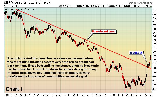
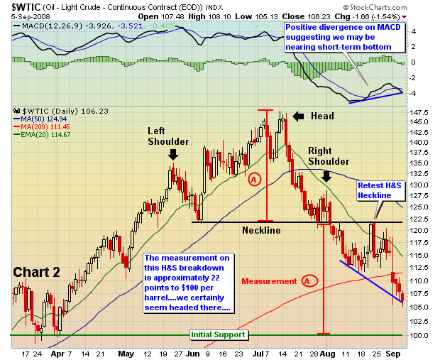
The U.S. dollar couldn't move lower forever. It had to turn and when it did, we knew things might get ugly for commodities. Since the July 14th low in the dollar index, we've seen the greenback rise over 10% (see Chart 1). That has sent commodity prices reeling. Crude oil prices per barrel have tumbled nearly 30% (Chart 2). Silver is down approximately 37%. Copper is down close to 25%. Gold has fallen about 19%. Commodity-related stocks have been bludgeoned as institutions have been liquidating stocks that the bears simply couldn't touch just a couple of months ago.
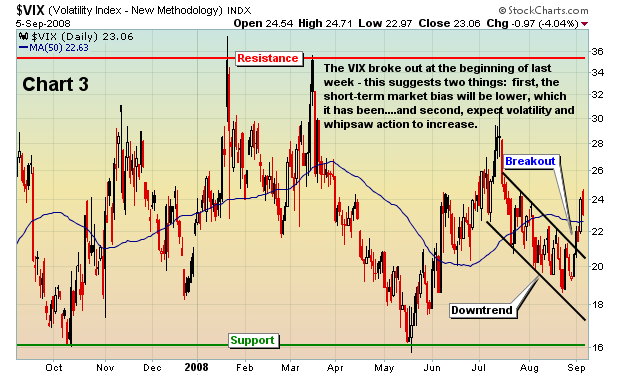
Volatility provides opportunities, especially as options expiration approaches. Take a quick look at the VIX, which broke out of a downtrend early last week.
We will be watching the action very closely as we finish next week and then head into another options expiration week. Analysis of max pain generally serves us well. If you're interested in learning more about max pain and how options expiration can affect the stocks you trade, then go to www.investedcentral.com/maxpain.html for more details about an upcoming LIVE presentation. Best of all, it's FREE!
Happy trading!
Join Tom and the Invested Central team at www.investedcentral.com. Invested Central provides daily market guidance, intraday stock alerts, annotated stock setups, LIVE member chat sessions, and much, much more.
The world's temperature gauge for risk is what we refer to as the
"carry-trade" indicator...or the Euro/Yen Spread. When this spread is
rising, then the world is said to be putting the carry-trade on and
expanding risk profiles; conversely, when the spread is falling...the
carry-trade is being taken off and risk is being shunned. We look at
this to take the temperature of the capital markets in terms of risk.
Right now, the patient is sick, and risk is being shunned, and the
technical prospects for the patient indicate further risk aversion and
a continuation of the "de-leveraging process."
Our statement is backed up by the simple technical fact the weekly
Euro/Yen Spread chart has broken below its bull market trendline as
well as its bull market 120-week exponential moving average. This
would imply the "triple top" will breakdown with a close under 1.52,
which would then target previous high support at 1.40 and then even
lower.
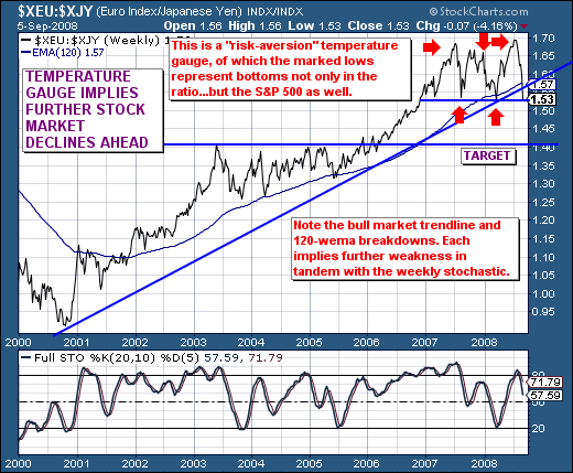
Therefore, the trend is lower, and we'll note the recent lows in the
spread all coincided with trading lows in the S&P 500. Given this
material breakdown in the spread, then we'll have to assume that
further S&P 500 declines are ahead of us...perhaps sharply so.
Henceforth, we are aggressive sellers of rallies as they materialize,
with our downside S&P target still rather wide between 960 and 1090.
Good luck and good trading,
Richard


