| |
|
|
|
|
| |

|
ChartWatchers
the StockCharts.com Newsletter
|
|
|
|
|
|
|
|
Hello Fellow ChartWatchers!
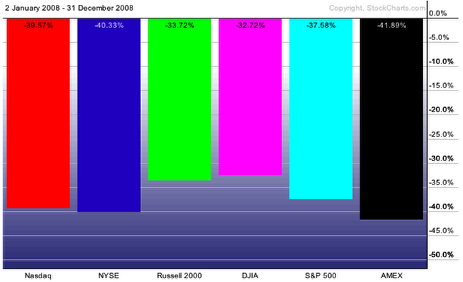
First off, Happy 2009! Let's hope this year is better than 2008 - one of the all time stinkers in terms of stock market performace. How bad was it? Here ya go:
Ugh. Well, let's not dwell on it too much. Instead I wanted to talk about another "hidden gem" feature of our website that can help subscribers get the most bang for their charting buck. Last time I talked about ChartStyles - templates of chart settings that you can save into your account. This week I want to show you how you can hook your saved settings up to small, easy to use buttons called StyleButtons that let you access you most important ChartStyles instantly.
First I want to show you how you can create a StyleButton for your Default style. If you've set up your account correctly you should have used the "Save As Default" link to customize the initial appearance of your charts so that they look the way you prefer. By doing that you've created a special ChartStyle called ">>Default<<". Let's assign a StyleButton to ">>Default<<" so that you will always have access to that style with a single mouseclick.
Start by logging into your account and then entering a ticker symbol in the QuickChart box in the upper right corner of the page. I used $COMPQ, the Nasdaq composite:
So this is what my current "Default" style looks like. Often, after experimenting with lots of different settings, I want to give up and quickly get back to this view. There are several ways to do that, but by adding a ChartButton I can do it in one click. To add a ChartButton for this default style simply click on the "Edit Properties" link in the "ChartStyle" area below the chart:
When you click on "Edit Properties", a popup box appears whith some settings. The one we care about is the "Shortcut" dropdown. That dropdown contains a list of numbers. Each number corresponds to a StyleButton position on the left side of the chart. Since we'd like our "Default" StyleButton to always be at the top of the chart we'll set the "Shortcut" dropdown to "1" and then press "Save Changes"
After saving that change our workbench page now looks like this:
Notice the difference? It's subtle but there is now a grey button just to the left of the top of our chart. That is a StyleButton. If you move your mouse over that button you'll see its name (">>Default<<" in this case). Clicking that button will now always bring you back to your Default style.
StyleButtons are most useful when you have several that show you different views of the same stock - for instance a Long-term view and a Short-Term view. To create a new StyleButton first create the ChartStyles that you will use with the "Add New" link then simply assign a "Shortcut" number to any of the styles that you want to make into buttons. When you are done you should see something like this:
In the example above I've created a "Weekly" style for button #2 and a Monthly style for button #3. My mouse is over button #3 so that you can see its name - as soon as I move my mouse away the name disappears.
As you can see StyleButtons give you one-click access to any kind of chart analysis you can imagine. Maybe you want a Renko style, a 1-minute style, a 10-year style and a Trending/Trading style (from my last article). All of that an more can be saved into your account as ChartStyles and then associated with StyleButtons for instance access.
-- Chip
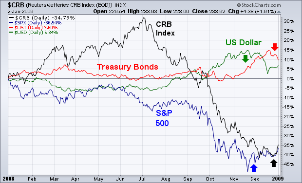
Chart 1 shows how the interaction between the four main asset classes unfolded during 2008 and how they're entering 2009. The two weakest assets were commodities and stocks. The two strongest were Treasury bonds and the dollar. During the first half of the year, commodities were the strongest asset class while the others lost ground. At midyear, however, a sharp rally in the dollar (green line) caused a massive collapse in commodities (black line) which continued until November. Treasury bonds (red line) rallied sharply on plunging commodities. During most of the second half, bonds and the dollar rallied while stocks (blue line) and commodities fell together. [During a recession, bond prices usually rise while stocks and commodities fall]. Starting in November, however, those trends started to reverse. The stock market started to recover as the dollar weakened. As we enter the new year, stocks and commodities are bouncing while the dollar and bonds are pulling back. While those trend reversals are still relatively small, they do suggest that investors are entering the new year in a more optimistic mood.
QQQQ broke consolidation resistance with a big surge on the first trading day of the year. After surging in late November and early December with two gaps, QQQQ stalled for most of December with a flat trading range. The consolidation pattern looks like a flag and the upside breakout calls for continuation of the Nov-Dec surge. For an upside target zone, the October-November highs mark the next resistance area around 34-36.
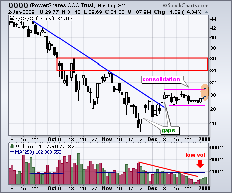
As expected, QQQQ volume levels have been low throughout the holiday season. In fact, QQQQ volume has been uninspiring throughout most of December. Volume was even below average on Friday's big move. While low volume advances are suspect, price action is first and foremost. The consolidation breakout should be considered bullish until proven otherwise. Volume will likely return in early January and it is important that the consolidation lows hold. A break below these lows on expanding volume would be bearish.
There is also a video version of the this analysis available at TDTrader.com - Click Here. HOW OVERBOUGHT IS IT?by Carl Swenlin | DecisionPoint.com
For the last few weeks the stock market has been drifting higher on low volume, and there is no doubt in my mind that the Fed/Treasury has been the invisible hand that has quickly moved in to squelch any selling that started. Under these conditions, I find it difficult to draw any solid conclusions from indicators that have been fed a diet of questionable market activity. Nevertheless, we must work with the information we have and accept it at face value until more normal market action increases our confidence in our conclusions.
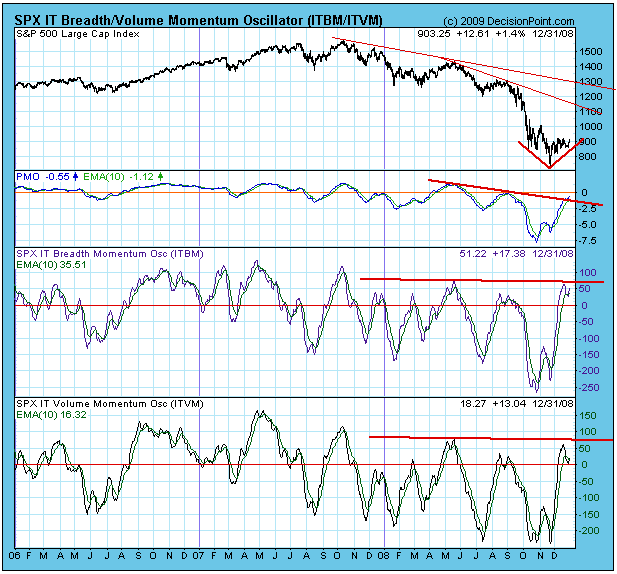
Looking at the chart below we can see pretty much all there is to see in the medium-term picture. Breadth and volume indicators are clearly in the overbought side of the trading range. Based upon the range we have seen during the bear market, internals are very overbought, but, relative to the normal indicator ranges, the indicators have a long way to go up if the rally continues.
The PMO (Price Momentum Oscillator) is still below the zero line, but it is recovering from the lowest reading since the 1987 Crash, and, relatively speaking, it too is overbought. However, there is still plenty of room before a continued rally will move the PMO to normal overbought levels.
Looking at the price index, we can see the S&P 500 is coming out of a "V" bottom, and there is plenty of room for it to rally before it hits serious overhead resistance. A rally up to that resisitance would convince most people that the bear market was over, but it wouldn't be. And by then the market would be seriously overbought by any standard.
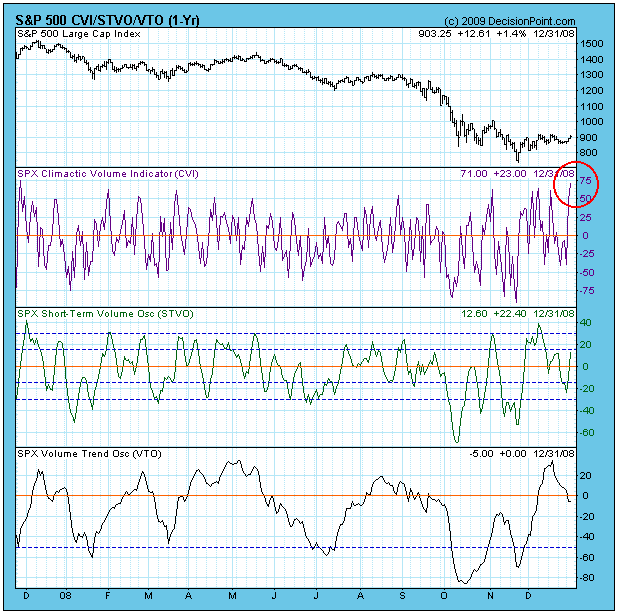
In the short-term the market is very overbought, as demonstrated by the CVI (Climactic Volume Indicator) chart below; however, CVI readings this high can also be an initial impulse that initiates a rally.
Bottom Line: By bear market standards the market is overbought and due for a correction, but there is plenty of room for prices and indicators to expand upward. The low volume associated with the rally dampens my enthusiasm for the positive signs that exist, and I wonder if investors are ready to forget the fear that has been generated by the severe beating they have been dealt by the economy and falling markets. WHAT LIES AHEAD?by Tom Bowley | InvestEd Central
In order to gain a decent perspective as to where we might go in 2009, it's always helpful to take a look at the past to see how we got here. 2008 was a horrible year for the major stock market indices. The Dow Jones, S&P 500, NASDAQ and Russell 2000 lost 33.84%, 38.49%, 40.54% and 34.80%, respectively for the year. It didn't matter where you put your money - nearly every stock index here in the U.S. as well as abroad suffered major financial and technical damage. It's not irreparable damage, but building a solid foundation for a future advance will be a key in 2009. Holding price support at the lows in the fourth quarter is paramount to building that solid foundation.
Clearly, the stock market suffered its worst annual loss in several decades. After all the selling and panic, especially towards the latter part of 2008, the Dow Jones finished 2008 23.66% below where it began this decade. The last time the Dow Jones lost ground during a decade was the 1930's, when it lost 39.64% over that ten year span. The Dow Jones would need to advance 31.00% to avoid having a losing decade. While anything is possible, that seems a tall order especially considering that the Dow Jones had already advanced 15.77% from the November 21st low through year end. Friday, January 2nd did get us off to a great start, albeit on light volume.
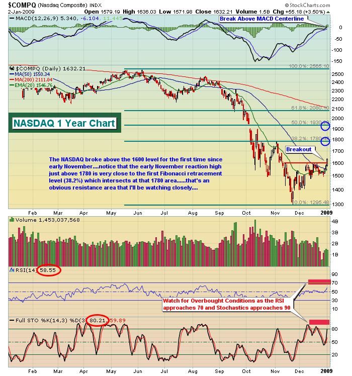
The U.S. stock market remains in a bear market. Despite the surge off of the November 21st lows, we must respect the longer-term bear market message. That doesn't mean we can't continue to advance near-term. In fact, I would be surprised if we didn't rally further during January. Historically, January is the best month for the NASDAQ and is one of the best months for the Dow Jones, S&P 500 and Russell 2000. Technically, if we look at possible Fibonacci retracements of the recent downtrend, we can attempt to pick a price point where the current rally may fizzle. Let's look first at the NASDAQ:
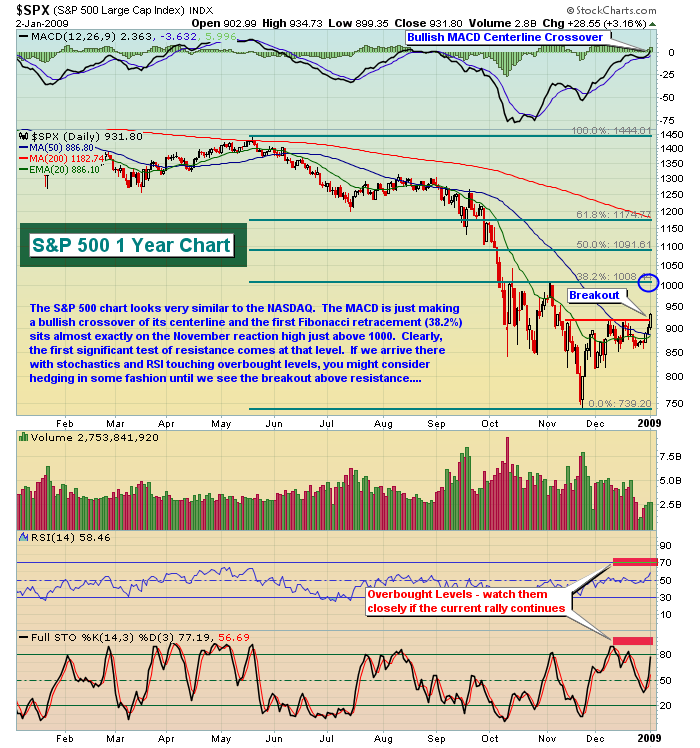
Here's the way the S&P 500 shapes up:
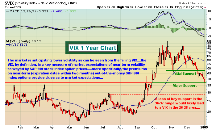
I do believe the market has moved from a very emotional, panic-stricken state to a more stable one. That's not to say we won't see periods of heightened volatility, but the initial shock that was felt in 2008 is behind us and so too is the enormous swings in prices from day to day. That should allow for a period of consolidation where momentum oscillators like stochastics and RSI can be used to more effectively time trades. Pay close attention to these indicators when they flash overbought and oversold conditions, however, because most likely trend changes will be sudden and perhaps without explanation. From the next chart of the VIX, you can see how the emotional roller coaster in the 3rd and 4th quarters of 2008 is finally calming down. Everyone can at least breathe a sigh of relief from that development.
I hope everyone had a very nice holiday season and here's to a healthier and happier 2009!
Happy trading!
Join Tom and the Invested Central team at www.investedcentral.com. Invested Central provides daily market guidance, intraday stock alerts, annotated stock setups, LIVE member chat sessions, and much, much more.
Advertisement:  PURSUING HEDGING STRATEGIES IN 2009by Richard Rhodes | The Rhodes Report
As the credit crisis continues apace into 2009, we believe the time is rather "ripe" for pursuing various hedging "thematic" strategies to profit from relative valuations across the globe. Quite simply, we believe that the credit crisis will fundamentally impact various global regions in a different manner. Asian countries are likely to prosper more so than Latin American countries as Asia isn't as dependent upon energy or natural resources as is Latin America. Also, Ecuador's tacit default has caused a bit of angst in the region. Therefore, we are putting on a long Asia-Pacific ex-Japan (EPP)/short
Latin America (ILF) spread trade.
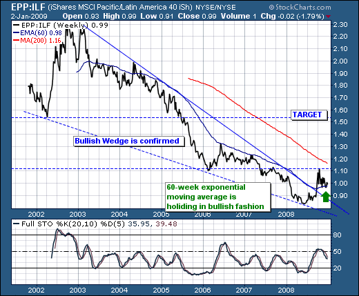
Technically speaking, we see EPP has underperformed ILF for about the past 5-years; however, that changed in 2Q-2008 as the EPP/ILF ratio broke out of its bullish declining wedge. This bottoming pattern would suggest a multi-year rally; and one that appears ready to trade higher once again after a brief correction back into the now turning higher 60-week exponential moving average. If we keep it simple, and buy the ratio around 1.0, then we can expect over time to gain upwards of 50% on the trade with a target of 1.50.
We believe this shall be a "core position" for some years into the future, and we would look to add in various increments as we see it prove its merit with higher prices. More importantly, given the enormous government intervention into the capital markets around the world, we can not whether stocks go higher or lower - just that EPP outperforms ILF. There is beauty in this trade indeed.
Good luck and good trading! |
|
|
|
|
|
|
|
|
|
|
|
|
|
|


