This is the first part of a series of articles about Technical Analysis from a new course we're developing. If you are new to charting, these articles will give you the "big picture" behind the charts on our site. if you are an "old hand", these articles will help ensure you haven't "strayed too far" from the basics. Enjoy!
Defining Technical Analysis
Technical analysis is the study of price and volume changes over time. Technical analysis usually involves the use of financial charts to help study these changes. Any person who analyzes financial charts can be called a Technical Analyst.
Despite being surrounded with data, charts, raw numbers, mathematical formulas, etc., technical analysts are really studying human behavior - specifically the behavior of crowds with respect to fear and greed. All of the investors that have any kind of interest in a particular stock can be considered to be "the market" for that particular stock and the emotional state of those investors is what determines the price for that stock. If more investors feel the stock will rise, it will! If more feel that the stock will fall, then fall it will. Thus, a stock's price change over time is the most accurate record of the emotional state - the fear and the greed - of the market for that stock and thus, technical analysis is, at its core, a study of crowd behavior.
"Weathering" the Market
When was the last time you saw a 100% accurate weather forecast for your area? Chances are that at least some of the weather predictions your local weather person tells you won't come to pass. In many cases, most of the predictions are wrong. So why do we keep listening to weather forecasts?
Weather forecasts are useful because they help us prepare for what is likely. If the forecast calls for rain, we bring our umbrellas with us when we go out. If sunshine is predicted, we bring our sunglasses. We know that we might not need these things, but more than likely we will and we like to be prepared.
Technical analysis is very similar to weather forecasting. Good technical analysts know that T/A can prepare you for what is likely to happen but, just like many weather forecasts, things can change in unpredictable ways. Here are some other ways that technical analysis is like weather forecasting:
- Weather forecasters measure temperature and air pressure and then use that data to determine more about the factors that cause weather changes - i.e., fronts, high pressure, low pressure, etc. Technical analysts use price and volume to determine more about the factors that cause market changes - i.e. fear and greed, trends, reversals, support, etc.
- Despite huge quantities of weather data at their disposal, weather forecasters still use their experience and intuition when creating each forecast. Technical analysis also draws heavily from the experience and intuition of the person doing the analysis (you!).
- Accurate weather forecasting requires local knowledge and experience. A forecaster from Florida that moves to Alaska will need time to become familiar with Alaska's weather patterns. Similarly, technical analysis requires experience and knowledge about the kinds of markets being charted - stocks are different from commodities which are different from mutual funds, large stocks are different from small stocks, etc.
- In the early days of weather forecasting, charlatans tried to convince people that they could somehow control the weather or that their predictions where always accurate. Unfortunately, even today, you can find people making similar claims about technical analysis.
- Weather forecasts tend to be most accurate when things aren't changing. If it has been sunny for the past three days and no big weather systems are approaching, chances are it will be sunny again today. Technical analysis also works well when conditions aren't changing dramatically. Both disciplines have more trouble with predicting exactly when big changes will occur.
- Both weather forecasting and technical analysis work well for the "mid-sized view." While predicting the weather for a large city is possible, predicting things for a city block is very hard. Similarly, second-by-second technical analysis can be extremely tricky; daily and weekly analysis is more reliable. Conversely, predicting weather for the country as a whole (i.e., "It will be sunny in the US today") and predicting the market as a whole (i.e., "This year stocks will go up") are too broad to be useful.
It is easy to lose perspective on what technical analysis can and cannot do. Try to remember this comparison with weather forecasting to keep yourself aware of its benefits and limitations.
Next time, we'll look at the real goal of Technical Analysis, why it works, and how it can be misused.
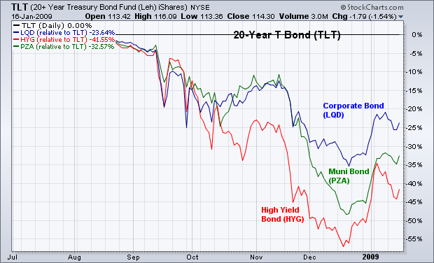
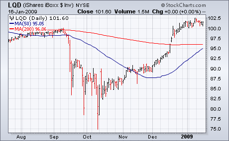
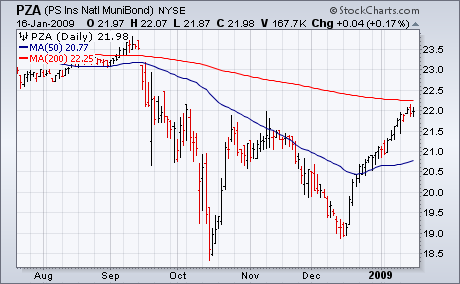
I recently wrote about how investment grade corporate bonds were starting to gain some ground on Treasury bonds. Today, I'm adding two other bond categories to that list. The flat line in Chart 1 is the 20+Year Treasury Bond iShares (TLT) which has been the strongest part of the yield curve over the past few months. That's been partly due to a flight to safety and deflationary concerns. The three other lines in Chart 1 are relative strength ratios versus the TLT. All three bond ETFs have been gaining ground on Treasury Bonds since mid-December. The strongest has been the LQD (blue line) which I wrote about in the earlier article. The next strongest is National Muni Bond Fund (PZA) which is the green line. The next in line is the High Yield Corporate Bond Fund (HYG). Charts 2 through 4 show what those bond ETFs look like. The LQD in Chart 2 is trading well above its 200-day line. The Muni Bond ETF (Chart 3) is testing that resistance line and its early November peak. Chart 4 shows the High Yield Corporate Bond ETF trading at a three-month high and nearing its 200-day line. For those who think that the recent surge in Treasury bond prices is overdone (I certainly do), these other bond ETFs offer some alternatives.

With a bounce on Friday, the Euro Trust ETF (FXE) found support from a confluence of indicators and chart features. First, broken resistance turns into support in 130-132 area. Second, there is support in this area from the 50-day moving average. Third, the decline over the last few weeks retraced around 62% of the prior advance. The ETF was also oversold after a rather sharp decline from 145 to 130. This combination of conditions and chart features made FXE ripe for a bounce.
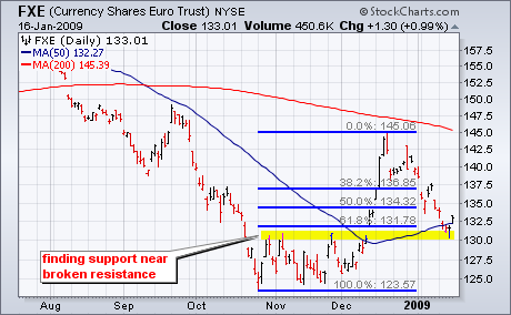
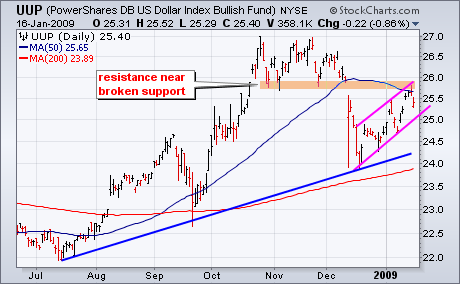
With the Euro bouncing, the US Dollar Index Bullish ETF (UUP) came under pressure on Friday. Notice that these two charts are mirror images of each other. After a surge over the last few weeks, UUP met resistance near broken support and the 50-day moving average. The advance in UUP looks like a rising flag, which is potentially bearish. For now, the flag is clearly rising as the trend has yet to actually reverse. A move below the early January low would break flag support and call for a continuation of the December decline.
There is also a video version of the this analysis available at TDTrader.com - Click Here.
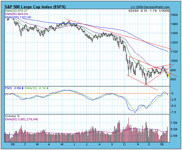
In my January 2 article I pointed out that the stock market was overbought by bear market standards, but that the rally had plenty of internal room for prices to expand upward if bullish forces were to persist. There was a brief rally and a small breakout, but then the rally failed, breaking down from an ascending wedge formation. I wasn't really expecting a bullish resolution, but one must keep an open mind when appropriate conditions appear.
On the chart below you can see the short-term declining tops line through which the breakout occurred. Instead of a buying opportunity, it was a bull trap. At this point we must assume that the November low will be tested. Note also that the PMO has crossed down through its 10-EMA, generating a sell signal.
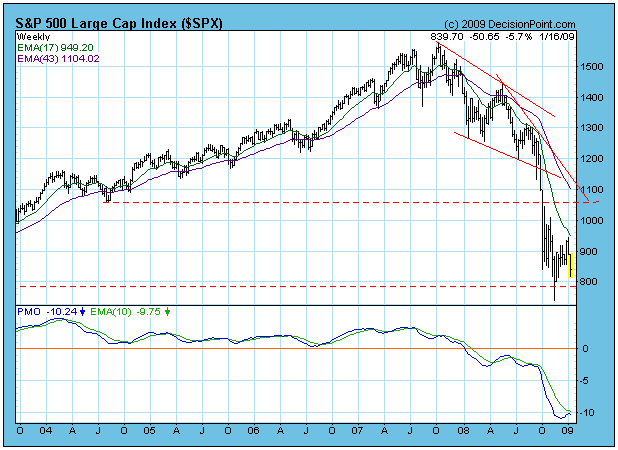
The weekly chart below gives a better perspective, I think. It shows how aggressive the current down move is compared to the price activity that precedes it. Also, the PMO has topped below its moving average, a bearish sign. Prices are once again approaching the long-term support drawn from the 2002 lows. A successful retest could set up a double bottom from which another intermediate-term rally could launch, but in a bear market we shouldn't bet on that outcome.
For many months I have been emphasizing that our analysis should be biased toward bearish outcomes because we are operating in the longer-term context of a bear market. The tide is going out and it is foolish to try to swim against it. In a much broader context, we are in the midst of a global debt collapse that is only in the beginning stages. I find it impossible to imagine economic circumstances in the immediate future that would be even remotely favorable to stocks.
Bottom Line: In a bull market overbought conditions most often result in small corrections, consolidations, or deceleration of the up trend. In a bear market overbought conditions are usually a sign that a price top is at hand. Because the most recent overbought event has resulted in a price top, I think we can safely assume that the bear has not retreated.
An interesting result of the government bailout of the financials and automakers, along with the huge economic stimulus package will be the long-term impact on the U.S. dollar. Can the dollar maintain its relative value as interest rates fall and deficits mount? Let's take a look at a few charts regarding the dollar and how we can profit if the dollar does plunge. First, let's take a look at the long-term picture of the dollar:
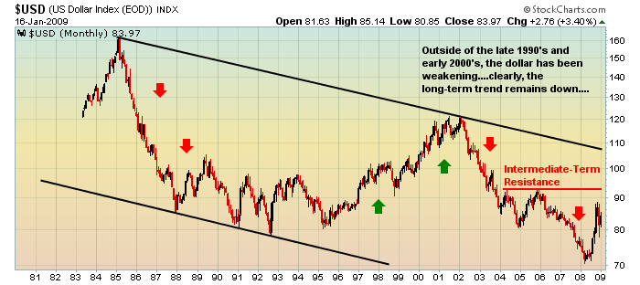
As you can see, the long-term trend in the dollar is down. Unless the dollar can pierce through the 92-93 area, the intermediate-term trend is down as well. Only the near-term chart shows any positive action on the dollar. And that rally is suspect technically as shown below:
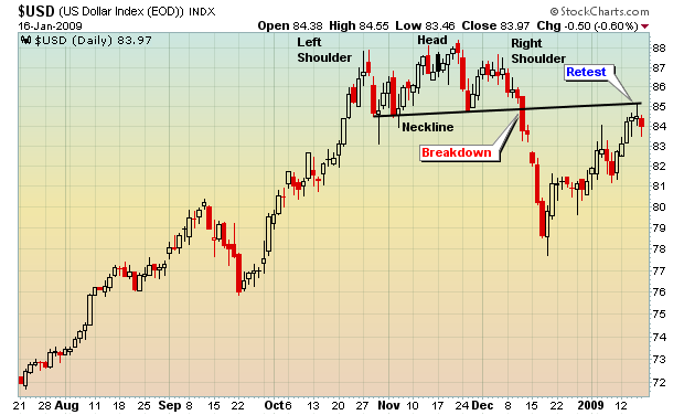
A bearish head and shoulders pattern formed from October through December and broke down below the neckline with force. Should the dollar fail to navigate the near-term resistance (retest of neckline) and the longer-term trend resumes to the downside, gold is likely to be a primary beneficiary. Gold is one commodity whose long-term uptrend remains intact because of the long-term downtrend in the dollar. Take a glimpse at the long-term chart on gold:
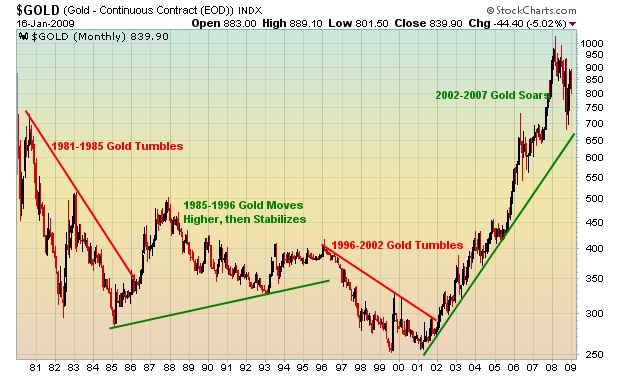
The dollar and gold have an inverse relationship that's quite evident when you compare the two charts. During periods of dollar strength, gold weakens. However, dollar weakness leads to gold strength. So the question remains: What happens to the dollar as a result of the massive government bailout and the economic stimulus package? Answer that question correctly and you profit. It's as simple as that.
Happy trading!