Hello Fellow ChartWatchers!
This week is the start of big changes here at StockCharts.com. We are moving much of our free content over into a new set of Blogs. ("Blogs" are Web Logs - collections of articles on a particular topic.) Things like, well, this newsletter are actually perfect for the Blog format. And so, this is the first blog-based version of ChartWatchers!
What does that mean? If you only read ChartWatchers as email in your mailbox, it doesn't mean much. But if you look at ChartWatchers on the web, it means that you can now read many of the articles BEFORE they are sent out in email. As soon as each author sends us their article, we'll add it to the ChartWatchers Blog area where you can read it immediately. If you subscribe to that blog with a "Feed Notification tool", you'll get notified as soon as new articles are ready. No more waiting until all the articles are complete!
(Again, don't panic. If you like reading ChartWatchers as an email message, you don't need to do a thing. It will still show up in your email box like it always has.)
Now, we didn't stop with just making ChartWatchers into a blog. We added a slew of additional blogs that should help you get more value out of StockCharts.com. Some of these currently contain some old content - we're in the process of migrating all the old ChartWatchers for example - and some of these are brand new! Here's a run down:
StockCharts.com - ChartWatchersThe new home for our free newsletter. Look for articles to appear here first before they are sent out as complete emails.
StockCharts.com - MailbagOur
"Letters to the Editor" blog. Real questions from real users with real
answers from the people that better darn well know... us!
StockCharts.com - Status
Reports
about server availability. Every day we'll post a summary of our
service performance including how much downtime we had (if any).
StockCharts.com - Step by Step
Our tutorial blog with lots of easy to follow instructions for doing
common tasks. Charting, scanning, changing settings - even fixing
common browser problems; all will be explained with lots of pictures to
guide you through.
StockCharts.com - What's NewLatest announcements about new content and features on StockCharts.com. I strongly encourage everyone to check out all these blogs on a regular basis and subscribe to them if you can. We'll be updating them often. Just click on the "Blogs" link on the left side of any of the pages on our website.
BIG NEWS: John Murphy has released "The Visual Investor, 2nd Edition"!
John's original version of "The Visual Investor" influenced me heavily. It was extremely easy to read and it has helped hundreds of thousands of people understand how to use financial charts to make investing decisions. Now John has completely revised "The Visual Investor" to bring it into the age of the Internet. New charts, new chapters, new examples - but with the same old easy-to-read logic that has helped a generation of chartists get started.
I CANNOT RECOMMEND THIS BOOK HIGHLY ENOUGH!
...which is why we have it on sale in our bookstore right now. Get you copy now.
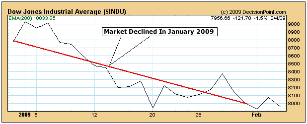
A reader complained this week that we failed to point out the
"negative divergence" in the daily MACD lines during January prior to
the latest downturn. The reason I didn't point it out was because none
existed. In fact, it may be the other way around. At the moment, the
daily MACD lines look more positive than negative. Chart 1 overlays the
MACD lines (and MACD histogram) over daily bars for the S&P 500.
The chart shows that the MACD lines bottomed during October and gave a
positive divergence during November (rising trendline) before rallying
into the start of January. No negative divergence was given at the
early January top. Although the S&P fell to the lowest level in two
months during January, the MACD lines remained well above their earlier
lows. The lines have now turned positive again (see circle). To me,
that looks like positive divergence and hints at more market strength.
The market is rallying today with the biggest gains coming from
financial stocks (and banks in particular). The S&P is up more than
2% and is nearing a test of last week's intra-day high at 877. A close
through that initial chart barrier would strengthen the market's
"short-term" trend and keep the three-month trading range intact.
There's even more good news.

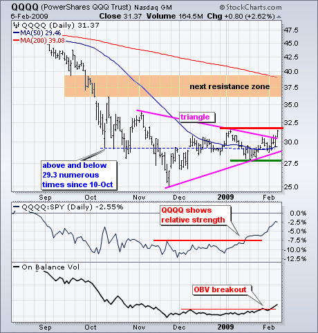
The Nasdaq 100 ETF (QQQQ) is breaking out of its trading range. The chart below shows QQQQ stuck in a trading since 10-Oct. Focusing on the blue dotted line marking the mid October lows, we can see that QQQQ traded above and below this line numerous times the last four months. In essence, QQQQ went nowhere from 10-Oct until early February. A triangle formed from early November as the trading range narrowed over the last two months.
QQQQ could be finding direction now. With an advance over the last five days, QQQQ broke the triangle trendline and is closing in on resistance from the early January high (red line). A breakout here would be quite positive and argue for a counter-trend rally. The big trend remains down, but bear market rallies are perfectly normal. QQQQ could possibly make it to the falling 200-day moving average.

Relative strength and On Balance Volume (OBV) confirm the triangle breakout. The first indicator shows QQQQ relative to SPY. This relative strength comparative rises when QQQQ outperforms SPY and falls when QQQQ underperforms. QQQQ has been outperforming since the second week of January because that is when the relative strength comparative broke resistance. On Balance Volume (OBV) is a cumulative indicator that adds volume on up days and subtracts volume on down days. Granville theorized that volume leads prices. If this is the case, then OBV suggests that QQQQ will break its January high soon. Notice that OBV broke its December and January highs this week.
Click here for a video presentation of this information.
Research published by Yale Hirsch in the "Trader's Almanac" shows that
market performance during the month of January often predicts market
performance for the entire year. The January "barometer" has been
particularly prescient in odd years (the first year of a new Congress),
with only two misses in 69 years (as of 12/31/2008). While the January
barometer has a good record of prediction, I still put it in the "for
what its worth" column, because I can't think of any sound reason why
it should work, and in many years it seems that a correct forecast is
simply serendipity.

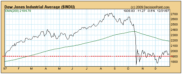
As usual we think you should view charts of actual market movement
before making decisions based on reported average performance. For
example, in 1987 the January Barometer forecast an up year. Well, it
was an up year, but what a wild ride! On our website we have an
extensive series of these charts going back to 1920. It is worth
studying the charts so that you have an educated opinion of how this
forecast device really works.

Bottom Line: The January barometer predicts that 2009 will be a down
year. Regardless of what the barometer says, I think it is wishful
thinking to believe that 2009 will be a winner. Consumers, which are
70% of our economy, are scared to death for their jobs. Until
unemployment stops rising I think investor risk aversion will remain
high.
We've seen this all before. The sure-fire short setups get waxed as trendline support holds. Then the bulls grow confident as the market soars only to get turned back by trendline resistance. The cycle continues to repeat itself until we get resolution. If you time your entries perfectly, the triangle formations can be powerful trading patterns, but patience and extreme discipline is required.
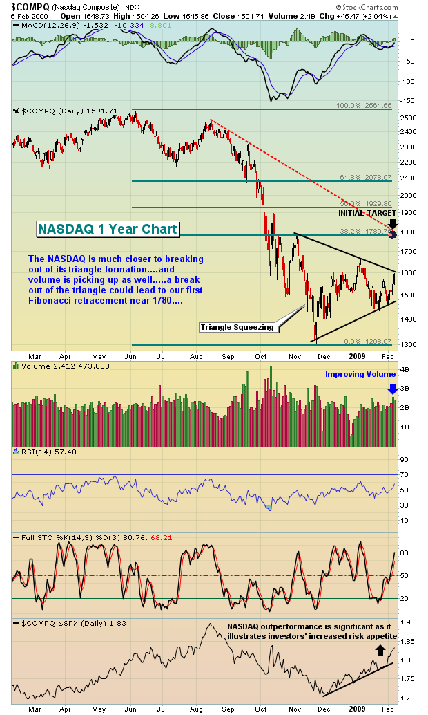
Right now, the market is faced with exactly that triangle mentality. The triangle keeps squeezing with each high moving lower and every low moving higher. At some point, something must give. That time is quickly approaching. The breaking of the triangle pattern doesn't necessarily dictate whether the bear market ends. In fact, I would argue it doesn't matter at all. It does matter whether the bulls can turn the recent upside action into something longer lasting, however.
Let's take a look at the unfolding triangles, first on the S&P 500:
Next, the NASDAQ:

There is one difference on the buying this time - it's the volume that's accompanying the move higher. Any time we can get the price movement and volume confirmation, it's much more bullish. We haven't broken resistance though. Until we do, the volume is not as meaningful. Whether we see enough bullishness to crack through triangle resistance is a story for next week.
The odds of reaching that first Fibonacci retracement (38.2%) area increases greatly if the major indices can break their current triangle patterns with heavy volume. That's what I'll be looking for as next week unfolds. Also, financials helped to spark the turnaround on Thursday morning and the rally has continued in that space since. If and when that rally ends, it will likely signal the end to the overall market rally as well.
Happy trading!
Our focus today is upon the Energy Sector (XLE) and its relative valuation to the S&P 500 Spyders (SPY). Given the current bear market, we've found recently that market participants are once again willing
to return aggressively to what they know worked rather well in the last bull market - buying energy stocks as the dwindling world energy supply story continues to get quite a bit of play. We think this is
wrong-headed, for Energy is a "late cycle mover" rather than an "early cycle mover" out of recessions. Perhaps it is different this time; but we think not. Hence, we believe it wise to consider lightening up
aggressive overweight energy positions, and in some cases...we would advocate selling short the exploration & production group. We aren't as bearish on the oil service group, but that is a story for another day.
Technically speaking, the ratio has declined from its high of .70 to an initial low at .49, and from that point to today...a bearish sideways consolidation has formed upwards into the 200-day moving average. Perhaps just as important, this moving average is itself rolling over in bearish fashion. Reasonably thinking, we would expect it then to prove its merit as resistance, and for another leg lower to
develop to below the recent low at .49...into the 2005-to-2007 consolidation range. For those Elliotticians out there, this would be a simple A-B-C correction; which would give us two peaks upon which to
draw a declining trendline - a line in the sand upon which when broken above, would then signal the development of the next relative energy bull market. Until then, there is quite a bit of risk holding energy
shares.