This is the fifth part of a series of articles about Technical
Analysis from a new course we're developing. If you are new to
charting, these articles will give you the "big picture" behind the
charts on our site. if you are an "old hand", these articles will help
ensure you haven't "strayed too far" from the basics. Enjoy!
(Click here to see the beginning of this series.)
Candlestick Charts
Compared to traditional OHLC bar charts, many traders consider candlestick charts more visually appealing and easier to interpret. Each candlestick provides an easy-to-decipher picture of price action. An analyst can quickly see compare the relationship between the opening and closing price as well as the high and low price.
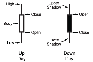
The graphic above shows how candlesticks are constructed.
Candlesticks with hollow bodies indicate buying pressure and filled bodies indicate selling pressure. Long upper or lower shadows form when the market moves significantly in a particular direction during the day and then reverses before the end of the day. As a result, long lower shadows can infer bullishness while long upper shadows can infer a bearish market.
Candlestick Colors
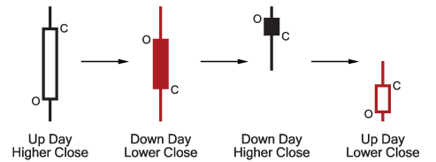
When the âColor Pricesâ option is selected on the Chart Attributes workbench, the Candlestickâs outline and body be colored black or red, depending on the candlestickâs opening and closing prices and the previous dayâs closing price.
If the closing price is higher than the opening price, the body will be displayed hollow. If the closing price is lower than the opening price, the body will be filled red with the following exception; if the closing price is higher than the previous dayâs closing price, the body will then be filled black.
The candlestickâs shadows and body outline are colored black or red depending on the closing price compared to the previous dayâs closing price. If the closing price is higher than the previous dayâs, the candlestickâs shadows and body outline will be colored black. And the candlestickâs shadows and body outline will be red if the closing price is lower than the previous dayâs closing price.
Market psychology is reflected in each of these candlestick formations in the following ways.
Up Day, Higher Close; typically results from expectations of higher prices (greed) out weighing expectations of lower prices (fear). The length of the candlestick body shown indicates especially strong buying.
Down Day, Lower Close; expectations of lower prices (fear) are stronger than those of higher prices (greed). As with the first candlestick, a longer candlestick body infers greater urgency of investors to sell their shares.
Down Day, Higher Close; a rare candlestick, this one begins with an opening gap up in price from the previous dayâs closing price but closes down for the day. A gap is defined as a price range where no trading takes place and is the result of a significant change in demand (gap up) or supply (gap down) before trading begins for the day. In this case, heavy buying at the beginning of the day reversed but still closed higher than the previous day. This is a bearish sign when it occurs well into an upward price move.
Up Day, Lower Close: another rare candlestick, this one begins with an opening gap down in price from the previous dayâs closing price but closes up for the day. This price action can be considered bullish during a downward price move since initial strong selling in the day becomes exhausted and buyers push the price higher at close.
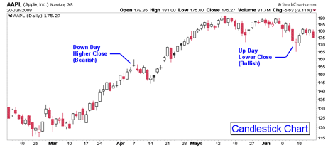
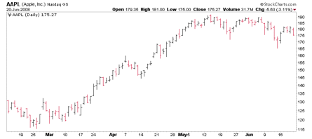
The SharpChart AAPL above illustrates the candlestick format. The up and down days are readily apparent with the use of candlestick charting. When the balance between buyers and sellers change, candlesticks often form recognizable patterns signaling the change. These candlestick patterns will be discussed in a later article.
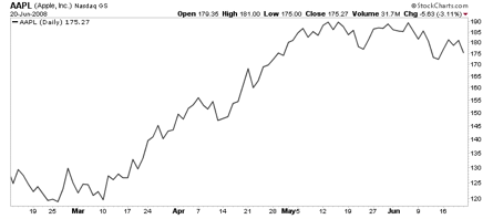
Below, you can see how the three types of charts compare visually:

Next time, we'll get into Chart Scaling, Volume, and CandleVolume charts.
I've received a number of requests to review the current position of
the 13-34 exponential moving averages (EMAs). As you probably know, I
place a lot of importance on that combination because of its strong
track record over the years. I apply the 13-34 EMA combination to
daily, weekly, and monthly charts. Let's start with the "daily" lines
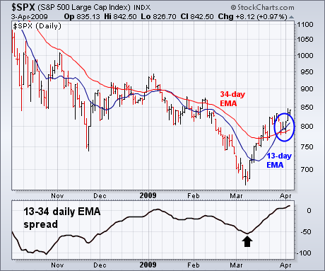
which measure the market's "short-term" trend. Chart 1 shows the 13 and
34 day moving average combination. For a short-term buy signal to
occur, the 13-day (blue line) has to cross over the 34-day (red line).
That short-term buy signal took place earlier in the week. But there's
more. The black line below chart 1 plots the "spread" between the two
EMA lines. [You can create that line by inserting 13,34,1 into the MACD
indicator]. You can see a positive divergence taking place during March
when the black line held above its October low (black arrow). [We've
shown similar positive divergences in several other technical
indicators]. More importantly, the black line has exceeded its January
high and risen above the zero line for the first time since last May.
[A crossing above the zero line by the black line coincides with a
positive EMA crossing]. That's a sign that the current rebound has legs.
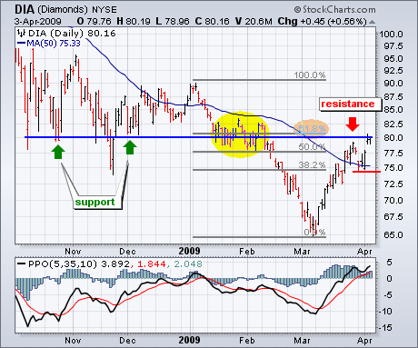
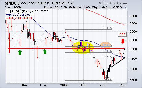
The Dow Industrials ETF (DIA) surged off its 50-day moving average with a big advance on Wednesday and a gap on Thursday. While the four-week surge is most impressive, the ETF is running into a resistance zone and becoming overbought. First, broken supports around 80 turn into resistance. This level is equivalent to 8000 on the Dow. Second, DIA retraced 62% of the prior decline and this key retracement can act as resistance. Third, the consolidation from late January to early February also acts as resistance (yellow area). Finally, DIA has advanced four weeks straight and is now up 23% since early March. This makes it overbought by most yardsticks. While securities can become overbought and remain overbought in strong uptrends, the chances of a correction are increasing. The bottom indicator shows the Percentage Price Oscillator (5,35,9), The bulls are in good shape as long as this indicator rises and remains above its signal line. A dip below the signal line could signal the start of a correction.
Last Friday I said we should be looking for a short-correction because
the CVI (Climactic Volume Oscillator) was very overbought, and prices
were approaching overhead resistance. There was a very small
correction, but prices kept moving higher, while the CVI zigzagged at
overbought levels. We also observed the STVO (Short-Term Volume
Oscillator) move down from overbought to neutral. This is the kind of
thing that happens in bull markets, and bear market rallys. There is no
guarantee that this bullish behavior will continue, but I suspect that
it will.
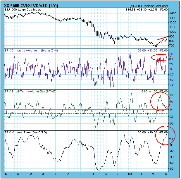
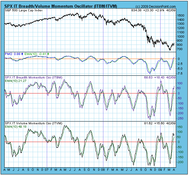
Now medium-term indicators are reaching overbought levels -- see the
VTO above and the intermediate-term breadth and volume indicators
below. Clearing this overbought condition will be more difficult than
the short-term clearing was.
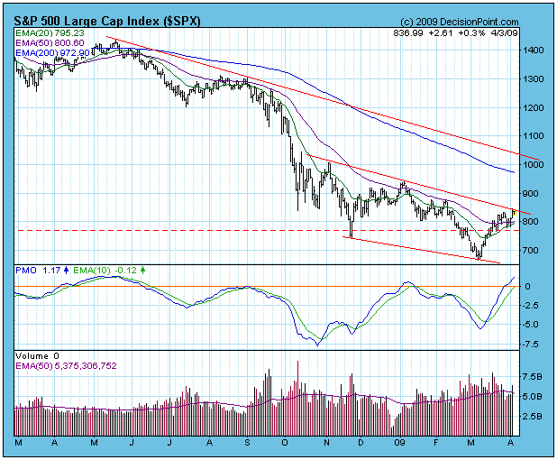
Further complicating the issue is the overhead resistance. The market
has reached the resistance line at the same time that internals have
become overbought. A breakout at this time would be a very bullish
sign; however, a real pullback, allowing the buildup of some internal
compression would not necessarily be a bad thing.
Bottom Line: The market has been behaving in a positive manner ever
since it rallied off the March lows. Of course it is possible that the
bullish phase will suddenly fade, but for now I think we are
experiencing a bear market rally that could move the S&P 500 up to
the area of 1000.
I am undeniably bullish right now. My only question at this point is whether this is a very significant bear market rally or the early legs of a new bull market. Believe it or not, I think it's the latter. As pointed out in my last article, this rally is being fueled by two very influential groups - financials and semiconductors. Wide participation in any short-term rally is necessary to justify any bull market call. We are definitely seeing wide participation on this rally. Breadth has routinely been 3 to 1 or 4 to 1 in favor of advancers on the NYSE and NASDAQ, and at times has grown to a 10 to 1 thrashing of the bears and beyond. The S&P 500 followed the lead of the NASDAQ recently, soaring above its 50 day SMA on heavy volume, retracing to retest it on lighter volume, then surging to a new high. The summer of 2007 was the last time that the S&P 500 was able to perform like that. Look at the recent strength of the S&P 500 below:
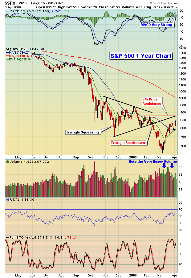
The S&P 500's next price test comes in around 875. However, if the VIX breaks down below key support in the 36-37 range, I believe the S&P 500 is heading a lot higher than that. Take a look at the VIX chart below:
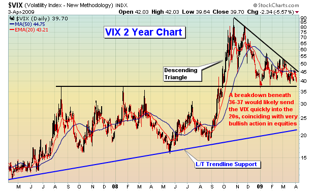
The relationship between the VIX and the current bear market is strikingly similar to the relationship between the VIX and the bear market of 2000-2002. There were double tops, lower VIX readings on bear market lows, even descending triangles that, in the case of 2002, broke down and sent the market soaring. I'm waiting for that breakdown to occur. I'm convinced it's going to happen. When it does, the next wave of buying will swamp the last one.
Click here to watch my video presentation, describing the reasons why I believe this bear market has ended. The trading opportunities that are staring us in the face right now are astounding.
One word of caution: The bullishness of late may require a price to be paid during options expiration week. The number of call options bought in the last 4 weeks is absolutely staggering. So enjoy this week while it lasts because tons of in-the-money calls may force a sudden drop in the major indices as we approach options expiration.
Happy trading!
As the market continues it counter-trend bullish rally, we find is more than interesting that the Homebuilders haven't yet taken a leadership role. We would posit that given it was the Homebuilders that was the "canary in the coal mine" for the sharp broader market decline, then if the economy were going to turn around and push higher...the Homebuilder ETF (XHB) would be in a very good position to benefit from it given they are quite oversold and heavily shorted. Thus, we would expect XHB to outperform the S&P as a rally unfolded.
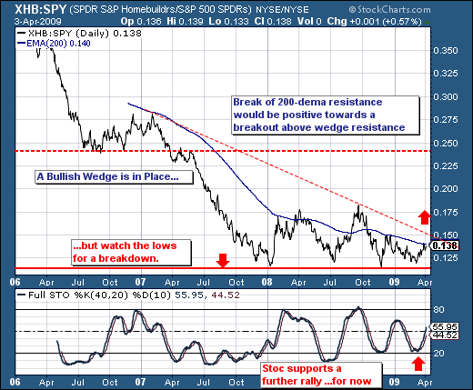
Thus far, this hasn't been the case. When we look upon the Homebuilder ETF/ S&P 500 Spyder ETF Ratio (XHB:SPY), it has bounced around near it's lows since November-08, and has risen very little relatively. In other words - "a market performer" - nothing more. However, technical pattern is a tale of two as they can be construed as both bullish and bearish. If the lows continue to hold and the ratio breaks out above the 200-day exponential moving average, then obviously wedge resistance will be challenged and perhaps broken above. If not, and the lows are violated, then we'll see further broad market weakness and probably a slew of homebuilder bankruptcies.
Time will tell as they say; and that time is coming sooner rather than later.
Good luck and good trading,
Richard