TECHNICAL ANALYSIS 101 - PART 6by Chip Anderson | ChartWatchers This is the sixth part of a series of articles about Technical
Analysis from a new course we're developing. If you are new to
charting, these articles will give you the "big picture" behind the
charts on our site. if you are an "old hand", these articles will help
ensure you haven't "strayed too far" from the basics. Enjoy!
(Click here to see the beginning of this series.)
Chart Scaling
Charts are created with one of two different kinds of vertical price scales. An arithmetic scale evenly spaces price along the right side of the chart. Arithmetic chart spacing between $10 and $20 is half as tall as the spacing between $20 and $40. A log scale evenly spaces price in percentage terms. Chart spacing between $10 and $20 has the exact same chart spacing as between $20 and $40 since they represent the same percentage increase.
The SharpCharts above illustrate the differences between the two scaling methods. On the arithmetic scale, three different trend lines were required to keep pace with the price advance. On the log scale, the trend line fits the price trend during the entire rally. Log scaling should be the first scaling choice when using trend lines, especially over long time frames.
Volume
StockCharts.com provides several ways to plot volume data on a chart. The following price and volume SharpChart of AAPL illustrates how volume is typically plotted.
Volume can be plotted in an âindicator panelâ above or below the âprice plot areaâ or in the price plot area as an âoverlayâ.
When the âColor Volumeâ option is used, the volume bars are shown as black for up days and red for down days. Color volume bars allow the chartist to quickly see where heavy or weak buying and selling activity is happening.
CandleVolume Charts
CandleVolume charts are similar to candlestick charts except that each candle's width is proportional to its corresponding volume value. This charting style allows one to visualize the volume activity âinâ rather than âbelowâ price moves. Depending on the style of analysis, volume bars could be omitted to simplify the chart.

The time axis for these charts is not uniformly spaced since the candlestick bar widths vary with volume values. As a result, trendline analysis using CandleVolume charts should always be confirmed with a standard candlestick or OHLC chart. The SharpChart above of AAPL shows how volume bars correlate to the candlestick widths.
That wraps up our look at how charts are constructed. Next time, we're going to start to talk about how charts are analyzed - starting with Support and Resistance analysis.
NASDAQ TESTS 200-DAY LINEby John Murphy | The Market Message One of the problems with doing an analysis of the "stock market" is
choosing which market index to represent it. Like most analysts, I rely
on the S&P 500 which is generally viewed as the
market benchmark. As we've pointed out several times, however, some
parts of the market have been rallying much stronger than others. One
of those groups is technology which is heavily represented in the
Nasdaq market. Generally speaking, relative strength by technology and
the Nasdaq are good signs for the rest of market. And the fact that the
Nasdaq Composite has already exceeded its January high is a definite
sign of leadership. However, the Nasdaq is undergoing another test of
its uptrend. Chart 5 shows the Nasdaq Composite Index
testing its 200-day moving average near 1750. It's a good idea to keep
an eye on that test. It's also a good idea to watch the rising 20-day
average (green line). The Nasdaq needs to stay above that rising
support line to keep its uptrend intact.
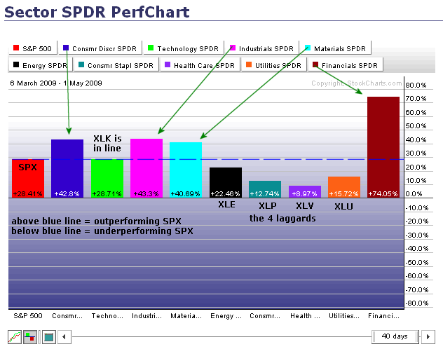
IT'S ALL RELATIVEby Arthur Hill | Art's Charts The PerfChart below shows the percentage
change for the S&P 500 and the nine sector SPDRs. The S&P 500 acts as
the benchmark for relative performance. Sectors with greater percentage gains are
outperforming the S&P 500. Sectors smaller percentage gains are
underperforming. Defining the leaders and the laggards can tell us a lot regarding
the quality of the rally. Relative to the S&P 500, the Financials SPDR
(XLF) is the leader of leaders since early March. Other leaders include the Consumer
Discretionary SPDR (XLY), Industrials SPDR (XLI) and Materials SPDR (XLB).
Surprisingly, the Technology SPDR (XLK) is simply performing in line with the S&P
500. Leadership from the consumer discretionary sector is probably the most
important aspect of this rally. This is the most economically sensitive sector
and leadership here bodes well for an economic rebound.

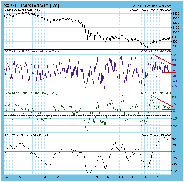
STEADY ADVANCE PERSISTS by Carl Swenlin | DecisionPoint.com I have been referring to the slow, steady advance of the last few weeks
as a "correction". To be more specific, it is a "running correction",
which means that prices have moved higher as indicators have chopped
sideways and lower. This is evident on the chart below which shows the
CVI and STVO (two short-term volume indicators). The CVI has been
oscillating above the zero line in an ever-narrowing range for almost
two months. The STVO is almost become a flat line. This kind of
indicator activity is very unusual, and the impression I get when I
look at the charts is that it is not likely to last much longer.

Looking at the medium-term breadth and volume indicators below, I am
concerned that the overbought conditions are so extreme and the
indicators have just barely topped. This condition must be cleared, but
it doesn't necessarily need to be cleared by a big price decline.
Looking to the left side of the chart, you can see two instances where
overbought conditions were cleared as the market moved higher. I
believe we will see a similar resolution this time.
Bottom Line: We are in a long-term bear market, but we also have a
medium-term buy signal, which means that bull market rules apply at the
present time. Market action has been persistently positive since the
March price low, and overbought conditions are most likely to clear in
a non-destructive way.
GO AWAY IN MAY? REALLY?by Tom Bowley | InvestEd Central Ok, I understand the logic - partially. In order of S&P 500 calendar month performance since 1950, May ranks 8th out of 12 and June ranks 10th out of 12. However, both have produced positive annualized returns and in this period of very low interest rates, does it really make sense to pull that portion of your investments devoted to equities? What's not mentioned by most who follow this theory, though, is that there are VERY bullish periods that fall within both of these calendar months. Simply avoiding the market during May and June makes little sense given that the first handful of days in May and the last handful of days in May have produced annualized returns of 37.72% since 1950. Compare that to the average annual return on the S&P 500 since 1950 of 8.46%. By sitting on the sidelines, your money has no chance of working for you during periods where annualized returns are more than four times the average. Does that make any sense? The middle of May does tend to have neutral to bearish implications, but only on the S&P 500 does our historical meter, The Bowley Trend, actually turn bearish.
The part I find most disturbing regarding this theory is the perception that all equity investments suffer after the beginning of May. Do these folks realize that since 1971 the NASDAQ has produced annualized returns of 13.85% and that NASDAQ prices have moved higher 23 of the 38 years over this period? Does pulling your equity investments really make sense given the NASDAQ's relative outperformance during May? By the way, June's annualized return since 1971 on the NASDAQ is 10.67%.
Now for the really good part. Let's talk about the small caps, the Russell 2000. In terms of the Russell 2000 monthly performance, only December has been a better month than May over the past 22 years. The annualized return during May on the Russell 2000 since 1987? How about 24.40%? Do you still feel like May is an atrocious month for equities? While I'll admit that May isn't the best month overall for equities, not even close to it, the facts suggest you might do more harm to your portfolio by "going away" than by staying. There's some food for thought.
As for the current state of the market, it continues to perform as I suspected it would. You cannot stand in the way of a significant market trend. The bias remains on the bullish side. The VIX, after breaking down from a triangle pattern, moved back higher to retest the breakdown as prices consolidated, then has moved lower. A declining VIX is somewhat synonomous with higher equity prices and that's what I continue to look for and trade based upon.
Happy trading!
Tom
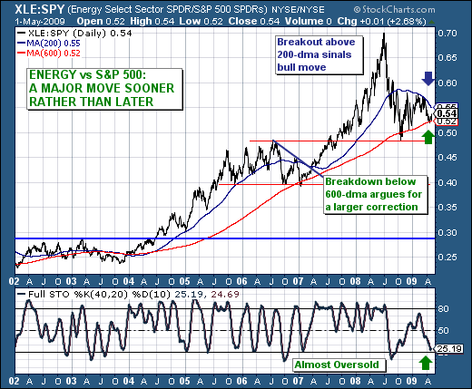
The past several trading sessions have shown an increased propensity for traders to "allocate or rotate" funds into commodity and natural resource stocks. Those gains were no starker than during Friday's trading session, when the S&P Energy Sector (XLE) was higher by +3.23% versus the S&P 500's (SPY) +.54% gain. This circumstance however, hasn't been the norm in recent months, but perhaps it is the beginning of a larger rotation move out of those sectors that have done relative well off the S&P 500 March 9th low such as the S&P Technology Sector (XLK). Time will tell as they say, but the technicals behind the XLE/SPY ratio are setting up reasonably well for a larger XLE move higher against SPY.

The daily XLE/SPY chart is clearly in an uptrend, with the 600-day moving avearge being the fulcrum point of this rally. Once again this level is being tested and arguably given yesterday's sharp move in XLE vs. SPY...it has begun to show its technical merit. The question is whether there is sufficient buying pressure to push the ratio above its 200-day moving aveage that would "seal the deal" for perhaps another run at the highs near .70. In our opinion, there is sufficient cause to believe this will be the case given the 40-day stochastic is plumbing down to near-oversold levels, which in the past has been a bullish harbinger of rallies.
Given these circumstances, and given the XLE is now clearly breaking out above its 100-day moving average - we would think that if long positions were to be added at this juncture, then Energy names would be at the forefront of any list.
Good luck and good trading,
Richard