TECHNICAL ANALYSIS 101 - PART 9by Chip Anderson | ChartWatchers This is the ninth part of a series of articles about Technical
Analysis from a new course we're developing. If you are new to
charting, these articles will give you the "big picture" behind the
charts on our site. if you are an "old hand", these articles will help
ensure you haven't "strayed too far" from the basics. Enjoy!
(Click here to see the beginning of this series.)
Price Channels
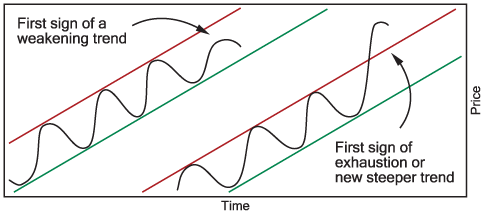
Trending prices often form a channel where prices can be bounded above and below by parallel trendlines. When trend channels form, it is helpful to draw the top and bottom trendlines and monitor how well prices stay within the channel.
If prices in an uptrend fail to reach the upper channel line, the uptrend may be weakening and getting ready to reverse. Also, if prices suddenly break above the upper channel line, the uptrend may be either beginning to exhaust itself and reverse direction or be starting a new, steeper trend. Similar behavior also happens in downtrend price channels.
Trend Changes
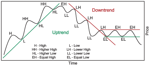
Trending prices can only go three directions; continue in the direction of the trend, change to a trading range or reverse the direction of the trend. Trend changes are most easily recognized by watching the price peaks and troughs. An uptrend makes ever higher price peaks and troughs. A downtrend makes ever lower price peaks and troughs. And a trading range price peaks and troughs are roughly equal over time.
A change in uptrend begins when a new price peak is similar or lower than the previous price peak. The change is confirmed when the next price trough is similar or lower than the last price trough.
Changes in downtrends and price ranges occur the same way, new price peaks or troughs break the pattern of prior peaks and troughs with the next peak or trough confirming the change.
Price and Volume Data Adjustments
When a company declares a normal stock split, additional shares are created in a ratio to the current available shares. For a 2:1 (two-for-one) stock split, every pre-split share will be replaced with two shares. Share prices are subsequently reduced by the split ratio (1/2 in this case) to maintain the total value (price multiplied by the total number of company shares) of the company. In a reverse stock split, the total number of shares is reduced by some ratio, resulting in the stock price being raised by that ratio.
Price and volume data adjustments are necessary for technical indicators to be valid during the period of the stock split. To accomplish these adjustments, pre-split prices are reduced by the split ratio and pre-split volume is increased by the split ratio. The opposite adjustments are made for reverse stock splits.
Data adjustments are made in the same way for dividends and mutual fund distributions.
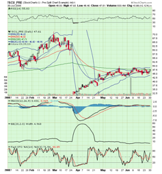
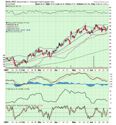
The following charts illustrate prices before and after a data adjustment for a stock split. Notice how several strong âsellâ signals on the first chart have disappeared on the adjusted chart.
Next time, we'll look at how volume can confirm trend change signals.
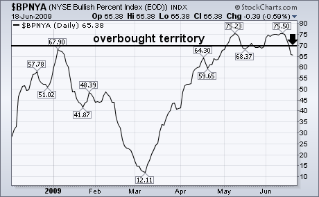
I recently showed the NYSE Bullish Percent Index (BPNYA) having reached
overbought territory over 70. the BPNYA is the percent of NYSE stocks
that are in point & figure uptrends. I suggested that a drop below
the May trough at 68 could signal a short-term top. Chart 1 shows that
downturn has taken place as the breath indicator has fallen to 65% and
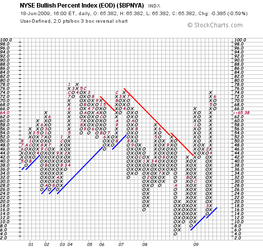
formed a small "double top" in the process. Chart 2 shows the point
& figure version of the same indicator. A three-box reversal into
the down column also took place this week. That's another sign that the
current uptrend is losing some breadth momentum. [Arthur Hill showed a
similar downturn in the number of NYSE stocks trading over their 50-day
moving averages]. Those are at least two reasons to be a little more
cautious at current levels.
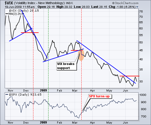
VIX BREAKS A TRENDLINEby Arthur Hill | Art's Charts A downtrend in the S&P 500 Volatility Index ($VIX) underpins the current rally in the S&P 500. After all, decreasing fear gives way to confidence. The chart below shows the VIX as a 3-day SMA to smooth out daily fluctuations. The VIX broke support on 12 March and this coincided with the March surge in the S&P 500. The VIX continued to trend lower as the S&P 500 extended its advance. While the S&P 500 hit a new high for the move in June, the VIX recorded a new reaction low to keep pace. With the sharp decline early this week, the VIX surged off its June low and broke the March trendline. This is a warning sign, but not quite enough to call for a new uptrend in the VIX. Look for further strength above the late May high signal a trend reversal and increase in fear that would be bearish for stocks.
BREAKDOWN AND SNAPBACK by Carl Swenlin | DecisionPoint.com
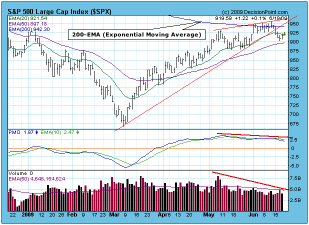
On Monday, in predictable fashion, prices broke down from the ascending
wedge pattern we've been watching. Then, after a correction of 5%,
prices began a snapback move up toward the recently violated support
line (now overhead resistance). Prior to the breakdown, you will notice
that overhead resistance was presented by the 200-EMA (exponential
moving average), which also happens to coincide with the top of the
wedge pattern. Once the snapback is completed, I am inclined to expect
the correction to continue for a while. There is good support at 880,
and after that the most obvious support is around 670.
As I mentioned last week, medium-term negative divergences are
beginning to appear -- the PMO and fading volume on the chart below are
two examples. Also, we are in the six-month period of negative
seasonality, which will last through October. The mini-bull market has
had quite a nice run, but, since we are still in a secular bear market,
we should consider that perhaps prices are starting to roll over in
order for the bear market to resume.
To change the subject, now seems like a good time to address the
differences between the simple moving average (SMA) and the exponential
moving average (EMA). A 200-SMA is the average of the last 200 days
closing prices. To calculate today's 200-SMA, you drop the first price
in the series (200 days ago), add today's closing price, then divide by
200. As you can see, the price 200 days ago has the same weight as
today's close.
The EMA is weighted almost totally toward recent activity. To
calculate a 200-EMA you begin with yesterday's EMA, subtract 1/200th of
that number, and add 1/200th of today's closing price. (Math wonks will
probably take issue, but it's close enough to help grasp the concept.)
With the EMA we will not have a large move that happened 200 days ago
affecting today's EMA.
The reason I am discussing this issue is to demonstrate how
EMAs and SMAs can present completely different pictures. On the chart
above, which uses EMAs, you can see how the 200-EMA appears to have
stopped the forward progress of the S&P 500. There is also a
substantial gap between the 50-EMA and the 200-EMA. (A 50/200-EMA
upside crossover would generate a long-term buy signal.) On the chart
below, which uses SMAs, the S&P 500 has broken above the 200-SMA,
and the 50-SMA is about to break up through the 200-EMA (long-term buy
signal).
Obviously, the SMAs present a positive picture versus an
ongoing negative picture presented by EMAs, and such divergences are
fairly common. So which one are you going to believe? I don't know how
this will ultimately resolve, but I believe and will act upon the EMAs.
I have always preferred EMAs because they do not give much weight to
old numbers, but others prefer SMAs. In any case, you should use one or
the other and stick with it.
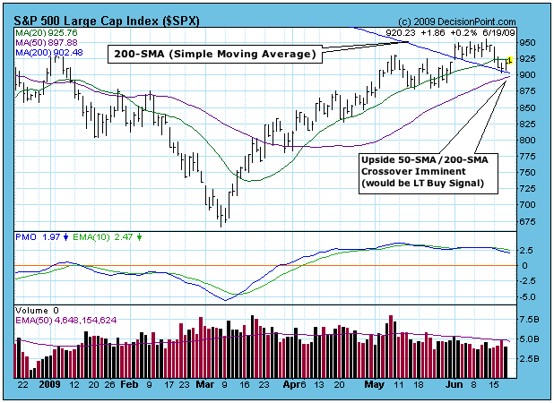
Bottom Line: The ascending wedge formation resolved downward, and after
a small decline, a reaction rally (snapback) has taken place. While
downside resolution of this formation has only short-term implications,
it is my opinion that medium-term correction has begun.
GOLD SETTING UP FOR MOVE HIGHERby Tom Bowley | InvestEd Central There are lots of questions in the market regarding possible inflation, deflation, and general market weakness. One way to hedge against all three is to play gold. Below is a long-term weekly chart that shows gold in a very bullish inverse head & shoulders continuation pattern. The current pattern is preceded by an uptrend, a requirement for an inverse head & shoulder pattern to be effective. While there are plenty of fundamental reasons to include gold in your portfolio, the technical reasons may be even stronger.
Check out the 5 year weekly chart on gold:
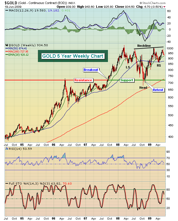
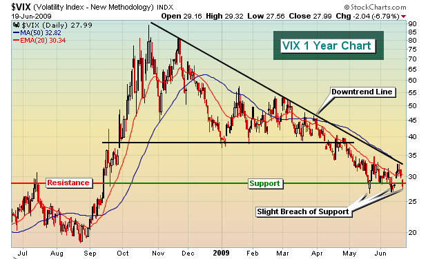
Watch for a breakout on gold above 1000, especially above 1025. The argument for a move higher grows stronger if equities weaken further or simply consolidate this summer. In my last article, I pointed out that the market appeared to be topping and I produced a video detailing the reasons. If you haven't seen the video, or you simply want to check out other videos that have been produced, click here (www.investedcentral.com/public/department57.cfm). There were several factors that influenced my call, including a VIX that had hit key long-term support. I believed the VIX would bounce off support and, in doing so, would send the major indices lower. Support at and around 28 on the VIX is quite strong as can be seen below:
The primary trend in equities remains bullish in my view. I believe the current move lower is potentially establishing the right shoulder of a reverse head & shoulders bottoming pattern as shown below on the S&P 500 chart:
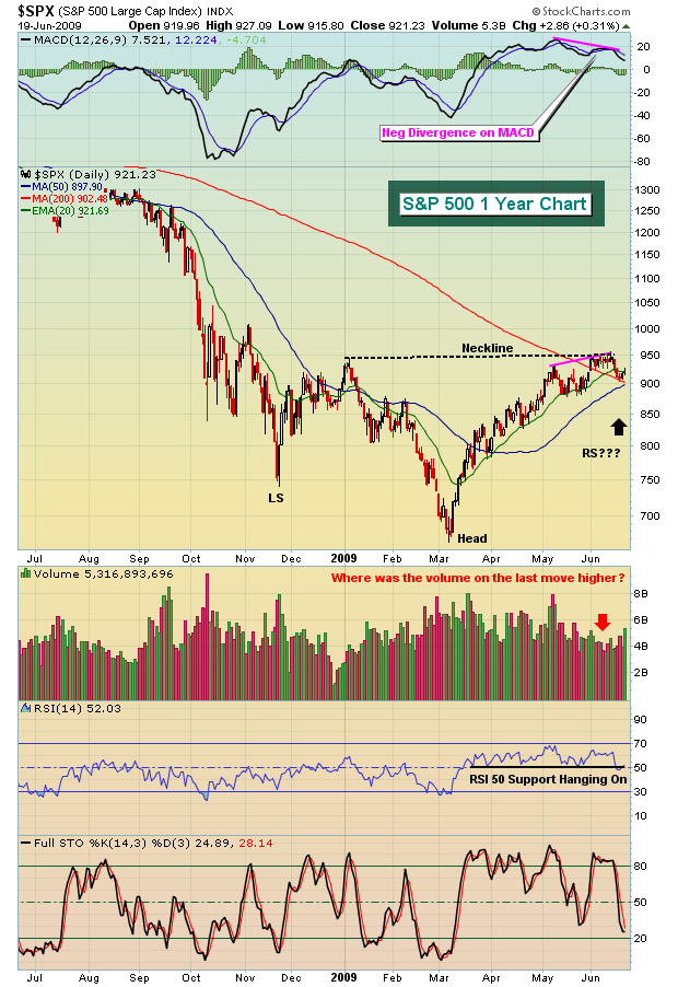
I'm expecting a test of the 50 day SMA, possibly slightly lower, before another leg higher. So, short-term I expect the market to be choppy to lower. I do, however, expect another rally to new highs in the not-too-distant future. Any further move to the downside will have to be evaluated as to volume, divergences, etc. in order to determine if the move down is something other than a corrective decline. An impulsive move to the downside would need to be respected.
Happy trading!
NOT MUCH TO LIKE ABOUT HOUSING...by Richard Rhodes | The Rhodes Report As the "green shootists" shout from the rooftops about the bottoming of the US and world economy; we think a technical and the Housing Index ($HGX) in particular offer keen insight as to whether one component of what led the US into the housing & credit market bubble...will lead it out. We hear very little about the housing stocks these days, for many are trading at very low levels and many do not believe they will come back anytime soon. Moreover, the current technical patterns may bear this out...no pun intended.
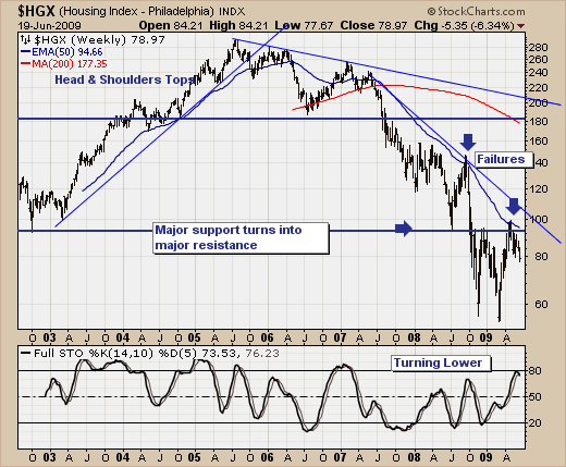
Quite clearly, the downtrend in place since 2005 remains in place as the 50-week exponential moving average remains the bullish-bearish fulcrum point. However, one could reasonably make the argument that prices are attempting to bottom at the 50-level as it has provided support on the past two occasions for prices to visit this level. The first rally attempt off this level faltered in major previous low overhead resistance at the 80-100 zone, did so within the context of the 14-week stochastic turning lower through it trading moving average. This led to lower prices and a second test of the 50-level - which was successful. But, major overhead resistance proved its merit a second time as well, with the stochastic turning lower as well. Hence lower prices are to be anticipated once again, and the 50-level support level is as good as any to target.
For us to become more "bullish" of $HGX, we'd like to see prices hold above the 50-level and the stochastic to turn higher - this would cause us to "dip a toe" in the water with an initial "buy." But the real key to being bullish stands on a breakout above the previous high and the 50-wema...something we think unlikely in the months ahead. Therefore, since we are "bettin men", we'll simply believe prices will form a base between 50 and 100 over the course of the next or so. In other words, there isn't much to like about the housing market or the US economy...really.
Good luck and good trading,
Richard