This is the tenth part of a series of articles about Technical
Analysis from a new course we're developing. If you are new to
charting, these articles will give you the "big picture" behind the
charts on our site. if you are an "old hand", these articles will help
ensure you haven't "strayed too far" from the basics. Enjoy!
(Click here to see the beginning of this series.)
Volume Confirmation
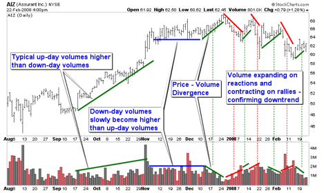
In an uptrend, volume should expand as the prices move higher and contract as the prices pull back. As long as this pattern continues, volume is confirming the uptrend. The opposite is true for downtrends. Volume should expand as prices decline and contract during rallies to confirm a downtrend.
Negative divergences can occur if new price highs in an uptrend take place on declining volume. This type of volume activity is an indication of diminishing buying pressure. If the volume also begins to pick up on price pull backs, prices may begin consolidating or reversing into a downtrend.
The same concept is true for positive divergences in downtrends. If volume begins to contract on new price lows but expands during rallies, prices may begin consolidating or reversing into an uptrend.
This is the end of our section on Trends and trendlines. Next time, we'll dive into some of the fundamental price patterns that result from when two trendlines are in effect at the same time.
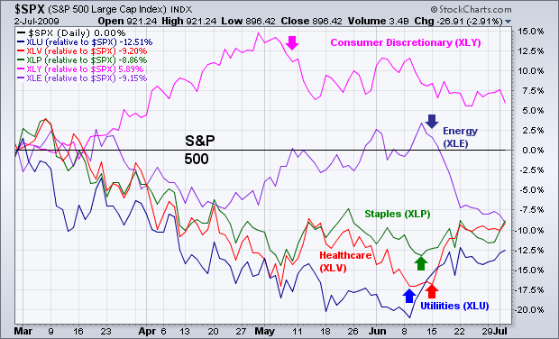
A sign that investors have turned more negative over the last
month is the rotation out of economically-sensitive groups (like
consumer discretionary and energy stocks) and into defensive groups
(like utilities, consumer staples, and healthcare). Chart 3 shows
relative strength lines for those five groups (versus a flat S&P
500) since the start of June. The downturn in the Discretionary SPDR
(XLY) performance in early June is consistent with views that retail
spending is being held hostage by rising unemployment numbers (which
were borne out yesterday). The downturn in energy (XLE) is consistent
with weaker commodity prices owing to a strong U.S. Dollar. Three of
June's best performers are defensive staples (XLP), healthcare (XLV),
and utilities (XLU). All of those rotation shifts are consistent with
a much-needed correction in a market that's risen too far too fast.
While stocks and commodities fell together during June, money has moved
back into Treasury bonds and the U.S. Dollar.
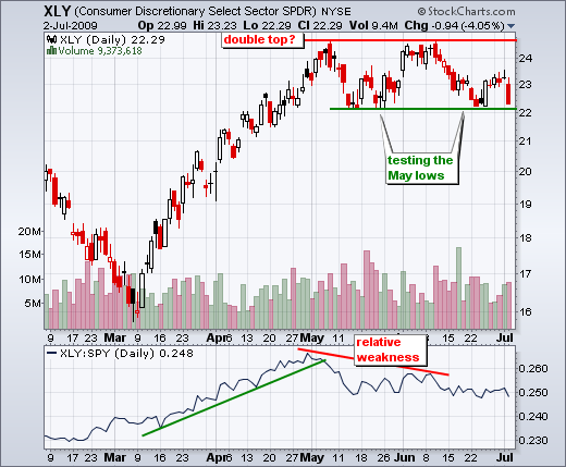
Non-farm payrolls declined 467,000 for June, which was worse than expected. Stocks took the news hard with a broad based decline on Thursday. The major indices were down 2-4% on the day, while all sector ETFs were down over 2% with the Consumer Discretionary SPDR (XLY) leading the way lower. On the chart, XLY is on the verge of breaking support from its mid-May lows. With a double top taking shape, a break below this support level would target further weakness towards 19. The height of the pattern is subtracted from the support break for a target. As the most economically sensitive sector, relative weakness in the consumer discretionary stocks is not a good sign for the overall market - or the economy. This sector includes retailers, auto manufacturers, restaurants and homebuilders.
About a week ago the S&P 500 50-SMA (simple moving average) crossed
up through the 200-SMA. (See chart below.) This is known as a "Golden
Cross" because it is interpreted by many as a sign that the market is
turning long-term bullish. Of course, this generated enormous optimism
among the market cheerleader crowd, most of whom do not use technical
analysis unless it supports their position. On the other hand, a highly
regarded economist/market analyst blew his stack that anyone could be
so lame-brained to use such a simple event to imply that the market was
about to go ballistic. Since both sides of this argument regarding a
technical event are offered by people who are fundamental analysts, I
thought it would be useful to present a technician's point of view.
First of all, a 50/200-SMA crossover means nothing to this
technician because I use exponential moving averages, and a golden
cross has not yet occurred on the 50/200-EMAs. (See my article of June
19.) Second, if we were to get a 50/200-EMA golden cross, it would be
an important event, but it would not be a sign to pile back into the
market with both feet.
A golden cross applies only to the price index where it occurs.
With the S&P 500 it means, based upon price movement, the broad
market is turning positive, and, in technical terms, we will have
entered a long-term bull market. At that point we would shift our
emphasis away from shorts and toward longs. We would start assessing
indicators and setups based on the assumption that we were in a bull
market.
Sure, false signals are generated, but we can only act on what
we know. In this case we would begin to look for medium- and short-term
setups for long positions. If the LT buy signal fails, chances are that
good setups will not be very common, and good position management will
limit losses. A golden cross is not useless, nor is it a signal to
throw caution to the wind. It is really an information signal, not an
action signal.
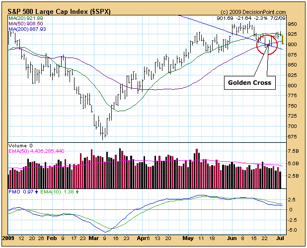
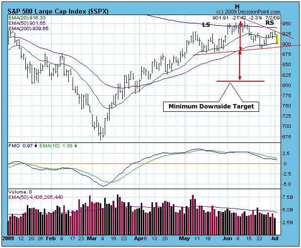
The next chart shows the current market conditions using EMAs. Note
that we are still awaiting the golden cross. More immediate to our
attention is the fact that a fully developed head and shoulders pattern
has formed, and Thursday's decline appears to be setting up challenge
to the neckline. If the pattern executes (the price index violates the
neckline), the minimum downside target is about 810.
If the pattern fails to execute and prices rally off the
neckline, it will tell us that medium-term bullish forces are still in
effect.
Bottom Line: The golden cross is a positive sign and gives us
information about the market's condition and trend. If it occurs, don't
overreact or ignore it. There is currently a head and shoulders pattern
that is on the verge of violating its neckline. If that happens, it
would be a pretty good sign that the rally is over.
I believe it's the former. Thursday's selloff after the June Employment report was a bit scary, particularly if you're only looking at the magnitude of the point losses. But, in my opinion, no key support levels have been violated. That means the beginning of next week will be worth watching. We have been in the midst of an uptrend for the last few months and we are still in it. We have a series of higher highs and higher lows off the March lows that has not been broken - yet. Therefore, I say we play the trend at hand, which still is higher.
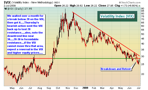
There were plenty of warning signs recently as to a short-term top - VIX hitting support, negative divergences on the daily MACD across the major indices, overbought conditions, light volume on early June highs, lack of participation from key sectors that led the rally since March, like financials and consumer discretionary stocks. Those warning signs did, in fact, lead to a short-term top.
This begs the question - is the bullish move off the March lows over? To be honest, that's a tough call. I'd place about a 60-40 chance on the major indices putting in higher highs during July. If it happens, it will most likely happen within the next two weeks as historical indications tell me that this period is the strongest in July, except for perhaps the last couple trading days of the month. Once we get past mid-July, all bets are off as we enter the third most bearish period historically in the market. Dating back to 1950, there's a one week period in July, just past the mid-point, where the S&P 500 has produced annualized LOSSES of 36%. That trails only bearish periods in September and October.
The market has a lot of reasons over the next few months to sell off. Historically, the worst time period of the year is from mid-July to late-September. Since 1998, the S&P 500 has gained more than 1.5% during this period only once - in 2006. On the flip side, we've seen losses in the range of 5%-16% during 5 different years. Clearly, the historical trend has been towards losses during these summer months.
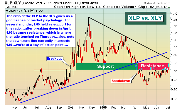
I can make a solid case for both bulls and bears, which is why it will be difficult to trade near-term. If you're right, you can make some nice money. But with the risk/reward up in the air, doing too much makes little sense at this time. First, here are a couple charts that are quite bullish in my opinion:
On the bears side is the following:
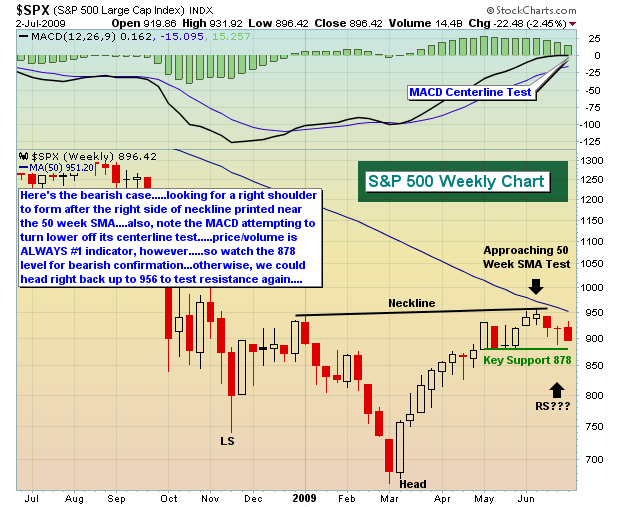 For the very near-term, I'm buying the bulls argument (but not aggressively so) and will remain on the long side. If key price support levels (primarily May lows) fail to hold, I'll grow much more cautious. Further out, I'm a student of history and I tend not to argue with trends that stand the test of time. Therefore, I'll remain cautious throughout the remainder of the summer, looking only for the best opportunities in terms of risk/reward. You can click here to review our alert performance over the past several months.
Those who are ultra-conservative should probably be sitting in cash at the moment or long with one finger on the sell button. Enjoy the holiday weekend!
Happy trading!