TRENDING UP, DOWN OR SIDEWAYS?by Chip Anderson | ChartWatchers Hello Fellow ChartWatchers,
Here's an article that first appeared in 2006 about using the ADX indicator. With lots of stocks starting to trend upwards now, I thought it was a good time to revisit this topic. Enjoy! - Chip
Trend analysis is one of the most important technical analysis
skills anyone can have. Knowing if a stock is trending or oscillating
can have a big impact on what kind of approach you take to trading it.
Stocks that are in a strong uptrend should be bought and held until one
or more momentum oscillators show signs of weakness (a moving average
cross-over for example). Stocks that are oscillating sideways within a
trading range should be studied using oscillating indicators like
Stochastics for entry and exit points.
So, how do you tell if a stock is trending or oscillating? And how
do you tell if the trend is strong or weak? One way is to use the old
Mark 1 Eyeball- but unfortunately that isn't always as accurate and
impartial as one might like. A more objective technique is to use the
ADX indicator.
The ADX indicator was invented by Welles Wilder, the same guy who
created the RSI. It is part of an indicator "system" whoses official
name is "Wilder's DMI". Wilder's DMI consists of three lines - the
green +DI line, the red -DI line and the thick black ADX line. Check
out this example that uses the Dow Industrials:
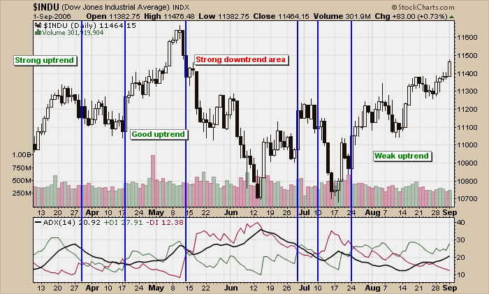
(Click the chart to see a live version.)
I've added vertical blue lines whereever the green +DI line crossed the
red -DI line in a significant way (I ignored some whipsaw-like
crossovers for clarity). When +DI is above -DI, the chart is in an
uptrend. When -DI is on top, the chart is in a downtrend. The
"strength" of the trend (up or down), is indicated by the ADX line.
Working through the chart from left to right, at first the Dow was in
an "uptrend" (+DI is above -DI) and it was a "strong uptrend" because
the ADX line rose to a relatively high level. Next, in early April,
came a short period of oscillation that saw the ADX fall. After that,
in late April, another uptrend developed but a couple of down days near
the beginning of May prevented the ADX from indicating that the uptrend
was particularly "strong".
After setting a high in the middle of May, the Dow entered a strong
downtrend for a couple of weeks. Notice that the ADX line continued
moving higher during this downtrend - don't let that confuse you! The
level of the ADX indicates the strength
of the trend, not the direction. In this case, this downtrend is the
strongest trend on the chart and therefore has the highest ADX levels.
The right side of the chart shows that we are currently in another
uptrend however the "strength" of that uptrend is very questionable.
Notice how the ADX line was at a very low level in mid-August and has
only begun to move higher recently. The ADX is telling alert
ChartWatchers to pay close attention for signs the Dow's current
uptrend is running out of momentum and react accordingly.
The calculation of the ADX is complex and beyond the scope of this
article however, we have recently gotten a very detailed new book about
the ADX into our bookstore that can tell you everything (and I mean everything) you ever wanted to know about this important indicator. Although it is pricey, serious ChartWatchers will find that "ADXcellence" by Dr. Charles Schaap is well worth the cost.
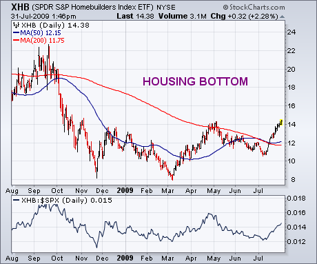
ITB VERSUS XHBby John Murphy | The Market Message On Monday, I wrote a bullish message on the homebuilding group and suggested using the SPDR S&P Homebuilding ETF (XHB)
as one way to participate in the housing recovery. I pointed out,
however, that the XHB has a relatively heavy weighting in a lot of
housing-related stocks that aren't necessarily homebuilders (like Home
Depot, Bed Bath & Beyond, Masco, etc.). A purer homebuilding play
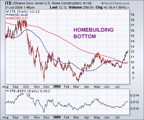
can be found in another ETF -- iShares Dow Jones U.S. Home Construction (ITB)
-- which is shown in Chart 2. The two charts are basically similar,
show the same bottoming characteristics since last November, and are
both on the verge of breaking out to the highest levels in nine months.
On percentage grounds, however, the ITB has an edge. Since the start of
2009, the ITB has gained 23% versus 19% for the XHB (the S&P 500
has gained 9%). Since the March bottom, the ITB has rallied 87% versus
74% for the XHB (and 44% for the S&P 500). The top holdings in the
ITB are homebuilders like NVR, DR Horton, PHM, Toll Brothers, Lennar,
and Centex. The XHB offers participation in a broader array of
housing-related stocks. If you want a purer homebuilding play, however,
ITB would be the better choice.
The McClellan Oscillators moved from bearish to bullish with the July surge in stocks. Basically, the McClellan Oscillator is the 19-day EMA of Net Advances less the 39-day EMA of Net Advances (advances less declines). As the difference of two moving averages, this indicator oscillates above/below the zero line like MACD. Based on recent observations, a thrust above 50 is viewed as bullish for the stock market, while a thrust below -50 is viewed as bearish. Even though this breadth indicator is not perfect, it's level can help determine overall market direction and underlying strength.

Click this chart to see more details.

Click this chart to see more details.
The Nasdaq and NYSE McClellan Oscillators both turned bearish in mid June with thrusts below -50. Both stayed in bear mode until mid July. The NYSE McClellan Oscillator was the first to turn bullish with a thrust above 50 on 15-July. Also notice that the NY Composite broke above 6000 on 15-July. The Nasdaq followed suit a week later with a move above 50 on 23-July. Even though both oscillators slipped back this week, they remain comfortably in positive territory and bullish overall. Click here to read more on the McClellan Oscillator and Summation Index.
HOPING FOR A PULLBACKby Carl Swenlin | DecisionPoint.com
Since the price lows of early-July, the market has moved relentlessly
higher, penetrating the important resistance posed by the 200-EMA. When
this rally began, a narrow window of fairly low-risk opportunity was
presented. Those who missed it are now hoping that prices will pull
back far enough to provide another good entry point.
The most obvious and promising pullback target would be a move
down to the 200-EMA, but would such a move fuel confidence, or would it
only serve to crank up the level of anxiety? As you can see, another
ascending wedge has formed, and, if you have been following our
commentary for a while, you know that an ascending wedge is a bearish
formation with a high probability of a breakdown. If we do get a
pullback, the next obvious fear will be that the pullback will not end,
and that prices will break down from the wedge and continue on down to
test the July lows.
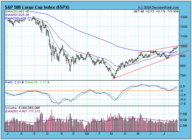
Adding to the evidence supporting a possible breakdown are medium-term
indicators, like those below, showing that the market is quite
overbought, a condition that will need to be cleared. In bull market
conditions, which I would ascribe to our current situation, it is
possible for overbought conditions to be worked off even as prices move
higher. That is to say that prices may not pull back at all, but simply
break up and out of the wedge. To the other extreme, a healthy price
decline can do the trick.
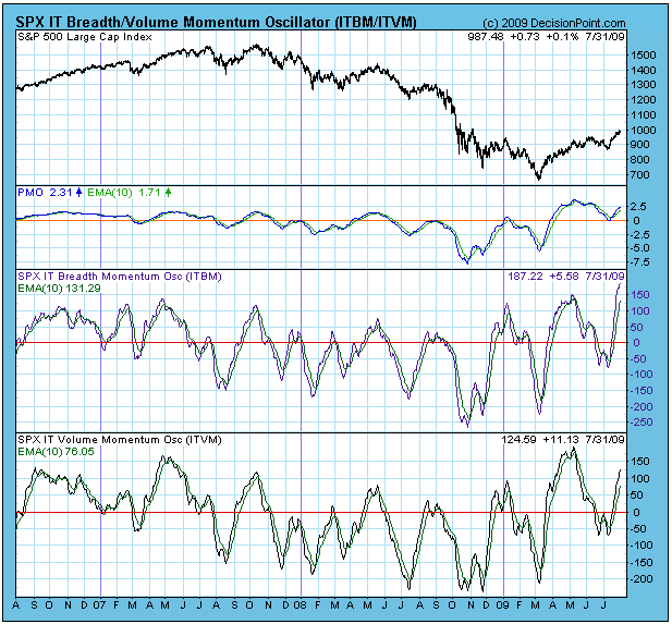
Bottom Line: For those who acted on our March 17 buy signal,
contemplating the outcome of the ascending wedge and/or the possible
pullback does not create much, if any, stress. But for those who are
still out of the market and looking for a chance to participate in
another up leg that has the potential to move prices up another 20%,
the next few weeks will probably not be much fun.
One of these days, the market mood is going to switch back to
bearish for an extended period, but, based upon price action to date, I
must assume that the current setup will resolve in favor of the bulls,
meaning that I don't think the wedge will be broken to the downside.
FINANCIALS TO THE RESCUE?by Tom Bowley | InvestEd Central During the initial phase of the market recovery, from the March lows to the early May highs, financials were a primary driver of the move. Since that time, financials have lagged badly as sector rotation has caused money to flee to other, better-performing sectors over the last 8 weeks or so. However, the relative outperformance that financials enjoyed in the Spring has returned of late. Will it continue? That's hard to say, but our first major clue is upon us. Check out the following chart:
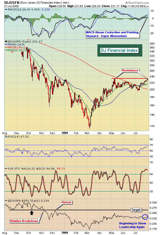
Should the sector break above key near-term price resistance, it would be prudent to look for companies within the sector primed to participate. One such stock could be E*Trade Financial (ETFC) - for two reasons. First, let's look at the one year chart:
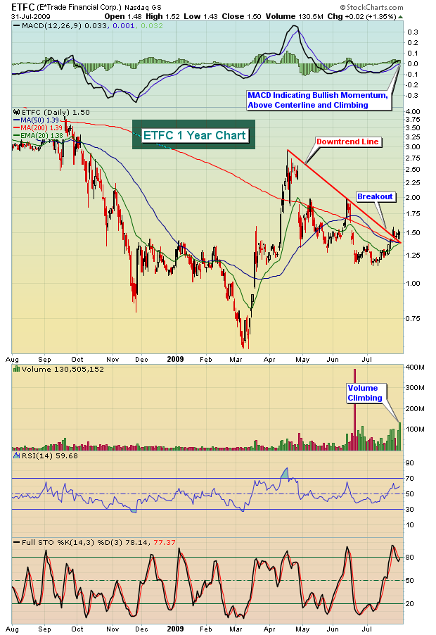
More interesting, however, was the trading in the last 15 minutes on Friday as volume exploded on ETFC. Check this out:
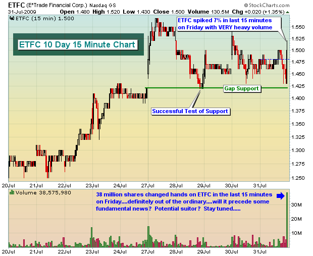
Over the last 90 days, ETFC has produced average daily volume of 47 million shares. In the last 15 minutes of trading on Friday, ETFC traded 38 million shares. Will there be news to account for such heavy volume? It's impossible to say, but if technicals precede fundamentals......
Given the possible breakout on financials, I scanned the financial universe, searching for potential short-term trade candidates within that sector, to benefit from any additional strength in the group. For the more aggressive active trader, I also used scans searching for small dollar stocks in the $1-$5 range that are showing increasing volume trends and other positive technical signs. To access these trade candidates, complete with my technical commentary, click here.
Happy trading!
COMMODITY SECTOR PICKING UPby Richard Rhodes | The Rhodes Report On Thursday and Friday of last week, we saw the US dollar resume its downtrend, and the commodity sector begin to pick up participation as a result. This is likely to continue into the future as the US dollar is destined for lower lows; thus we are quite interested in finding parts of the commodity sector that have been "laggards" recently. The first that comes to the "radar screen" is the Agriculture group as it has been "most laggard." This group is primarily comprised of the grains such as Soybeans, Corn and Wheat; but the ETF that we are interested in - the DB Agricultural ETF (DBA) - is comprised of roughly 70% grains and 30% Sugar. This is fine for our puproses; and if we have to make a bullish fundamental case for DBA...it is that the bountiful harvest is already discounted, with any type of stress into harvest leading to a bit of short covering and perhaps a good deal of real buying if anticipated economic growth materializes.
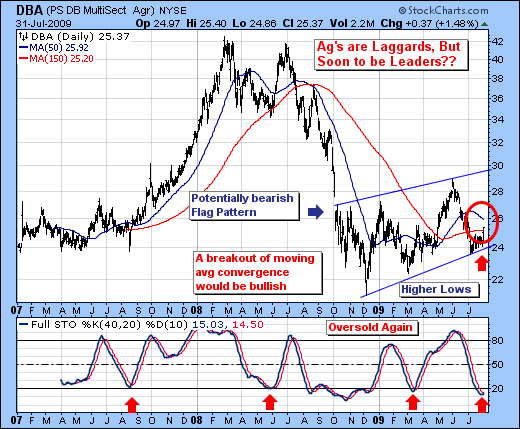
From a technical perspective, we'll simply note that there are a series of higher lows and higher highs forming, which may or may not be part and parcel of a rising bearish flag pattern. But in any case, even if it were a bearish pattern - there is certainly room for an upside trade from its current $25 level to $30 in the weesk and months ahead. Quite simply, DBA is oversold per the 40-day stochastic, which increases the probability of a rather sharp move higher. Too, prices are breaking out above the 150-day moving average, which has been a rather bullish sign in the past as well.
If one chooses to consider this trade, then the risk is for a break of the recent lows at trendline support; while the reward is a trade to $30. Put another way; we'll risk $1.50 for a gain of $4.50.
Good luck and good trading,
Richard