This is the next part of a series of articles about Technical Analysis from a new course we're developing. If you are new to charting, these articles will give you the "big picture" behind the charts on our site. if you are an "old hand", these articles will help ensure you haven't "strayed too far" from the basics. Enjoy!
(Click here to see the beginning of this series.)
Price Patterns
Price Patterns result when the market is not in agreement on the value of a stock. Essentially, they are the âvisual remainsâ of a big battle between Bulls and Bears. In many ways, they are like weather patterns that you see on the nightly news. Often todayâs weather can be forecast by looking at yesterdayâs atmospheric data but occasionally (frequently?) the forecast is wrong. Similarly, chart patterns often but not always indicate future price movements.
At their core, most price patterns are combinations of several trendlines. The simplest pattern is the Rectangle Pattern.
In a rectangle pattern, price moves between two horizontal lines of support and resistance. In order to qualify as a rectangle pattern, both support and resistance lines must be touched at least twice. Rectangle patterns have a narrow or wide price range and last from days to months. The pattern ends once the line of support or resistance is broken.
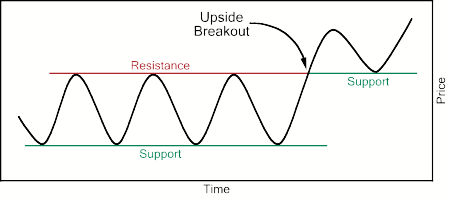
A price break through resistance may be anticipated if volume expands when prices rise and contracts when prices fall within the rectangle pattern. An imminent price break above resistance may exist if prices donât fall to the support line before rising again.
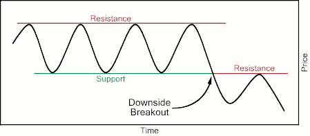
A price break through support may be anticipated if volume expands when prices fall and contracts when prices rise within the rectangle pattern. An imminent price break below support may exist if prices donât rise to the resistance line before falling again.
As illustrated above, as soon as the pattern breaks down, the top (or bottom) of the rectangle changes into a support (or resistance) line for the stock.
Rectangle patterns clearly show the battle between bulls and bears with the bulls repeatedly buying when prices hit the support level and bears repeatedly selling when prices hit the resistance level. At some point, one of those groups will âwinâ and prices will breakout of the pattern. The longer prices have been in the pattern then the larger the âbreakout moveâ will be and the more significant the new support/resistance line becomes.
Another common price pattern is the Triangle Pattern. The triangle pattern is very similar to the rectangle, except that the upper and/or lower trendlines that define the pattern are sloped instead of horizontal.
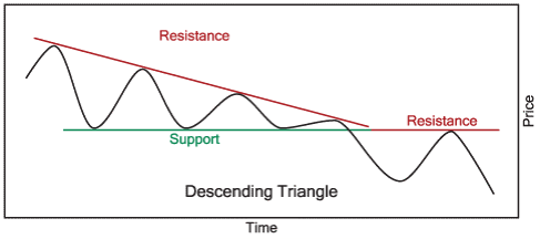
Go back to the rectangle diagram above and imagine that bearish sentiment about the stock was growing over time. What would that look like? Well, in that case, more and more sellers would not wait for prices to return to the level of the red resistance line before selling. Instead, they would sell sooner. That would cause the red resistance line to become a downward trendline forming a Descending Triangle Pattern.
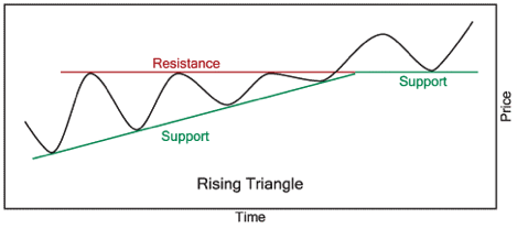
Alternately, what if buyers started getting impatient and started buying before the stock got back to its green support line? Then a Rising Triangle Pattern would form.
And what if both the bulls became more bullish while at the same time, the bears became more bearish? Then both the red and green lines would be slanted and weâd have a Symmetric Triangle Pattern.
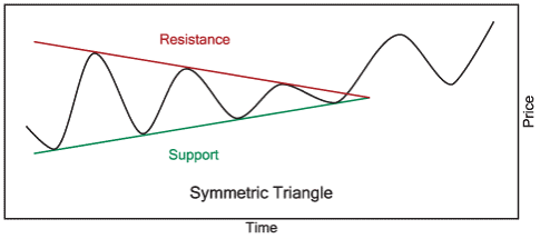
By the way, triangle patterns are also referred to as âcoils.â Can you see why? As the upper and lower parts of the triangle get closer together, the battle between the bulls and the bears gets more intense and the suspense builds. Obviously, at some point, prices are going to move outside of the triangleâs boundaries â but will they move higher or lower? Psychological energy coils up like a spring inside of the triangle and the closer the lines get, the bigger the inevitable breakout will be.
As you probably guessed, the diagrams above are not realistic. Typically, triangle patterns have a breakout well before the apex of the triangle is reached. It is the direction of the breakout that is the key question when watching a triangle form. Will the bulls win? Will the bears win?
A couple of clues can be found in the price action that precedes the triangle. If the stock was in an uptrend prior to the triangle, there is a good chance it will break out of the triangle pattern on the upside and continue the uptrend. In addition, rising triangles tend to breakout to the upside while descending triangles often break lower. Symmetric triangles are usually not completely âevenâ â i.e., the support side may be stronger than the resistance side making the triangle âpoint upâ or, if the support side is weaker, âpoint down.â In that case, the triangle often breaks in the direction it is âpointing.â
Next time, we'll look at how to confirm these patterns with volume and examine some real-world examples.
John will return for our next issue....
The Bullish Percent Indices measure the percentage of stocks on a Point&Figure buy signal for a given index. In general, an index has a bullish bias when its Bullish Percent is above 50% and a bearish bias when below 50%. Stockcharts.com users can easily keep an eye on the bullish percent indices in the Market Summary page. In fact, the table below comes directly from the bottom of the Market Summary page. The major indices are at the top, followed by the sectors.
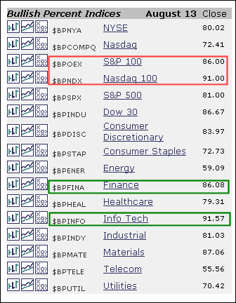
As you can see, the Bullish Percents are above 70% for all the major indices. No sign of weakness here. Of the ten sectors, six have Bullish Percents greater than 79%. This is a sign of broad strength. Of the remaining four sectors, two are in the low 70s, energy is around 59% and telecom is around 55%. Using bullish percent to measure relative strength, energy and telecom are the least strong sectors right now. Of the major indices, the Nasdaq 100 and S&P 100 are the strongest (large-cap and large-cap technology). The bulls are in good shape as long as the majority of these Bullish Percents holds above 50%. You can read more on Bullish Percent in the Chart School.
Two weeks ago, I pointed out what appeared to be the early stages of a new trend of outperformance by the financials and suggested they might be primed for a move higher to rescue the stumbling stock market. Right on cue, money rotated back into financials and we saw the Dow Jones US Financial Index rally nearly 10% in one week, breaking out above its May highs. That spurred the S&P 500 to its highest level since mid-October 2008. Therein lies the problem. We've now retraced much of the collapse from late September and staying aggressively long at key resistance is not a good reward to risk proposition in my opinion. The S&P 500 may ultimately break out and move higher, but let's deal with that when and if it happens. For now, check out the resistance on the S&P 500 chart below:
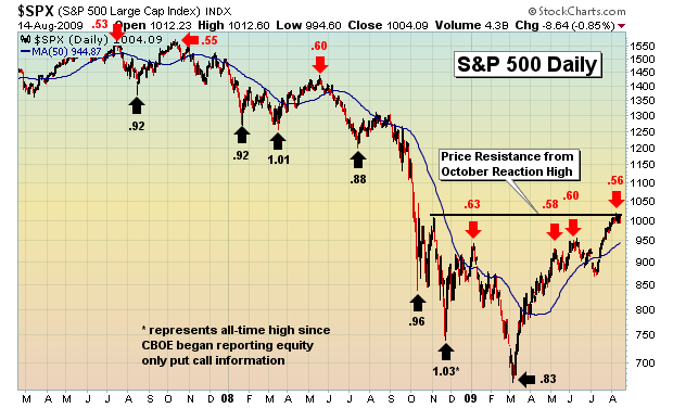
In addition to the price resistance, I've also plotted the 5 day moving average of the equity only put call ratio at significant short-term tops and bottoms in the S&P 500. Any time this average drops below .60, a red flag is raised in my view. It doesn't mean the S&P 500 will top as complacent readings have erred in the past. However, it does make me aware of a possible short-term trend reversal. Given the critical price resistance that the S&P 500 is battling right now, the significant number of net in-the-money calls that exist just one week before options expiration, and the rather complacent equity only put call readings of late (just hit .56, a 2009 low), we removed all exposure on the long side on Thursday and actually began shorting using a juiced ETF. I feel the timing is right because we're at critical price resistance. If the S&P 500 breaks out, it's a quick minor loss and we'll be back to cash looking for other opportunities.
Every month at Invested Central, we host a "max pain" chat the Sunday night before options expire. This Sunday is no different. Because there are so many stocks currently trading above their "max pain" levels, we'd like to invite anyone interested to join us as we discuss the theory behind "max pain" and its usefulness in trading during this one week free-for-all. If you'd like to join us Sunday night, simply click here.
Happy trading!
The July-August stock market rally has caught many surprised given its strength and duration; however, we are of the opinion that this "freight train" is running of out of fuel, and shall falter from roughly current levels in what may be quite a "quick and nasty" setback at a minimum. It very well may take on a more decidedly bear market decline, but it is far too early for us to determine this.
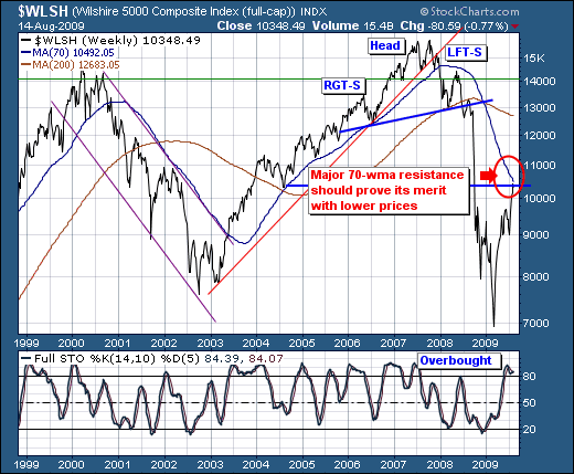
Quite simply, if we look at the broad-based Wilshire 500 Index, we find the rally off the March low is substantial, but only insofar as a mean reversion exercise towards the 70-week moving average currently at 10,492. Looking back in time, we find that on a closing basis, the Wilshire tends to confirm bull markets once it breaks out above this moving average, and bear markets when this major resistance level proves itself with lower prices. We have just such a fulrcum point roughly 1.5% above current levels.
Our thoughts are simple: we expet thje 70-week moving average to provide resistance to this rally; and for prices to correct rather sharply. However, it shall be the character of that decline that will speak volumes - we hope of course - as to whether a major test of the March lows is in store. From a fundamental perspective - we believe that to be the case; but we have no solid technical evidence to support our supposition. Therefore, we are willing short sellers at current to slightly higher prices, and our stop loss will be two weekly closes above this moving average as we would want to give this position wide lattitude to work given the potential for a major inflection point and the volatiltiy that surrounds them.
In other words: "if they a yell'in; then you should be sell'in"; and traders do seem to be doin so.