TECHNICAL ANALYSIS 101 - PART 12 by Chip Anderson | ChartWatchers This is the next part of a series of articles about Technical
Analysis from a new course we're developing. If you are new to
charting, these articles will give you the "big picture" behind the
charts on our site. if you are an "old hand", these articles will help
ensure you haven't "strayed too far" from the basics. Enjoy!
(Click here to see the beginning of this series.)
Volume Confirmation of Price Patterns
When identifying potential price patterns on a chart, it is
crucial to try and verify that the market psychology behind the price pattern is
really happening at that point on the chart. One of the best ways to do that is to use volume to confirm things.
In the case of a rectangle pattern, volume should be decreasing while the rectangle is forming. There may be volume spikes whenever prices get near the top or bottom of the pattern, but in general, as a rectangle pattern continues to
develop, volume should decrease. Volume will probably spike up heavily immediately after the breakout as people realize that the support or resistance line has been broken.
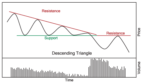
Triangle patterns should have a similar volume pattern - decreasing volume while the triangle is forming with a sharp increase in volume once a breakout is achieved.
Again, the diagrams above are idealized - the real-world is much messier. Consider this example:
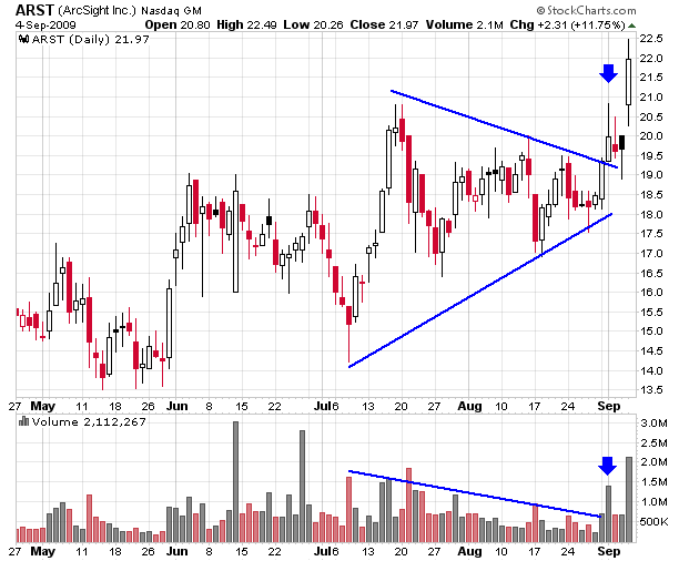
Notice that ARST didn't have a smooth decrease in volume but instead had several "mini-spikes" that corresponded to each change in direction of the "coil." The key however is that each mini-spike was smaller than the previous one (with the exception of July 21st, but that was early in the coil's formation). Once that downward volume trend was well established, a big spike above that trendline would signal the breakout - just like on September 1st.
Consolidation / Continuation Patterns vs. Reversal Patterns
So far, the two price patterns we've looked at - Rectangles and Triangles - are examples of "Consolidation Patterns" also known as "Continuation Patterns." They are called that because, in general, after the pattern completes prices will usually continue whatever trend they were in prior to the pattern forming. In order words, if prices were in an uptrend prior to a rectangle pattern forming, prices will usually resume the uptrend once the rectangle pattern finishes. Basically, consolidation patterns are places where the bulls and the bears have another short-term "argument" about the stock, but it is a half-hearted one. The "bigger picture" situation doesn't really change.
Next, we are going to start looking at "Reversal Patterns." These are where the fireworks occur. If consolidation patterns are skirmishes, reversal patterns are the big battles. When reversal patterns start to appear, the current trend is in real danger and lots of people start to pay attention.
Next time, we'll look at the granddaddy of all reversal patterns - the Head and Shoulders reversal.
GOLD AND SILVER HAVE BIG WEEKby John Murphy | The Market Message GOLD TESTING ALL-TIME HIGH... Last Friday I wrote about the
bullish potential in gold and gold shares. That optimism was based on
two bullish chart patterns which are shown below. The first is the
bullish symmetrical triangle shown in Chart 1 for the Gold Trust ETF (GLD).
This week's upside break of the upper resistance line (on heavy volume)
is bullish and signals a test of its February high near 100 (which
corresponds to $1,000 in bullion). Chart 2 shows why that's an
important resistance level of its own. Chart 2 (based on the price of
bullion) shows an inverse (or continuation) head and shoulders pattern
with a neckline drawn over gold's 2008-2009 highs. A close through that
level (which appears likely) would be even more bullish for gold and
gold shares. In fact, gold shares have risen even more than bullion
this past week. So did silver.
Intermarket analysis shows strength in bonds and gold, but weakness in the Dollar and oil. Strange days indeed. The Intermarket Perfchart below shows performance over the last sixty days, from June 11th to September 3rd. Relative strength in bonds is the first thing that jumps out. Performance for the 20+ Year Treasury ETF (TLT) has been positive the entire time (60 days). In contrast to bonds, oil is the weakest of the intermarket players. Except for a positive blip in early June, performance for the US Oil Fund ETF (light blue) has been negative since mid June. While bonds are up over 10%, oil is down over 10%. Could this be a sign of deflation? For one reason or another, money is clearly moving into bonds. It could be deflationary pressures, slower economic growth or a flight to safety. It is also interesting to note that oil moved lower even as the US Dollar moved lower. Oil usually benefits from weakness in the Dollar. The green line shows the Dollar Bullish ETF (UUP) working its way lower from mid June to early September. Weakness in the Dollar is, however, helping gold, which surged over the last few weeks (pink line).
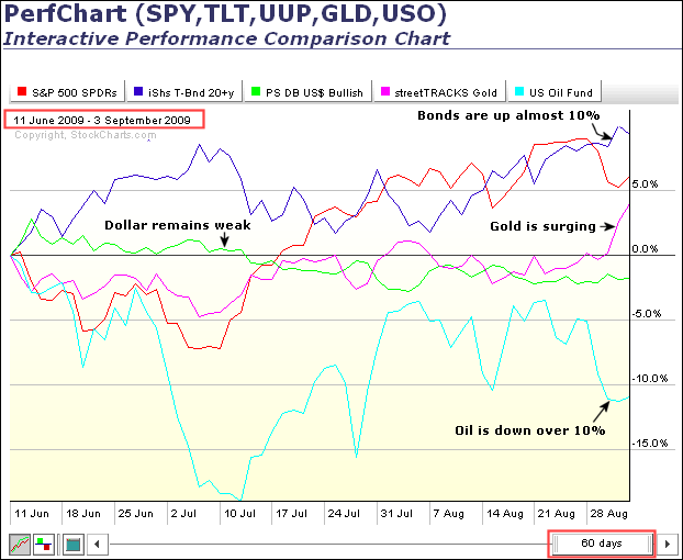
Click this chart to see details.
LOOKING BACKby Carl Swenlin | DecisionPoint.com
I continue to get mail from people who question how it is possible to
be bullish in the face of the worst fundamentals since the Great
Depression, so I thought it would be useful to look at a chart of the
1929 Crash and the decade that followed it.
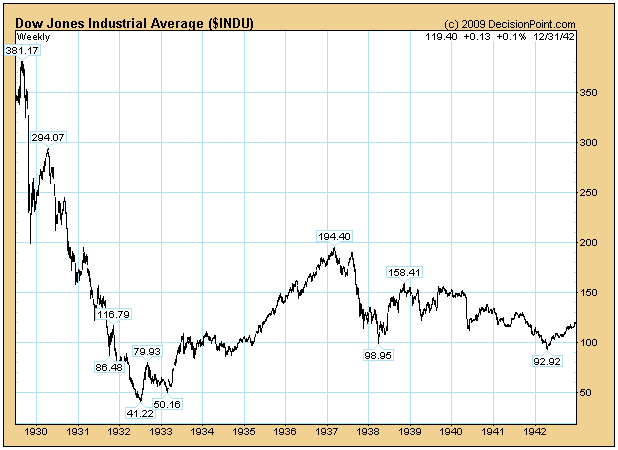
Squeezed on the left side of the chart you can see the initial
Crash and the rally that followed it into mid-1930. That was a bear
market rally, and it advanced about 50% from the Crash low. While all
our current signals are bullish, I still have no problem imagining our
current rally ultimately resolving in this manner. The point, however,
is that the big rally in 1930 occurred at a time that the fundamental
problems had hardly been acknowledged, let alone solved.
After the final low in 1932 the market rallied for over four
years and 300% during what has to be characterized as the depths of the
Depression. I do not mean to assert that this is what I expect from our
current situation, only to demonstrate what can happen and how
fundamentals can often be at odds with price movement.
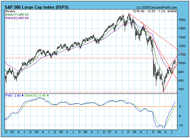
Moving back to the present, let's take a look at a weekly-based chart
of the S&P 500. As of Friday's close, the 17-EMA crossed up through
the 43-EMA by a thin, thin, thin margin of 0.03. This is the
approximate equivalent of a 50/200-EMA crossover on the daily-based
chart, and it confirms the long-term (months to years) buy signal we
got on August 11.
What bothers me on this chart is the ascending wedge pattern,
which looks more ominous from a weekly perspective than it does from a
daily view. It is hard for me to imagine this wedge resolving any way
but downward. I cannot picture in my mind a congruous price pattern
that could result from an upside breakout. Once a correction is
completed, more sensible possibilities could emerge. I guess this
opinion falls under the heading of "gut feeling", but it comes from a
person who has looked at a lot of charts for a lot of years.
Bottom Line: Medium-term indicators are still quite overbought, and a
correction would be the best way to clear this condition. Is entirely
possible that we have seen the top of the rally/bull market, but
medium- and long-term signals are positive, so I think the worst case
we should expect for now is a correction. Our medium-term timing model
will switch to neutral from buy if the S&P 500 daily 20-EMA crosses
down through the 50-EMA.
CHINA MAY HOLD SOME CLUESby Tom Bowley | InvestEd Central China's Shanghai Composite index is swinging wildly in both directions, reminiscent of the 1999-2002 moves by the NASDAQ. From a long-term perspective, you can clearly see that trends in both directions have been exaggerated. Any time that we've seen impulsive moves in one direction or the other, we have seen follow through in that same direction. From the mid-2005 to mid-2007, the impulsive moves were up while the corrective moves were down. From the peak in 2007, just the opposite occurred with impulsive moves lower. Take a look at the chart below and study the monthly swings in this index from mid-2005 up until now:
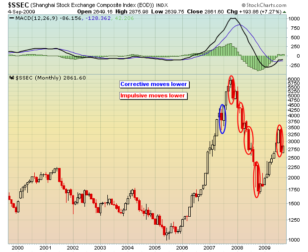
It's impossible to ignore that impulsive move down last month. Thus far in September, the Shanghai is rebounding. Will it last? Well, some of the short-term strength was suggested by the MACD histogram on the daily chart, which printed a positive divergence on the latest move lower in China. The chart below is a three year chart and it shows the positive divergence on the MACD histogram and a triangle formation to keep an eye on:
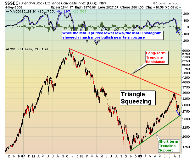
The MACD histogram measures the distance between the MACD (thick black line) and its 9 day moving average (thin blue line). So while prices were falling on the Shanghai and the MACD found new lows as well, the MACD histogram indicated that the MACD was not dropping as fast as its 9 day moving average, an early hint of an impending reversal if you will. I prefer to see the positive divergence develop on the MACD, but I do take note of divergences on the histogram as well.
The Shanghai gained over 100% off of its October 2008 lows and started its climb well before the S&P 500 bottomed. I find the sudden drop in Chinese shares somewhat alarming and would feel much better about the S&P 500 if the Shanghai breaks out of its current triangle to the upside. Could the recent fall in China be a precursor to another quick drop here in the U.S.? Well, I wouldn't rule it completely out, though we must remain focused on the here and now, not what could be. So long as the major indices in the U.S. continue their uninterrupted climb and key price support levels are not lost, then I assume pullbacks can be bought. Personally, I'd like to see additional selling on the U.S. indices down to their 50 day SMAs, a drop that would in my opinion reset the MACDs near the centerline and provide a better opportunity for another upside move. A breakdown below the 50 day SMAs on increasing volume should absolutely be respected.
Price/Volume trends have remained bullish for the last several months. However, that did begin to change over the last week as heavy volume accompanied selling after good fundamental news had been reported - ie, Intel's (INTC) raised guidance, higher pending home sales, much higher ISM reading. As I always like to say, it's not the news that I focus on. It's the market's REACTION to the news that's important. I am short-term neutral to slightly bearish, while bullish the intermediate-term. September has finished lower 35 of the last 58 years on the S&P 500, the only calendar month to finish down more than up since 1950. It is the worst month of year, bar none. History can, and many times does, repeat itself, so tread and trade lightly.
Happy trading!
ON HIATUS THIS WEEKby Richard Rhodes | The Rhodes Report Richard will return for our next issue.