This is the next part of a series of articles about Technical
Analysis from a new course we're developing. If you are new to
charting, these articles will give you the "big picture" behind the
charts on our site. if you are an "old hand", these articles will help
ensure you haven't "strayed too far" from the basics. Enjoy!
(Click here to see the entire series.)
The Infamous Head and Shoulders Reversal Pattern
One of the most common reversal patterns is the Head and
Shoulders pattern.
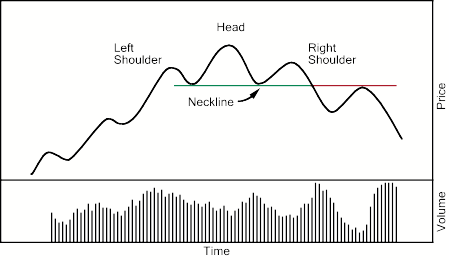
This pattern forms in an uptrend and its completion
marks a trend reversal. The
pattern contains three successive peaks with the middle peak (head) being the
highest and the two outside peaks (shoulders) being lower. The reaction lows of each peak can be
connected to form line of support called a neckline. The top reversal
pattern is completed when price breaks below the neckline.
While it is preferable that the left and right shoulders
be symmetrical, it is not an absolute requirement. They can be different widths
as well as different heights.
It's important to realize that up until the point where prices move back below the level of the left shoulder, things look like a normal, ongoing uptrend. It is only when the left shoulder's price level is violated that the bulls become fearful and the bears start to smell blood. The right shoulder forms as the bulls try to reestablish the uptrend and then fail - usually because many of the more skittish investors will take profits at that point.
As the Head and Shoulders top reversal pattern unfolds,
volume plays an important role in confirmation. Buying volume (volume on up days) will slowly translate into selling
volume (volume on
down days) as the pattern develops.
This is seen when volume that previously expanded on rallies begins to
expand on declines and contract on rallies.
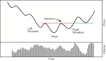
The Head and Shoulders bottom reversal pattern is just
the reverse of the top reversal pattern with volume acting as a
confirmation.
As with the Head and Shoulders top reversal pattern,
volume action is helpful in confirming the trend reversal. Volume that was previously expanding on
declines begins to expand on rallies and contract on declines as the trend
reversal develops.
Traders begin noticing lighter selling volume on the
declines and heavier buying volume on the rallies. This kind of price and volume action is quickly noticed by
the market which results in additional buying volume supporting the trend
reversal.
A couple of other comments about this pattern:
- Sometimes several left shoulders will form before a true head appears. Sometimes several right shoulders appear before a true neckline break occurs.
- When a neckline break occurs, the stock will often fall at least as much as the distance from the neckline to the top of the head.
- Head and Shoulder patterns are easy to find but hard to confirm. Make sure that the pattern is based on real fear/greed and confirmed by volume before acting on it.
Other Reversal Patterns
Many of the technical analysis books out there will go on to talk about several other kinds of reversal patterns - the rounding bottom, the V-reversal, double tops, triple bottoms, and others. (We have many of them cataloged in our ChartSchool area.) I'm going to tell you a secret - most of those are just variations of the Head and Shoulders reversal which didn't form "perfectly" for some reason. For example, the triple top is a Head and Shoulders pattern where the head didn't go above the left shoulder.
The key point here is this - don't worry about what type of reversal is occurring. Knowing that it's a triple top instead of a H&S top won't make you more money. Focus on the fact that the chart is telling you that the fear/greed ratio is changing and react accordingly.
Next time, we'll look at the question "how much is too much?" One of the catalysts behind Thursdays heavy stock selling was the
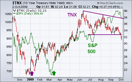
breakdown in Treasury bond yields. The 10-Year T-note yield fell below
its July low to the lowest level in more than four months. Bond yields
are an indicator of confidence in the economy. When investors are
optimistic, they buy stocks and sell Treasuries. That pushes bond
yields higher. When they're more pessimistic, they sell stocks and buy
Treasuries. That pushes yields lower. So the direction of Treasury bond
yields has some bearing on the direction of stocks. That's been
especially true over the last two years. The weekly bars in Chart 1
compare the trend of the 10 Year Treasury Note Yield (TNX) to the S&P 500
(green line). At least two things are apparent. One is that bond yields
and stocks have usually trended in the same direction. The second is
that bond yields have tended to change direction first. Bond yields
started dropping during the summer of 2007 several months before stocks
peaked. Bond yields started bouncing at the start of 2008 and
anticipated a stock rebound that spring. After falling together during
the second half of last year, bond yields turned up several months
before stocks. Chart 2 shows bond yields turning up in January of this
year two months before stocks' March bottom. Bond yields peaked in
June, however, and have been weakening since then while stock prices
have risen. That "negative intermarket divergence" grew more serious
with yesterday's breakdown in yields.
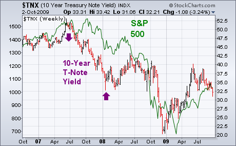

One of the catalysts behind Thursdays heavy stock selling was the
breakdown in Treasury bond yields. The 10-Year T-note yield fell below
its July low to the lowest level in more than four months. Bond yields
are an indicator of confidence in the economy. When investors are
optimistic, they buy stocks and sell Treasuries. That pushes bond
yields higher. When they're more pessimistic, they sell stocks and buy
Treasuries. That pushes yields lower. So the direction of Treasury bond
yields has some bearing on the direction of stocks. That's been
especially true over the last two years. The weekly bars in Chart 1
compare the trend of the 10 Year Treasury Note Yield (TNX) to the S&P 500
(green line). At least two things are apparent. One is that bond yields
and stocks have usually trended in the same direction. The second is
that bond yields have tended to change direction first. Bond yields
started dropping during the summer of 2007 several months before stocks
peaked. Bond yields started bouncing at the start of 2008 and
anticipated a stock rebound that spring. After falling together during
the second half of last year, bond yields turned up several months
before stocks. Chart 2 shows bond yields turning up in January of this
year two months before stocks' March bottom. Bond yields peaked in
June, however, and have been weakening since then while stock prices
have risen. That "negative intermarket divergence" grew more serious
with yesterday's breakdown in yields.

Chart 1
Charts 2
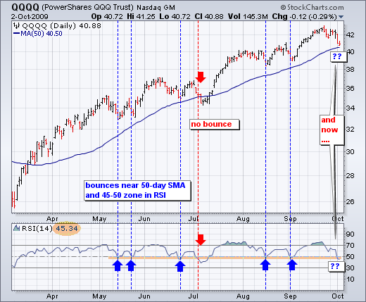
With a sharp decline over the last eight days, the Nasdaq 100 ETF (QQQQ) is testing support from the rising 50-day moving average and RSI is testing support around 45-50. QQQQ broke the 50-day moving average briefly in July, but held the 50-day during the May, June, August and September pullbacks. Some bounces were bigger than others, but the moving average held for the most part. A clean break below the 50-day would be negative for the current uptrend.
Click this chart for more details.
The bottom indicator window shows 14-day RSI. Notice the support zone around 45-50. RSI held this support zone in May, June, August and September. Again, the only breach of support occurred in July (red arrow). This also coincided with the breach of the 50-day moving average. With RSI again in this support zone, a momentum test is upon us. Failure to hold this zone would be negative for momentum and possible signal the start of an extended correction.
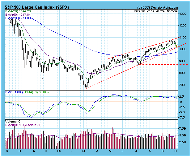
The market has begun another correction, but so far no serious
technical damage has been done. The S&P 500 remains within the
grasp of an ascending wedge formation, the dominant feature on the
daily chart. On Friday prices hit their lowest level of the correction,
but they remained above the support of the 50-EMA and the rising trend
line. Next major support is at the 200-EMA.
As regular readers know, it is most likely that prices will
break down from the rising wedge pattern, and I am inclined to believe
that will happen in this case. Internal conditions for the medium-term
are neutral to slightly overbought, and I think the market needs to get
medium-term oversold before the correction will end. Also, it is
October, and a certain amount of ugliness should be expected. I hear
that a number of people are expecting a crash, but I see no evidence
that would make me anticipate anything more than a normal correction.
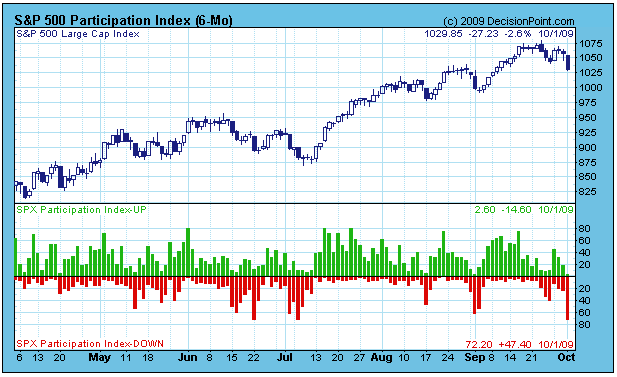
The following Participation Index (PI) chart shows that the short-term
market condition is oversold. This could signal a short-term bounce, or
the end of the correction. The latter is unlikely because the market
needs to get more oversold medium-term before another up leg begins.
Bottom Line: It is very likely that the S&P 500 will break down out
of the rising wedge pattern soon. With luck a breakdown will be
followed by a healthy correction, but we are in a bull market and I
wouldn't bet on anything worse than that.
I've cautioned recently about the risks of being long in the market. There were too many warning signs. Yes, the market could have kept its head down and pushed to higher levels. But that wouldn't have been the healthy way to extend the recent uptrend. Many of the major indices failed at critical long-term resistance and now must regroup from lower levels as they approach key short-term support levels. I'm featuring a few key indices/ETFs in order to highlight the importance of the resistance levels tested. Check these out below:
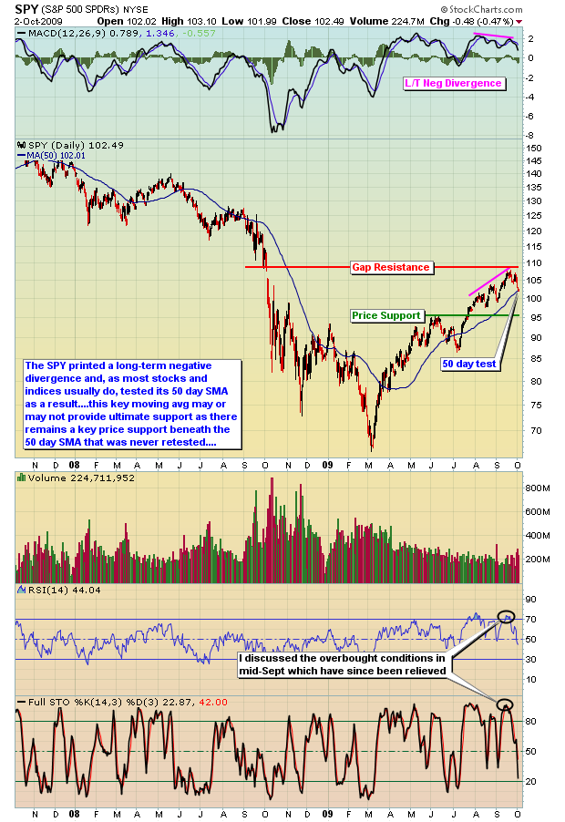
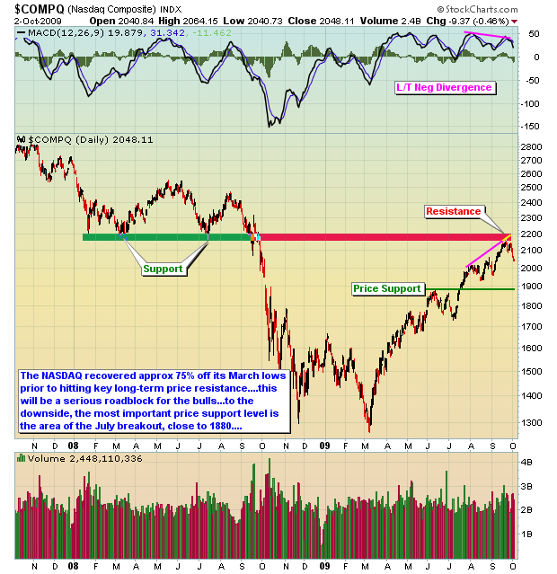
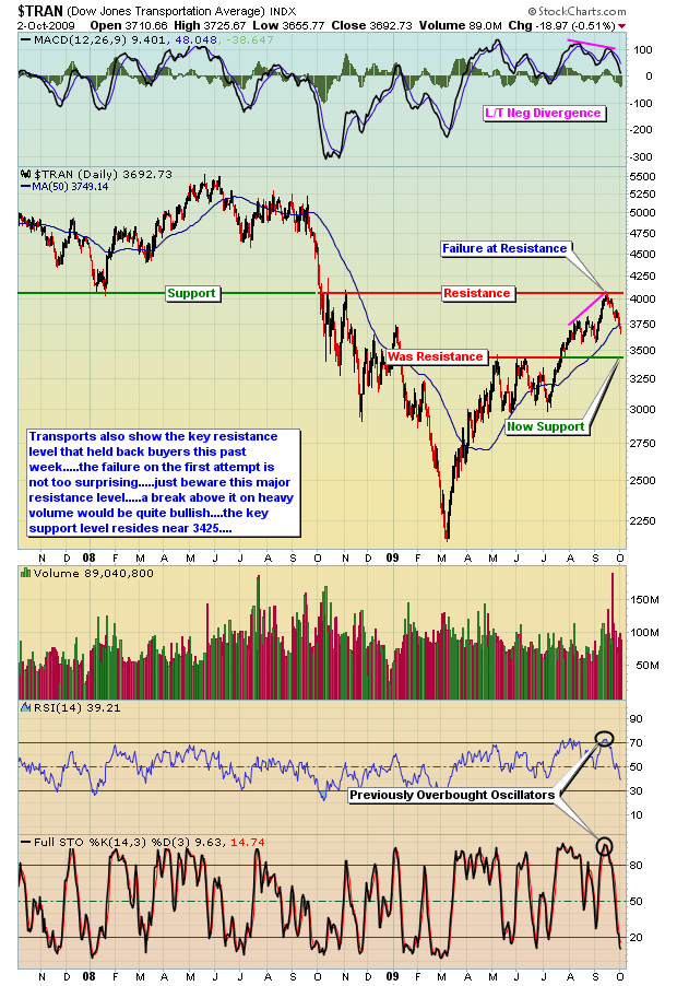
I used the SPY chart above instead of the S&P 500 in order to reflect the gap resistance present on SPY that doesn't appear on the S&P 500 chart. Notice how the price of SPY climbed almost exactly to the top of that gap before failing and rolling over to the downside. Sellers were lined up at that level, knowing full well that a close above gap resistance would likely trigger more short covering and more technical buyers. The failure on this first test should come as no surprise. You can also see that the technology-laden NASDAQ and the economically-sensitive transports also failed at key resistance. Given the recent overbought conditions, negative divergences on the MACD, and complacency readings on the equity only put call ratio, a pullback was very much needed. In my last article, I indicated the record number of equity calls traded on September 16th and 17th. Take a look at the NASDAQ 30 day chart below to understand why following this sentiment indicator is so important. The combination of a very low equity only put call ratio AND the high volume of options traded suggested that an important top was forming, just as it did in early May. While the top didn't occur exactly on September 16th/17th, the market had little fuel in the tank after the extreme complacency readings that were mentioned two weeks ago.
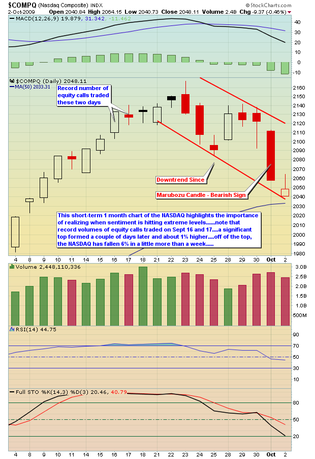
Many of the red flags that have tormented the market the last few weeks have been eliminated, making it easier for the uptrend to resume. However, we must all be aware of the fact that the July breakout occurred from much lower levels and that the 50 day SMA may not necessarily hold as support near-term. A final line in the sand should be drawn at the price level where June highs were eclipsed during the July uptrend. That's your critical price support level.
Happy trading!
Complacency, complacency and more complacency. While the media worries about a correction in the strong cyclical bull market, they should quite simply be considering whether or not the cyclical bull has indeed topped out and a cyclical bear market has begun. This is the nature of higher prices; market participants tend to extrapolate the present far into the future - and this is what most market participants are doing right now.
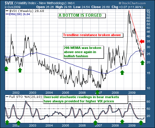
To wit, note the CBOE Volatility Index ($VIX) has forged a low at the 23 level after having traded to mind-numbing 80. Where everyone was bearish the broader market at the highs; they are bullish at the lows. But the lows now look to be turning higher once again, and we should see traders start to notice that trendline resistance was in fact given in bullish fashion; we should further note that the weekly stochastic is turning higher from oversold levels once again. In the past, this has increased the probability of a larger market decline than not; so buyers should be beware. The time to have been bullish is past; the time to consider bearish positions is here. Rallies are to be used to put on short positions; not dips to be buyers. There is a distinction; and it is important to one's trading health.
