TECHNICAL ANALYSIS 101 - PART 15by Chip Anderson | ChartWatchers This is the next part of a series of articles about Technical
Analysis from a new course we're developing. If you are new to
charting, these articles will give you the "big picture" behind the
charts on our site. if you are an "old hand", these articles will help
ensure you haven't "strayed too far" from the basics. Enjoy!
(Click here to see the entire series.)
Price charts often have blank spaces known as gaps. They represent times when no shares were traded within a particular price range. Gaps result from extraordinary buying or selling interest developing when the market is closed. When the market opens, the price is raised or lowered enough to satisfy all of the buying or selling orders.
For an up gap to form, the low price after market close on the day of the up gap must be higher than the high price of the previous day. Up gaps are generally considered bullish.
A down gap is just the opposite of an up gap; the high price of the down gap day after market close must be lower than the low price of the previous day. Down gaps are usually considered bearish.
Up and down gaps can form on daily, weekly or monthly charts and are considered a significant when accompanied with higher than average volume.
A price chart with gaps almost every day is typical for very lightly traded securities and should be avoided. Prices often gap up or down at market open and then close the gap before market close. Such temporary intraday gaps should not be considered as having anything more significance than normal market volatility.
Many investors mistakenly believe that gaps influence future prices to the point of eventually filling the gap. Instances where gaps close within a few days of forming can be significant. However, gaps have little to no influence on price action weeks or months after forming.
Breakaway gaps signal a change in market psychology about the future prospect of a security, especially when accompanied by above average volume. A bullish breakaway gap forms when a security gaps up after an extended decline, extended base or a consolidation period. A bearish breakaway gap forms when a security gaps down after an extended advance, an extended top or a consolidation period.
Common gaps occur within a trading range or shortly after a sharp move as a reaction. These gaps do not reflect a change in market psychology, but rather represent price volatility or temporary imbalance of supply and demand. For instance, if a security has declined 20% in a week and gaps up, it would be considered a common gap and not likely to signify a change in trend. Or, if a trading range develops between $20 and $30, and a gap forms in the middle, it is probably a common gap.
Continuation gaps form near the middle of a short or intermediate trend in the same direction. These gaps signal a continuation of the preceding trend. Continuation gaps are also known as measuring or runaway gaps. These gaps can be triggered by news events that bring more market attention to a security.
Exhaustion gaps occur in the direction of extended trends. For an exhaustion gap to be considered valid, prices should reverse soon after the gap and close the gap. In the later stages of a trend, the extent of the trend becomes widely reported; eventually causing a surge in trading that cannot be sustained. These events often mark the end of the trend.
Next time, we'll start looking at Candlestick Chart Patterns.
BARRICK AND NEWMONT MINING TURN UPby John Murphy | The Market Message With gold hitting new record highs each day, gold stocks are starting
to play catch-up. Two of the biggest are at or very close to hitting
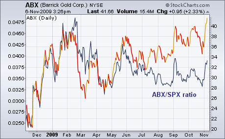
new 52-week highs. Chart 1 shows Barrick Gold closing
at a new 52-week high today. The gray line is the ABX/SPX ratio which
has been dropping since February and just starting to rally. Chart 2
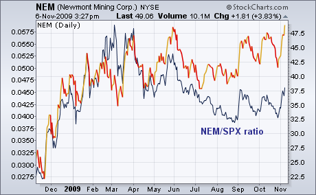
shows Newmont Mining closing at a new 52-week high as
well. Its relative strength ratio (gray line) is turning up as well.
What the two RS lines tell us is both big gold stocks are pretty good
values relative to the rest of the market and are starting to show
upside leadership for the first time in eight months.
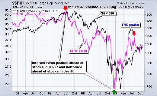
The 10-Year Treasury Yield ($TNX) is largely positively correlated with the S&P 500 - and also shows a propensity to lead the stock market. The chart below shows the 10-Year Treasury Yield peaking in July 2007 and stocks peaking in October 2007, three months later. Similarly, the 10-Year Treasury Yield bottomed in December 2008 and stocks bottomed in March 2009, again 3 months later. The 10-Year Treasury Yield now has peaks in early June and early August. In addition, the 10-Year Treasury Yield broke below its July low with a decline into early October. Should the current pattern hold, the stock market would be expected to peak between September and November. This period is three months after the June peak and three months after the August peak in the 10-Year Treasury Yield ($TNX). If we take the middle, then that means an October peak for the stock market. So far the S&P 500 remains above its early October low and the medium-term trend has yet to reverse.
Click this chart for details.
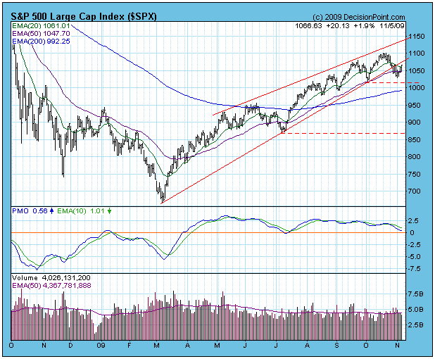
Looking at the S&P 500 chart below, the breakdown from the
ascending wedge pattern is clear enough, and expectation of the
breakdown has been fulfilled. The rising trend line violation brings
with it the expectation of a continued decline, but I do not have a
price target at this time. The horizontal dotted lines show the closest
and furthest likely support levels, but I have no expectations
regarding either one.
At this point, I am still expecting a price low at the end of
this month based on the 20-Week Cycle low projection, but it doesn't
look as if the price correction will be too severe. My reasoning is
that so far short-term oversold conditions are generating very strong
bounces. Of course, this could change in a heart beat, so keep an eye
on it.
Technically speaking, we do not yet have a down trend -- we need a lower high and a lower low.
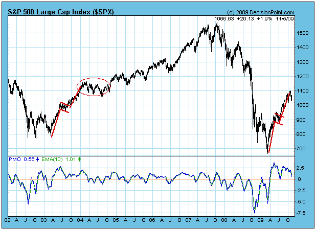
When we think of a correction, we usually imagine a fairly straight
forward decline, but there are other possibilities, such as a
consolidation phase. When I looked at the longer-term chart below, it
struck me how similar the current rally is to the rally off the 2003
low. There was a sharp leg up, followed by a short consolidation,
followed by another leg up. At that point, many people expected a
corrective decline. Instead, there was a sideways consolidation with a
modest downward bias. I do not assert that the same kind of pattern
will evolve this time. I just wanted to illustrate the possibility of
other outcomes.
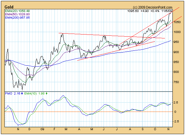
Gold hit an all-time high this week, and it is rising in the face of
rising currencies. Gold typically falls when currencies are rising, so
many analysts are suggesting that people are starting to view gold as
the new reserve currency. On the chart below you can see that gold is
being contained by a rising trend channel, so the next move should be
back to the bottom of that channel; however, if people are moving away
from paper currency, there is the possibility for gold to go ballistic.
Bottom Line: Based solely upon the rising trend line violation, I am
assuming that the market is in a corrective phase that will last for
several weeks; however, a declining trend has not yet been established,
and my assumption could be premature.
In my latest article on October 18, I provided a very cautious tone but noted that volume trends remained strong - good news for the bulls! Well, short-term volume trends now have turned negative, though the really key long-term price support levels remain intact. A couple damaging technical developments make the end of week rally very suspect. In the chart below on the NASDAQ 100 (or NDX), check out several annotations of significance:
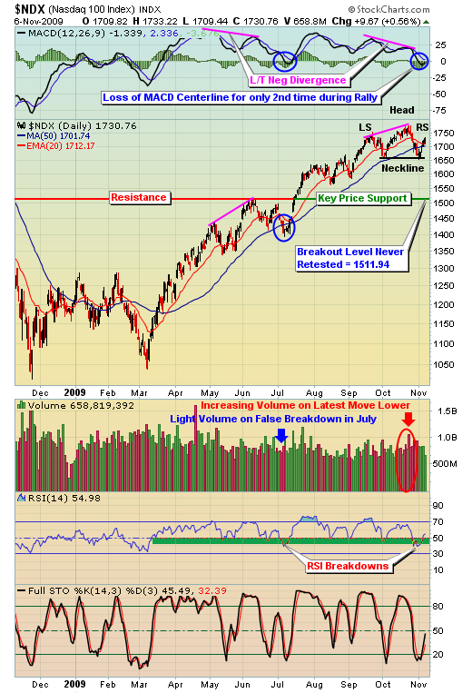
There's a lot of information on this chart to digest so let's address each item, one at a time. First, notice since the March lows, we've seen the daily MACD break below its centerline only twice - once in early July and the other just recently. The MACD centerline breakdown in July was accompanied by a breakdown beneath the 50 day SMA as well, just like we're seeing now. The big difference though, in my view, is that the volume that accompanied the breakdown in July was extraordinarily light. Recently, our breakdown has occurred with the heaviest down volume since the March lows. This is a big red flag until it's resolved with a heavy volume breakout to the upside.
Next, notice the bearish head & shoulders pattern that has developed. This pattern is not confirmed until we see a breakdown beneath the neckline on heavy volume. Bottom line, the bears' work is not done yet. It is, however, a beautiful symmetrical head & shoulders pattern, the easiest to identify visually. Here are some of the key attributes of this head & shoulders pattern:
(1) Downsloping shoulders (from left to right) thus far, generally more bearish than upsloping shoulders
(2) Left shoulder peak = 1754.54
(3) Right shoulder peak (thus far) = 1733.22 (lower than left shoulder)
(4) Downsloping neckline, generally more bearish than upsloping neckline
(5) Left side of neckline = 1656.57
(6) Right side of neckline = 1652.44 (lower than left side of neckline)
(7) Distance between top of head (1780.83) and right side of neckline (1652.44) = the potential measurement on a breakdown, or 128.39 points
(8) Target on breakdown = right side of neckline (1652.44) minus measurement (128.39) = 1524.05.
The target on a potential breakdown is very interesting because it would represent a level that is less than 1% above the July breakout level that was never retested. One of the basic tenets of technical analysis is that a price resistance level, once broken, becomes price support. Usually such breakouts result in a later retest of the breakout level. In the case of the July breakout, however, we have yet to see a retest. This is the primary reason why I believe a short-term breakdown, if one were to occur, may only be temporary to backtest the July breakout. I still view the July breakout level to the be biggest technical price support level on the various indices and sectors. A head & shoulders breakdown could lead us exactly where we need to go technically, at least from a price support perspective.
The reason for studying the NDX instead of our other major indices is quite simple. The NDX is comprised of many of the higher risk, higher beta names among the medium to large cap companies. When market participants have an appetite for risk, the NDX begins outperforming the S&P 500. We normally see this outperformance just before major bottoms are formed. Likewise, the NDX usually begins to underperform the S&P 500 just before tops are reached. So a quick review of the relative performance of the NDX vs. the S&P 500 can yield very important clues about how market participants view the market. In our world at Invested Central, this is one of many "under the surface" clues we regularly watch to identify changing market conditions.
Below is a relative chart that dissects the performance of the NDX relative to the S&P 500. Check out the chart and explanation below:
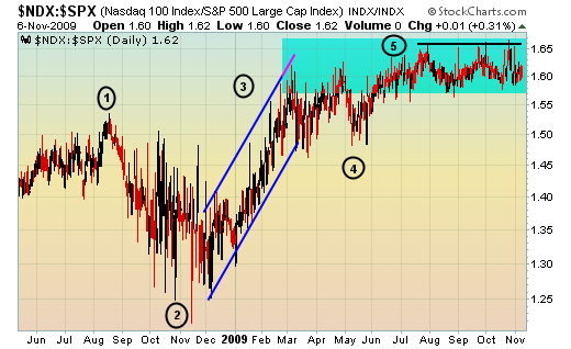
A few items stand out and are explained as follows:
Point 1 - represents the peak of outperformance by the NDX, just one month before the market's major meltdown that kicked into full gear by mid- to late-September 2008.
Point 2 - notice that in November 2008, the NDX began to outperform the S&P 500, a few months BEFORE the S&P 500 actually bottomed.
Point 3 - outperformance by the NDX on a relative basis was significant from November 2008 to March 2009 as the S&P 500 bottomed. Investors were showing their appetite for risk long before the market bottomed
Point 4 - By late April/early May 2009, this relative ratio was hitting levels that we're still failing to break above, a potential warning sign.
Point 5 - currently, this is the biggie. As the major indices continue to break out month after month during this uptrend, why isn't the NDX outperforming? I believe the appetite for risk is waning despite the higher equity prices. If this relative ratio falls back beneath 1.55, it would signal a major shift in market sentiment.
Bottom line, the warning signs are out there and watching the price/volume trends turn negative short-term adds to our cautious stance.
Happy trading!
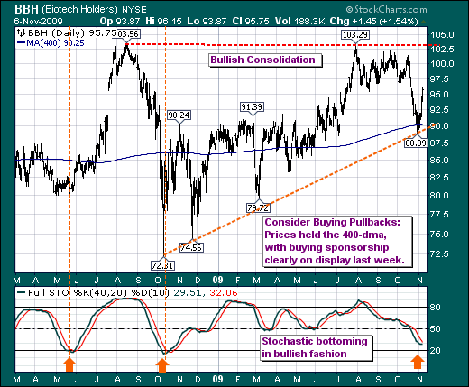
BIOTECHNOLOGY ETF FINDING SPONSORSHIPby Richard Rhodes | The Rhodes Report We find it rather interesting that the laggard Biotechnology group and the Biotechnology ETF (BBH) in particular have begun to find sponsorship; and it is our opinion that BBH is set to embark upon a period of both absolute and relative out-performance. Quite simply, BBH is forming a rather large and bullish consolidation, which implies prices will move above previous high resistance at $103.50 - a level that has proved for weakness in the past. But the prime reason we should consider long positions is that the 400-day moving average has held, while the longer-dated 40-day stochastic is bottoming in bullish fashion.
From a trading perspective, we would look to buy weakness as it develops in the days ahead. The four largest stocks in the index are Amgen (AMGN), Biogen (BIIB), Gilead (GILD) and Genzyme (GENZ). We have our opinions about the individual shares, and needless to say that AMGN isn't at the top of our list. Those looking to perhaps out-perform BBH...should choose a combination of GENZ and GILD and perhaps some of the other junior shares.
The fact of the matter is Biotechnology is going higher; choose your vehicle carefully.
