TECHNICAL ANALYSIS 101 - PART 16by Chip Anderson | ChartWatchers This is the next part of a series of articles about Technical
Analysis from a new course we're developing. If you are new to
charting, these articles will give you the "big picture" behind the
charts on our site. if you are an "old hand", these articles will help
ensure you haven't "strayed too far" from the basics. Enjoy!
(Click here to see the entire series.)
Candlestick Patterns
A series of candlesticks often develop into recognizable patterns that can give a trader insight about the current market psychology and likelihood of near term price moves. Many of these 1, 2 or 3 candlestick patterns are used as warning signs for upcoming trend reversals.
Dozens of candlestick patterns have been identified dating back to the 1700âs with Japanese rice futures traders. Japanese traders were able to quickly identify and communicate short term supply and demand forces in the market with these recurring patterns of price action.
Doji Candlestick

One candlestick that has significance by itself and in combination with other candlesticks is the Doji candlestick shown above. Price moves above and below the opening price during the day and then closes at the same, or nearly so, price as opening. This is an indication that buying and selling market forces were balanced even though investors had a rollercoaster ride in price swings during the day.
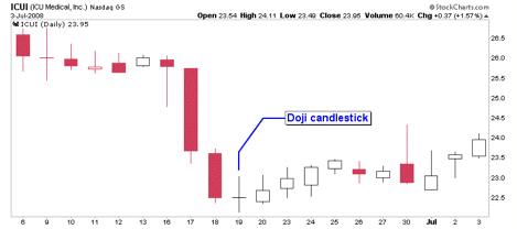

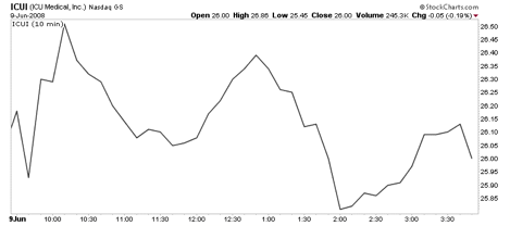
The SharpChart of ICUI above illustrates a doji candlestick. The intraday 10 minute SharpChart of this particular doji candlestick below shows the 5.5% price swing from high to low that investors endured during the day. Doji candlesticks are a sign of market indecision which often precedes trend reversals.
With doji candlesticks, a long lower shadow is considered bullish since buying interest moved the price up from a deep intraday decline before market close. Long upper shadows are bearish for a similar reason; initial buying interest gives way to sellers by market close.
Doji Candlestick Formations
The candlestick patterns above are often present in trend changes. The doji in these patterns illustrate how market indecision often acts as a pivot in trend changes.
Other Important Candlestick Patterns
While there are literally hundreds of candlestick patterns out there, the following candlestick patterns have been found by Thomas N. Bulkowski to be six of the most reliable candlestick patterns based on testing on 4.7 million candle lines.
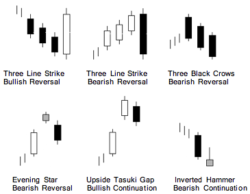
Note: The gray candlestick bodies in the diagrams indicates that the body color is not relevant for the subject pattern.
Additional candlestick reliability information can be found in Bulkowskiâs book Encyclopedia of Candlestick Charts. while Greg Morris' book Candlestick Charting Explained is a good general introduction to the topic.
Next time: Comparison Charting!
FINANCIALS CONTINUE TO SURGEby John Murphy | The Market Message On Tuesday, I showed the financial sector in the process of turning
from a market laggard into a market leader. Chart 1 shows that new
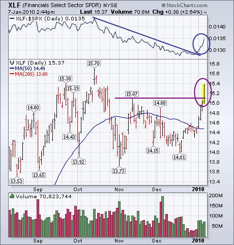
financial leadership continuing. The Financials SPDR (XLF)
has now exceeded its mid-November peak at 15.07 to turn its short-term
trend back up again. That puts the XLF in position to challenge its
October high. The upturn in its relative strength ratio (top of chart)
shows financial stocks starting to outperforming the S&P 500 for
the first time since mid-October. Similar bullish patterns are now
visible in most financial stocks. One of the biggest, which I showed on
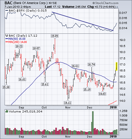
Tuesday, is Bank Of America. Chart 2 shows that bank
leader trading over 17 for the first time in nearly three months. The
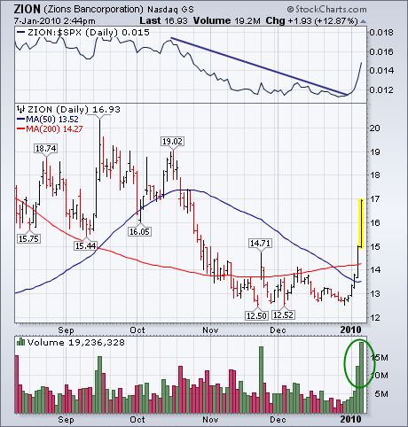
sector's top percentage gainer today is Zions Bancorp.
Chart 3 shows that financial service company surging 12% on huge
volume. That's a bullish combination. Both of those stocks are also
showing rising relative strength lines. Regional banks are also having
a very strong day.
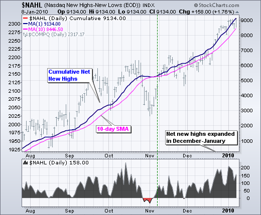
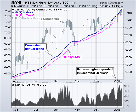
With the advance over the last 3-4 weeks, Net New Highs expanded to their highest levels since October. Net New Highs equals new 52-week highs less new 52-week lows. The bulls have a clear edge when Net New Highs are positive and rising. Conversely, the bears have an edge when Net New Highs are negative and falling. The bottom window in first chart shows Net New Highs for the Nasdaq moving above +200 in early January. This total fell to +158 on Friday, but Net New Highs are clearly in positive territory and this is bullish. The main window shows Cumulative Net New Highs. Like the AD Line, this line rises when Net New Highs are positive and falls when Net New Highs are negative. Except for a brief dip at the end of November, this line has been rising for months. The second chart shows NYSE Net New Highs expanding in December-January as well.
Click this chart for details
Click this chart for details
STILL NO DECISIVE MOVEby Carl Swenlin | DecisionPoint.com One would think, after a three-week hiatus, that there would be plenty
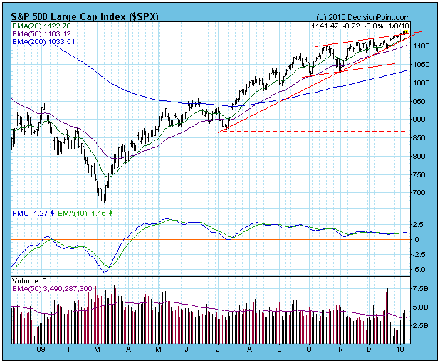
to write about the market. But there isn't. The S&P 500 has drifted
higher in an ever-narrowing ascending wedge pattern, making little
progress. Since the mid-October top, the S&P 500 has only gained
about 40 points. You can see on the chart that the price index has kind
of oozed above the top of the wedge, but only by a tiny amount, and
certainly not decisively. In my opinion, the ascending wedge has not
yet been resolved, and the most likely resolution will be to the down
side.
While I think a medium-term top is a strong possibility, I have no
reason to think that a long-term top is likely. My Chart Spotlight
article of 12/18/2009 still reflects my view for all time frames. Our
Thrust/Trend Model (T/TM) is still on a buy signal as of 3/17/2009.
Bottom Line: We have been in an extended period of low
volatility, and a period of high volatility is sure to follow. That
will probably materialize as a medium-term correction; however, the
long-term technical outlook is positive.
Happy New Year!!!!
It's been awhile since I've spoken about the financials in a positive light. As sector rotation continues though, it appears as if the financials may get their turn after all. I've been watching bank after bank, financial after financial, either moving to a fresh 52 week high or blowing past 50 day SMAs over the past couple weeks, this latest week especially. JP Morgan (JPM), Bank of America (BAC) and Wells Fargo (WFC) are among the largest financials and have led the parade. Volume on these stocks and other financials was on the rise as well, helping to confirm the move. A strong financial group has been the one missing ingredient to what otherwise has been a very bullish move off the March 2008 lows. During the first two months of the rally, financials were a relative leader. Since then, however, they have languished.
I believe one of the most important factors in seeing higher equity prices in 2010 is a rebounding financial sector, relative to the S&P 500. It needs to happen. A healthy financial sector leads to credit for small business and opens up job opportunities for the unemployed. Now that the monthly job losses have moved closer to the zero line, the next step to take equity prices higher is to actually begin to add jobs each month and lower the unemployment rate. Again, this brings me back to the need for participation from a healthier financial sector. Technical analysis is based on the premise that price action will precede fundamental changes. Therefore, it stands to reason that before we'll see additional improvement from financials, we'll need to see technical improvement first. Take a look at the chart below:
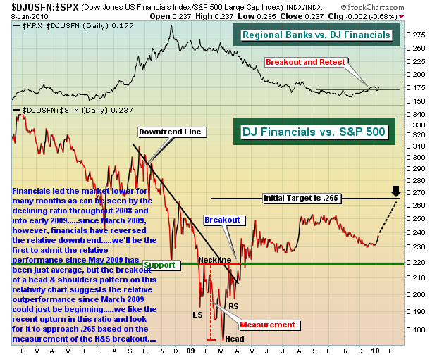
The above chart really highlights two things. First, notice that financials have yet to make their initial relative target of .265 based on their measurement from the bottoming head & shoulders pattern I've identified. This is important because technical conditions are predicting relative outperformance from financials in the days and weeks ahead. Take note that there has been relative weakness, not strength, from financials from mid-October through the end of 2009. But as we look for a catalyst to take equity prices higher in 2010, financials may be emerging with relative strength at just the right time. The relative strength line has turned higher in the first week of the year and I've provided a dotted line above to forecast what we might see over the next several weeks.
The second item of note in the chart above is the top portion of the chart, where I'm showing the performance of the bank index, relative to the Dow Jones US Financial Index. That ratio has not only turned higher, but for the first time since the downtrend began in late 2008, I'm actually seeing higher highs and higher lows in this relative ratio. So two things are occurring here - financials are beginning to show relative improvement vs. the overall market AND banks are outperforming within the financial space.
I'm expecting the financials to continue to perform well and, as a result, have scanned for banks within the space that appear solid technically. We're featuring one of them, Webster Financial Corp (WBS) as our Chart of the Day for Monday. Click Here to see an annotated chart on WBS and my video analysis.
Happy trading!
ROTATION THE THEME OF 2010by Richard Rhodes | The Rhodes Report Rotation, rotation and more rotation. This is what 2010 will be about, with the first week of trading a very good example of what to expect. During 2009, there were only 3 S&P sectors out of 10 that out-performed the S&P 500: Consumer Discretionary, Basic Materials and Technology. Thus far in 2010, we've seen relative weakness in the Consumer Discretionary and Technology groups, with money rotating into the Energy group. This interests us greatly, for it presents an excellent relative trading opportunity to be long Energy and short the S&P 500.
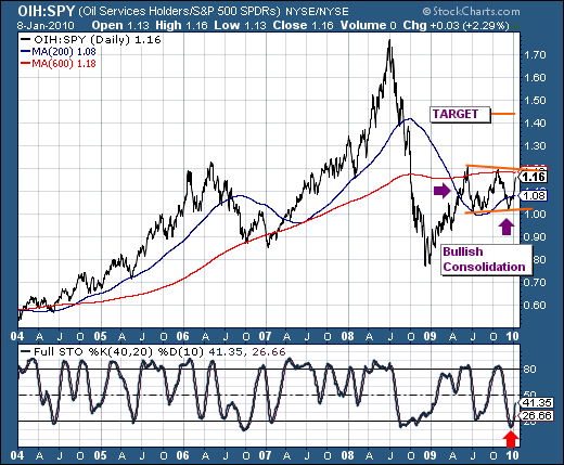
We've chosen the Oil Service HOLDr (OIH) as our energy group of choice, given it is "higher beta" than many other energy groups. The chart clearly shows the OIH / SPY ratio bottomed in December-2008, and has done nothing more than consolidate those gains in bullish fashion since May-2009 - and having done so above the 200-day moving average. The current surge has developed with the 40-day stochastic turning higher from oversold levels, which we suspect will be sufficient to push the ratio through the 600-day moving average towards our ultimate target near 1.45 from its current 1.16.
Good luck and good trading,
Richard