Hello Fellow ChartWatchers!
I am thrilled to officially announce that StockCharts.com now provides free real-time charts and quotes for everyone!
Thanks to the BATS exchange and the fine folks at IDC/Comstock, our free users and our Basic and Extra members are now able to see charts based on non-delayed price data during market hours. The data comes directly from the BATS exchange and we highlight it in yellow on our charts.
While that change is very exciting, it is important to keep in mind several differences between real-time data from BATS and the "official" real-time data from the NYSE, Nasdaq and TSX exchanges (which our "ExtraRT" subscribers see). Those differences include:
- The "real real-time" data that ExtraRT subscribers see comes
directly from the NYSE, Nasdaq, or TSX stock exchanges. It is the
"official" data for a particular stock. If you place a typical trade
order with your broker, they will execute the trade using those prices.
- The "free real-time" data that appears on our non-ExtraRT charts
comes from the BATS exchange. The data is often very similar to the
"official" data from the major exchanges, but there can be small
differences in prices. The volume information that the BATS exchange
provides is much, much lower than the volume data from the major
exchanges.
- Because "free real-time" data is different from the "official"
data, we highlight it in yellow on our charts. Real real-time data is
highlighted in green.
- We only display "free real-time" data for 20 minutes on our
charts, After that, we replace the "free real-time" bar(s) with
delayed "official" bars from the major exchanges. For 1-minute and
5-minute charts, we place a vertical, dashed yellow line on the chart
to show where the free real-time bars end and the official bars begin.
- We do not display volume information with the free real-time bars
because the volume data from the BATS exchange is so much smaller than
the official volume data. We also do not display any volume-based
indicators in the "free real-time" section of the chart.
- Not all stocks that we track have free real-time data available for
them. There is no free real-time data currently available for Canadian
stocks or for Pink Sheet stocks. Other thinly traded stocks will
probably also not have BATS data either.
Here is what a 1-minute BATS real-time chart looks like on our website when the market is open:
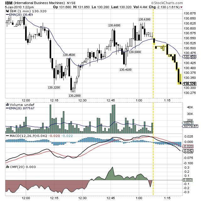
The dashed yellow line is the dividing line between the BATS data (on the right) and the official NYSE data (on the left). As time goes on, we update this chart in two ways:
- We update the most recent bar (on the far right) with BATS data - adding new bars as necessary.
- We replace the oldest BATS bar (the one next to the dashed yellow line) with official NYSE data as soon as possible; after 15 minutes in this case.
This chart also shows how we do not display volume or volume-based indicators like the CMF for the BATS part of the chart.
5-minute charts work very similar to the chart above. Longer period charts however will not display the dashed yellow line because they only have one BATS-based bar. Those charts - including the daily and weekly charts that free users see - are based on real-time quotes from the BATS exchange and the phrase "+ BATS" appears next to the exchange label in the upper left corner of the chart.
In summary: if you need real-time data for ALL stocks (including Canadian stocks), you'll still need to subscribe to our ExtraRT service. If you need to see real-time volume information, you'll still need to subscribe to our ExtraRT service. But, if those things aren't important, our new BATS-based real-time charts should work well for you and save you some money.
Enjoy! and let us know what you think of the change.
- Chip
(Note: If you currently subscribe to ExtraRT and would like to downgrade to the less expensive Extra + BATS service, please watch the "What's New" area of the homepage next week for an announcement about how to do that.)
ON HIATUS THIS WEEKby John Murphy | The Market Message John Murphy is on hiatus this week. His article will return in the next issue.
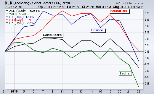
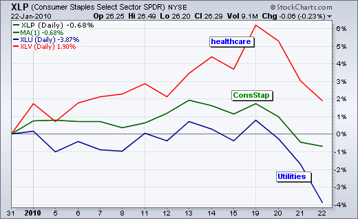
OFFENSIVE SECTORS TAKE A HITby Arthur Hill | Art's Charts Offensive sectors took a hard hit in January. Offensive sectors include technology, consumer discretionary, industrials and finance. I call them the offensive sectors because their participation is key to a bull market. Technology represents growth and the appetite for risk. Consumer discretionary is the most economically sensitive sector. Industrials represent big global manufacturers like GE, United Tech, 3M, Boeing and Caterpiller. Finance represents the banking system. The first chart shows the technology SPDR (XLK) as the weakest of the offensive sectors. In fact, it is the weakest all sectors in 2010. Relative weakness in technology reflects risk aversion and a preference for safety (defense). The industrials sector is holding up the best of the four (thanks to a gain from GE on Friday). Healthcare, utilities and consumer staples make up the defensive sectors shown in the second chart. These are the sectors investors turn to in times of uncertainty. Utilities are down sharply. Consumer staples are also down, but not near as much as technology or consumer discretionary. The healthcare sector remains the star performer for the year, and the only sector showing a year-to-date gain.
Click this chart for details
FINALLY A BREAKDOWNby Carl Swenlin | DecisionPoint.com
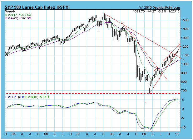
The S&P 500 has finally decisively broken down through the support
formed by the rising trend line that marks the bottom of the ascending
wedge formation. This was the technical expectation, but the market
sure did fight it. The break has also carried the price index through
the 20- and 50-EMAs. I have drawn a dashed line from the November low,
parallel with the upper boundary of the wedge to suggest a possible
bottom of a rising trend channel. This line is not drawn by strict
technical rules, just a bit of speculation on my part.
The first obvious support is at about 1030, not a real problem;
however, the next obvious support is at about 870. That would be great
in terms of a substantial correction, and it would raise fear levels to
the point where a good buying opportunity might appear.
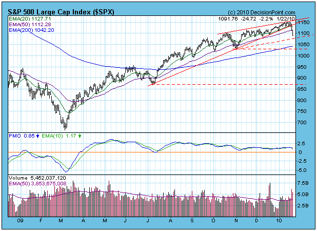
The weekly-based chart of the S&P 500 shows that the PMO has topped
at a very overbought level, hinting that we may be at an important top.
On the positive side, the price index is holding above the long-term
declining tops line.
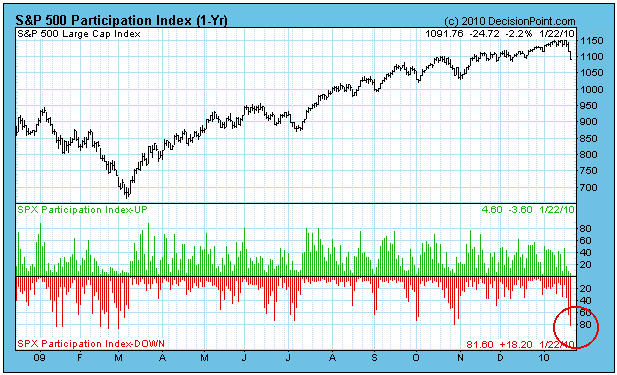
In the short term the market is very oversold, as illustrated by the
Participation Index chart below. This could represent an initiation
thrust for a decline that will last a lot longer, or it could mark the
end of the decline altogether. The latter does not seem likely, but it
would be consistent with the market action we have observed in recent
months.
Bottom Line: We have just witnessed the worst three-day decline since
the March 2009 bottom. I think it is the beginning of a more
substantial decline, but short-term indicators are so oversold that the
next thing we will probably see is a bounce. The most important thing
to watch in the medium term is for 20-EMAs to cross down through
50-EMAs. In most cases, this will change buy signals to neutral
signals, except where the 50-EMA is below the 200-EMA at the time of
the 20/50-EMA crossover. That would be a sell. In the event that the
S&P 500 bounces high enough to exceed the January highs, I would
have to assume that the presently anticipated correction has run its
course.
IT ALL COMES DOWN TO DEFENSEby Tom Bowley | InvestEd Central Ask any NFL coach and he'll tell you unequivocably that defense wins championships. If you're looking for market-beating returns, then you'd better improve your defense first, then your offense. Plain and simple, Invested Central did everything possible to prepare defensively for last week's massacre. Two weeks ago, we acknowledged that the banking sector was showing marked improvement, especially relative to the S&P 500, and that could bode well for later in 2010. And it still might. But at the same time, red flags were being raised and, as a result, we put our members on high alert in the very near-term. In fact, we issued cautious short-term comments beginning around January 10th and we haven't strayed since. The "clouds on the horizon", as we like to call them, exploded into a Category 4 storm, leaving most investors wondering whether the storm will be upgraded to a Category 5 next week. No one can predict with any certainty the timing of a stock market selloff. However, we do have tools to at least know when we should be more defensive. Those tools begged us for two weeks to bring our "A" game when it comes to defense. We've constructed a defensive timeline page to provide details of how we approached the market as this newest of storms emerged, CLICK HERE for more details.
What causes the stock market to drop like it did last week? There are many reasons, but one that always gets our attention is the emotional element that leads to market swings. Fear and greed are present at most pivot points on longer-term index charts. It's just how the market works. When markets bottom, investors and traders usually feel despair and vow to never again place a trade in the stock market. It takes weeks, months, or even years sometimes to create the type of confidence that fuels the opposite emotion of greed. At the height of greed, no risk is too great to take. To me, greed and fear are simply by products of the stock market. Any time the potential of financial reward or threat of financial loss is present, so too will greed and fear. You can ignore it or profit from it. We've chosen the latter and believe you should too.
I've discussed in prior articles the necessity of watching the equity only put call ratio ("EOPCR"). By following the "equity only" put call ratio, you can delve into the true psyche of the retail trader. Many experts follow other sentiment components such as the weekly survey from Investors Intelligence that details the ratio of newsletter writers that are bullish vs. bearish. While I recognize this as being somewhat valuable, it doesn't tell me what folks are doing with their money. Rather, it tells me what they're doing with their lips. Fundamentally, that's a big difference. Not every market period is exactly the same, however. So a high "equity only" put call ratio one period may not necessarily carry the same weight in a different period and different environment. Therefore, I've created what I refer to as a "relative complacency" ratio when the market turns greedy and a "relative pessimism" ratio to identify the periods of extreme fear. In order to measure the "relativity" component of this ratio, I compare a short-term moving average of the EOPCR vs. a longer-term moving average of the EOPCR. Two weeks ago, this ratio touched levels that marked tops twice in August and once in September. Take a look at the chart below:
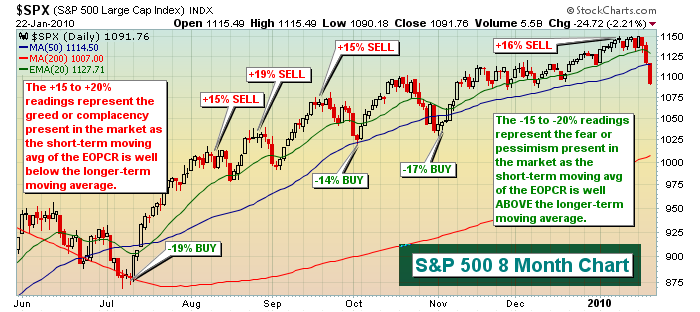
For a thorough explanation about this chart, you can CLICK HERE for the video version, which will also serve as our Chart of the Day for Monday, January 25th. We are now awaiting signs that the market is safe to step back in on the long side. Historically, a reason may be right around the corner as we enter a bullish historical period for the market in the middle part of next week.
Until signs emerge that suggest it's safer to trade on the long side, play solid defense.
Happy trading!
$USD INDICATING A CHANGE?by Richard Rhodes | The Rhodes Report The past week was punctuated with sharp stock market weakness, with many pundits believing that it is transitory and doesn't have the makings of a larger top. Quite obviously, there is nothing definitive at this juncture, but we're giving odds of over 50% that indeed a major top has formed. Our reasoning is a bit circuitous, but suffice to say that it starts with the US dollar. In recent years, larger turning points in the US dollar have preceded larger stock market turning points from 1-to-4 months. If this is the case - and we think it is - then the late-November 2009 USD bottom and the January 2010 stock market high are within the window of marking seminal turning points for each.
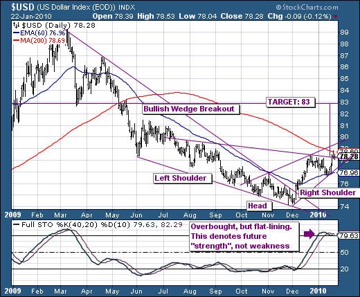
Many do not want to believe the USD has bottomed for a variety of reasons that we understand; however, the technicals behind the USD rally are rather strong at this juncture. The USD broke out of a major declining bearish wedge pattern, which is normally terminal in nature; and in fact it did so from a higher major March 2008 low. We find this compelling; but we find it more so when we consider the confirmed "head & shoulders" bottoming pattern, which has formed just below the 200-day moving average. This would presume a breakout above the 200-day, and would target the 83 level. This would do nothing to upset the bearish apple-cart case in any way, and could possibly bring the technicals back to more neutral levels upon which selling can then reassert itself. But in any case, this USD strength will be coexistent with broader stock market and commodity market weakness from Friday's already weak close.
Good luck and good trading,
Richard