Hello Fellow ChartWatchers!
Here at StockCharts we are fanatical about accuracy. Without accuracy, there would be no reason to use our website. We work hard at it every day. There are two key factors in creating the "cult of accuracy" we have here - first, you need accurate data; then you need accurate calculations. If we get either of those things wrong, our charts suffer and your trust in us diminishes.
Data accuracy is a huge can of worms that I'm not going to address today. I want to spend some time however on Calculation Accuracy because I can show you some specific cases where our Calculation Accuracy exceeds other websites out there. Here is an article I wrote back in 2001. Amazingly, it is still as valid today - 8 years later - as it was back then:
On Accuracy and EMAs
Recently,
someone named "e91978" (really!) wrote us to inquire about our chart
for QLGC. QLGC was closing in on its 200-day Exponential Moving Average
and e91978 was trying to find out if it had closed above or below that
indicator last Monday evening. The charts on their broker's website showed that QLGC
was below its 200-day EMA while our charts showed it was above. Which
was correct?
At first
glance, a question like this may seem unimportant. But the question
goes to the heart of an extremely critical aspect of Technical Analysis
for, you see, many other indicators and overlays used by technical
analysts are based on calculating one or more Exponential Moving
Averages. If someone's EMA's are wrong, then you really should not trust any of their other indicators. With that in mind, e91978 had every right to be concerned.
The answer
to the question lies in the way that Exponential Moving Averages are
calculated. While calculating a 200-day Simple Moving Average is easy
(add up 200 data points and divide by 200), calculating a 200-day
Exponential Moving Average is much trickier. What most people don't
know is that, in theory, every closing price a stock has ever had should be used to calculate any EMA for that stock no matter what the EMA's period is! See our ChartSchool article on Moving Averages for the gory details.
Bottom Line: The less data you use in your calculation, the less accurate your results.
Because some stocks have data going back to the 1920's or earlier, and because the
effect of data from many years ago diminishes over time, most
high-performance charting programs - including ours - actually estimate
the true EMA by performing the calculation on a subset of the stock's
data. If you go back far enough, the estimated EMA will be accurate to
within a fraction of a penny. The trick is knowing how far back is
"good enough" - StockCharts is very conservative here, using more data
than our competitors to make sure that our calculations are correct.
Thanks to e91978, here's the proof:
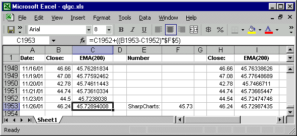
Click here to download the entire spreadsheet.
First off, I created an Excel spreadsheet that contains all of the data for QLGC
going back to when the stock IPO'ed in 1998. I then had Excel calculate
a running 200-day EMA for the stock all the way up until Nov. 26th, 2001
(column C above). The value Excel came up with was 45.72894008. I'm going to consider that to be the "true" EMA value.
Data errors can often throw off sensitive EMA calculations, so next I collected
QLGC data from an independent source (Yahoo.com) and had Excel perform
the same calculations (column I above). Excel's Yahoo-based 200-day EMA
value was 45.72987435 - a difference of 0.000934269 - which is very
close to the first value.
On Nov. 26th, 2001, QLGC closed at 46.24 - fortunately all of the charting sites
did agree on that! Now, 46.24 is clearly higher than then values that
Excel calculated for the "true" 200-day EMA. Let's see what some of the
common charting sites displayed on that date:
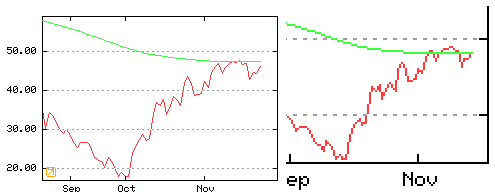
Look familiar? Look closely at the top chart. That is the chart that you get when you use the default settings and add a 200-day EMA. First off, we can't be sure
what the 200-day EMA value is since it isn't displayed. However, in the
top chart, QLGC closed clearly below the line. Now look at the chart on the lower left. That is a blow-up of a 2-year chart. Notice that now QLGC closes right on top of
the EMA - the EMA must have moved! Finally look at the chart on the
lower right. This is a blow-up of a 5-year chart. Wow! Now the EMA is
(correctly) below the closing price! Obviously, the longer the chart, the more accurate the result - but that's not the way things should work!
The chart above is what e91978 was looking at. It's even harder to tell what the value of the EMA is since the axis values are on the left side
of the chart, but this chart's EMA is also clearly above the closing
price (wrong!). A blow-up of a 2-year chart is in the upper right
corner - again, the EMA appears to have moved!
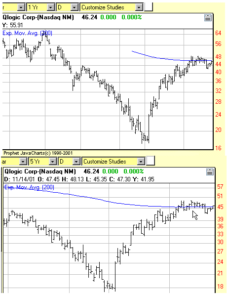
One last example,
this is from an "interactive" Java charting tool. The problem is that
both the code for the tool and the data for the chart has to be
downloaded into your computer before the chart can appear. To minimize
delays, they minimized the amount of data that they initially download,
thus maximizing the potential for EMA errors. The top chart shows the
default view of things. Note that the 200-day EMA line doesn't start
until mid-September and the close is once again in the wrong position.
It was a struggle, but I was finally able to get the tool to load lots
of data but only display the last couple of months. Once that was done,
a fairly accurate 200-day EMA line appeared (bottom).
2010 UPDATE
The charting site that e91978 was using back in 2001 still doesn't get it. Here's their 3-month chart of QLGC from this Friday followed by their 6-month version of that same chart:
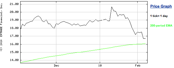
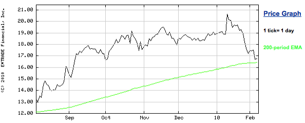
All I did was change the chart's setting from 3-months to 6-months. Notice that the green 200-day EMA was very close to 16.00 on the top chart but then has moved up to near 16.50 on the bottom chart? That's a huge difference! So where should the 200-day EMA be? Here's a hint.
Remember folks, many other important technical indicators are derived from EMAs
including the MACD, the PPO, the Percentage Volume Oscillator, the
Chaikin Oscillator and the McClellan Oscillator. I'll say it one last time - Incorrect EMAs mean incorrect charts.
- Chip Anderson
The stock market remains in a downside correction as evidenced by the
breaking of initial support levels and negative turns in several
longer-term technical indicators (more on that later). Friday's
heavy-volume upside reversal, however, suggests that a short-term
bottom may have formed from an oversold condition. That's especially
true of two sector ETFs that bounced off their 200-day moving averages.
Material stocks have been among the hardest hit because of the sharp
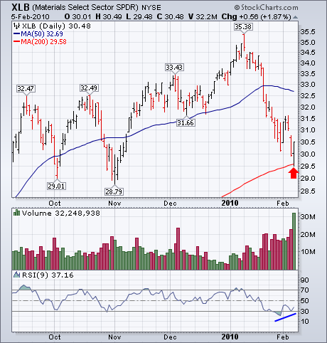
selloff in commodity markets. Chart 1, however, shows the Materials Sector SPDR (XLB)
reversing upward on Friday (on huge volume) after touching its 200-day
line. Its 9-day RSI line (below chart) shows slight "positive
divergence" from an oversold condition below 30. The chart picture for
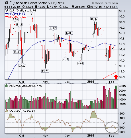
the Financials SPDR (XLF) in Chart 2 looks weaker
owing to its having broken its fourth quarter lows. But it too bounced
impressively off its 200-day line. The Commodity Channel (CCI) Index is
also in oversold territory. That helped launch the late rebound on
Friday.
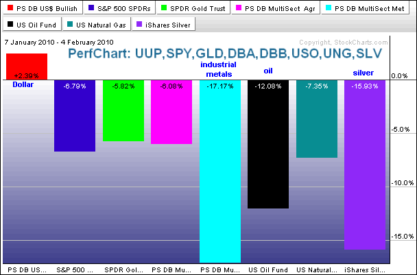
In addition to stock markets around the world, we have seen a rout in various commodity groups over the last 3-4 weeks. Strength in the Dollar is partly to blame. Weakness in global equities also bodes ill for the commodities. A downturn in global equities would imply a future downturn in the global economy that would dampen demand for commodities. In Thursday's Market Message, John Murphy showed the DB Commodity Index Tracking ETF (DBC) breaking below its 200-day moving average. The PerfChart below shows six commodity related ETFs with the S&P 500 ETF (SPY) and the DB Dollar Bullish ETF (UUP). Of these eight securities, only the DB Dollar Bullish ETF (UUP) is up over the last four weeks. The DB Base Metals ETF (DBB) and the Silver ETF (SLV) are pacing the declines with losses in excess of 15%. Silver is an industrial metal so the relationship here makes sense. The US Oil Fund ETF (USO) is also down double digits.
Click this image to see a live chart.
On Thursday our mechanical Thrust/Trend Model changed from a buy to
neutral, based upon the 20-EMA crossing down through the 50-EMA. Now
our hope is that there will be enough continuing decline to cover what
may turn out to be a whipsaw signal. No guarantees in that regard, but
bull markets typically do not end this cleanly.
The market sold off deeply on Friday, but in the end it rallied
and closed up by a small amount. This looks like the beginning of a
bounce of at least short-term duration.
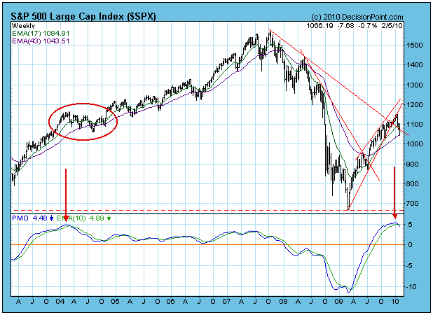
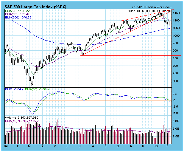 The weekly-based chart of the S&P 500 shows that the PMO is very
overbought and has crossed down through its 10-EMA. It could take a few
months to clear this condition by bringing the PMO back to the zero
line. This doesn't mean that there must be a severe correction to
accomplish this. Note how in February 2004 the PMO reached similar
overbought levels, and how that condition was worked off by sideways
(and slightly downward) consolidation.
While I don't weight my cycle studies too heavily, it is worth
mentioning that a 9-Month Cycle low is projected for the first part of
April, and a 4-Year Cycle low is projected for later this year (July to
October time frame). Viewed in this negative cycle context, the market
could experience considerable difficulty for several months.
Bottom Line: The mechanical model has moved us to a neutral
market posture. I worry about whipsaw when neutral signals generate
coming off market highs, but the weekly PMO and the cycle context make
me think that the correction has a way to go.
Relax Chicago. You're not in the Super Bowl this year. I'm just applying a little Super Bowl-mania to the current state of the stock market. The bears are calling the plays.
From a sentiment and technical perspective, this market is really making sense right now. The top was identified in early January by analyzing the relative complacency in the market. This was discussed in great detail in my previous article, "It All Comes Down to Defense". At the time that signals suggest a top is imminent, I never know what kind of downtrend or consolidation may follow. In order to make further predictions, it's imperative that we allow the market to communicate its next move. The market spoke loud and clear as very heavy volume accompanied breakdowns of price support, trendlines and moving average support. A "death cross" followed (20 day EMA crossed beneath the 50 day SMA) and our intermediate-term downtrend was underway. As soon as we lost our major moving average support on heavy volume, we adjusted our near-term price support levels to 1036 on the S&P 500 and 2115 on the NASDAQ. Friday, we lost the NASDAQ's support level intraday only to recover strongly into the close, finishing well above 2115 and near the highs of the day. The S&P 500 also reversed strongly on Friday afternoon, although its strong move down earlier merely approached its 1036 support level, falling less than 1% short of it before turning higher. This reversal could bode well for the very near-term, though we are downright bearish the intermediate-term because of technical conditions discussed below. First, take a look at the "kick saves" on the S&P 500 and NASDAQ at or near short-term price support levels.

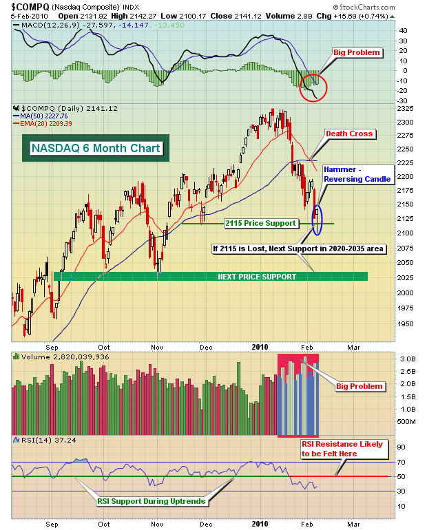
So short-term a move higher off of Friday's reversing candles is certainly a possibility, perhaps even a very good possibility. But there are serious technical reasons that any up move likely won't last. The first is the most important. We have witnessed a major breakdown of price support, moving average support and trendline support - all on very heavy volume. The combination of price/volume breakdowns can never be overemphasized. Until it is remedied, long-term buy and holders BEWARE. It's actually a good thing for technical traders willing to short stocks and ETFs as bounces can generally be shorted with fairly tight stops in place. It's what we'll continue to recommend to our subscriber base until this bearish price/volume scenario ends.
Also, the MACD is continuing to diverge with every new price low. This is indicative of BUILDING downside momentum. As long as the MACD provides no signs of slowing momentum, we have to assume that the 20 day EMA will likely serve as a significant resistance barrier for the bulls. Eventually, we'll see a long-term positive divergence print on successive price lows and at that time it's likely we'll see a more significant and reliable move higher. Until then, it's best to exercise caution.
Finally, the RSI provides solid clues during both uptrends and downtrends. During uptrends, it's common to see the RSI fall to 50 on market pullbacks. Occasionally, it'll even dip to 40. Rarely do we see RSIs move much below 40 during a sustained bull market advance. During a downtrend, however, the exact opposite holds true. Look for the market to struggle as the RSI hits the 50 level from underneath. On occasion, we might see the RSI print 60, but generally 50 will hold back the bulls.
Everyone has their own ideas of where the market might go from here. I expect we'll see weakness over the next several weeks as a potential flag formation develops. I've included this prediction in our Chart of the Day, which will be featured on Monday. You can CLICK HERE to view this video.
Good luck to the Colts and Saints fans in Sunday's Super Bowl. I'm going with the sentimental favorites. Who Dat Gonna Beat Dem Saints?
Happy trading!
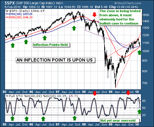
Last week's S&P decline reached a crescendo on Friday around mid-day at 1044.50, which brings the decline to roughly 106 S&P points from the January 19th high at 1150.42. Pencil to paper, and the decline stands at -9.2%, which is just about a normal -10% correction that many like to speak of in a bull market. This obviously begs the question as to whether a more normal correction has just occurred - which would mean new highs above the 19th's highs; or whether the 19th's highs represent the resumption of the bear market, with rallies being sold. We honestly don't have any concrete answers; but we do have some thoughts and observations on both the fundamental and technical pictures as they stand.
First, we'll state that the sovereign debt issue griping Europe will grip other countries as well in a larger contagion, for the only manner in which countries can escape the bond market vigilantes is to cut deficits over time. However, the current plans in hand by both Eurozone countries and the US aren't enough, and greater austerity measures and higher taxes are going to dominate the fiscal landscape. It's only a matter of time before the focus become US debt markets. We view this as the "next shoe to drop" in the ongoing bear market.
Second, the technical picture is strategically bearish given the S&P forged a key monthly reversal to the downside in January; hence the trend is lower as long as the S&P remains below 1150.42. Rallies in our opinion are to be sold. But having said this, Friday's S&P decline tactically bottomed in "the zone" demarcated by the 200-day and 380-day exponential moving averages. Now, this zone has previously been major support and has pushed prices higher as the longer-dated 40-day day stochastic has bottomed. But that isn't the case at present, which means the setup isn't as good as we would like it to be in order to become aggressively long - thus a short-term rally should be expected, but one that fails.
Therefore, we are more inclined to be short-term buyers of the strongest groups such as Biotechnology, while using this strength to become short the broader market and the commodity stocks. This is our roadmap for the time being; and we're sticking with it.
Good luck and good trading,
Richard