Hello Fellow ChartWatchers!
Last time I talked about the great lengths that we go to here at StockCharts.com to make sure that our indicator values are calculated correctly. This time I want to talk about how we work hard to make sure that the data used in those calculations is as accurate as possible.
First off, I want to talk about the differences between intraday data and daily data with respect to accuracy. The key thing to keep in mind here is that after the stock markets close, the daily quote (open, high, low, close and volume) for each stock is audited by the exchanges. That means that the people at the exchange go back and review all of the trades for each stock - tossing out any incorrect numbers - and then reissue the "official" values for open, high, low, close and volume for that stock. In order to make sure we have the "official" numbers, we recollect the daily data from our data vendors several times each day after the market closes. Our goal is to have "official" numbers in our database for every stock's daily values.
Having accurate daily values is important for several reasons:
- The exchanges try very hard to publish accurate daily quotes and we want to take advantage of their efforts.
- Daily data can be cross-checked from multiple public sources like Yahoo Finance and Bloomberg.
- Daily data is used to create weekly and monthly data bars.
The bottom line is that we work really hard to collect accurate daily data from our data vendors every trading day. Intraday data is a completely different story however.
Unlike daily data, Intraday data "is what it is." The exchanges do not audit intraday data values and issue corrections. There aren't any other public sources where intraday data can be cross checked. Intraday data is essentially a running record of what our data feed told us the stock was trading at during each minute of the trading day. If a bad data point gets into the datafeed somehow, we faithfully record and preserve it. Intraday data is the "chaotic wild west" of Wall Street.
That said, we still work hard to fix intraday data once it gets off the datafeed and into our databases (which happens after the markets close each day). Once the data is "ours" we can go in a fix any blatantly obvious problems like spikes and dropouts. Unfortunately, without anything else to compare our intraday data to, we often aren't sure if a spike is real or not. In those cases, we'll err on the side of caution.
ADJUSTING HISTORICAL DATA
Let me state this clearly: StockCharts.com adjusts our historical price data to eliminate the "artificial" effects of splits, distributions and dividends.
Those adjustments ensure that our technical indicators provide accurate signals at all times. Without those adjustments, incorrect buy and sell signals would occur on our charts and in our scan results whenever a stock undergoes a split, dividend or distribution because those events cause gaps to appear on the chart.
When we first created this website, we consulted all of the experts we could find on this subject. Should we adjust for splits? What about dividends and distributions? Should we adjust our data even for really small stuff that no one else notices? "Adjust your data for everything no matter how small" they said. Experts like Carl Swenlin and John Murphy were very clear - unadjusted data causes huge problems. So we did. And we have since the beginning over 10 years ago. Our goal remains the same - adjust all historical data to eliminate those "artificial" gaps.
The downside to adjusting our data is that our charts should not be used to determine past buy and sell prices. Often - around tax time - we get questions about this. "My broker said I bought this stock at $50 but your chart shows that it was at $25 on that date." Don't do that. Your broker's records are for tax purposes. Our charts are for technical analysis.
MAINTAINING DATA ACCURACY
Unfortunately, data accuracy is a never-ending struggle. We have several people here dedicated to keeping our databases in synch with the hundreds of ticker changes and updates that happen "behind the scenes" each day. One of the big benefits of using StockCharts.com is that you get all of those updates "for free" as part of our service. But don't forget that there is effort - lots and lots of effort - going into keeping our data as accurate as possible.
And yes, from time to time we miss things. We are always glad to hear from our users about a data issue that we can fix. Anything that helps us improve our data accuracy is welcome.
So as I said last time, we are fanatical about accuracy here at StockCharts because we know that our users are also fanatical about accuracy. And we will continue working hard to ensure that our charts remain the most accurate anywhere on the Internet.
- Chip
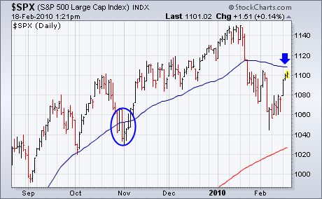
One of our readers recently pointed out that the blue 50-day moving
average is declining for the first time since last March, and asked if
that makes it more of a resistance barrier. The short answer is
probably. Although most attention is paid to "crossings" above and
below a moving average, the "direction" of the line itself is also
important. Near the end of October, the SPX fell below its rising
50-day line briefly before moving back above it within a week (see
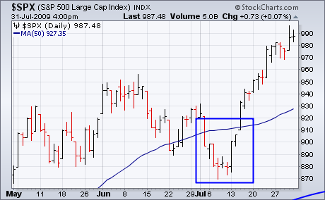
circle). Last July, the SPX also fell below its 50-day line for eight
days before turning back up again (see box in Chart 2). At that time,
the 50-day line continued rising as well. Since mid-January of this
year, however, the 50-day line has been dropping. That makes the recent
price decline a bit more serious. For recent damage to be reversed,
therefore, at least two things have to happen. First, the SPX needs to
close back above the blue line. Secondly, the blue has to start rising
again.
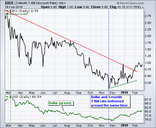
With a quarter point hike in the discount rate, the Fed surprised some in the media, but few in the bond market. As one of the most interest rate sensitive asset classes, the bond market often moves before an actual Fed move. First, the Fed has been jawboning about the end of quantitative easing for some time now. Second, the Fed specifically mentioned the possibility of future rate increases last week, which was noted in the Market Message on Wednesday, February 10th. Third, short-term interest rates have been moving higher since November. Yes, the bond market has been pricing in some sort of rate increase or tightening since November. The chart below shows the 3-month T-Bill Rate ($IRX) over the last 12 months. Short-term rates declined from March 2009 until November 2009. Rates bottomed in late November and moved higher the last three months - well ahead of the Fed move. Even with the three month advance, short-term rates are still historically low.
Click this chart for details
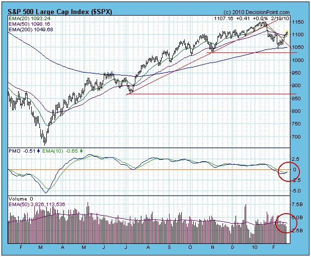
Last week we were looking at a bearish reverse flag formation, but this
week prices broke above a short-term declining trend line, effecting a
bullish resolution of the flag and changing the short-term outlook to
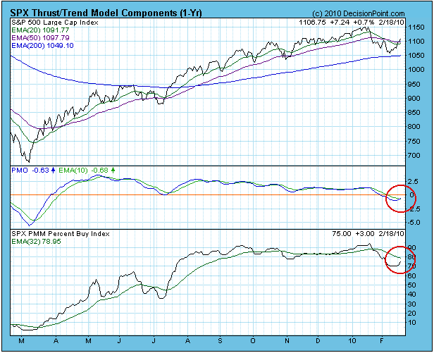
bullish. This was confirmed by a PMO (Price Momentum Oscillator) buy
signal, generated as the PMO crossed up through its 10-EMA.
The negative side of the picture is that volume accompanying
the breakout and subsequent advance only has been averaging about 85%
of the 250-EMA of daily volume, which does not reflect broad confidence
in the move. This, plus other evidence we will discuss, makes me think
the breakout could be a bull trap.
Our market posture for the S&P 500 remains neutral; however, our
Thrust/Trend Model (T/TM) could generate a buy signal if positive price
action can continue and the Percent Buy Index (PBI) can cross up
through its 32-EMA. To clarify, the PMO buy signal is one-half of a
T/TM buy signal. The PBI is harder to generate, and is intended to keep
the T/TM from reacting too quickly to short-term rallies.
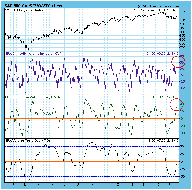
Additional negative evidence is that most of our short-term indicators
are very overbought, as illustrated by the CVI (Climactic Volume
Indicator) and STVO (Short-Term Volume Oscillator) charts below. Until
those conditions are relieved, it will be difficult for the market to
make upward progress. And it may take a price decline to clear the
conditions. In this regard, it is possible that the support implied by
the recent lows will be retested, if not violated.
Finally, my cycle projections still call for a 9-Month Cycle low around the first part of April.
Bottom Line: The market can often overcome short-term overbought
conditions, but most often these conditions are cleared by price
pullbacks. The recent breakout could reveal itself as a bull trap.
History is a valuable tool in the stock market as
we witness cycles repeating themselves all the time. Our major indices and
the various sectors and industries rotate back and forth as our economy moves
from strength to weakness and back to strength again. Certain sectors
perform better during strong economic times while others outperform as our
economy stumbles. I like to use this knowledge as the market makes its
moves up and down to determine "staying power". For instance,
transportation stocks tend to lead the economy out of recession and it makes
sense because as economic conditions improve, industries like the railroads are
relied upon to ship more goods, etc. So when charts relating to the
transportation group begin moving up on a relative basis to the S&P 500, it
generally will alert us to the probability that the underlying economy is
strengthening and we should look for higher prices in the broader market to
continue. When transports underperform on a relative basis, however, it
tells us to be a bit more cautious about the overall market. Take a look
at the chart below:
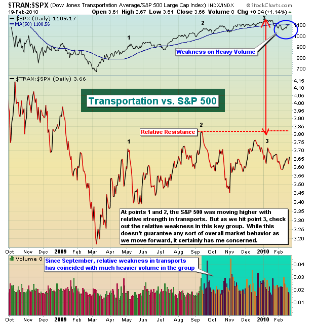
An obvious question to me is - why have transport
stocks failed to break out to new relative highs since September 2009?
Furthermore, the transportation index made a triple top price breakout above the
4050 area in early December, failed to capitalize with much in the way of
further gains, and then broke down badly in late January with very heavy
volume. Currently, transports are moving higher on much lesser volume and
now are back to challenge that 4050 area and their 50 day SMA. Check out
the next two charts:
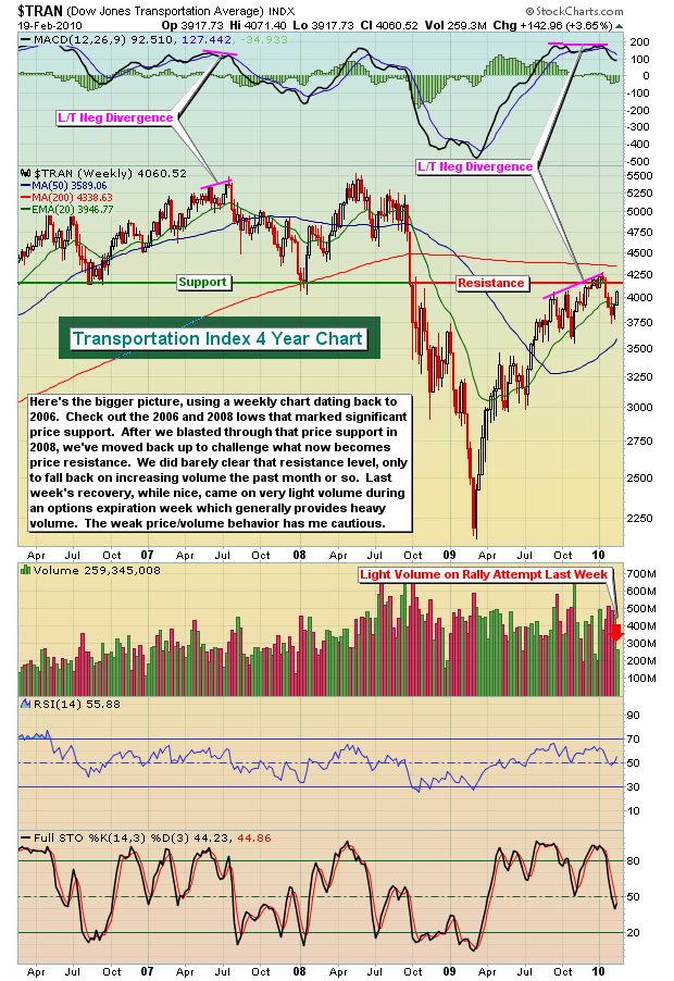
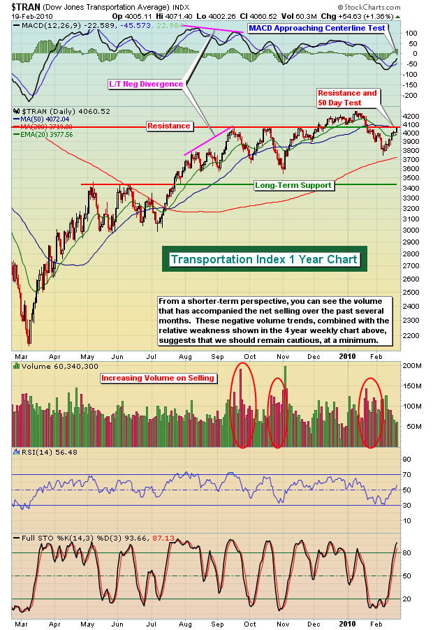
The rally off the March 2009 lows shows a number of
similarities to the 2003 rally off of the 2000-2002 bear market lows. The
current technical picture of transports and their relative action compared to
the S&P 500 is very similar to what we saw back in 2003/2004 and provides
further evidence that we could be setting up in a flag pattern in the S&P
500 that could last for several more weeks to months. CLICK HERE
to view this video.
The rally that we've witnessed the last two weeks
is a bit stronger than I anticipated, but there certainly are more obstacles
ahead for the bulls. The actual short-term bottom recently should
come as no surprise though. In my last article, I discussed the short-term
bullish implications of that high volume market reversal on Friday, February
5th. In addition, the equity only put call ratio ("EOPCR") turned bullish
early the next week. If you missed Chip Anderson's chat with the Invested
Central team, along with our members, you can still see it by CLICKING HERE.
I've also recorded a short version of setting up this indicator on StockCharts,
while we also are providing the longer version with Chip's visit. Both are
worth watching.
Happy trading!
The Gold Futures ($GOLD) market has begun to capture traders' attention once again, for the developing technical patterns would suggest new highs above $1225/oz will materialize in the months ahead. Unfortunately, we haven't included a Gold Futures price here, but take our word for it: a rather bullish consolidation is confirmed, with prices having broken above the 20-day and 50-day moving averages. This obviously would presume that we become buyers of the Gold Futures. However, that isn't the case when one considers the relative chart pattern of the Gold Miners ETF / Gold Futures Ratio (GDX:$GOLD), for the chart clearly demonstrates that one should be a buyer of GDX rather than $GOLD.
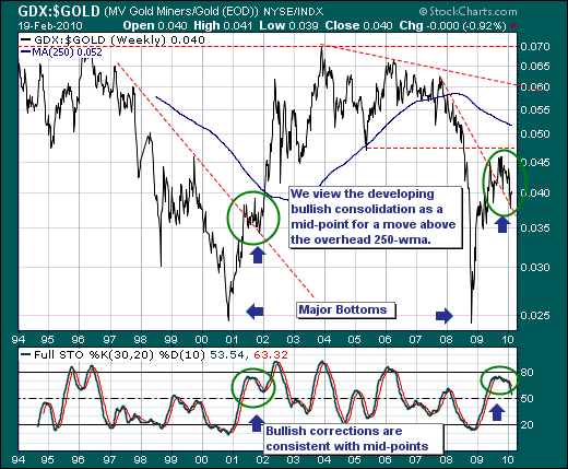
The technical reasons are rather simple:
1) A very large trading range has formed between roughly .025 and .070; each level has been tested multiple times in sequence.
2) A larger bottom was forged in late-2008 much like that of late-2000. If the latter is like the former - and we do think it is, then the cycle wind will be at the back of higher ratio prices for several years further into the future. A minor mean reversion target would be the overhead 250-week moving average, which we think would provide only minor resistance until trading range resistance is once again tested.
2) A clear corrective process has developed in the latter half of 2009, which is above trendline support and mirrors the corrective process of the late-2001 period. Moreover, each of these corrective processes occurred with the 30-week stochastic rolling over from something less than overbought levels. If the current pattern is like that of 2001 - then sharply higher prices are ahead.
Thus, if one were bullish of Gold in general - then one should own the Gold Miners rather than the Gold Futures or Gold ETF (GLD). If were agnostic about the direction of Gold, then the evidence is sufficiently compelling that this would make a great hedged pairs trade.
Good luck and good trading,
Richard