Hello Fellow ChartWatchers!
We've been working hard the past couple of weeks to get better
Sector and Industry classifications for the stocks in our database and
today that work is finally starting to surface on the web site.
One
of the big problems with Sector and Industry classifications is that
there is no universally accepted standard for what constitutes a
sector, what constitutes an industry and which stocks belong in which
category. The other big problem was that, until recently, the only
source for that information was high-priced research firms that usually
frowned on our request to make their classifications publicly available
on our website.
Recently however Google has started publishing
categorizations that they have derived from their search engine logic.
The Google classifications are very similar to the "typical" categories
that most people are used to and the Google classifications have the
additional advantage of not having the typical restrictions on
republication.
So we are now - finally(!) - able to offer a broad
set of Sector and Industry classifications for many of the stocks that
we track. We are now providing that information for over 5,000
different US stocks. There are a couple of ways that information can
be used:
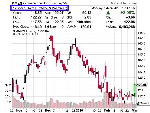
- If you select the "Full Quote" option for any SharpChart, you will
now see the Sector and Industry classification for that chart in the
upper left corner of the Full Quote area:
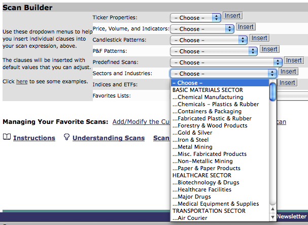
- Extra members can also use our Advanced Scan Workbench to add Sector
and/or Industry categories to their scans via the "Sectors and
Industries" dropdown:
- User-defined Scan Results now include the Sector and Industry of each stock that is returned by the scan.
 (Note for Extra Users: Our old "SPGICS" sector and industry codes groups were out of date and could not be updated, so we are replacing them. If you have been using them in your saved scans, we'll automatically updated them so that they use our new Sector/Industry codes instead.)
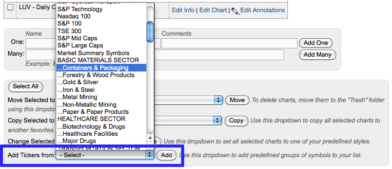
- Extra members can also add all of the stocks that are in a Sector or Industry to one of their ChartLists using the "Add Tickers from -- Select --" box at the bottom of "Edit" view:
We will continue to expand
both the number of stocks that we can reliably classify as well as the
different ways Sector and Industy information can improve our charts
and our scans. We're looking into adding new MarketCarpets,
CandleGlance Groups, Bullish Percent Indexes and more. Stay tuned!
- Chip
A number of readers have asked why I haven't said much about inverse
(or bear) ETFs. The main reason is that I wasn't convinced that the
recent market dip was serious enough to warrant bearish positions. So
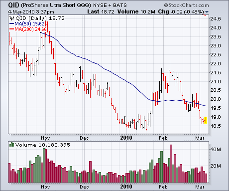
far, that view has been justified. Chart 1 shows the ProShares Ultra Short QQQs (QID)
nearing a test of its January low. It's also back below its 50-day
average (blue line). Inverse funds are not meant as long-term holdings.
Their use is only justified when the market is in a serious downward
correction or a bear trend. Some short-term profits could have been
made in the QID from mid-January to mid-February, but only for very
nimble traders. For everyone else, it's back where it started the year.
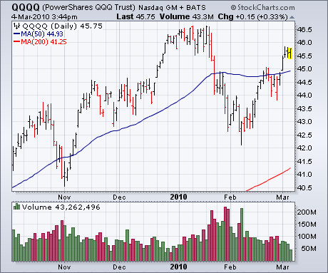
The QID is designed to trade in the opposite direction of the Power Shares QQQ Trust (QQQQ).
Chart 2 shows that technology-dominated ETF trading a couple of points
from its January high and well above its 50-day line. At the moment,
the QQQQ is acting a lot better than the QID.
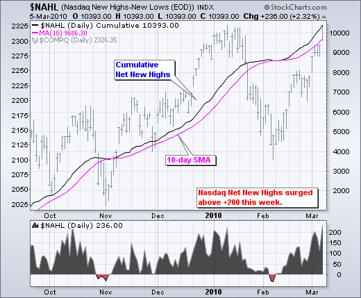
Net New Highs survived their third corrective period and surged over the last few weeks. The chart below shows Nasdaq Net New Highs surging back above +200 this week. Prior surges in October and early January hit the +200 area. Notice that there have been three corrections over the last eight months. Net New Highs dipped into negative territory in early July, late October and early February. These red areas are small as Net New Highs moved back into positive territory soon thereafter. In fact, notice that Net New Highs found support at or above -50 each time. This means we should expect a trend reversal if and when Net New Highs break below -50.
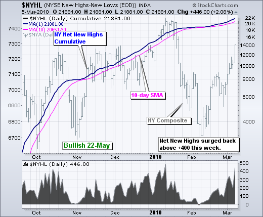
The next chart shows NYSE Net New Highs. Notice how this indicator bounced near the zero line in early July, early November and early February. Also notice that cumulative Net New Highs have been rising (above the 10-day SMA) for over 8 months. Even though Net New Highs are considered a lagging indicator, they have captured the current uptrend by staying largely positive. SharpCharts subscribers can click on these charts to see the settings and save to their favorites list.
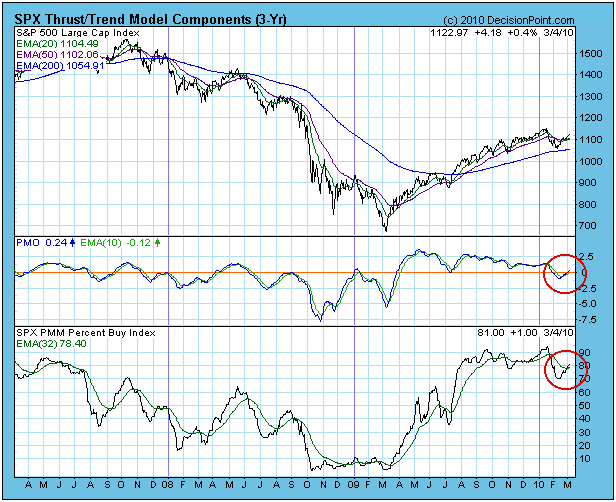
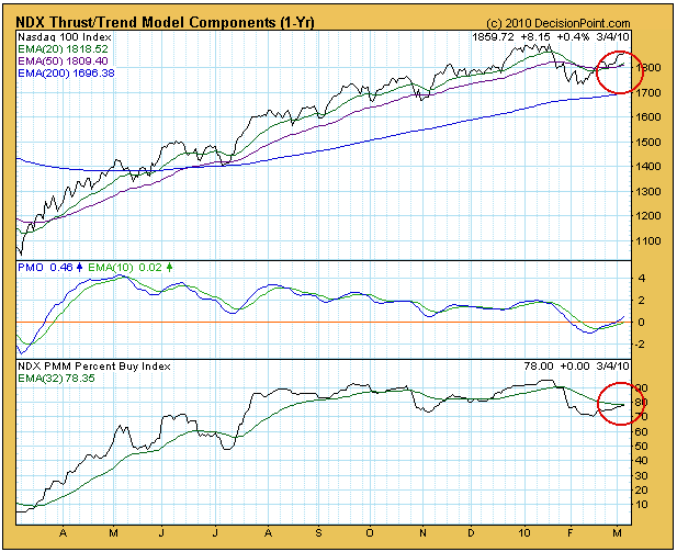
Looking at the S&P 500, a new Thrust/Trend buy signal was generated
on Monday, changing from a neutral stance. Specifically, the signal was
generated by the PMO (Price Momentum Oscillator) and PBI (Percent Buy
Index) crossing up through their EMAs. The Thrust Component signal was
confirmed later this week when the upside 20/50-EMA crossover occurred.
The Dow generated a buy the previous trading day, and we are now left
with only the Nasdaq 100 still on neutral, needing a PBI crossover to
occur. As you can see, this will most certainly happen by today's
market close. Note that the 20/50-EMA crossover has already taken
place.
Bottom Line: Most of the indexes and sectors we track are generating
buy signals after having been in neutral for about six weeks of market
correction and rebound.
Happy Anniversary! It was one year ago, on March 6, 2009, that the S&P 500 made that unforgettable 666 low, completing an amazing drop from above 1300 in August 2008. That represented nearly a 50% decline in the market capitalization of 500 of the largest U.S. companies in a little more than 6 months. We were already down more than 15% in the year before that remarkable decline. A lot has changed over the past year, specifically the levels at which our major indices are now trading. The old cliche that "time heals all wounds" most definitely can be applied to the stock market. And as a self-proclaimed market historian, 2008-2009 was a period of market turmoil that I'll never forget. There are lessons to be learned from that traumatic period, however. First and foremost, we can never let our guard down, now even for a moment. We shouldn't be swayed by the "experts" paraded on CNBC and other media outlets. Our capital is OUR capital and we must do whatever it takes to preserve and build upon it. The first step that each of us can take is to continually gain a better understanding of how the market works and the warning (technical) signs that suggest that we enter our "defensive" mode.
So should we be preserving or building capital right now? Well, that depends on which charts you want to look at. On most of the one year charts, we're overbought but technically very sound. But weekly charts are showing long-term negative divergences, which can translate into weeks of consolidation to downside action. Many of our indices and sectors are at or quickly approaching new 52 week highs. The Russell 2000 finally blasted through 650 with gusto. Consumer discretionary stocks have been on fire. Haven't we been told for many, many months that the U.S. consumer is dead? Tell that to the folks who are pouring billions of dollars into consumer discretionary stocks. If you're looking for leadership, look no further than consumer discretionary. Check out this chart:
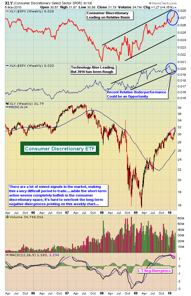
The key to trading the stock market right now is understanding the sector rotation that is taking place. I did a brief analysis of two periods. The first period was from the March 6, 2009 low to the May 8, 2009 close. The second period was from the May 8, 2009 close to Friday's close (March 5, 2010). I did this to see how the various sectors performed on a relative basis to one another and to the S&P 500 as a whole during both periods. You can review my analysis by CLICKING HERE. The short answer though is that the initial runup off of the panicked lows were led by all six aggressive sectors while the defensive sectors trailed badly. Since that May 2009 high, however, the defensive groups have performed much better on a relative basis and only the consumer discretionary and technology groups have outperformed considerably since. During 2010 thus far, technology has lagged. If you're bullish, you have to like the prospects of technology on a relative basis here. The aggressive sectors have been taking turns leading the market higher since May 2009. We would expect this to continue until major support levels are lost to the downside. That means attention should be given to technology right now. We ran a scan of technically sound stocks and have provided an interesting one, Ingram Micro (IM) as our Chart of the Day for Monday, March 8th. You can check it out our annotated chart by CLICKING HERE.
Happy trading!
Richard will return for our next issue.