Hello Fellow ChartWatchers!
With the market posting four solid up days over the past week, is now the time to get back in to the market? That's the main topic of this week's newsletter and there are lots of opinions going around right now.
One of the key things to watch for after a prolonged market decline are the major market breadth indicators like the NYSE Bullish Percent ($BPBYA) and the NYSE Summation Index ($NYSI). Like all market indicators, these lines condense the movement of hundreds of stocks down into a single line that can be used as a proxy for the overall health of the market.
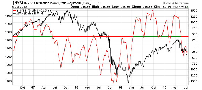
Here's a chart of the NYSE Summation Index (red) overlaid on top of the S&P 500 (black):
(Click here for a live version of this chart.)
The horizontal line on that chart illustrates that, for the past couple of years at least, things always get "interesting" when $NYSI approaches the 400 level. (The vertical scale for $NYSI is on the right, the scale for $SPX is on the left.) Notice the behavior of $SPX whenever $NYSI moves above or below the 400 line - strong, long-term trends usually occur. Granted, the signal usually happens well after the start of the trend, but that's always the tradeoff - early entry versus whipsaws. If whipsaws aren't your cup of tea, the $NYSI at 400 signal should do well for you.
It also lends perspective to the current market rise. With $NYSI currently at -215, it is too early to declare the return of a bull market. That said, if the Summation Index continues to rise and breaks through 400 then greater optimism is definitely warranted.
- Chip
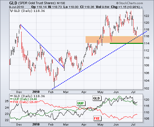
After sharp declines in late June and early July, gold and silver are testing important support zones from their prior lows. The fist chart shows the Gold ETF (GLD) hitting new 52-week highs in late June. These highs did not hold long as GLD declined towards support around 114-116. This zone stems from broken resistance, the May low and the February trendline. GLD remains in a clear uptrend as long as support holds. Failure to bounce and a support break would reverse the 4-5 month uptrend in gold.
Click these images for details
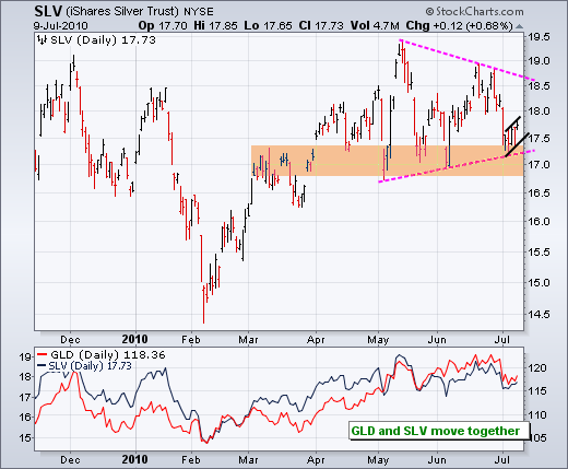
The second chart shows the Silver ETF (SLV) with a weaker pattern than gold. While gold exceeded its May high, SLV fell short of its May high and forged a lower high. Despite a sharp decline from this lower high, SLV firmed near its support zone around 17. Support in this area stems from the May-June lows and the lower trendline of a triangle. Looking closer, we can see a small consolidation over the last five days. A break below these lows would signal a continuation lower and project a break below the support zone. It ainât broken yet, but we need to watch this in the coming days. The indicator window shows GLD and SLV moving together throughout 2010. Even though gold is more precious and silver is more industrial, these two are still positively correlated.
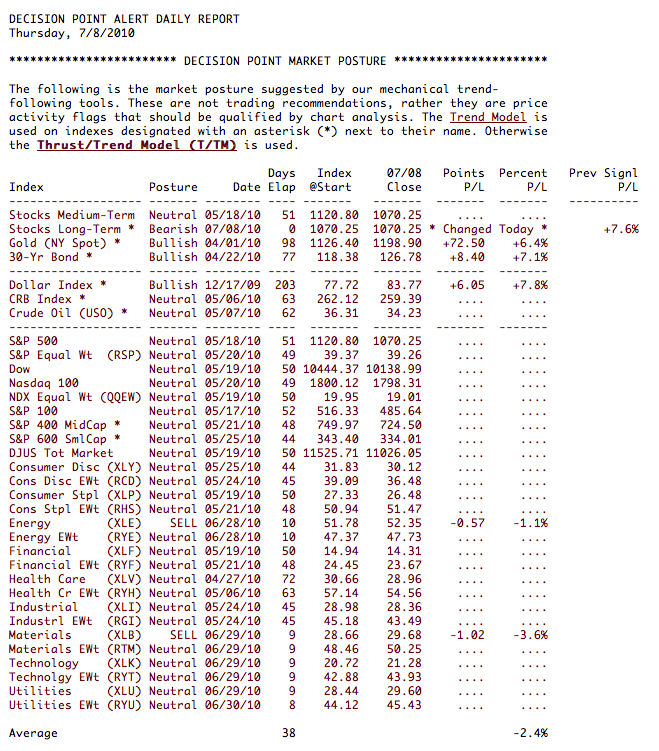
As you can see in our Decision Point Alert Daily Report below
our Trend Model has triggered a Long-Term SELL signal for stocks. This
occurs when the 50-EMA crosses below the 200-EMA. It has been headed
this direction for quite some time so it is not unexpected. Note on the
chart below that the margin on this signal was a 50/200-EMA difference
of 0.01. Not much, but as long as price remains below those EMAs, the
distance between them will continue to increase.
In
the daily chart of the SPX we see prices moving up toward resistance in
the descending wedge. With our short term indicators still bullish,
this could continue.
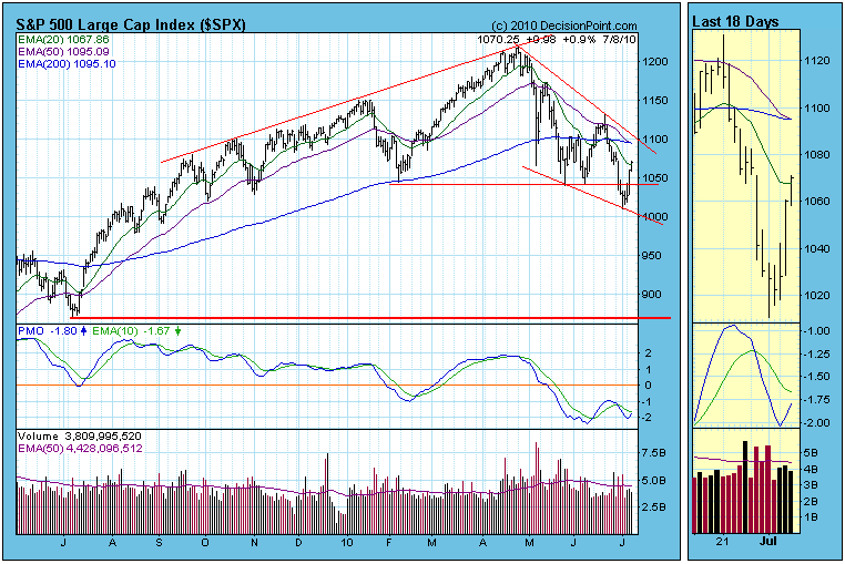
Our
indicators are now looking somewhat schizophrenic with the PMO turning
up and moving toward a positive crossover along with other indicators
looking bullish in the midst of a new long term SELL signal. This new
long term signal gives us a read on the environment in which our
shorter term indicators and signals now operate. It tempers our
conclusions. Carl's Learning Center article "Bull or Bear Market Rules" explains this best.
As
we discussed Wednesday, our bullish short term indicators tell us a
move toward resistance could continue. But our environment is now
bearish and with the bullish descending wedge being the dominant
medium-term pattern, and, ultimately, lower prices should follow even
as we move up inside this wedge.
Bottom Line: A
new long term stocks SELL signal has been generated based upon a "death
cross" (opposite of "golden cross") of the 50- and 200-EMAs. Decisions
in the intermediate and short term now need to take this into account.
Nevertheless, short term indicators continue to be bullish and and
there are now positive divergences on medium-term indicators. So we
have a positive theme developing in a negative longer-term context, but
we should consider it to be a temporary development.
In the life of a technical analyst, a month seems like a week, a week seems like a day and a day seems like minutes. Time flies and so do the charts and various technical patterns. I think it's always a good idea to periodically take a step back and look at the broader picture. It sounds like a good time for a mid-year update.
The following is a chart of the QQQQ, an ETF that tracks the NASDAQ 100 index. In my last article, I took a look at the QQQQ and pointed out the likely resistance at the 50 day SMA and provided reasons for potentially trading a juiced ETF (QID) to capture gains from any fall in the underlying NASDAQ 100 index. After falling for 2 weeks, the QQQQ moved into oversold territory and has bounced. Check out the chart:
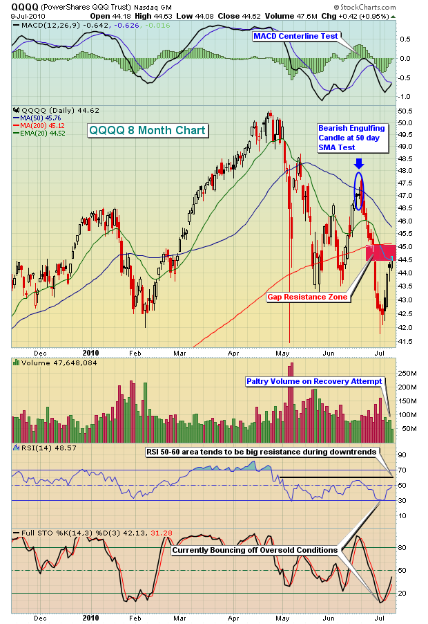
The market was very oversold to start last week with the constant pounding by the bears the prior two weeks. RSI and stochastics had fallen to 30 and 7, respectively, a combination that generally favors the bulls near-term. From those oversold levels, the market has bounced and gains last week were in the 5-6% range across all of our major indices. It was certainly great to see the market regain half of what it had lost the prior two weeks, but even the gains didn't come without warning signs flashing and those warning signs were the subject of an hour long chat/video that I recorded at our website this past week for members of Invested Central. I see potentially BIG problems brewing as it appears the summer months will not be particularly kind to the bulls. I've discussed a few of these bearish signs in articles since mid-April, but if you'd like to check out the entire video, I think it'd be well worth the time to review this session. It's free, simply
CLICK HERE.
I'd like to focus on just one component of this session - the relationship between the 10 year treasury yield and performance on the S&P 500. First, take a look at this chart:
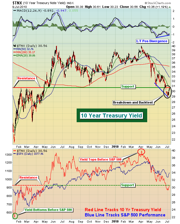
First, it's important to realize that bond prices and bond yields move inversely to one another. So when you see the yield dropping, it means money is flowing INTO bonds. When money flows into bonds, it's coming from somewhere. Over the past many years, it's generally been bad news for equities. What I've found is that many times the yield can be an indicator of things to come for the S&P 500. For instance, on the chart above, notice that the 10 year treasury yield bottomed in early 2009, just before the S&P 500. Then again, three months ago, the yield topped a few weeks before the S&P 500. There are several reasons why it appears that strength in equities will not be sustained for long. One of those reasons is the breakdown in the yield beneath significant long-term support near the 3.10% level. The recent spike in yields back to test that breakdown level is no doubt fueling the short-term rise in equity prices, but the question is - how long will it last? I doubt much beyond the 3.10%-3.20% level.
A sector that I always follow closely is the semiconductors. This group tends to lead during economic expansion, so watching the behavior here is generally critical to my market forecast. Semiconductors are trending lower, and while that makes me nervous, it's also important to note that the relative strength in semiconductors remains strong, but showing signs of potential weakness. Its relative performance vs. the S&P 500 is rising, but squeezing tighter and tighter into a narrowing triangle. I've featured this group as our Chart of the Day for Monday, July 12, 2010. If you'd like to view it,
CLICK HERE.
Historically, the trend next week remains bullish. But after next week we enter the worst 2 1/2 month historical period of the year - BY FAR. Here's a fact. Over the last 60 years on the S&P 500, this period has accumulated losses totaling 23%. We've actually seen advancing prices in 33 of the 60 years. The problem is when the market goes lower, it REALLY goes lower. Check out the returns from mid-July to late September in each of the following years:
1957: -12.41%
1958: -10.31%
1974: -22.41%
1981: -13.76%
1990: -18.11%
1998: -11.97%
2001: -16.13%
Are we setting up for another year we can throw into this group? It's hard to predict that type of weakness, but to be honest, it wouldn't surprise me.
There have been 3 years where we've seen gains of +10% or more, including 2009 where the S&P 500 gained 11.06%. But if the market is prepping to make a big late summer move, there's probably better than a 2 to 1 chance it's going to be to the downside. While history never guarantees us anything, I have to admit I'm nervous heading into these historical headwinds with technical sirens blaring.
Happy trading!
The July 4th fireworks came a bit more belatedly this year as the S&P 500 rose +4.86% in the holiday shortened week. This performance was rather impressive in terms of points and breadth, but certainly not in terms of volume. To us, this calls into question the veracity and staying power of the current rally.
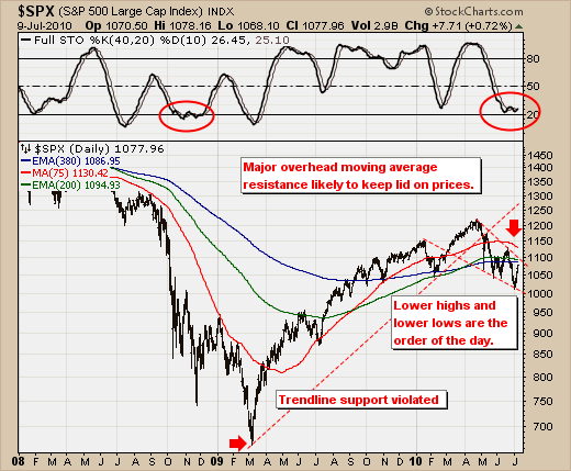
To wit, the current S&P rally has simply retraced back into major overhead resistance at the 380-day exp. and 200-day exp. moving averages at 1087 and 1095 respectively. Thus, we would expect to see prices fail at this zone given these moving averages are now rolling over to the downside. Further, we find the 40-day stochastic starting to "bottom feed" as near oversold levels, which is consistent with the downtrend in force as in the 2008 example. The puts the onus upon the bulls to reverse these negative developments; and perhaps they shall be successful. If prices do breakout above these levels, then one may conclude that the bull market is "back on."
From our trading perspective, we are now considering become aggressive short sellers against this zone,. with Consumer Discretionary shares being at the forefront of our trading strategy.