THE NEED FOR SPEEDby Chip Anderson | ChartWatchers Hello Fellow ChartWatchers!
Are you feeling more bullish now? Last week's rallies have put some needed energy back into the traders that haven't gone on vacation this summer. Technically the market is mixed and you can see evidence of that in the articles below - John Murphy talks about a positive development on the daily charts while Arthur Hill points out a negative sign on the latest monthly charts. Clearly the markets have a ways to go before anyone can say a bull market has returned, but last week's trading was the first bullish action in a long time.
THE NEED FOR SPEED
Here at StockCharts, we are constantly looking for ways to get you our charts as quickly and consistently as possible. Much of the past two months has been spent adding and testing two different "web acceleration" technologies to our site in an effort to reduce the time it take for our charts to move across the Internet.
The first technology we tried came from a company called Akamai. While this technology works well for other websites and, at first, showed some promising results for us, when we dug deeper we discovered that it really wouldn't work well for us mainly because when the market is open our charts cannot be cached (i.e., saved for later reuse).
The second technology looks much more promising however. It is called "XIP" and it comes from InterNAP, the same company that currently connects us to the Internet. XIP dynamically adjusts the low-level settings that control how data flows across the Internet. It works best when transmitting large items (such as a chart) across long distances. The bigger the object and/or the longer the distance, the more XIP helps.
(Another really nice thing about XIP is that it doesn't require any changes to your computer - it's a change that we make here in our datacenter. No install, no settings to mess with, just improved speed - pretty nice!)
At this point we've completed our internal testing of XIP and the results look good. In our tests, XIP reduced the time it takes to send out our charts by 30 to 40% in most cases. That said, we now need your help. We want to make sure that if we switch to XIP it won't cause any problems for our users.
If you have a spare second this morning, please click on the following link and see if you have trouble seeing any of the charts on the page. If any of the charts don't appear, please let us know. If any of the charts take a really long time to appear, please let us know. (If some of the charts appear 30 or 40% faster than they did before, please let us know too!)
Here's the link: http://stockcharts.com/charts/gallery.html?VMW
Some of the charts on that page use the "old, standard" technology and at least one of them uses the new XIP technology. See if you can see which is which just by refreshing the page. Click here to send us your comments and thanks for helping us test this technology.
- Chip
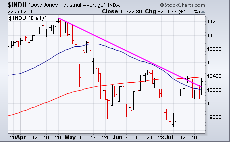
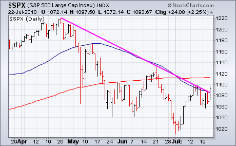
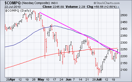
STOCK INDEXES BREAK DAILY DOWNTRENDby John Murphy | The Market Message Stocks turned in a strong performance Thursday. The three major stock
indexes shown below closed back over their 50-day moving averages. The
S&P 500 (Chart 2) and the Nasdaq Composite (Chart 3) did so for the
first time since early May. Another positive sign is the ability of
all three indexes to close above the down trendline drawn over their
April/June highs. The next hurdle to overcome is their July highs and
200-day moving averages. The short-term stock picture does appear to
have improved with the growing possibility of a rebound to the mid-June
peak. The rally in stocks was supported by a rally in most
commodities, most notably copper prices which hit a three-month high.
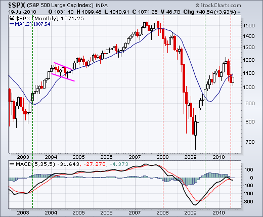
On the monthly chart, the S&P 500 broke below its 12-month moving average for the first time since July 2009. Even though moving average crossovers do not pick exact bottoms or tops, this moving average cross captured the major moves over the last eight years. As with all moving average crossover systems, success depends on a strong trend or sustainable move. A trading range or choppy market will produce whipsaws. For now, the S&P 500 broke below the 12-month SMA with a sharp decline in May-June. This is bearish until proven otherwise. There was a rebound in July, but the index needs to close above 1100 to negate this latest signal.
Click this image for details
The indicator window shows MACD(5,35,5) moving back into negative territory and below its signal line. This is also a long-term bearish development. First, momentum favors the bears when MACD is negative. Second, MACD is also moving lower and getting more negative. A move back into positive territory is needed to turn momentum bullish again. Why use MACD(5,35,5)? Monthly charts are already long-term oriented. Monthly price data is also smoother than daily or weekly price data. Changing the MACD settings from (12,26,9) to (5,35,5) increases sensitivity.
MONITORING EQUAL-WEIGHT INDEXESby Carl Swenlin | DecisionPoint.com
We have added a new page of charts to help us monitor the relative
strength of equal-weighted indexes against their capitalization-weighted
counterparts. Cap-weighted index values are dominated by the larger-cap
stocks in the index. For example, the 50 largest-cap stocks in the
S&P 500 represent about 70% of the index value. Conversely, the
Rydex S&P Equal Weight ETF (RSP) gives each of the 500 stocks equal
weighting when calculating the index value. As a general rule, the
equal-weighted indexes will outperform their cap-weighted counterparts
because smaller-cap stocks dominate the index, but not always, so we
want to monitor their performance so we know where we should put our
money.
There are 11 equal weighted ETF, 10 of
which are sponsored by Rydex. One of those 10 is RSP, mentioned above,
and the other 9 are for the SPDR Sectors. Finally, there is the Nasdaq
100 Equal-Weighted Fund ETF (QQEW). The RSP chart below is an example of
all the charts on the new page.
Price Relative line is calculated by simply dividing the value of RSP
by the SPY. When RSP is stronger, the price relative line rises, and it
falls when SPY is stronger. Is this really such a big deal? Well, yes,
it is. From the March 2009 low the SPY advanced 87% to the May 2010 top.
RSP advanced 125% during the same period, which is 44% better
performance.
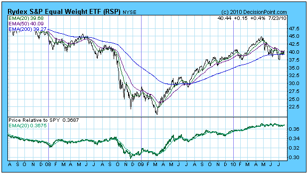
On the negative side, it appears that the equal-weighted indexes are often
weaker during pullbacks and declines, but as a practical matter there
are no hard and fast rules, and we need to constantly be aware of the
relative performance of these two types of indexes.
Below
are two charts comparing RSP and SPY over the long term. Note the
peculiar behavior of RSP during the 1990s. This was when the stock
market bubble was inflating, and money was concentrated in large-cap
stocks. When the bear market started in 2000, we can see the sudden up
turn in relative strength, and RSP didn't hit its bull market top until a
year after SPY.
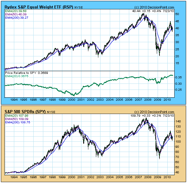
A final comment on performance, from the 2002 bear market low SPY
advanced 107% to the 2007 top. RSP advanced 183% during the same period.
Why hasn't anyone noticed?
Bottom Line: There are 11 ETFs that feature equal weighted indexes, and we
track and generate timing signals on all of them in our Decision Point
Alert Daily Report. On market advances these equal weighted indexes
normally outperform their cap-weighted counterparts, but shifts in
relative strength do happen, so we have set up a page of special charts
specifically to monitor relative strength on these indexes.
UNDERSTANDING DIVERGENCEby Tom Bowley | InvestEd Central Divergences are among the most misused technical analysis tool anywhere, in my opinion. The first step in successful trading using divergences is understanding both their strengths and their limitations. My preference is to focus on divergences as they relate to the Moving Average Convergence Divergence (MACD). Others use divergences on bound momentum oscillators like the RSI and stochastics. The word "bound" refers to the physical limitations of both of these oscillators. They cannot print a reading higher than 100 nor lower than 0. That's a fact. By definition, a "positive" divergence occurs when you have lower equity prices and a higher oscillator reading. So think about this for a minute. If a stock is selling off and prints a stochastics reading of 0, what is the likelihood that stochastics will be lower the next time prices move to new lows? I'd say there's a 0% chance. So if prices do move lower, you're guaranteed to have a positive divergence. To me, that's an absolutely worthless piece of technical evidence. RSI is also a bound oscillator, but it rarely moves below 20 or above 80. Therefore, it's a bit more reliable in terms of suggesting slowing momentum. I may check the divergence on the RSI occasionally, but it's never a primary indicator for me.
That brings me to the MACD. Let's start with the definition. The MACD is the difference between any two moving averages. Are they converging (moving closer together) or diverging (moving further apart)? It gives us a sense of momentum in an underlying stock or index. The "standard" MACD is the difference between the 12 period EMA and the 26 period EMA. StockCharts allows the printing of a simple chart to provide the calculation. Check out this S&P 500 daily chart:
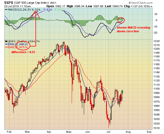
As prices move higher or lower, it's very typical for the shorter-term moving average to change more abruptly in the direction of price. But after a period of rising or falling prices, the difference between these moving averages begin to "converge" and that's the signal that momentum is shifting. While many technical indicators lag, the long-term positive and negative divergences that form on the MACD actually precede trend reversals. Last Tuesday, we issued three stock setups and one was flashing a buy signal based on a long-term positive divergence that had formed. Take a look below at the result since:
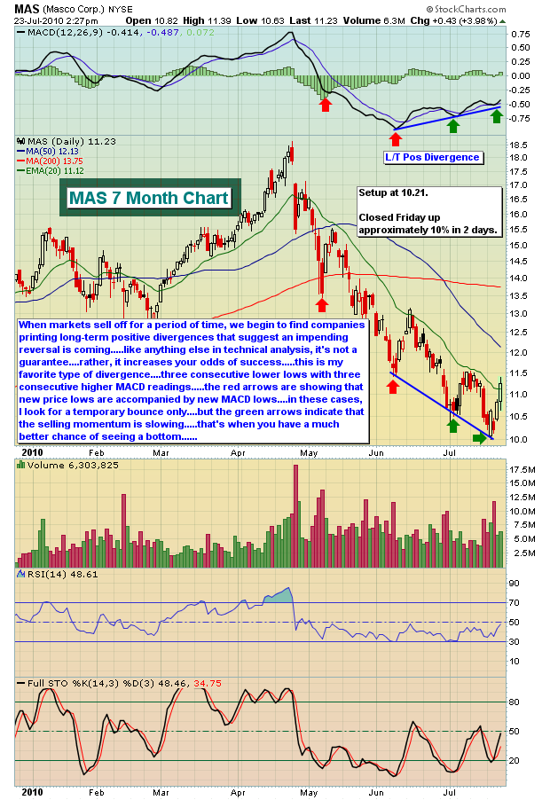
There are definitely rules to follow when buying a stock with a positive divergence or selling one with a negative divergence. If you're interested in divergences and would like to learn more about them, feel free to join me on Tuesday, July 27th as I lead the fourth in our monthly Online Traders Series events.
CLICK HERE for more details on this event and for additional trading candidates with long-term positive divergences currently present.
We are also featuring another stock with a powerful long-term positive divergence in place as our Chart of the Day for Monday, July 26.
CLICK HERE for more information.
Happy trading!
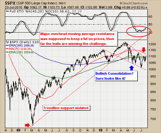
NOW THAT'S A TRADABLE RALLY!by Richard Rhodes | The Rhodes Report After a horrid 2nd quarter, the S&P 500 is sure making up it's losses at a rapid rate. We've been rather bearish of late given the S&P was trading below its major moving averages that delineate bull & bear markets, with the prospect of these important resistance levels proving their merit with another leg lower. The only caveat we've had is that our models were near oversold levels. They never made it that far, but certainly they have now turned higher - with the S&P now gingerly breaking back above our resistance levels. This is material in our mind, and it has caused us - for now - to become tactically bullish. Our reasons are simple:
1. The bullish consolidation formation was confirmed with a breakout above trendline resistance;
2. The 40-day stochastic is rising from right at oversold levels; our proprietary models are based on the stochastic, so it serves a useful purpose here for illustration;
3. All the major moving averages - except the medium-term 75-day moving average - were violated from below; and,
4. Breath has been astoundingly good on this rally. Volume is a bit suspect; but we've found this argument not to hold water in the trading world any longer given the entire March-09 to April-10 rally was on low volume.
Therefore, our upside targets are 1120-to-1160, and we'll expect to see this develop by August-end...which pencil to paper would suggest a rally of another +11% in the space of a month. Now that's a tradable rally.
