Hello Fellow ChartWatchers!
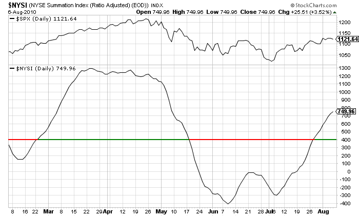
The market is trying to rise but bearish news keeps beating it down. One of my favorite market indicators - the McClellan Summation Index - rose decisively above the 400 level at the end of July indicating that it was time to start looking for entry points again. This week however a number of economic reports have kept the stock market in check. While opinions are mixed on what next week will bring, I'm still encouraged by the fact that the Summation Index has continued its upward movement.
(Click here for a live version of this chart.)
DON'T FORGET OUR TWITTER FEED AND FACEBOOK PAGE: We are continuing to improve and expand how we get information out to our users. Be sure to "follow" our Twitter feed (http://twitter.com/stockchartscom) and "friend" our Facebook page (http://facebook.com/stockchartscom) in order to get the latest info on StockCharts.com. Just yesterday, we pointed our Twitter and Facebook fans to a terrific new article by John C. Lee entitled "How I Use Stockcharts.com". Click on either link above to navigate to the article.
GREAT PUBLIC CHARTLISTS STILL EXIST! We know that many of the ChartLists in our Public ChartLists area aren't the greatest. We are constantly working with Public ChartList authors to "up their game" and provide their readers with great content. As part of that effort, I wanted to single out two authors that have created some very nice new lists that everyone should check out.
Greg A. Neal's "IN THE MOMENT" list uses some of our newest features including overlaid area indicators and the Elder Impulse System to create some remarkable charts. His clear annotations compliment the charts and help anyone see how he reaches his conclusions.
John Moschell's "Moschell's Charts" is another list that is clean, neat, and easy to understand. His use of different trendline styles to define channels really sets his list apart.
There are many, many more great Public ChartLists out there besides these two. You owe it to yourself to visit this free part of our website frequently. And remember, if you see a ChartList that you like, don't forget to scroll down to the bottom and VOTE FOR IT. The authors work hard and really appreciate you votes.
IMPROVING PERFORMANCE; IT TAKES TWO: The biggest lesson to come out of all the comments that we received last week is that performance can vary widely depending on how your computer is set up. When I asked for help tracking down a performance problem that Norton Security users had been reporting, I didn't expect the huge number of responses that were sent in - so thanks to everyone for that. There's lots of great advice inside those comments for people that are seeing slowness with our website. If trading is important to you, you owe it to yourself to review those comments and test out some of the ideas there. Why continue to suffer with slow chart speeds when something as simple as installing Google Chrome or switching security software could speed things up by 2 or 3 times?
StockCharts is doing its part too in the battle for faster performance. We are halfway through with the implementation of the XIP web acceleration service from InterNAP. The feedback from last month's test was extremely positive and we hope that soon everyone will be seeing charts appear much faster.
Finally, don't forget to get out and enjoy the final few weeks of summer!
- Chip
STOCK INDEXES IN P&F UPTRENDSby John Murphy | The Market Message
The intermarket picture shows a preference for the risk-on trade over the last five weeks. The next two PerfCharts show five intermarket ETFs over two distinct timeframes. The first extends from late April until late June, which is when stocks declined sharply. The second extends from early July to early August, which is when stocks advanced sharply. A sharp decline in stocks reflects risk aversion or the risk-off trade. Weakness in stocks extended to oil, which has been positively correlated to the stock market all year. The risk-off trade also involves a flight to safety. Notice that bonds, the Dollar and gold advanced when stocks were weak. The second PerfChart, which extends from early July to early August, is pretty much the inverse of the first. Stocks advanced sharply and this coincided with an advance in oil. Strength in stocks means investors are embracing risk. Unsurprisingly, the flight-to-safety securities suffered over the last five weeks as bonds, the Dollar and gold moved lower.
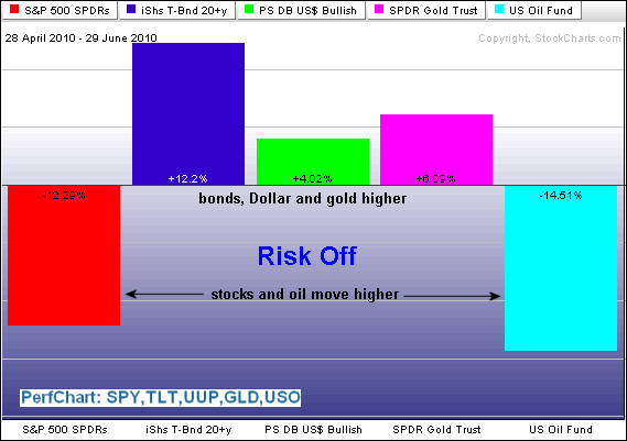
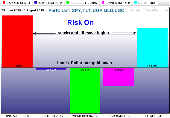
Click these images to see a live PerfChart
MCCLELLAN OSCILLATOR IS POSITIVEby Carl Swenlin | DecisionPoint.com
The
McClellan Oscillator chart could be voted one of the most likely charts
to cause the glazing over of multitudes of eyeballs; however, with a
little effort you can understand it and appreciate the wealth of
information it conveys. Take a moment and read and let the following
paragraph sink in.
The McClellan Oscillator (displayed just
below the S&P 500 chart) is the difference between the 5% and 10%
Indexes, which are a 19-EMA and 39-EMA of daily advances minus declines.
(They are in the bottom panel of the chart below.) The Oscillator
reflects the short-term strength and direction of market liquidity. A
longer-term view is provided by the Summation Index (the dotted line),
which is the cumulative total of the daily McClellan Oscillator values.
These indicators move within a trading range and also help us determine
the overbought/oversold condition of the market.
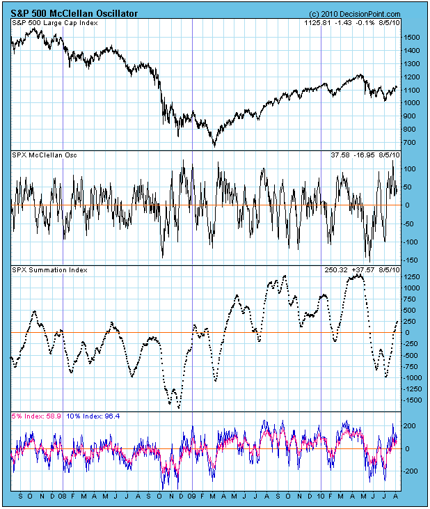
The
Oscillator has been above the zero line since just after the July price
low. You can see that, historically, this situation will not be
sustained too much longer -- the oscillator will drop below the zero
line, indicating that breadth has turned negative. This is not
necessarily something to worry about because you can see that it happens
frequently, even when prices are in a rising trend.
I
do become concerned with below zero Oscillator readings when the 5% and
10% indexes are themselves below the zero line. As you can see, they
are currently both above the zero line, and have been since the
correction low. On the next pullback they may dip below the zero line,
but that won't be a problem as long as the condition doesn't persist.
Bottom
Line: The McClellan Oscillator is an excellent tool for examining the
internal condition of market breadth. In my opinion, observing the
configuration of the 5% and 10% indexes is an essential part of
interpreting the Oscillator and Summation Index. For more information,
check out Tom McClellan's website at mcoscillator.com.
MAKING CENTS IN A WACKY MARKETby Tom Bowley | InvestEd Central Yep, you read the headline correctly. I want to personally congratulate you if you're able to successfully trade this market. Because it ain't easy. Friday was yet another example. Not only did the report fall well short of expectations on the July jobs, the revision to June was another 100,000 of jobs lost. In a market that seemed ripe for a pullback, at a minimum, and possibly something much worse, the bulls didn't flinch. Sure, there was early selling on Friday, but by day's end the sellers were gone and the bulls once again established control of the action, nearly finishing the day with the major indices in positive territory. Crazy!
The bears were left wondering what it might take to drive prices lower. Seriously, what could have been worse than the disappointing July jobs numbers and the major downside revision to the June? Clearly, the market is heading higher, right? Well, that's where the "wackiness" comes in.
I've had serious issues with the market advance, starting in April. Two major technical problems surfaced in April that led to the broad selloff. First, the financial sector led the advance from the February bottom to early April. But as the market attempted another rally in late April, relative support from financials had reversed and this influential group began lagging, never a good sign. The second red flag involved the 10 year treasury yield. The yield has generally moved in unison with equity prices, with one caveat being that we've usually seen the yield move first, seemingly dragging equity prices along for the ride. We've seen several instances where the two have diverged, only later to realize that the yield seems to be the dog wagging equity prices, the tail. It happened in January 2009, when the 10 year treasury yield bottomed a couple months before the S&P 500 finally hit rock bottom in March 2009. More recently it happened in April 2010 as the yield topped at 4.00% in early April, a few weeks before the S&P 500 topped.
Check out this chart:
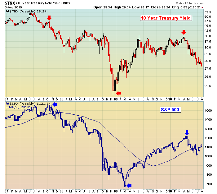
Focus on the red and blue arrows above. Note that every significant change in direction in the S&P 500 follows an earlier move in the 10 year treasury yield. It's as if the bond market senses and prices in economic changes slightly ahead of the stock market. While the downtrend in both the bond yield and the S&P 500 is quite apparent, the subtle leadership of bond yields may not be. If you study individual movements in each chart, you'll find a couple times where it appears the S&P 500 leads the bond yields as well. But the major moves seem to be led by the bond market. Keep mind that bond prices move inversely with bond yields. So a falling yield means that money is moving INTO bonds. Given that treasuries are viewed as a "safety net", the increasing bond values and falling yields also send a disturbing signal that investors continue to search out safety over higher risk. This always represents a red flag for equity prices.
Back to that chart for a moment. As the S&P 500 continues its march higher and the bulls' resiliency shines through, how should we interpret the action in the bond market and the new recent lows in bond yields? Personally, I view it as a bearish backdrop for equities looking ahead. The problem with this thinking, however, is that many of the technical indicators I follow have turned decidedly bullish. The daily MACD, for instance, has made a very bullish centerline crossover and is pointing higher. This is unmistakable evidence that the bulls are in control of the action in the near-term. A downtrend is defined as a series of lower highs and lower lows. While the Dow Jones recently cleared its June "lower high" of 10594, the S&P 500 is still trying to clear its June "lower high" of 1131. That's the next hurdle to clear to the upside. And the bulls need to clear this hurdle while they have bullish momentum on their side. The short-term uptrend line and the 20 day EMA are the bulls' biggest lines of defense during periods of selling. I'd consider following this chart for additional short-term clues:
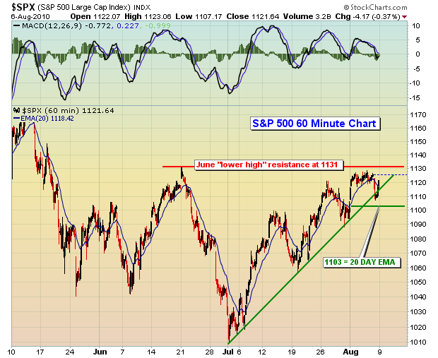
Generally, when the MACD is as strong as it is now, the 20 day EMA holds as support during directional trend periods. I've plotted 1103 on the chart, identifying that as the current 20 day EMA. If 1103 is lost as support, clearly the short-term uptrend will have ended and significant short-term moving average support will be lost as well, a bearish development. However, if the bulls can continue to show their recent resiliency and clear 1131 price resistance on a closing basis, it's another feather in their cap.
So, how can we make "cents" out of this market? Good question. First, I'd lower the bar in terms of performance expectations. It's a difficult market environment. I like to scan for very specific stock candidates with very low risk in the event the recent whipsaw action continues. It's not a guaranteed method to riches, but it is a disciplined approach to trading a wacky market. Along these lines, I'm pleased to announce that Invested Central is introducing its first in a new Premier Active Trader Series, "Scanning Strategies for Active Traders".
CLICK HERE for more details. Our Chart of the Day for Monday, August 9th, represents a trading candidate from one of our weekend scans.
CLICK HERE to view this chart.
Happy trading!
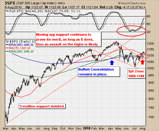
S&P 500 BULLISH....FOR THE TIME BEINGby Richard Rhodes | The Rhodes Report The rally off the July low is ongoing, and appears resilient in the face of very negative sentiment. While we want to be bearish based on a plethora of macro fundamentals, the technical viewpoint remains rather bullish for the time being. However, as we all understand - it could change quickly. But having said this, there are defensive points that are clear and unequivocal in our mind that if violated - then the "risk-off" trade or bear market is back in vogue.
To review, the S&P 500 bottomed in July with perhaps the best internal breadth figures we've seen in quite sometime. And, no one can refute that the S&P has broken out of a bullish consolidation and above major moving average resistance levels at 1008 and 1096, and remains above the 75-day trading moving average at 1107. Moreover, the 40-day stochastic remains in a clear uptrend. Hence, the path of least resistance is technically higher...regardless of the bearish fundamentals.
Therefore, one should consider long positions on corrections back into support at 1107 such as Friday's late day rally surge in lieu of a move to new highs above 1230. This is a diffucult trade to get one's hands around given the negative sentiment, but if we can compare this period to any other in recent memory - then it would be the rally after the initial "financial earthquake" in the Summer of 2007. Shortly thereafter, the S&P rallied to a new all-time high with talks of a "pause that refreshes", but in reality it was something far worse. Thus, we wouldn't be surprised to see the S&P climb towards the 1250 level by sometime in late August or early September before giving way to sharply lower prices.
