Hello Fellow ChartWatchers!
It's that time of year again:

Now through the end of August, StockCharts.com is running it's "End-of-Summer-Almost-Fall" special and this is a very special special indeed. Here's the deal:
Subscribe to any of our services for six months and we will give you one addtional month for free!
Subscribe to any of our services for one year and we will give you THREE(!) additional months for free!
Normally, our specials give you 2 months for free when you order a year of service. This is the first time ever that we've given away 3 months of service with a 12 month order!
Let's do the math here. If you subscribed on a month-to-month basis to our top-of-the-line "ExtraRT+Market Message" package, 15 months of service would cost you $45.90 x 15 = $688.50. However, if you subscribe between now and the end of August, those same 15 months would only cost you $459.35, a savings of $229.15 which works out to 33.3% off. It drops your per month cost from $45.90 down to $30.63 per month - less than the monthly cost for just ExtraRT by itself!
Looking at the other end of the spectrum, this means that you could sign up for "Basic", our least expensive package, for only $10.33 per month, saving up to $69.30 in the process.
To get started, simply click on this link and follow the instructions. Better do it quick however, this special only lasts through the end of the month!
Now, I know what you are thinking:
"Hey Chip! What if I'm already a StockCharts Member?"
If you are already a member, I have even better news for you. First off, you can extend your current subscription right now using these discounted rates to lock in the savings. Why risk having your account expire during a non-special time period? If your account is scheduled to expire within the next 12 months, I strong encourage you to take advantage of this deal now.
Second, have you been a StockCharts.com member for more than a year? If so, you can save even more by using your StockCharts Loyalty Coupon. The loyalty coupons can be used IN ADDITION TO THE SPECIAL DISCOUNT. Click here to learn more about loyalty coupons and how to use them.
Throughout the year we have people ask us "When is the next special going to be?" Now we finally have an answer - "Now." Don't miss it. Don't one of the people who writes in after the Special has ended. Click here to lock in our best special deal ever.
- Chip
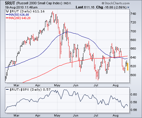
It's usually a bad omen for the market when small caps and technology
stocks are underperforming -- as they're doing at present. Chart 1
shows the Russell 2000 Small Cap Index trading closer
to its July low than its July high. Its falling relative strength line
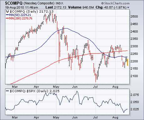
also shows small-cap weakness. The same is true for the
technology-dominated Nasdaq market. Chart 2 shows the Nasdaq Composite
meeting resistance at its (blue) 50-day average (having never closed
the overhead resistance gap formed last week). It's also dangerously
close to breaking support near 2150. Its falling relative strength
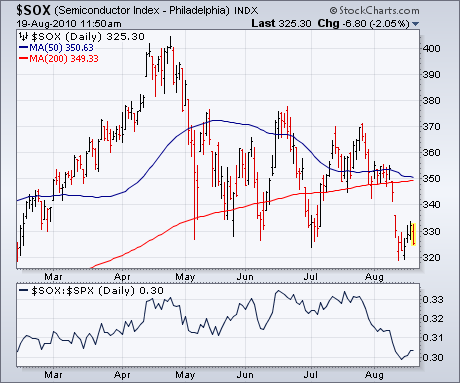
shows it leading the S&P 500 lower. A big reason for the Nasdaq
underperformance can be seen in Chart 3 which shows the Semiconductor (SOX) Index
having already broken its summer low. Notice the steep drop in its
RS line since mid-August. Semiconductor weakness is usually bad for
the Nasdaq which is bad for the rest of the market. That increases the
odds for more stock selling.
The Point & Figure chart for QQQQ shows clear support and resistance lines for 2010. The ETF advanced for 9-10 months with a long column of Xâs in 2009 and then embarked on a consolidation in 2010. Notice that the Xâs started in March 2009 and continued until December. The numbers 4 through 9 represent April to September. The letters A,B and C represent October, November and December. After the ABC, we start with January 2010 by marking a red 1 on the chart.
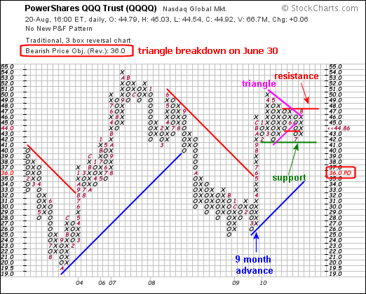
The current P&F signal is bearish. A triangle formed from January to June and the ETF broke triangle support in late June. This break is denoted with the black âoâ just above the red 7, which marks the start of July. This bearish P&F signal has yet to be negated and the current price objective is 36. It would take a move above 48 to forge a double top breakout and reverse the current bearish signal. In fact, a break above 48 would make this pattern looks like a large pennant, which is a bullish continuation pattern.
Even with a bearish price objective, QQQQ is still holding major support around 41-42. Notice how the ETF bounced off this level in February, May and July. A move below this support level would forge a quadruple bottom support break and call for a new downside price objective. See our ChartSchool for details on P&F charting techniques (click here) and P&F alert patterns (click here). Chart annotations were done with a separate drawing program.
Looking
at a weekly chart of the U.S. Dollar Index we can see that it entered a
steep correction off the June top when it encountered long-term
resistance from a declining tops line reaching back to 2006. During the
correction a rising trend line drawn from the December 2009 low was
violated, and it seemed likely that the index would decline all the way
back to the long-term rising trend line drawn across the 2008 and 2009
lows. That may still happen, but currently a snapback rally has begun.
When a line of support is violated, shortly after the breakdown the
technical expectation is that prices will snap back up toward the point
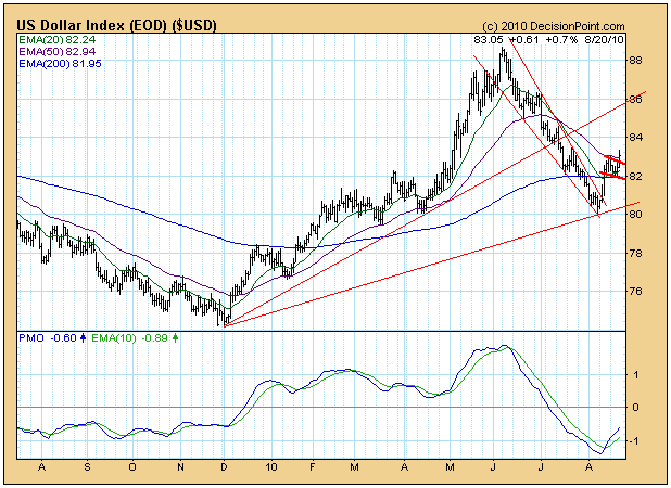
of breakdown. The daily chart below gives a closer view of the action
and of the bullish flag formation that has formed. We can see the sharp
up move that broke through the declining tops line (flag pole), and for
the last week the price index has been consolidating in a tight,
downward-slanting trading range (flag).
While
the expectation of a snapback rally has been fulfilled, the flag
formation implies that the index will continue to rally -- today there
was a breakout from the flag. The price projection equal to the length
of the flag pole is about 85.
As of 7/14/2010 the US Dollar is on a Trend Model neutral signal. A new buy signal will be generated when/if the 20-EMA crosses up through the 50-EMA.
Bottom
Line: After over two months of decline, the Dollar Index is rallying
and looking bullish for the short-term; however, there is a rising trend
line above that will present resistance, and the longer-term picture on
the weekly chart shows a PMO that is falling below its EMA. My best
guess at this point is that the rally will continue for a time, but that
it will eventually fail and that the longer-term decline will continue
down to long-term support -- around 76 on the long-term rising trend
line.
With a myriad of "under the surface" problems, the S&P 500 simply ran out of gas at a very inopportune time. The bulls were on the threshold of a major breakout on the S&P 500 above its June highs near 1131. For seven consecutive days, the S&P 500 flirted with that 1131 resistance, each time setting an intraday high somewhere between 1120 and 1130. Unfortunately for the bulls, each time resulted in a failure. It's not at all surprising to me. As much as I'd love to see the market breakout in a big way to the upside, there were simply too many signals indicating that it wasn't going to happen. The Russell 2000 (small caps) were lagging, not leading. Joining the small caps as laggards were financials, technology (especially semiconductors), and consumer discretionary. That is not a recipe for higher prices. In an advancing market, these groups lead. The fact that none were leading made it very difficult for me to buy into the July market strength.
Technically, the S&P 500 confirmed the end of its short-term uptrend on August 11th. In my article on August 7th, I suggested that the short-term uptrend on the S&P 500 be watched carefully for short-term directional clues. The uptrend was on a course for a major battle at 1131 resistance and the winner of that battle would have the upper hand in terms of short-term market direction. Take a look at how that trend resolved itself:
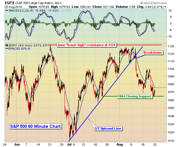
The bulls simply didn't have enough gas in the tank. Not enough key influential sectors/industries participated in the breakout attempt. It was doomed from the beginning. The bears understand where the MAJOR resistance lies - at 1131. So now the question becomes, how low do we go? Technically, I've identified two key areas of support. The first was the July 16th close at 1064.88, while the second resides all the way back down at the July 2nd close at 1022.58. Obviously, a close beneath 1022.58 spells more trouble ahead. That's the last thing this market needs as we head into the worst historical month of the year - September.
I continue to lean to the bearish side, but I don't believe we're heading back to test 666 like many in the bearish camp. The market has a way of overdoing things during panicked times and that low came on the heels of monumental levels of panic. We'd have to see a lot more economic and technical deterioration before we'd come close to revisiting those levels. Personally, I believe a move on the S&P 500 to 950 might just do the trick, although I'll certainly keep my options open. Such a move during the historically weak month of September would make a lot of sense, both technically and fundamentally. It's a really tough and volatile market though. There are so many bullish and bearish arguments, trying to decipher which ones make the most sense is next to impossible. But I always keep one thing in mind. The market uses every bit of known information to come up with current prices. Don't believe for a minute that you have knowledge that the market hasn't considered. There's a reason it's priced where it is. So I always leave the door open on both sides - bullish and bearish.
One of my favorite relative charts is included as our Chart of the Day for Monday, August 23, 2010. The recent uptrend in this chart portends of further market weakness. CLICK HERE for details.
On Tuesday, August 24, 2010, we will be hosting the 5th monthly event in our very popular Online Traders Series. This month's event will delve into the Elliott Wave Theory, a form of technical analysis that forecasts trends in financial markets by identifying extremes in investor psychology. This event will be led by a long-time, very successful portfolio manager who applies Elliott Wave Theory in his analysis of the market. For more information, CLICK HERE.
Happy trading!