| |
|
|
|
|
| |

|
ChartWatchers
the StockCharts.com Newsletter
|
|
|
|
|
|
|
|
Hello Fellow ChartWatchers!
Today I want to answer a question that we get frequently - "Where do I start? This is all so overwhelming!"
The answer is, you start with John Murphy's 10 Laws of Technical Trading.
In anticipation of your next question, here and now I present to you <fanfare> "John Murphy's Ten Law's of Technical Trading" with my strong recommendation that you read (or re-read) them and take everything in them to heart.
- Chip
John Murphy's Ten Laws of Technical Trading
1. Map the Trends
Study long-term charts. Begin a chart analysis with monthly and weekly charts spanning several years. A larger scale map of the market provides more visibility and a better long-term perspective on a market. Once the long-term has been established, then consult daily and intra-day charts. A short-term market view alone can often be deceptive. Even if you only trade the very short term, you will do better if you're trading in the same direction as the intermediate and longer term trends.
2. Spot the Trend and Go With It
Determine the trend and follow it. Market trends come in many sizes â long-term, intermediate-term and short-term. First, determine which one you're going to trade and use the appropriate chart. Make sure you trade in the direction of that trend. Buy dips if the trend is up. Sell rallies if the trend is down. If you're trading the intermediate trend, use daily and weekly charts. If you're day trading, use daily and intra-day charts. But in each case, let the longer range chart determine the trend, and then use the shorter term chart for timing.
3. Find the Low and High of It
Find support and resistance levels. The best place to buy a market is near support levels. That support is usually a previous reaction low. The best place to sell a market is near resistance levels. Resistance is usually a previous peak. After a resistance peak has been broken, it will usually provide support on subsequent pullbacks. In other words, the old "high" becomes the new low. In the same way, when a support level has been broken, it will usually produce selling on subsequent rallies â the old "low" can become the new "high."
4. Know How Far to Backtrack
Measure percentage retracements. Market corrections up or down usually retrace a significant portion of the previous trend. You can measure the corrections in an existing trend in simple percentages. A fifty percent retracement of a prior trend is most common. A minimum retracement is usually one-third of the prior trend. The maximum retracement is usually two-thirds. Fibonacci retracements of 38% and 62% are also worth watching. During a pullback in an uptrend, therefore, initial buy points are in the 33-38% retracement area.
5. Draw the Line
Draw trend lines. Trend lines are one of the simplest and most effective charting tools. All you need is a straight edge and two points on the chart. Up trend lines are drawn along two successive lows. Down trend lines are drawn along two successive peaks. Prices will often pull back to trend lines before resuming their trend. The breaking of trend lines usually signals a change in trend. A valid trend line should be touched at least three times. The longer a trend line has been in effect, and the more times it has been tested, the more important it becomes.
6. Follow that Average
Follow moving averages. Moving averages provide objective buy and sell signals. They tell you if existing trend is still in motion and help confirm a trend change. Moving averages do not tell you in advance, however, that a trend change is imminent. A combination chart of two moving averages is the most popular way of finding trading signals. Some popular futures combinations are 4- and 9-day moving averages, 9- and 18-day, 5- and 20-day. Signals are given when the shorter average line crosses the longer. Price crossings above and below a 40-day moving average also provide good trading signals. Since moving average chart lines are trend-following indicators, they work best in a trending market.
7. Learn the Turns
Track oscillators. Oscillators help identify overbought and oversold markets. While moving averages offer confirmation of a market trend change, oscillators often help warn us in advance that a market has rallied or fallen too far and will soon turn. Two of the most popular are the Relative Strength Index (RSI) and Stochastics. They both work on a scale of 0 to 100. With the RSI, readings over 70 are overbought while readings below 30 are oversold. The overbought and oversold values for Stochastics are 80 and 20. Most traders use 14-days or weeks for stochastics and either 9 or 14 days or weeks for RSI. Oscillator divergences often warn of market turns. These tools work best in a trading market range. Weekly signals can be used as filters on daily signals. Daily signals can be used as filters for intra-day charts.
8. Know the Warning Signs
Trade MACD. The Moving Average Convergence Divergence (MACD) indicator (developed by Gerald Appel) combines a moving average crossover system with the overbought/oversold elements of an oscillator. A buy signal occurs when the faster line crosses above the slower and both lines are below zero. A sell signal takes place when the faster line crosses below the slower from above the zero line. Weekly signals take precedence over daily signals. An MACD histogram plots the difference between the two lines and gives even earlier warnings of trend changes. It's called a "histogram" because vertical bars are used to show the difference between the two lines on the chart.
9. Trend or Not a Trend
Use ADX. The Average Directional Movement Index (ADX) line helps determine whether a market is in a trending or a trading phase. It measures the degree of trend or direction in the market. A rising ADX line suggests the presence of a strong trend. A falling ADX line suggests the presence of a trading market and the absence of a trend. A rising ADX line favors moving averages; a falling ADX favors oscillators. By plotting the direction of the ADX line, the trader is able to determine which trading style and which set of indicators are most suitable for the current market environment.
10. Know the Confirming Signs
Include volume and open interest. Volume and open interest are important confirming indicators in futures markets. Volume precedes price. It's important to ensure that heavier volume is taking place in the direction of the prevailing trend. In an uptrend, heavier volume should be seen on up days. Rising open interest confirms that new money is supporting the prevailing trend. Declining open interest is often a warning that the trend is near completion. A solid price uptrend should be accompanied by rising volume and rising open interest.
"11."
Technical analysis is a skill that improves with experience and study. Always be a student and keep learning. The ChartSchool area of StockCharts.com is a great please to start.
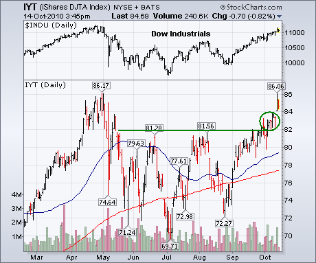
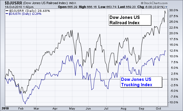
Previous messages showed the upside breakout in the Dow Transports (over their summer high) which confirmed a previous upside breakout in the Dow Industrials and constituted a Dow Theory buy signal (see circle). Both Dow averages are approaching another test at their spring highs. Needless to say, the ability of both Dow averages to clear their spring highs is necessary to keep the new uptrend going. I'm going to focus today on what I consider to be the most economically-sensitive part of the transports which are the rails. Chart 1 shows the DJTA iShares (IYT) testing its May high near 86. Rails have the strongest IYT weighting at 29%, air freight is second at 23%, truckers are third at 21%, and airlines at 8%. Rail dominance is further demonstrated by the fact that four out of the top ten IYT holdings are rails. Transportation stocks are considered to be economically-sensitive because they move goods throughout the country. The two groups most often used to move that traffic are rails and truckers. Chart 2 shows, however, that rails (black line) have been much stronger than truckers (blue line). One reason for stronger rails is that they're less fuel-sensitive than truckers. Another is that rails are the primary mover of commodities like coal and grains which have been very much in demand. In a sense, it could be said that rails are another way to play rising commodity markets.
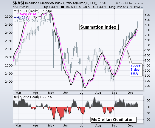
Even though stocks are overextended after a massive seven week run, we have yet to seen any evidence of weakness that would signal the start of a correction or pullback. Many momentum oscillators are also at or near overbought levels, but cumulative indicators, such as the McClellan Summation Index, continue moving higher to capture the current uptrend.
Think of the Summation Index as the smoother cousin of the McClellan Oscillator. Basically, the McClellan Oscillator equals the 19-day EMA of Net Advances less the 39-day EMA of Net Advances. Like MACD, it captures momentum by taking the difference of two moving averages. This indicator oscillates around the zero line as momentum shifts for Net Advances. The Summation Index is a cumulative McClellan Oscillator. As a cumulative indicator, it is smoother than the McClellan Oscillator and has fewer crosses above/below the zero line. It also trends.
Click this image for a live chart.
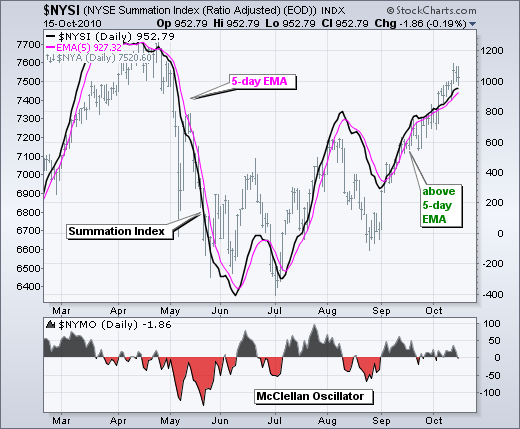
The charts below show the Summation Index with a 5-day EMA to identify upturns and downturns. This may seem like a tight moving average, but the Summation Index is already smooth and this short moving average identifies the turns pretty well. Notice that the Summation Index moved above its 5-day EMA in early September and remains above this moving average. There is no questioning the uptrend in the Summation Index. As long as this breadth indicator remains above the 5-day EMA, I would expect the current rally to continue, even if conditions are overbought. A break below this moving average would signal weakness in breadth that could give way to a correction or pullback in the market. The second chart shows the NYSE Summation Index ($NYSI) with similar characteristics.
Click this image for a live chart. A subscriber had some questions about the Percent Buy Index (PBI) versus the Bullish Percent Index (BPI). The PBI is my creation, and it tracks the percentage of Price Momentum Model (PMM) buy signals for the components in a given index. (In the case of this discussion we will be looking at the PBI for the S&P 500 Index.) The BPI was, I believe, created by Tom Dorsey, who is a highly regarded expert on point and figure (P&F) charting. The BPI tracks the percentage of P&F buy signals in an index.
To clarify, as far As I know the BPI was introduced long before we got the idea for the PBI, but we started collecting data on the OEX PBI many years before we even heard of the BPI. I think that is called "reinventing the wheel." Nevertheless, there are significant differences between the timing models that drive the BPI and PBI.
As I said before, the BPI uses buy signals generated on P&F charts. I'm not going to go into how P&F charts are made, but suffice it to say that they are nothing like a standard bar or line chart that we normally use for charting, nor are the buy signals they generate. I don't use P&F charts because I don't find them intuitive enough for me, but many people do use them with great success, and more power to them.
The Price Momentum Model (PMM) uses ten percent price move and 200-EMA crossover to generate buy signals (see our Glossary article).
On the chart below we can see how both have performed over the last three years. I think they are remarkably similar, except for the period I have highlighted in the red rectangle, which was during the last six months of the bear market and prices were getting thoroughly hammered. As you can see, the BPI was quite volatile, showing a spike of over 70% of buy signals well ahead of the final price low. Conversely, the PBI correctly stayed flat during that time and did not start a strong up trend until the final price low was in place.
As I have said many times, every mechanical model has its weaknesses, and in this case we can see the weakness in the P&F model. Specifically, expect volatile signals during periods when there is severe price decline -- the P&F model apparently triggers too easily in these circumstances.
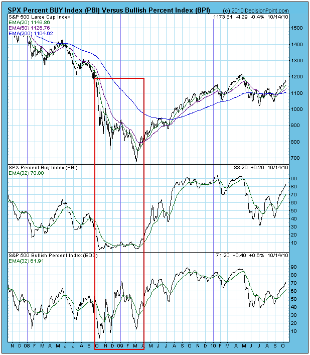
We use a PBI 32-EMA crossover to generate buy and sell signals, but the PBI has a finite range, and these crossovers will generate some noise when the PBI is near the top or bottom of its range. It is most reliable in generating buy signals from the bottom to the middle of its range.
Currently, both the PBI and BPI are becoming overbought. If we are in a condition similar to what we were in mid-2009, I don't think that will be a problem. In other words, the indicators can remain overbought for some time while prices move higher.
Conclusion: The PBI and BPI have a similar objective of tracking the number of buy signals for the components in a given index, so we can estimate the kind of participation is behind price moves. The PBI seems to be more stable, particularly during severe price declines.
A LOOK AT THE FINANCIALSby Tom Bowley | InvestEd Central I spend a great deal of time evaluating the financial sector because I believe it's the most influential group in terms of leading the market. Financials underperformed miserably in 2007 and 2008 and overall market performance followed suit. In 2009, financials outperformed and the market recovered a lot of its prior losses. But in 2010, the market doesn't quite seem to know what to do about the lagging financial sector. Year-to-date, our major indices are up as follows:
Dow Jones: +6.09%
S&P 500: +5.48%
NASDAQ: +8.80%
Russell 2000: +12.44%
The financials? Well, the Dow Jones US Financial Index ($DJUSFN) is roughly 1% higher, badly lagging the major indices. Take a look at the chart below and you'll see another failed breakout attempt in this sector:
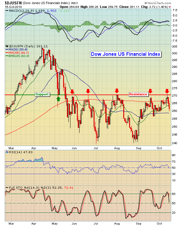
The financials performed extremely well from February to April of 2010 and the overall market did very well also. Since April, however, the financials have performed miserably. Yes, our major indices have had their moments where we've seen straight up moves, but the overall direction since April has been sideways at best. In my opinion, the market is awaiting leadership from financials and if last week's initial reaction to JP Morgan's (JPM) earnings is any indication, the market may not like the kind of leadership it's about to get. Financials had an opportunity to seize a major breakout and they simply choked. Foreclosures, high unemployment, sagging consumer confidence, etc. are taking their toll on this sector.
Google (GOOG) provided a huge lift to the NASDAQ, especially the NDX, last week based on its blowout earnings, but I do not believe these types of gains will be sustainable if the DJUSFN cannot break that 271 resistance level. Believe me, there are no clearcut signs in this market. Several indicators say BUY, but many others say SELL. Certain indicators, like the MACD, are suggesting this rally has a long, long way to go potentially. Before I buy into that theory, however, I want to see a technical breakout in financials. A close above 271.00 on the DJUSFN and 48.10 on the Bank Index ($BKX) would provide a HUGE boost to our major indices. Should the financials actually begin to gain strength, we're keeping a very close eye on an insurance stock that could be poised to make a nice run to the upside. We're featuring it as our Chart of the Day for Monday, October 18, 2010. CLICK HERE for more information.
Market timing could be an issue soon as well. September 2010 is now in the record books, defying historical bearish trends for that month. While the September 2010 gains were the strongest September gains since the 1930s, we still need to take a step back and objectively look at the big picture. Despite a great September, that months still looms as the worst calendar month of the year, and it's not even close. Now we are quickly approaching the single worst week of the year historically. The stock market's historical tendencies are the subject of our next Online Traders Series event, scheduled for Monday, October 18, 2010. I will discuss, in detail, the upcoming bearish period that has produced MINUS 53.82% annualized returns over the last six decades, and share other remarkable statistics about historical trends that can help in your trading. For more details, CLICK HERE
Happy trading! |
|
|
|
|
|
|
|
|
|
|
|
|
|
|