Hello Fellow ChartWatchers!
We are now halfway through our current plan for adding more value to every StockCharts.com subscriber's membership. Two weeks ago, we doubled the amount of chart storage that Extra members get and we drastically increased the "freshness" of our Scan Engine results. This week, we've increased the number of charts Basic members can store from 100 to 500 and we've given then access to many of the same features that Extra members have - i.e., multiple list views, storage for annotated charts, etc.
(At this point there are only 3 differences between Extra and Basic - Extra members get multiple ChartLists, Extra members get full scan results, and ExtraRT members get official real-time data instead of BATS data.)
All of these upgrades have been provided to our members automatically and for no additional fee and so far the reviews have been very positive:
"You have NO idea how happy you have made me. Because I work with industry sectors, the 100 chartlist limit is something that I've continually bumped into." - Leisa Deffenbaugh
"Thanks for the improvements. They are much appreciated and show your continued determination to remain #1. It would have been easy to sit back and just "let it roll" but you didn't do that. I've been with you for nearly 9 years and will continue, no question. The inclusion of Art Hill and John Murphy is an outstanding feature and also much appreciated. Keep it going! I love it!" - R. Rimrodt
So... that's it right? All the improvements are complete. Move along. Time to get back to charting...
Actually, not quite.
We still have a couple more big changes up our sleeves that I wanted to let you know about. All of these changes will make your StockCharts subscription even more valuable. Here they are:
1.) Dynamic Chart Sizing!
I've mentioned this briefly before, but next week we plan on rolling out a new option in the "Size" dropdown for our SharpCharts. The new option is called "Dynamic" and, if you select it, the chart will automatically resize itself to fit your browser window's size. This is perfect for people that use multiple windows to view multiple charts.
2.) The Great Market Message Merger!
Here's another huge increase in value for all StockCharts.com subscribers. Starting in December, we're going to automatically bundle in the StockCharts Market Message with all of our charting packages for free(!) Soon anyone who subscribes to either our Basic, our Extra, or our ExtraRT charting service will automatically get access to the StockCharts Market Message written by John Murphy and Arthur Hill.
(If you already subscribe to the Market Message, we'll automatically extend your subscription to account for the change in pricing. If you only subscribe to the Market Message, we'll give you access to our charting service for free.)
3.) I See London, I See France!
We've just gotten permission to provide charts of stocks from the two major European stock exchanges - the London Stock Exchange and the Euronext Exchange. Initially we will be providing these charts to everyone on a delayed basis for free. In a couple of months, we will start providing real-time versions to people who pay the exchange fees.
4.) Seattle ChartCon 2011 - Learn EVERYTHING About StockCharts.com From the Experts
We're throwing a party and everyone's invited. Next August, for 3 days, we're going to hold a conference in downtown Seattle that is focused exclusively on helping you get the most out of our website. Myself, John Murphy and Arthur Hill will give you in depth training on every aspect of every tool that StockCharts.com has. We're still preparing the "official" agenda but rest assured that this conference will be well worth the time for anyone who's into charting. Mark your calendar (August 11-13) and stay tuned for more details in the coming weeks.
Wow. That's a lot of stuff. Which one are you most looking forward too?
- Chip
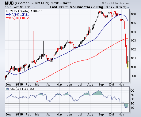
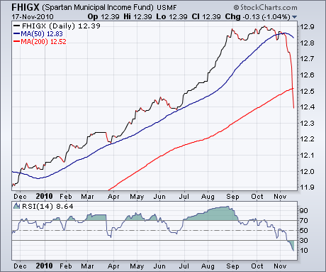
We've been showing the upward trend in bond yields since the Fed's latest QE2 package was announced last week. We've also shown the drop in bond prices, especially Treasury bonds and notes. The bond category that's been hit the hardest has been tax-exempt municipal bonds. The first two charts show just how bad they've been hit. Chart 1 shows the S&P National Municipal Bond ETF (MUB) tumbling to a new 2010 low over the last month. It has also broken its 200-day moving average for the first time in two years. Mutual fund bond investors haven't escaped the price plunge. Chart 2 shows the Fidelity Municipal Income Fund (FHIGX) breaking its 200-day line as well (other muni bond funds look pretty much the same). The only bright spot lies in the deeply oversold conditions of both funds. That suggests that the muni bond market may be due for a bounce. But there's a bigger message (and warning) involved in the two charts. A lot of investors have poured money into the fixed income market over the last year in a search for yield (at the expense of stocks). Part of the preference for fixed income has also been a desire for safety. While it's true that bonds are generally safer than stocks, it is possible to lose money in bonds. When bond yields rise, prices fall. If you have money in a bond mutual fund, it will lose money when long-term rates are rising (as they're doing now). Yes, you'll get a higher yield. But the benefits of a higher yield will be more than offset by falling prices. Your mutual fund statement is based on price, not yield. The sharp drop in the Fidelity muni bond fund in Chart 2 shows that bond funds aren't always safe.
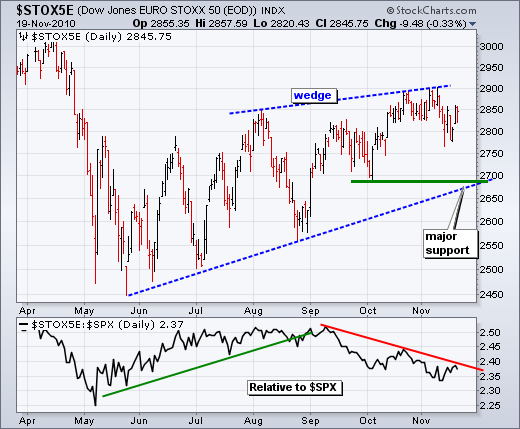
Despite weakness in the Euro and European debt concerns, we have yet to see significant weakness or a breakdown in the DJ Euro Stoxx 50 ($STOX5E). This index is the Dow Industrials of Europe. There are 50 stocks representing 9 countries and 18 industry groups. French and German stocks dominate the index, while finance-related stocks (14) form the single biggest industry group. It is a good cross-section of âcoreâ Europe. While there are concerns with âperipheralâ Europe, these have yet to spread to the Stoxx 50 Index.
Click this image for a live chart
The chart above shows the Stoxx 50 Index remaining in an uptrend overall with a rising wedge taking shape the last six months. A lower high could form as the index never made it to the April high. Major support is based on the October low and lower trendline. A move below these levels would call for a continuation of the April-May decline. The indicator window shows the index relative to the S&P 500. The Stoxx 50 Index was outperforming from May to September, but then started underperforming in mid September. While relative weakness in the Stoxx 50 Index is a potential negative, it has yet to turn into absolute weakness.
According to our mechanical timing models, as well as my conclusions through visual analysis, we are in a bull market, a cyclical bull market, which refers to the bull/bear cycle that occurs about every four years. A subscriber wanted to know if we were also in a secular bull market, which refers to trends that usually persist over many years, even decades. The next chart shows about 85 years of S&P 500 history, and I have marked it with red lines to highlight where, in my opinion, secular bull and bear markets took place.
The decline from the 1929 top to the 1932 low took less than three years, but the decline was almost 90%, so I think this qualifies as a secular bear. The advance that followed lasted about 30 years, certainly a secular bull. The flat move in the 1960s and 1970s has been declared a secular bear by many. It included a decline of about 50%, but it looks like a consolidation to me.
Then came the secular bull market, which began in 1974 (or 1982, depending on your point of view) and ended in 2000.
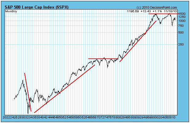
Finally, the market has entered another sideways trading range, which has lasted about 10 years so far. In that time there have been two bloody cyclical bear markets (down about 50% each) and one cyclical bull that drove prices up about 100%. We are currently in another cyclical bull market, seemingly headed back to the top of the trading range. Some are calling the last 10 years a secular bear market. I am inclined to call it a consolidation, but it certainly has heaped a lot of pain on some investing styles, so I won't argue the point.
Where we go from here is a matter of speculation. It appears to me that prices can continue back up to the top of the trading range, completing the bull market with another gain of about 100%. Perhaps it can continue to rally well above the top of the range in the beginning stages of another secular bull market, or, others have suggested, it may continue sideways for another decade or so, cycling through a series of cyclical bull and bear markets. Last, but not least, there is the possibility that prices will drop below the range and enter a devastating secular decline.
My best guess, and it is just a guess, is that the market will continue sideways for several more years -- the pattern has been set. I don't have a guess as to which way the trading range will eventually resolve, but I don't really need to guess. Our mechanical timing models should keep us aligned with the trend no matter which way it goes.
The top in April was laced with warning signs, from record complacency to negative divergences on daily and weekly MACDs to underperforming financials to overbought oscillators to oversold bonds. In particular, the negative divergence on the MACD on the weekly charts suggested the weakness was likely to last. Recently, complacency once again became an issue. As expected, the market reversed lower. Check out the chart below:
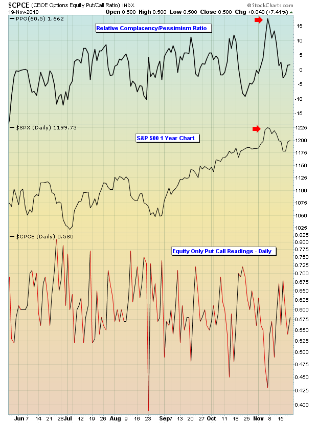
In my long-term analysis of the market and the history of market tops, high complacency is definitely a contributing factor. The extent of any subsequent weakness, however, generally lies within the number of corroborating technical signals that are bearish. As mentioned above, the weekly divergences in April were abysmal and clearly negative, suggesting many weeks or months of market turmoil. I anticipated the summer to be sideways to outright bearish given those divergences. However, once the divergences on the MACD "reset" back to the centerline, the market was able to regain its earlier bullish momentum, which is exactly what we saw in September and October.
So what impact might the recent complacency and overbought conditions have on the market as we move forward? Well, that's the subject of our Chart of the Day for Monday, November 22, 2010. At the time of this article, I am literally returning from the Las Vegas traders expo and, as a result, the Chart of the Day will be updated as soon as I'm grounded back on the East Coast. CLICK HERE for more information.
Happy trading!
Happy Thanksgiving!
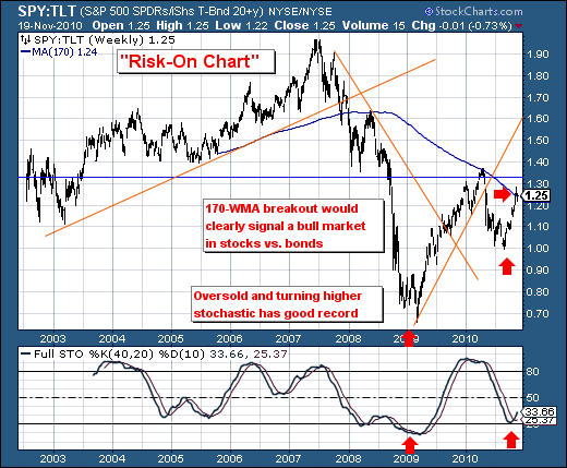
We view the ratio between stocks and bonds as a barometer for the "risk-on" or "risk-off" trade. Therefore, the recent upward movement in the ratio has our attention, and so too should it have our readers as it on the precipice of breaking out into a full-fledged "risk-on" bull market in stocks vs. bonds as the 170-week moving average looks to be violated to the upside given 40-week stochastic is turning higher in bullish fashion. This simply means that stocks shall gain at the expense of bonds, and more importantly - given the bond market has harbored the "risk-off" crowd, they will be forced into becoming buyers of stocks as they shall not want to see capital losses associated with falling bond prices/rising yields.
This is what the Fed Chairman wants; and he said so very eloquently in his November 3rd Washington Post Op-Ed piece. Those who bet against the Fed's unlimited balance sheet do so at their own peril.
