Hello Fellow ChartWatchers!
Next August we are hosting the first ever gathering of StockCharts enthusiasts here in Seattle - a 3-day conference we're calling it "Seattle ChartCon 2011". It's going to be a blast!

For 3 full days, myself, John Murphy and Arthur Hill are going to be giving in-depth presentations on everything that StockCharts.com can do. If you use StockCharts to make investing decisions, you owe it to yourself to attend this conference. Here's a sample of the agenda:
Friday, August 12th
9:00am - Welcome and Overview
9:30am - StockCharts from 10,000 feet - Chip
10:30am - Morning Break
10:45am - SharpCharts In Depth - Chip
12:00pm - Lunch
1:00pm - Advanced Annotation Techniques - Arthur Hill
2:00pm - Advanced SharpCharts Tips and Tricks - Chip
2:30pm - Afternoon Break
2:45pm - Point and Figure Charting for Fun and Profit - Chip
3:30pm - "The Technical State of the Current Market" - John Murphy and Arthur Hill
6:00pm - Sunset Dinner Cruise on Puget Sound
And that's just for Friday! On Thursday we're going to hold a series of presentations called "StockCharts University" that focuses on the fundamentals of Technical Analysis. And of Saturday, we dig even deeper into the website including topics like scanning and market indicators. The agenda for the entire conference can be found here.
Beyond the conference sessions themselves, we're going to have three great evening events - a Northwest Wine Tasting, a Sunset Dinner Cruise on Puget Sound, and club-level seats at a Seattle Mariners/Boston Red Sox's game! Every event will provide lots of time to mingle with StockCharts experts and other users like yourself. I am really looking forward to those events.
If you register now, the cost of the conference is only $295 (prices increase if you delay). But wait! Registering for the conference also gets you 1 year of our Extra charting service - a $250 value. That means that as of right now the effective cost for the conference is less than $45. That is a seriously good deal.
You can find all of the information about Seattle ChartCon 2011 on the ChartCon Homepage. You can also use that link to register.
Please take a moment and think about how 3 days next August with StockCharts in Seattle could help your investing results. Then register today to reserve your place at this amazing event. I would love to see you there and meet you in person.
We've created an FAQ page with additional details about the event. Click here to see it.
Happy Holidays!
- Chip
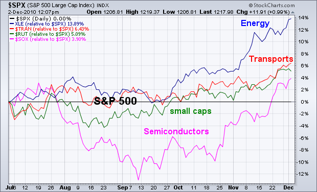
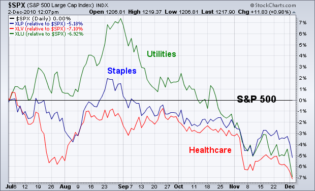
A way to determine whether or not investors are turning more optimistic on the economy (and stock market) is to study the trend of recent sector rotations. In an improving economy, investors tend to favor economically-sensitive stock groups. In a weakening economy, they favor defensive stock groups. The charts below reflect a much more upbeat mood on the American economy. The first chart shows relative strength lines for four economically-sensitive stock groups since midyear, and show all four groups rising faster than the S&P 500 (flat black line). In order of strength, they're energy, transports, small caps, and semiconductors. It's always a good sign when those groups are leading the market higher. By contrast, the second chart shows the three weakest groups since August to be healthcare, utilities, and consumer staples. Investors rotate out of those defensive stock groups in a strengthening economy.
Point & Figure produce straight-forward charts that focus exclusively on price action. Columns of Xâs appear during an advance. Columns of Oâs appear during a decline. Nothing appears when prices are flat or move less than the box size or reversal amount. Point & Figure charts are especially good for identifying support and resistance levels. The chart below shows a 30 minute S&P 500 ETF (SPY) Point & Figure chart**. Each box represents 50 cents and this is a normal 3 box reversal chart. This intraday chart goes back to mid September. The red A signals the start of October, the red B shows the start of November and the red C marks the start of December (most recent column).
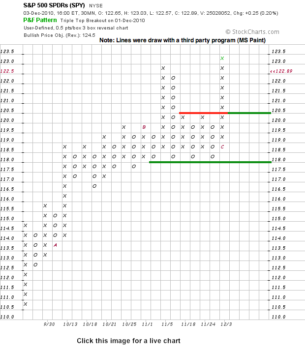
From this chart, we can identify two support levels to watch. First, the ETF broke resistance at 120.5 with the surge over the last few days. Broken resistance at 120.5 now turns into the first support level to watch. A strong breakout should hold. A move below this level would suggest the bulls are getting cold feet. Just below 120.5, we can see a more important support level at 118. Four columns of Oâs reversed off this level in November. A break below these lows would be a bearish development.
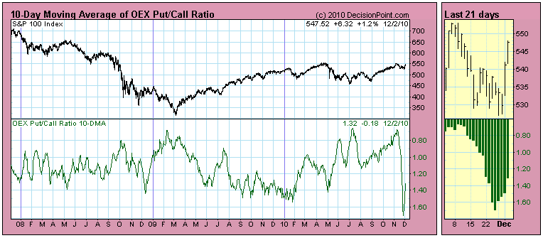
Last week some subscribers asked me what was going on with the OEX Put/Call Ratio. You can see on the 10-Day Moving Average chart that it took a sharp dive off the November price top. (Actually the ratio reading went higher, but we reverse the scale to make oversold readings visually more intuitive.)
I verified that the data were correct, but I drew a blank as to why the indicator was behaving as it was. In fact, I don't follow put/call ratios closely because I find they are hard to interpret, so I had to let it simmer on the back burner for a few days until it came to me. Now I will belatedly explain what I think happened.
OEX options are one of the instruments that money managers use to hedge their portfolios. When the market began correcting in November, the big money started hedging with OEX puts on a very large scale. Once the rally started, things rapidly got back to normal. Well, in fact, things got back to normal just a little bit before the rally began. The chart below shows the raw daily ratio (not smoothed as a moving average). Note on the thumbnail chart on the right how the ratio went back to the opposite extreme just two days before the rally breakout occurred. Isn't that amazing?
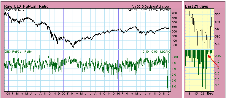
Bottom Line: The OEX Put/Call Ratio is one way to get an idea what the big money is doing because OEX options are one of the instruments used for hedging. The fact that the ratio reached such extremes demonstrates how much concern there was about the progress of the correction. The fact that this represented bearish sentiment of the so-called smart money could have been misleading -- they tend to get it right -- but in this case a negative outcome did not materialize. The real news is how that negative sentiment evaporated shortly before the market actually began to rally. It makes one wonder what happened to cause them to change their mind.
Complacency was the big issue for stock market bulls as we entered the second week of November. The market simply ran too far too fast and everyone began piling in on the equity calls as if the buying would never end. Well, guess what? The buying ended! The market topped on November 9th, while complacency (which I define by our proprietary relative complacency ratio) peaked on November 10th. The warning signs began to mount on November 5th. This usually sends us into our trading shell, risking very little in terms of capital. Individual trades on a case-by-case basis is fine, but risking an entire portfolio on the long side without hedges makes little sense during times like that. From the NASDAQ's top on November 9th, it fell 133 points, or roughly 5%, over the next 5 trading days. I prefer missing out on that type of pullback if at all possible.
That selling was healthy for the market, however, as the Dow Jones and S&P 500 both tested their respective 50 day SMAs for the first time since breaking above those key moving averages in early September. In the case of the Dow Jones, a long-term negative divergence had formed in early November, suggesting the 50 day SMA test was likely to "reset" the MACD back at the centerline.
So where does the market likely go from here? Well, I remain cautiously bullish. Energy and consumer discretionary stocks were the leading sectors in November, but both are sporting nasty long-term negative divergences. Check out the chart on the XLY (ETF that tracks consumer discretionary stocks):
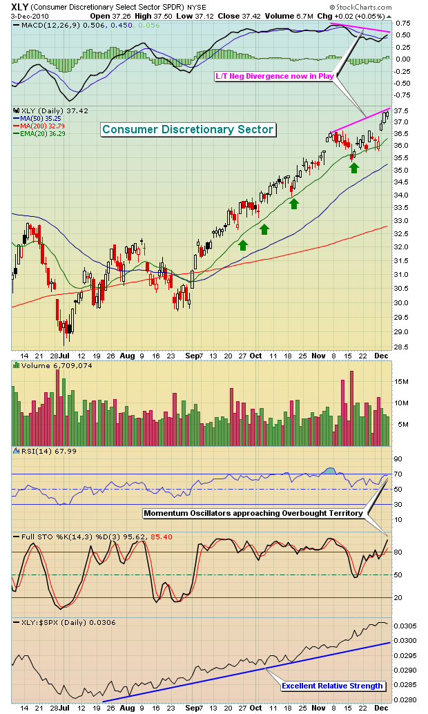
The negative divergences in key sectors like consumer discretionary and energy are likely to result in more rotation. As momentum slows in these two groups, selling normally accelerates and cash is redeployed to other sectors. Materials was a major beneficiary last week and I believe that group and technology, industrials, and financials could benefit in the week(s) ahead.
If you'd like more information on the MACD (Moving Average Convergence Divergence), I will be hosting two FREE events on Tuesday, December 7th. During this presentation, I'll explain exactly what the MACD is, why it works and how we use it. It will be a great refresher for those who already use the MACD and a great learning tool for those interested in developing better trading skills. To register, CLICK HERE.
I'll also be featuring the XLE's (an ETF that tracks the energy sector) negative divergence as our Chart of the Day for Monday, December 6th. CLICK HERE for more details.
Happy trading!
The past several day market rally has caught many "flat-footed" to be sure as traders head into year-end. Moreover, the prospects for further gains are rather high; hence we're likely to see many traders attempt to play "catch-up". This begs the question as to what sector may be one of the "surprise performers" and offer both absolute and relative performance. To us, the Financials and the Banks in particular are "under-loved" and quite "under-owned" - hence they fit the bill for those traders looking for leverage.
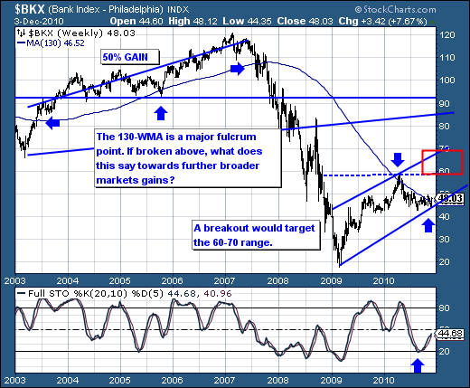
Technically speaking, the Banking Index is on the precipice of breaking out on an intermediate-term basis above its bottoming 130-week moving average. In the past, this moving average has served as a fulcrum point, and if this current bullish technical setup extends higher - then we'll see higher banking stock prices in the near-and-intermediate term. We think this is an "out of consensus call", which given the potential inflows of capital into the beleaguered sector - could result in outsized gains in the weeks and months ahead. Our favorite bank stocks are JP Morgan (JPM), PNC Financial (PNC), US Bancorp (USB) and First Horizon (FHN).
Good luck, and good trading!