Hello Fellow ChartWatchers!
Happy New Year! The response to our upcoming conference has been amazing. Since we announced our first ever get together for StockCharts users, over 100 people have registered. They will be joining myself, John Murphy, Arthur Hill and the rest of the StockCharts team in Seattle this coming August for three days of in-depth technical analysis education and some great evening events.

As I said before, if you use StockCharts to make investing decisions, you owe it to yourself to attend this conference. The current version of the agenda (subject to minor changes):
Friday, August 12th
9:00am - Welcome and Overview
9:30am - StockCharts from 10,000 feet - Chip
10:30am - Morning Break
10:45am - SharpCharts In Depth - Chip
12:00pm - Lunch
1:00pm - Advanced Annotation Techniques - Arthur Hill
2:00pm - Advanced SharpCharts Tips and Tricks - Chip
2:30pm - Afternoon Break
2:45pm - Point and Figure Charting for Fun and Profit - Chip
3:30pm - "The Technical State of the Current Market" - John Murphy and Arthur Hill
6:00pm - Sunset Dinner Cruise on Puget Sound
The conference kicks off on Thursday, August 11th with a series of presentations we're calling "StockCharts University" that focuses on the fundamentals of Technical Analysis. And on Saturday, we dig even deeper into the website including topics like scanning and market indicators. The agenda for the entire conference can be found here.
Beyond the conference sessions themselves, we're going to have three great evening events - a Northwest Wine Tasting, a Sunset Dinner Cruise on Puget Sound, and club-level seats at a Seattle Mariners/Boston Red Sox's game! Every event will provide lots of time to mingle with StockCharts experts and other users like yourself. I am really looking forward to those events.
If you register now, the cost of the conference is only $295 and that includes 1 year of our Extra charting service - a $250 value. That means that as of right now the effective cost for the conference is less than $45. That is a seriously good deal.
BUT THAT'S ONLY IF YOU REGISTER BEFORE THE END OF JANUARY...
Because of the way hotels charge for conference space, after January 31st we have to raise the cost of the conference to $395. It is still a great deal at that price - but it is a better deal now. If you are considering attending, please don't delay and register now.
You can find all of the information about Seattle ChartCon 2011 on the ChartCon Homepage. You can also use that link to register. We've also created an FAQ page with additional details about the event. Click here to see it.
I'm looking forward to meeting everyone in August,
- Chip
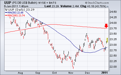
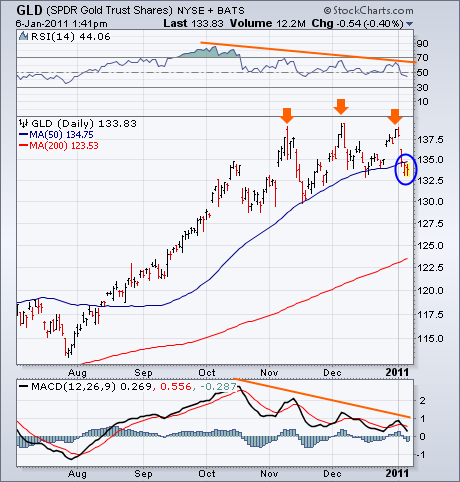
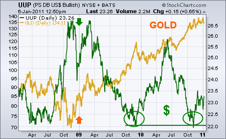
Tuesday's message wrote about an overbought condition in stocks and commodities, and showed gold in particular starting to roll over to the downside. Although some have questioned the viability of the dollar/commodity link, my view is that it's alive and well. Intermarket relationships aren't perfect and do get out of line on occasion. My experience, however, it that sooner or later they snap back into place. This may one of those times. Chart 1 shows the PS Dollar Bullish ETF (UUP) bouncing sharply this week (after bottoming in November). Gold is the market most sensitive to dollar moves. And, not surprisingly, gold is the market being most negatively impacted. Chart 2 shows the Gold Trust Shares (GLD) slipping below its 50-day average for the first time since August. The price pattern has the look of a "triple top" formation (marked by three peaks). Notice that the first peak took place in early November when the dollar bottomed. Notice also that the daily RSI (top of chart) and MACD lines (bottom) have been descending since October. That shows loss of upside momentum. Chart 1 also shows that the UUP is still well below its 200-day moving average. A move up to retest that major resistance line (or its late November peak) will help determine if this is just a bear market bounce in the greenback or something more lasting. That upside test may coincide with stocks and commodities testing some underlying support levels. At this point, however, I'm inclined to view all of these intermarket trends as retracements of current trends and not necessarily major reversals.
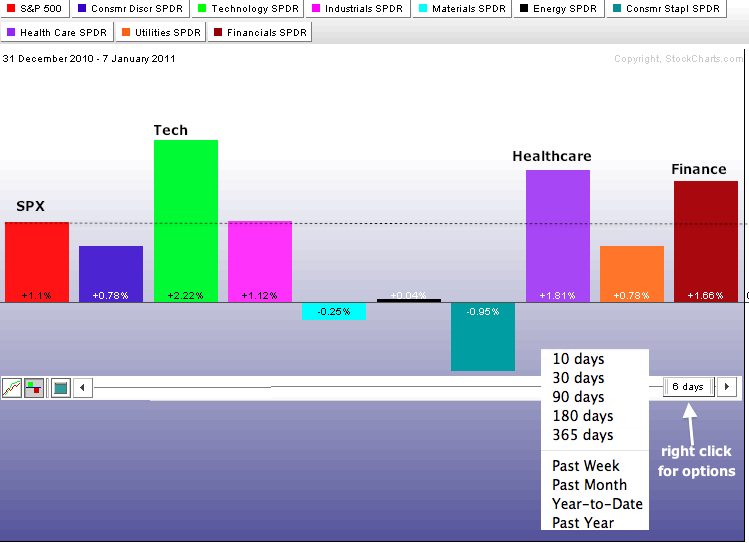
Even though 2011 has just begun, there are clear leaders and laggards among the nine sectors. In particular, the technology sector is getting off to a great start. The Sector PerfChart shows the nine sector SPDRs and the S&P 500. The black dotted line marks the performance for the S&P 500 at 1.1%. Sectors extending above this line are outperforming. Those falling short are underperforming. Technology, healthcare and finance are outperforming so far in 2011. Consumer discretionary is up for the year, but underperforming the S&P 500. While it is quite positive to see relative strength in technology, it is negative to see relative weakness in the consumer discretionary sector, which is dominated by retailers. Charting Note: users can change the time scale by hovering over the date tab, clicking the right mouse button and choosing a preset selection. The icons on the bottom left can be used to change the PerfChart from line to histogram format.
Click this image for a live chart.
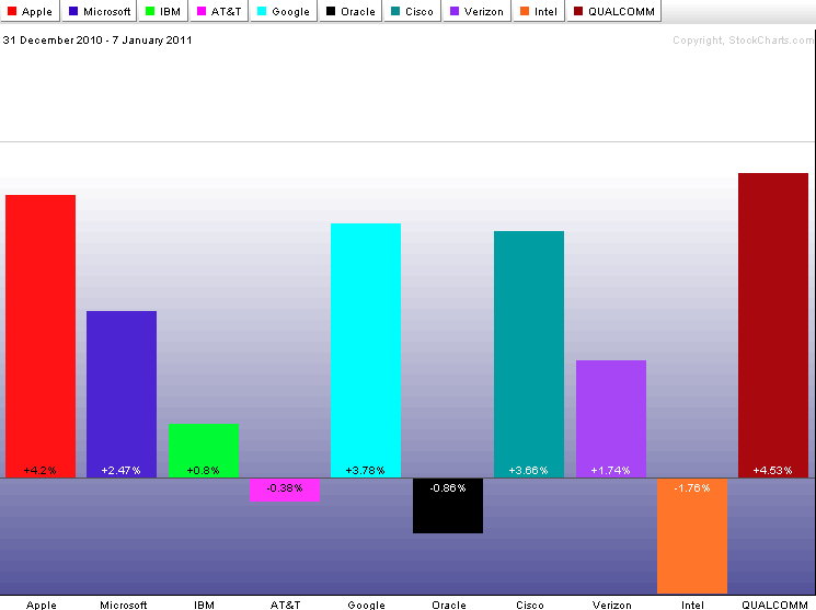
A look at the top 10 components for the Technology ETF (XLK) shows Apple (AAPL), Microsoft (MSFT), Google (GOOG), Cisco (CSCO), Verizon (VZ) and QualComm (QCOM) up more than the S&P 500. Except for Verizon, all are up more than XLK as well. These are the early leaders in 2011. On the negative side, Intel (INTC) is showing both relative weakness and absolute weakness with a 1.76% year-to-date decline. The Semiconductor HOLDRS (SMH) is also underperforming with a .91% gain year-to-date. Click here for a CandleGlance chart showing these 10 stocks.
Click this image for a live chart.
NYSE COMMON STOCK ONLY INDICATORSby Carl Swenlin | DecisionPoint.com QUESTION FROM READER: Iâve been noticing some anomalous behavior in the NYSE Advance-Decline data and other indicators based on NYSE data that does not match up with other measures of breadth. Iâve read comments from other authors on numerous occasions that refer to the same problem and it seems to stem from the fact that a high percentage of the issues on NYSE are fixed income and closed end funds, not real equity issues. Of late this has been, I believe, seriously skewing the data since stocks have been rising and fixed income is getting killed.
This is creating an apparent false (or at least exaggerated) divergence between price and AD line and other breadth measures as well (HL) and probably creating false Hindenburg Omens. This is, I believe, a serious problem for technical analysts who rely upon breadth data. I have pretty much decided to stop using NYSE AD and NH-NL data and will instead switch to using Nasdaq. I think you could do the entire TA world a huge service and generate a lot of interest in your service by creating an NYSE ex-closed end and fixed income fund AD line and New Highs-New Lows. Itâs really NEEDED!
ANSWER: We have it! Way back in 2003 the New York Stock Exchange reconstituted the NYSE Composite Index to include ONLY common stocks, weighted by market float. (To clarify, issues that are not common stocks still trade on the NYSE, but they are not included in the computation of the NYSE Composite Index.} This resulted in a much more interesting index, one that competes well with other favorites in terms of volatility and correlation to broad market movement.
Some time after this Decision Point began collecting NYSE common stock only (CSO) breadth and volume data, and we have a set of NYSE CSO indicators that are available to subscribers through our Straight Shots Menu, as well as various indicator series.
Below we have two Advance-Decline charts -- one Common Stocks Only and one with all NYSE traded issues. Currently the NYSE Composite is composed of about 1800 common stocks, whereas there are about 3500 issues of all kinds traded on the NYSE.
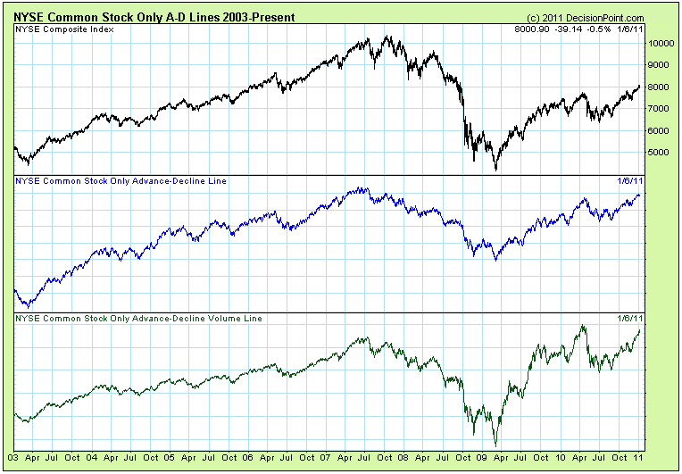
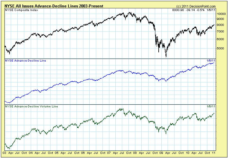
Obviously, the All Issues indicators have no useful relationship to the NYSE, but we still carry them for comparison.
The important thing to note is that the CSO Advance-Decline Line for breadth is confirming the price highs of the current bull market, and it is unlikely that the broad market will run into serious problems under those conditions.
Other CSO indicators available on Decision Point are the Swenlin Trading Oscillator (STO), Stocks Above Their 200-EMA, Bullish Percent Index (BPI), ITBM/ITVM, New Highs and New Lows, McClellan Oscillator, McClellan Volume Oscillator, 1% EMA of A-D, and Volume Ratios.
Happy New Year!!!
The financial sector looks superb as we bring in a new year. I am of the opinion, at least based on current technicals, that 2011 will be a solid stock market year and financials will be a primary reason. I'm looking for solid quarterly earnings reports from this group over the next few weeks - much better than expected and with guidance raised in many instances. I've written articles in the past about the performance of financials and the relative performance of financials vs. the S&P 500, and how that correlates to overall stock market performance. Generally speaking, if financials are performing well, the market moves higher. With that in mind, take a look at the relative performance of financials during 2010 and how it changed over the past 5-6 weeks:
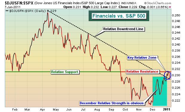
Now let's discuss this chart as a few things stand out to me. The topping of financials and the relative underperformance that transpired through early December 2010 kept a lid on overall market performance. From the April highs to the start of December, the S&P 500 lost 3-4%, while the relative weakness in financials was quite apparent. Most of the stock market's 2010 gains were attributable to December strength. It was during this period that financials exploded higher on a relative basis, no coincidence in my opinion. So far in 2011, financials are among the leaders once again. Should this continue, there's a VERY strong likelihood the U.S. stock market heads higher from here. Now back to the chart. Look at the "Relative Support" level near the .231 level. Once that relative support level failed, it became relative resistance. The strength in financials in December sent this relative ratio above the relative downtrend line - a bullish development - but the relative resistance line remains intact for now. If money continues to flow into financials on a relative basis and we can break back above the .231 level with force, it's likely to signal much higher prices for financials in 2011 and that will only add to the recent bullish market behavior. I have a few short-term concerns about market direction, but my longer-term view is bullish for now.
Here's an obvious follow up to the discussion above. If the financials are strengthening and the outlook looks great for 2011, why not "triple" our pleasure with a 3x leveraged ETF that tracks the sector. The Direxion Daily Financial Bull 3x Shares (FAS is the ticker symbol) uses leverage to track the return of financials at a 3 to 1 clip. It would seem reasonable that if financials grew at a rate of 10% in 2011, then the FAS would grow by 30%, right? The answer is a clear and resounding NOOO!
In my last article, I discussed four New Year's trading resolutions for 2011. If I added a fifth, it would likely be to avoid trading leveraged ETFs. There is just so much that many traders don't understand about their appropriate uses and limitations that I generally cringe when I'm asked to comment on a particular one. Despite my increasingly bullish outlook on financials, I'd avoid holding onto FAS for any length of time. "Trading Leveraged ETFs For Profit While Minimizing Risk" is my topic for this month's Online Trader's Series event at Invested Central. CLICK HERE to register for this event and to view a brief video that I produced on the basics of leveraged ETFs.
Invested Central has also added a brand new feature, "Anatomy of a Trade", that will debut this weekend. The purpose of this feature will be to tear apart a recent trade idea that we communicated to members, identifying the risk/reward indications of that trade. We'll pass along both successful and unsuccessful trade candidates, illustrating the importance of patience and discipline. I believe it will be highly educational in nature and a real benefit to those who trade stocks, either casually or actively. CLICK HERE for more details.
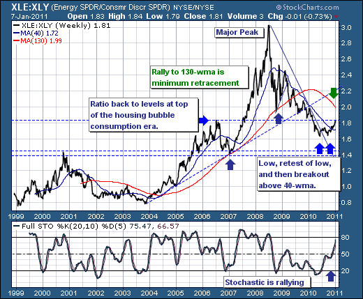
As the 2011 trading year unfolds, it is rather clear that the consumer discretionary sector and retail in particular are showing a tendency towards declining rather than rallying with the overall broader market. This is change from the past 2-years, where the consumer discretionary names have out-performed rather than handily. Therefore, this interests us from a trading perspective, for although we may not want to outright short these names, then we certainly want to be under-weight them and/or short them versus another sector such as Energy.
To this end, we've illustrated the S&P Energy/S&P Consumer Discretionary ETF ratio. And what we see is rather interesting and bullish. Interesting in the fact the ratio is trading at mid-2006 levels, which was at the height of the housing-bubble home equity extraction period that fueled large amounts of frivolous buying. Thus, given today's challenged consumer environment, then it would appear the discretionary stocks are a bit overextended in absolute terms, and overvalued versus energy. But given the chart is XLE/XLY, then it means that XLE should gain rather nicely against XLY in the weeks and months ahead.
Hence, we are buyers of the ratio, and we'll do so via the individual shares in each group as it is far easier to put on given the ability to find XLY shares to be short. But for our interests, the ratio clearly illustrates our point.
