Hello Fellow ChartWatchers!
As I travel around the country talking to various investment groups, I always make a point to remind everyone about the what I call "The Technical Process" - the steps that every investor goes through before taking a position in a stock. Some people get so caught up in the details of this process that they lose track of the "big picture" so I created this diagram to help re-focus people:

The goal of any serious investor is to continually develop a set of signals that they trust and then use prudent money-management techniques to limit losses and profit from gains.
In this context a "signal" is anything that causes you to consider buying a particular stock. It could be a mention in a newspaper, a technical indicator crossing some value, a broker recommendation, a "hot tip" from a neighbor, etc. Regardless of the source of the signal, the first thing everyone has to ask themselves is "Do I trust this signal and if so, why?"
Technicians work to develop well-defined, objective, repeatable signals based primarily on price and volume data. Such "Technical Signals" can then be analyzed, reviewed and evaluated to see if the stocks that they select meet the technician's goals. The process is not easy. It requires a fair amount of time and dedication. It never really ends either since good technicians are always looking to improve their results. But the process is very worthwhile in the long run and the diagram above should help you stay on track.
Some people skip the "Research, Study, Plan" phase almost entirely while other people never leave it. Our ChartSchool area is a great place to start and our bookstore contains many more sources of information. But remember, while learning about technical indicators and trading strategies is very important, there is only so much one can learn by reading. In order to truly understand how fear and greed drive markets, you need to combine research with participation.
Selecting signals is a combination of science and art. Again, there are no 100% accurate signals and signals that work for one person may not fit with someone else. My strong advice is to start simple and build up over time. When in doubt, start with a simple MACD Crossover signal and build from there.
Our ScanEngine can help you see how many stocks meet your current signal criteria. The goal is to create a scan that returns a "manageable" number of stocks - anywhere from 2 to 50+ depending on your tolerance for chart analysis. If your scan returns too many stocks, consider adding price and/or volume constraints to reduce the number of results. If your scan returns zero results, remove clauses one-at-a-time until a non-zero number of results appear.
Learning to create and run technical scans effectively is crucial to your success as a technical investor. Unfortunately it can take time to learn the ins and outs of scanning but again, the rewards are well worth the time and effort needed.
Once your scan returns a reasonable number of results, you should then review the chart of each result carefully to see if it is the kind of stock you'd be interested in buying. If all of the stocks look "wrong" to you, you should probably start the process over again with a different signal. If most of them look good but a couple are odd-balls, just delete the odd-balls and keep going. As the lines show, this is an iterative learning process that takes time.
The steps for placing your trade, monitoring it and managing your risk - collectively known as the "mechanics of trading" - are something that other people have covered extensively so I won't go into it in this article except to say that money/risk management is another required skill for technical traders.
The last bubble on the chart says "Evaluate Trade." Implied in that phrase is that you maintain and review a trading journal. It could be as simple as a pad of paper and a pencil or as complex as a private database. Regardless, note down the reasons for entering your trade, the expectations for the trade, the ultimate results and lessons learned. Use your journal to improve your research as you start the entire technical process again. Over time, your trust in your signals will increase and your results will improve.
Remember, for successful investors, this process never ends.
- Chip
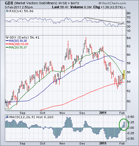
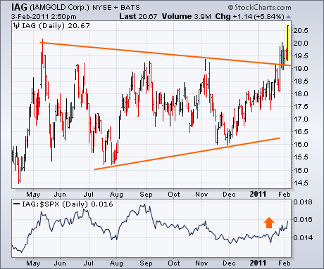
My Tuesday message showed the Market Vectors Gold Miners ETF (GDX) testing long-term support at its 200-day moving average, and suggested watching it closely for signs of an upturn. Today's strong rally in precious metals assets may be the start of that upturn. Chart 1 shows the GDX surging more than 2% today and clearing its 20-day moving average (green line) for the first time this year. In addition, its 14-day RSI line (top of chart) has turned back up. The daily MACD histogram (below chart) has also turned positive (see circle) for the first time in two months. In my view, those signs of improvement increase the odds that the pullback in precious metal stocks is over. The Tuesday message identified IAMGOLD as the strongest gold stock and showed it having broken through the upper line in a bullish "symmetrical triangle". Chart 2 shows IAG exceeding its spring 2010 high to reach a new record. Its relative strength ratio (bottom of Chart 2) has turned up as well. Gold and silver stocks are rallying on the backs of their respective commodities.
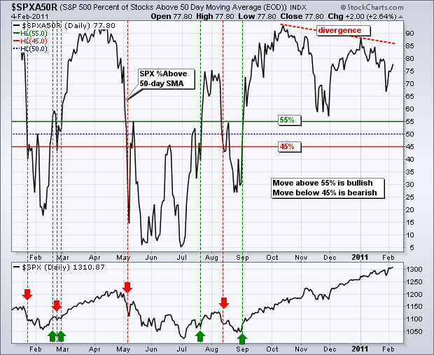
The S&P 500 %Above 50-day SMA ($SPXA50R) indicator is a breath gauge that measures the degree of participation. In this instance, the indicator tells us the percentage of S&P 500 stocks that are above their 50-day SMAs. In general, a bullish bias exists when more than 50% are above their 50-day SMAs and a bearish bias otherwise (<50%). Using the 50% line to signal shifts can result in whipsaws so it is often helpful to apply a filter. For example, a bullish threshold could be set just above 50% (55%) and a bearish threshold could be set just below (45%). Even though this filter creates a little lag, it reduces the number of signals and whipsaws.
Click this image for a live chart.
The chart above shows the S&P 500 %Above 50-day SMA moving above 55% in early September and remaining in bull mode the last four months. Prior signals are shown with green and red arrows. In fact, the indicator has not even dipped below 55% since this cross. Chartists may notice a bearish divergence from October to January as the indicator formed a lower high and the index pushed to new highs. This shows participation narrowing somewhat. However, keep an eye on the absolute levels. The S&P 500 hit a new 52-week high this week and 77.8% of its components are above their 50-day SMA. This is much less than mid October and early January, but anything above 70% is more than enough to power a rally. The bearish divergence does not show material weakness. It simply shows less strength than before. Look for a move below 45% to reflect actual weakness within the index. See our ChartSchool article for more details.
(This is an excerpt from Monday's blog for Decision Point subscribers.)
One of the things I constantly flog in this blog is that equal-weight indexes usually perform better than cap-weighted indexes. The reason they perform better is that smaller-cap stocks normally perform better than large-cap stocks, and the smaller-cap stocks carry a heaver weighting in equal-weight indexes, thereby enhancing performance.
Here is an excerpt from yesterday's Decision Point Alert Daily Report. In the bottom section we track 27 indexes, 22 of which are pairs of cap-weight/equal-weight indexes. Note that, with the exception of Materials and Utilities sectors, all sectors and indexes generated buy signals about the same time. Also note that, where paired indexes generated buy signals on the same date, all the equal-weight indexes have out performed their cap-weighted counterparts, except the Nasdaq 100.
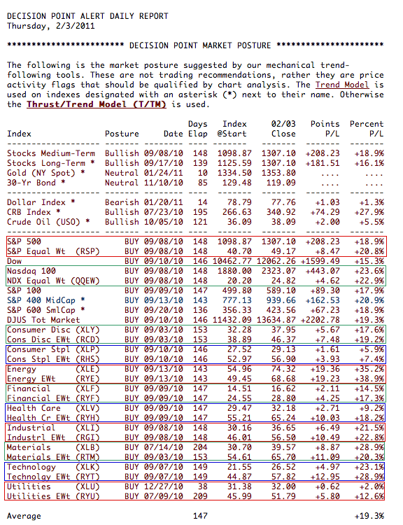
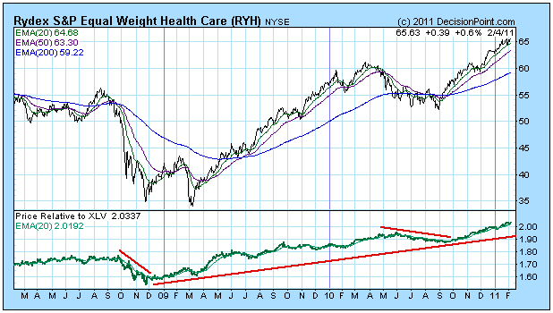
The most astonishing difference is in the Health Care sector, where the Health Care Equal-Weight ETF (RYH) has a profit of about double that of the Health Care SPDR (XLV) -- +18.2% versus +9.2%. Here is a chart of RYH with a relative strength comparison to XLV. Since the beginning of the bull market the trend of relative strength has been up, but you can see that the equal-weight index is noticeably weaker during declines.
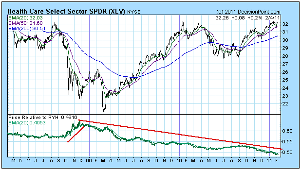
This next chart is just the flip side, showing XLV with a relative strength comparison to RYH.
Finally, let's have a look at the Rydex S&P Equal-Weight ETF (RSP). It was up about 150% in the 2002-2007 bull market versus only 100% for the SPX. And since the current bull market began, RSP is up about 146% versus only about 86% for the SPX. Pretty amazing.
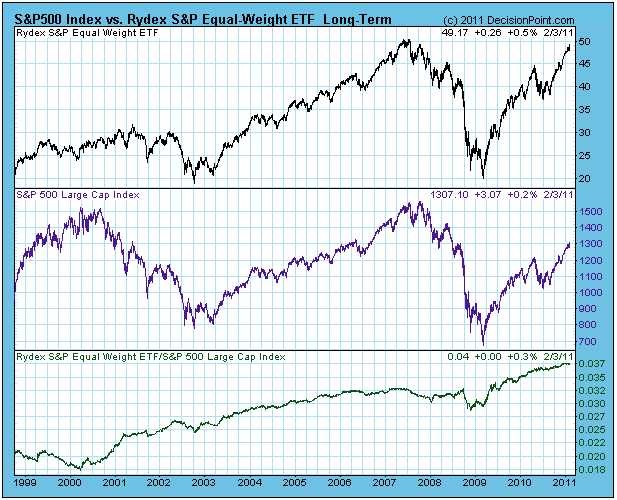
Bottom Line: In general, equal-weighted ETFs continue to perform better than their cap-weighted counterparts, yet their volume remains relatively low, indicating that investors/traders have never heard of them. "Invent a better mousetrap and the world will beat a path to your door." So far that is not the case with equal-weighted ETFs.
Attempting to short this market prior to any significant breakdown is the equivalent of financial suicide. Taking profits occasionally, moving into cash, and awaiting entry on a new position is fine. But shorting this uptrend with hopes of a big reversal just makes no sense. Since January 27th, take a look at the poor economic/geopolitical news that's surfaced:
(1) durable goods orders missed by 4 percentage points (mostly due to transports
(2) preliminary 4th quarter GDP came up short, 3.2% actual vs. 3.7% estimates
(3) personal income came in a tad light
(4) construction spending in December was abysmal
(5) ADP employment change in January beat by 40,000, but there was a 50,000 downward revision in December
(6) January's nonfarm payrolls fell by 85,000 jobs from the revised December number and it was 112,000 short of January consensus estimates
(7) Middle East crisis escalates in Egypt
There have been plenty of reasons to take the stock market lower yet the resiliency of the bulls shines through every time. How can you short this type of market behavior? The answer: You can't.
I have to say one thing about CNBC and the "experts" covering the jobs data each month. Why do they project big job gains, then immediately make excuses for poor reports by blaming it on the weather? Don't they have The Weather Channel? If you knew there were a lot of weather-related problems across various parts of the country, wouldn't you include this in your projection? Why does it always come up AFTER the shortfall is reported? I don't get it.
The market sends constant reminders to us that it's not about the reports. It's about the market's reaction to the reports. That's what matters. And the market keeps going higher. How can a market like this be traded? Well, quite carefully for one. And on the long side. I've been suggesting smaller position sizes for short-term traders. I've also been trying to avoid stocks with slowing momentum, as evidenced by weakening MACDs and lower volume on up moves.
Here are a couple of recent setups that I liked with annotations on the chart to help explain the positives I saw:
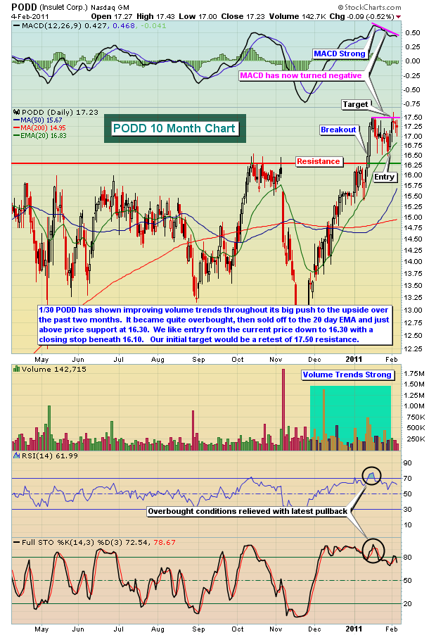
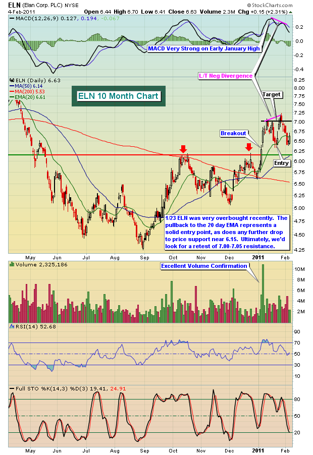
Both of these trades benefitted from exercising patience to allow entry on those 20 day EMA tests. At the time of the pullbacks, both MACDs were solid providing us some comfort that the bulls remained in control of the action. Both stocks hit our short-term profit targets, but have since weakened technically, printing long-term negative divergences on attempted breakouts. The risks appear too great to trade them now, but they did their jobs. That's why it makes sense to take your profit, move to the sidelines and await a solid setup. Every week, we highlight at least one trade that we've suggested, breaking down the rationale for the trade and our strategy at the time of entry. To view this weekend's Anatomy of a Trade and to view performance of recent setups, CLICK HERE.
Happy trading!
While the US markets power towards higher highs â although in a weak manner we might add, weâve begun to see outflows of funds from the Emerging Markets. Ostensibly, this is due in large part to the Egypt uprising, but there are other issues the emerging markets are facing such rising inflationary pressures and rising food prices. Many believe these circumstances to be transitory; but perhaps they shall be with us longer than anyone anticipates, and the impact upon the emerging market stock markets should not be dismissed so easily.

To this end, we find it instructive to look at the monthly charts of various emerging markets, and Brazil in particular. What we see is that the rally off the 2009 low is rather sharp at over 100%, and we find that Brazilâs BOVESPA follows its 16-month moving average rather nicely. What concerns us is that prices have now broken through sufficiently to call this a new bear market, but we need to see whether prices shall remain below it and close below it by monthâs end. If not, then it shall prove support and new highs would be forthcoming. But when one looks at the 5-month RSI divergence, then one gets the sense prices are indeed going into a bear market.
Therefore, if a bear market is indeed underway â then we would be naïve to believe that the US can escapes significant weakness in the face of emerging market weakness since it was the emerging markets that led the US out of its bear market.
Good luck and good trading!