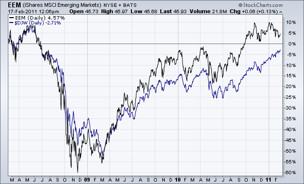
I'm not a believer in global decoupling. On the contrary, I believe that global stock markets are highly correlated and usually trend in the same direction. That's especially true of the relationship between emerging and developed markets. Chart 1 shows a strong correlation between emerging markets (black line) and the Dow Jones World Index of developed markets (blue line). The main point is that these global markets usually rise and fall together. The chart also shows that emerging markets have risen a lot faster than developed markets since the 2009 bottom. In fact, emerging markets gained 130% from that bottom versus 90% for developed markets. Growth in the larger emerging markets like China and India is often cited as the engine driving global economic growth and uptrends in stocks and commodities. Problem is stock markets in those countries have been falling since last November.
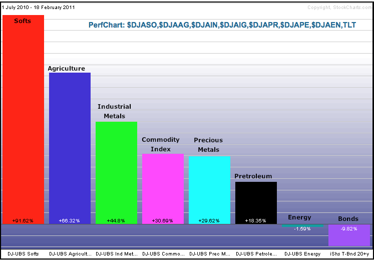
Except for natural gas, most major commodities and commodity groups are up sharply over the last 6-8 months. Stockcharts.com provides a broad range of Dow Jones-UBS commodity related indices. The PerfChart below shows seven commodity related indices and the 20+ year Bond ETF (TLT). Five represent major commodity groups. The DJ-UBS Commodity Index ($DJAIGT) represents commodities as a whole and the DJ-UBS Petroleum Index represents the oil complex (crude, gasoline, heating oil).
Click this image for a live chart.
So-called âsoftsâ and agriculture are leading the way higher. Softs consist of sugar, coffee and cotton. Agriculture represents corn, soybeans, wheat, sugar, soybean oil, coffee and cotton. The message here is clear. Prices for agricultural related commodities are rising, and rising fast. The DJ-UBS Softs Index ($DJASO) has almost doubled, while the DJ-UBS Agriculture Index ($DJUSAAG) is up over 65%. These big gains will almost certainly filter down into the prices at the retail level, which would be inflationary. Perhaps that is why bonds are down sharply over this same timeframe.
The daily number of New Highs and New Lows (NHNL) refers to stocks reaching their highest or lowest price during the most recent 52-week period. Below is a NHNL chart for the stocks that compose the S&P 500 Index, and we can learn a few things from it.
First, we can see that the main problem is that new highs are contracting as prices move higher. This is a negative divergence and is also almost certain to be a setup for a price decline.
Another feature on this chart is that the new high structure for this bull market is much more massive than at any time during the 2002-2007 bull market. Even though they represent a contraction from earlier new highs, the most recent new high readings are nearly as high as the highest new high readings of the the preceding bull market. This attests to the strength of the market rebound off the bear market lows in 2009.
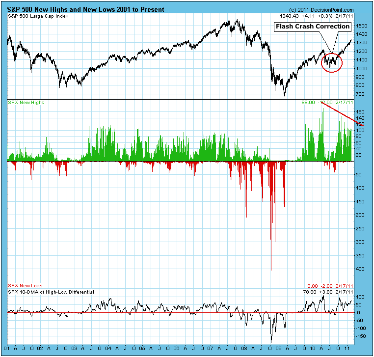
Note also that the price advance from the 2009 low has taken about half the time as the same amount of price gain took during from the 2002 lows -- we're talking 22 months versus 54 months. Again, this has been a very powerful move.
Another thing I wanted to mention -- something that has nothing to do with the subject of NHNL -- is the Flash Crash Correction. I have named it thus because I believe that its depth and duration were more exaggerated than they would have been were it not for the Flash Crash. In hindsight we can see that this event took place in the middle (so far) of a strong bull market. Notably, there was no significant deterioration before hand that could have given us a credible warning. We are told that it can't happen again. I wonder.
Bottom Line: New highs are presenting a negative divergence, but the level of new highs remains very high, and the strength of the price advance better than normal, in spite of the Flash Crash Correction. Corrections are inevitable, but there is no indication that the next correction will be unusually difficult.
One thing that's been quite apparent to me over the past several months is that money is not leaving the equity market. When one sector or industry group sells off, the money simply rotates elsewhere. Then rinse and repeat. This is truly a trader's dream because there are almost always opportunities to find low risk, high reward plays. It's as simple as using the StockCharts scan engine to find stocks in patterns that afford us great opportunities.
I like to take a top down approach. I first look at the overall market and the indicators I use to determine the intermediate- to long-term health of the stock market. Those indicators have been bullish for months and remain that way. The next step is to ignore the temptation to short stocks because they "seem" like they're priced too high. The market has priced them there for a reason and as long as momentum remains bullish, I don't argue with the market. My third step is to review the various sectors and subsectors, trying to identify groups that are beginning to lead on a relative basis OR groups that have previously led and have pulled back to key support levels or moving averages.
To give you an example, I sent our daily Market Chatter out on Thursday, February 10th. Here was an excerpt:
"Energy (XLE) has been showing relative weakness of late, but it's a sector that has not seen a close beneath its 20 day EMA since August, a very powerful trend. This morning, the XLE is trading at 72.83 in pre-market (at last check). Its 20 day EMA is currently at 72.10. So for those who would like a more conservative position, consider trading the XLE as it approaches its 20 day EMA. If it fails to hold, exit with a fairly small
loss."
The XLE printed a bullish engulfing candle that day, just above its 20 day EMA and hasn't looked back since. Now take a look at the XLE chart and I'll explain what I saw:
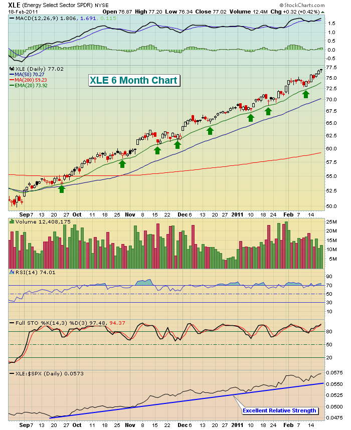
Note first that the relative strength of the XLE was quite strong, rising against the S&P 500 for months. This clearly indicated to me that energy had bullish momentum on its side. Any time I can jump on a sector like this when it's "on sale", I'll take advantage.
Just before the XLE hit that short-term bottom, we provided a setup on Hornbeck Offshore Services (HOS) - they provide specialty services to the offshore oil and gas exploration and production industry. We liked the group and also the technicals at the time. HOS is featured as our Anatomy of a Trade for this week. CLICK HERE for more information on this setup and its subsequent performance.
As I look forward, I really like the action in the NASDAQ Insurance Index. Take a look at the following chart:
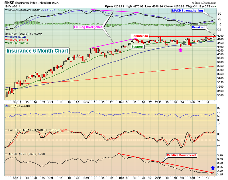
A solid period of consolidation helps to set up a more bullish move upon breakout. That's what has transpired here. Insurance was outperforming the S&P 500 until late in 2010. That's when a nasty long-term negative divergence formed. Astute traders bailed on the group as insurance consolidated (and underperformed) over the next two months. The price breakout late last week was encouraging, as was the relative downtrend breakout. This is a group that is likely to see more buying in the near-term. I am focusing on this industry group in this weekend's stock setups for our members.
Invested Central is hosting three events this week, beginning with a FREE "Meet Invested Central" event on Monday, February 21. I'll be joined by my partner John S. Hopkins, Jr. as we discuss our services and methodology and our approach to education (among other things). CLICK HERE to register and for more information.
Happy trading!
Richard Rhodes is on hiatus this week. His article will return in the next issue of ChartWatchers.