Hello Fellow ChartWatchers!
(This is a repeat of an article I wrote in 2007. Seems like now is a great time to review its message. - Chip)
Last month I had the pleasure of sitting in on several local Technical Analaysis User Groups and seeing how they used many different tools to do group stock analysis. It was a very educational experience for me and I strongly recommend that everyone reading this newsletter join your local technical analysis user group. (If there isn't one in your area, why not start one?) Doing technical analysis with other people is probably the best way to improve your investing success - period.
But as I was sitting in the back of one of the classes, I watched them fall into one of the more insidious "traps" in technical analysis these days. See if you can spot it as I tell the tale:
The group was looking at an ETF for one of the more interesting market sectors these days. The person running the meeting pulled up a chart of the ETF on the screen for everyone to see (I was happy it was a StockCharts.com chart!). Someone in the group commented that the chart had a possible "double top" pattern and they were right - it certainly looked like a double-top. Someone else chimed in that the volume bars appeared to confirm that double-top hypothesis (I thought to myself "Yea! They are using volume to confirm chart patterns!") The group leader then suggested that they add some indicators to the chart to see what they showed - so they added a MACD and a Chaiken Money Flow plot to the chart. The MACD looked weak, but the CMF looked bullish. This caused the group to pause and check out a couple of other CMF plots with different parameters. Hmmmmm. Most of the CMF's were bullish. Eventually, the group decided to ignore the CMF data and move on.
Anyone spot the problem yet?
First off, the problem was NOT that the group ignored conflicting information from the CMF plot - it is very common that some indicators will be bullish while other ones are bearish. You need to think about which indicators you trust more and why. In this case, the group discussed it and decided that they trusted the MACD signals and the double-top chart pattern more than the CMF and that was a good decision.
The problem comes from the nature of ETFs. ETF stands for "Exchange Traded Funds" and they are all the rage right now. These are financial vehicles that are designed to track some index very closely and can be traded just like a stock. They are very useful to investors and the number of ETFs has increased dramatically in the past couple of years.
A typical example of an ETF is SPY which tracks the S&P 500 ($SPX). If the S&P 500 index goes up, SPY goes up. If $SPX goes down, SPY goes down. You can buy and sell SPY much easier than you can buy and sell the 500 stocks that make up $SPX and so SPY is a very useful tool in many investors' arsenals.
Have you spotted the trap yet?
Before I reveal the problem, let's look at two charts. Here is a chart of $SPX and one of SPY. See if you can spot the key difference:
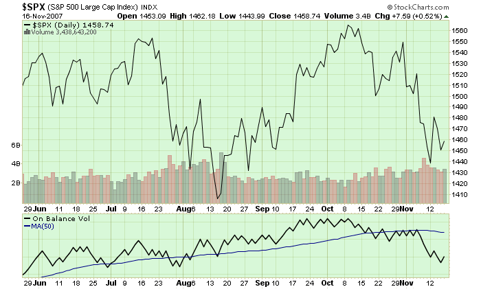
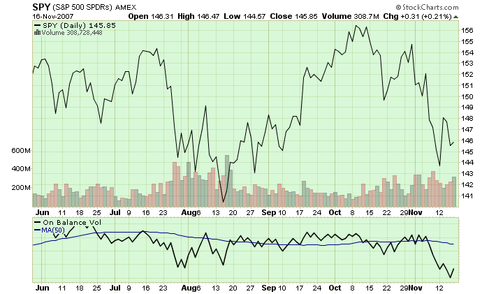
Look at the On Balance Volume indicator line. Notice the difference in the direction of those lines? I've added a moving average line to each plot to help you see that the OBV for $SPX is going up while the OBV for SPY is going sideways/down.
Have you spotted the trap yet?
The price plots for $SPX and SPY look extremely similar - just as they should. When $SPX goes up, SPY goes up and vice-versa. But now look at the volume bars. They don't look identical do they? First off, the volume scales are very different - $SPX ranges from 2 Billion to 6 Billion while SPY's volume ranges from 200 Million to 600 Million. But the bigger problem is that the "shape" of the volume bars aren't exactly the same. They are similar - but there are subtle differences in the position and magnitudes of the taller volume bars. Those differences are what caused the OBV plots to be different. But why would the volume plots for $SPX and SPY be different? Could this be the trap? Will Chip ever get to the point!? 
ETFs are different from stocks because of this fact: While the price of an ETF closely tracks the underlying index's value, the volume of an ETF only reflects the popularity of the ETF itself - NOT THE SUPPLY OR DEMAND FOR THE THING THE ETF TRACKS.
Consider the following hypothetical example: Let's say that for some reason an amazingly rich Jillionaire decides that they wants to invest in the market - so they buy 1 Billion shares of SPY in a single day. What would SPY's chart look like?
Despite all of this new demand for SPY, SPY's price chart would continue to mimic the value of the S&P 500 index. It would go up and down in the exact same way as before, just like $SPX does. Of course SPY's volume would have a HUGE spike in it, but that volume spike would have no impact on the price of SPY.
Now consider what would have happened if our hypothetical Jillionaire had invested in a real stock instead of an ETF. In addition to a huge spike on the volume chart, there would also be a huge jump in the price of the stock since the price of a stock is directly related to the demand for that stock's shares.
The key point here is that many kinds of technical analysis make an assumption that is not always true for ETFs. Any form of T/A that relies on studying both price and volume - including chart pattern analysis and price/volume indicators like the CMF - assumes that volume and price are directly related. Since there is no direct relationship between price and volume for an ETF, those analysis techniques should be used very carefully when looking at ETFs.
(Note: The volume for popular ETFs like SPY actually do a pretty good job of mimicking the demand for the underlying index, but that is due to indirect factors. As shown in the charts above, sensitive indicators can be thrown off by those differences. In the case of less popular ETFs, the differences are even greater.)
As I sat in the back of the class observing the give and take around their study of the ETF, I thought about speaking up. Unfortunately the class was almost over and I was late to my next appointment. Fortunately for you, I made a note to myself to write about it in the next newsletter.
- Chip
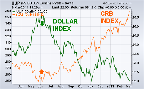
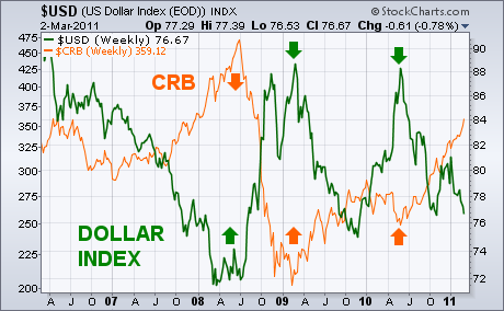
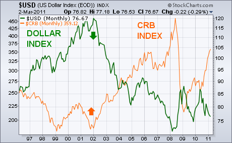
In my Tuesday message, I agreed with the Fed chairman that commodity prices were rising against all currencies. That doesn't mean, however, that the falling U.S. Dollar isn't a major contributor to rising commodities. After all, global commodities are priced in dollars. Chart 3 shows that the latest surge in the CRB Commodity Index began last June just as the U.S. Dollar Index was peaking (see arrows). A dollar bounce during the fourth quarter coinicided with a modest commodity pullback. The dollar downturn during the first quarter of this year has contributed to another commodity surge. One of the most consistent intermarket relationships is that the dollar and commodities trend in opposite directions. The charts below all show a clear inverse relationship between the two markets and appear to contradict the view expressed by Mr. Bernanke that the lower dollar isn't a major reason that commodity prices are rising. Chart 4 shows them moving in opposite directions since 2007. Note their coincident turning points in 2008, 2009, and 2010. Every major turn in the dollar coincided a major turn in commodities in the opposite direction. Chart 5 gives an even longer view, and shows that the major upturn in commodities that started in 2002 coincided exactly with a major downturn in the dollar. A lot of the dollar weakness since 2002 is directly tied to aggressive Fed easing and, more recently, to the Fed keeping U.S. rates near zero. With rates in emerging markets already rising and Europe close to raising rates, it seems the dollar has nowhere to go but down (at least until the Fed starts raising rates). That should push commodity prices even higher and make the inflation problem even worse. That will be especially true in the U.S. which now has the world's weakest currency.
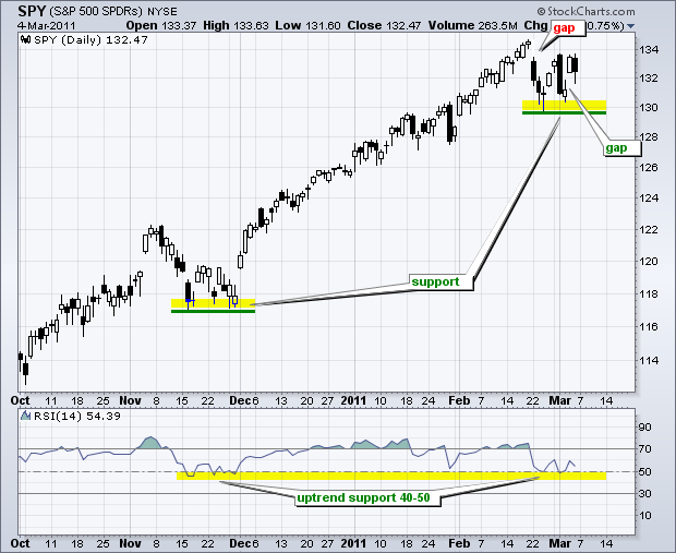
The S&P 500 ETF (SPY) is hitting resistance from last weekâs gap down, but may just find support from this weekâs gap up. The latest round of gaps started with a gap down from a new high on 22-February. The ETF rebounded later that week, but fell sharply on Monday with a long black candlestick. This candlestick met resistance from the 22-February gap. SPY firmed above its late February low and gapped up on Thursday. However, once again, the ETF met resistance from the 22-Febuary gap with a decline on Friday. This puts the ETF between a rock (gap down) and a hard place (gap up). The first one to be filled will offer a good clue on the next directional move.
Click this image for a live chart
Overall, the trend on the daily chart remains up. SPY is holding the support zone around 130 and RSI is holding support in the 40-50 zone. This zone held in November and late January. A move below 40 in RSI and 129.5 in SPY could signal the start of a correction that retraces a portion of the September-February advance.
(This is an excerpt from Friday's blog for Decision Point subscribers.)
The U.S. Dollar Index is in immediate danger again, so lets take a close look at charts from all three time frames, beginning with the daily bar chart. The most important feature on the chart is the bold rising trend line near the bottom. That is a long-term rising trend line that we will see on the longer-term charts. Note that in November the Index bounced off that line only to retest and penetrate it just a month later. The November breakdown was a bear trap, resulting in a strong rally, which ultimately failed.
The decline from the January top has resulted in a test and retest nearly identical to the previous one, and we are left to wonder if this latest breakdown will be another bear trap.
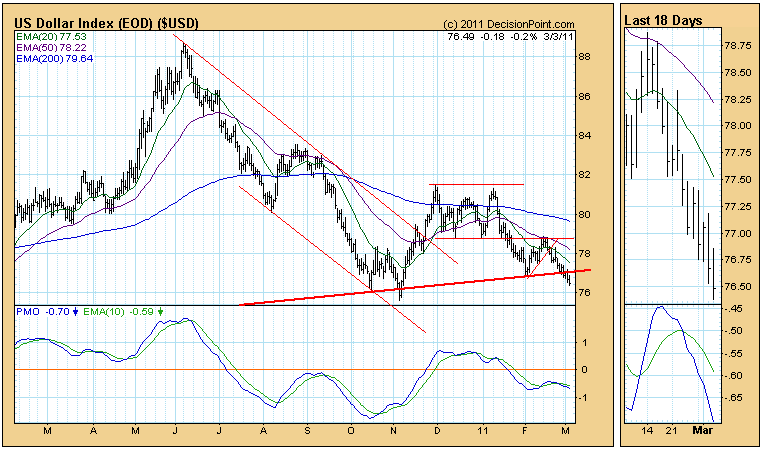
I am assuming that this is more serious than the first. As of 1/20/2011 the US Dollar Index is on a Trend Model SELL signal. And the PMO configuration is less promising than the oversold PMO bottom in October followed by a PMO positive divergence in November.
The weekly chart below shows the entire rising trend line and demonstrates that it is important support. The weekly PMO is negative and falling.
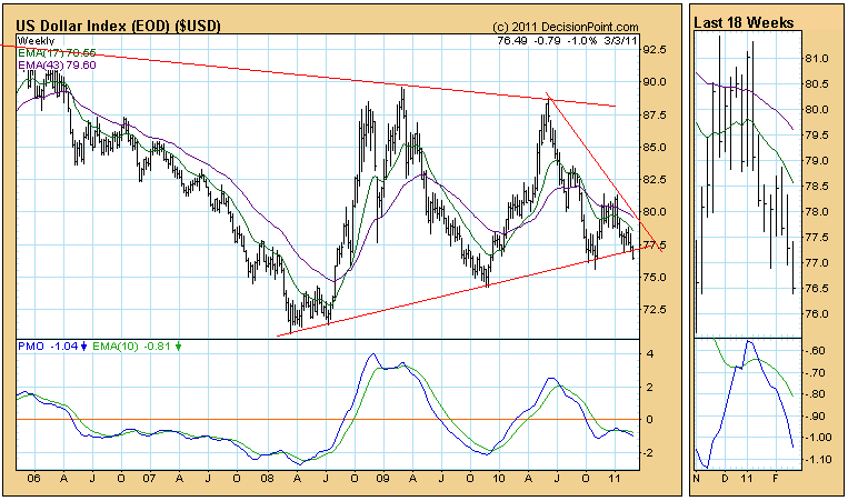
Finally, the broader context of the monthly chart shows that the rising trend line forms the bottom of a reverse pennant formation. A decisive breakdown from that pennant would have serious implications regarding the potential downside.
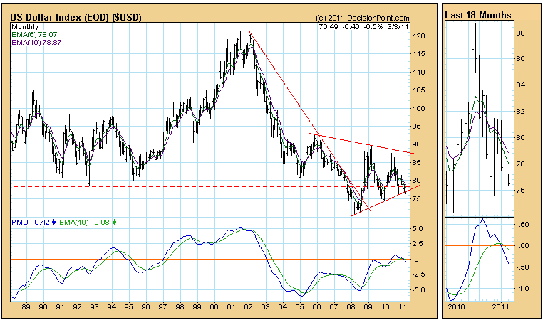
Bottom Line: The Dollar Index has broken down through important long-term rising trend line support. A similar breakdown in November proved to be a of no consequence, but technical indicators are less favorable this time around, so we should expect the decline to continue longer-term, although, a short-term snapback toward the line would be a normal technical reaction.
It's hard to believe it's been two years since that infamous 2009 March bottom. I'm going to focus on the NASDAQ for purposes of today's article. Let's take a quick look at the advance since late August 2010 to gain a real appreciation for how far the NASDAQ has come in such a short period of time:
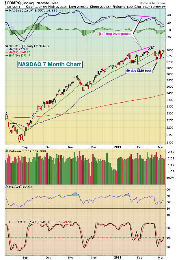
The NASDAQ rose nearly 35% in less than 6 months. That came AFTER the NASDAQ had already bounced 75% from the March 2009 low to the August 2010 low shown above. It's truly been a remarkable recovery as the NASDAQ recently approached its 2007 highs at 2859. The obvious question is, "Where do we go from here?" Is there any gas left in the tank? I believe there is. Take a look at that 7 month chart above again. Notice the slowing momentum in February, evidenced by the lower MACD with rising prices? That's a sign to be very careful in the near-term. From an educational perspective, that development is important because it tells us that the shorter 12 day EMA is beginning to converge with the 26 day EMA despite rising prices. That's unusual because as prices rise, I expect the short-term moving average to move up more rapidly and diverge from the 26 day EMA. This, along with declining volume, are two signs that suggest momentum is slowing. Positive and negative divergences are a trader's best friend as it's a clear signal that risks are rising. If your trading strategy involves risk management, you cannot afford to ignore MACD signals.
Now let's look at the longer-term view of the NASDAQ, which I find to be very bullish:
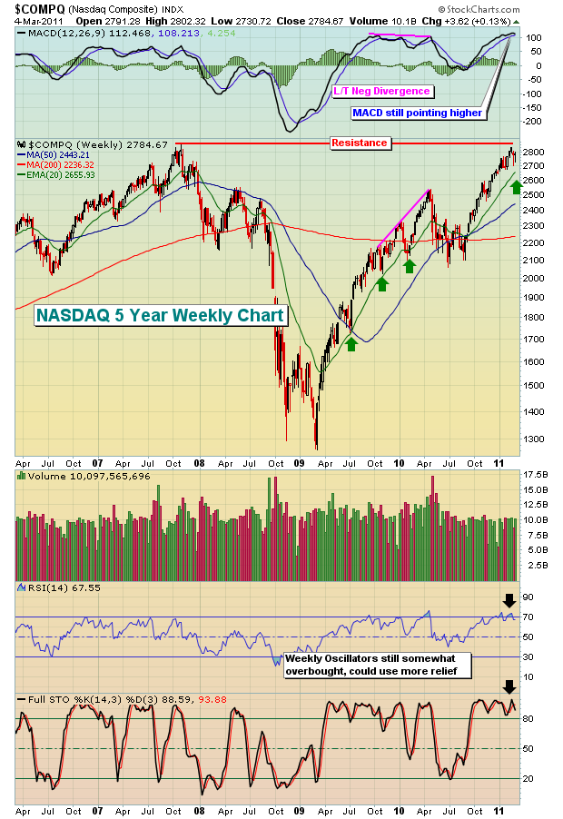
Back in April 2010, prices were moving higher with a lower MACD and that led to well-documented issues over the summer. I had previously discussed warning signs back in April prior to the selling, but those same warning signs are not present right now. We're overbought and could use some selling to consolidate the significant gains, but the MACD is not suggesting the bullish momentum is about to end. After the long-term negative divergence on the MACD in April, notice that weekly prices fell until the NASDAQ tested its 50 week SMA. Also, note the MACD centerline test over the summer. That's the type of selling necessary to "reset" the MACD back to the centerline, which is the technical point where the 12 period and 26 period EMAs are exactly equal. From there, in my opinion, the market was once again left to do its own thing, which in this case turned out to be another bullish move. Note the green arrows above on the chart. During periods when the MACD has been strong, pullbacks are generally contained by the 20 week EMA. Currently, that 20 week EMA resides at 2656. If selling resumes in the days and weeks ahead, you'll want to keep a close eye on this level.
In the very near-term, the trading range on the NASDAQ is 2723-2835 as reflected on the very near-term one month chart shown below:
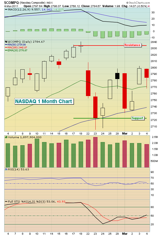
The consolidation is welcome relief and we hope it continues a bit longer to form a nice base. Should the price support be violated near 2723 on a closing basis, the NASDAQ will likely head back to test that 20 week EMA where a much more significant intermediate-term battle will take place.
Given the market turmoil the last few years, Invested Central conducted a member-only survey to find out more about what traders are looking for and how well we've met those needs. You might find the highlights interesting and are welcome to CLICK HERE to learn more. As always, feel free to join me as I break down a recent trade candidate with our featured Anatomy of a Trade. CLICK HERE for the latest candidate.
Happy trading!
The recent gold price rally to new highs hasn't been impressive when compared to silver's sharp rally; but then again, the race may not always go to the rabbit. And it is this thought that has prompted us to consider the horridly lagging gold stocks (GDX). They haven't been able to get out from under their own weight, and they stand not too far off their respective 200-day moving averages, and haven't moved to new highs with gold. This is a rather large divergence, and one we don't believe shall remain in place for very long as gold shares (GDX) appears poised to breakout sharply versus gold prices.
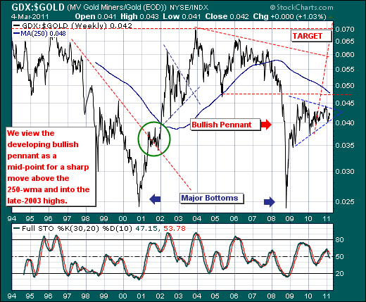
Turning to the weekly GDX:GOLD ratio chart, we find the sharp rally off the late-2008 lows to have consolidated in bullish pennant fashion for the past two-years. This is quite some period of time to consolidate, and classical technical analysis will tell you that the longer the consolidation...the more powerful and extended the breakout. As such, we'll be monitoring this chart carefully for a breakout similar to that seen in 2003 that pushed the ratio from .05 to it highs at .07. Our penannt target measurement is a rough one, and we'll call it the highs at .07 again...with a chance at new highs. But before ending, we should note one important caveat: we've simply noted that GDX appears ready to breakout against GOLD...we don't have a view on GOLD...therefore GOLD could very well move sharply lower, while GDX simply stands in place. It's certainly a risk, but we will consider buying GDX while it is above its 200-day moving average and cut our losses below it.