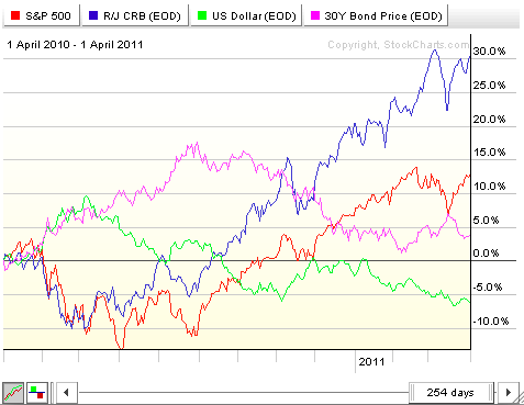
John Murphy has written extensively about Intermarket Analysis - the study of the key relationships between the four major financial markets and how those markets affect each other in the long run. To study Intermarket relationships we use our Intermarket PerfChart that displays the percent performance of the major index for each of the four markets - $SPX for stocks, $CRB for commodities, $USB for bonds, and $USD for the US Dollar.
According to John's book, the "Normal" relationships between the four financial markets are:
Stocks vs. Bonds: POSITIVE
Stocks vs. Commodities: INVERSE
Stocks vs. US Dollar: POSITIVE
Bonds vs. Commodities: INVERSE
Bonds vs. US Dollar: POSITIVE
Commodities vs. US Dollar: INVERSE
In other words, when the markets are "working correctly", you should see (for example) Stocks and Bonds rising (or falling) together on the PerfChart. You should also see Commodities moving in the opposite direction as Stocks. etc.
If you see those relationships occurring then the likelihood of the current market trends continuing is pretty good. It's when those relationships break down that a change in the market's direction becomes more likely.
Flipping the relationships around, we can judge the "health" of the four financial markets by looking at the current relationships:
Stocks and Bonds moving together? HEALTHY
Stocks and Commodities moving together? UNHEALTHY
Stocks and US Dollar moving together? HEALTHY
Bonds and Commodities moving together? UNHEALTHY
Bonds and US Dollar moving together? HEALTHY
Commodities and US Dollar moving together? UNHEALTHY
So where are things currently? Here's a snapshot of our Intermarket PerfChart:
Click here for a live version of this chart.
So, as we look at the chart, which lines have been moving together over the past couple of months? To my eye, it looks like the red line (Stocks) and the blue line (Commodities) have been moving in the same general direction for most of the past year. That is categorized as an UNHEALTHY relationship.
The relationship between the pink line (Bonds) and the green line (US Dollar) is more complex. Clearly, between the start of the chart and June of 2010, these two lines were moving in the same direction. Between June and September they moved in opposite (inverse) directions. From September thru November they both moved lower but then the US Dollar recovered some while Bonds continued to slide. Since February of this year, Bonds have been creeping higher while the US Dollar has been moving lower again. So, at the moment, these two are moving in opposite directions and can be categorized as an UNHEALTHY relationship (subject to change however!).
So, is anything on the chart HEALTHY at the moment? Well, Bonds have been creeping higher which would mean they are in a HEALTHY relationship with Stocks right now however that relationship could change in the next week or two as bonds test their current uptrend.
Where does that leave us? Basically this analysis indicates that changes in the directions of these markets are needed in order to return things to a healthier technical situation. Will that change happen tomorrow? This analysis doesn't say. Which markets will change direction? Again, the analysis doesn't say. Regardless, caution is clearly advised.
- Chip
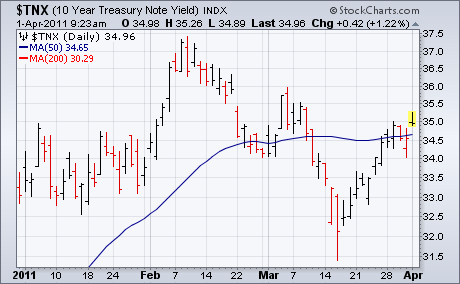
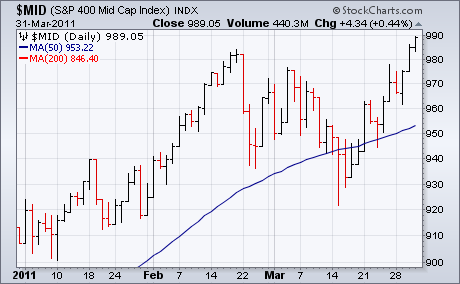
This morning's March jobs numbers reported U.S. payrolls jumping by 218,000 which was higher than estimates. In addition, the unemployment rate declined to a two-year low of 8.8%. The result is a jump in stock futures which points to a higher open today. Bond yields are also climbing on the jobs report. Chart 1 shows the 10-Year T-Note Yield hitting a one-month high after clearing its 50-day line earlier in the week. Rising bond yields are bad for bond prices (which trend in the opposite direction of yields) but are generally good for stocks. That's because rising bond yields are symptomatic of a strengthening economy. Arthur Hill has shown the upside breakout in small cap stocks. Chart 2 shows the S&P 400 Mid Cap Index having also exceeded their February high. That greatly increases the odds that large caps will do the same. Developed markets are also getting a lot of help from strong emerging markets.
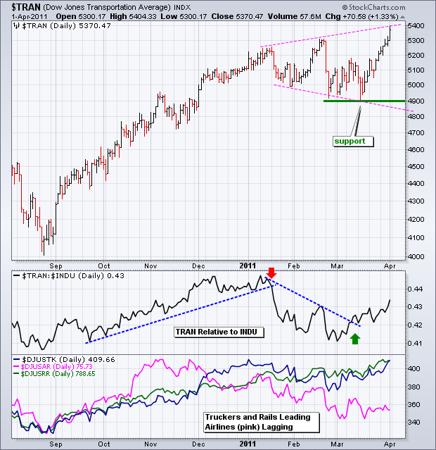
Despite relative weakness in airlines and $108 oil, the Dow Transports surged to a fresh 52-week high on Friday. The chart below shows the Average finding support around 4900 from late February to mid March and then surging around 10% the last 2-3 weeks. Admittedly, there is an outside chance that a broadening formation is taking shape, but the Average shows no signs of significant selling pressure at the moment.
Click this image for a live chart
In the first indicator window, we see the Dow Transports relative to the Dow Industrials. This indicator is the Price Relative, which is a ratio chart of the two Averages ($TRAN:$INDU). The Price Relative rises when the Transports outperform and falls when the Transports underperform. The ratio is currently rising as the Transports outperform. The second indicator window shows three key groups within the Dow Transports: Truckers (blue), Railroads (green) and Airlines (pink). Coal-laden Railroads are leading the way with a 52-week high this week. Truckers are challenging their 2011 high. Airlines are the current laggards.
(This is an excerpt from Friday's blog for Decision Point subscribers.)
If nature abhors a vacuum, technicians abhor "V" bottoms. Once prices bounced out of the March lows, the technical expectation was that, after a week or two of rally, prices would turn down again and the March lows would be retested. At this point, those expectations seem to be a fading dream.
Looking at global markets we can see that "V" bottoms abound, and that in some cases the February highs have already been exceeded.
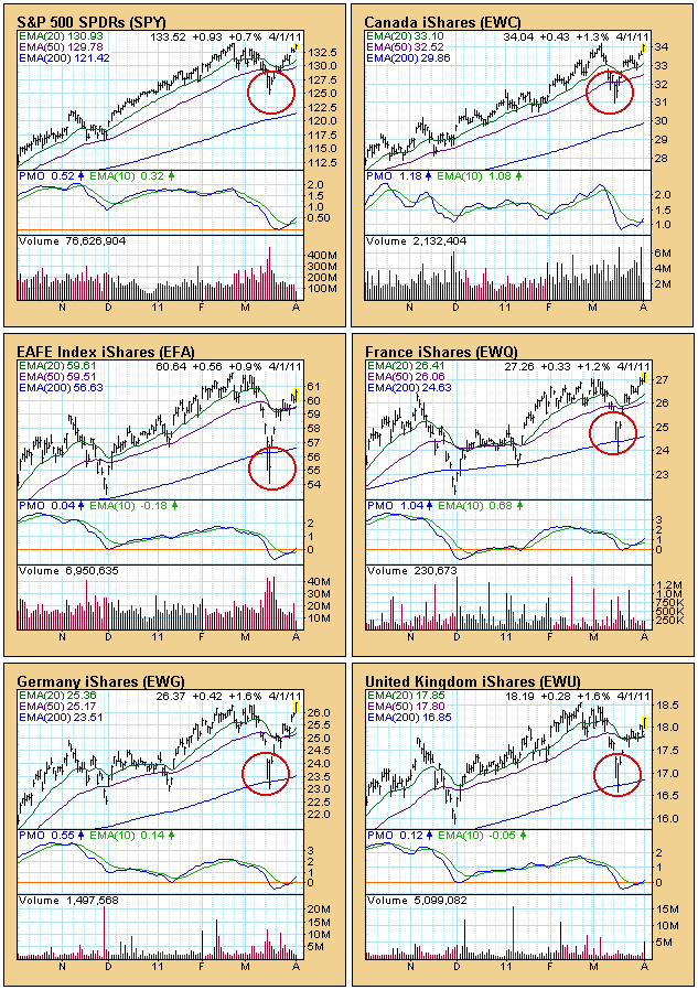
There could be some doubt that the rally can be sustained, and that, perhaps, a double top will form and that there will indeed be a retest, but I seriously doubt that will happen. Recently I conquered my tunnel vision with the S&P 500 Index and looked at global markets. What I discovered was that quite a few do not have "V" bottoms at all. Rather there is a large number of double bottoms (a solid technical bottom formation), which demonstrate broad-based strength in world markets. The graphic below is a bit daubting, but you only need to scan it briefly to see my point.
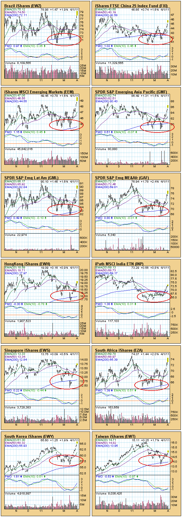
Bottom Line: Despite the precarious nature of "V" bottoms, the broader picture reveals a preponderance of solid double bottoms, which leads me to believe that the "V" bottoms will lead to higher prices without the benefit of retests.
Let's face it. Two weeks ago, the market looked cooked. There didn't appear to be a single drop of gas left in the bulls' tank. We saw impulsive selling. The volume surged on the selling. Daily charts had already printed long-term negative divergences across our major indices, indicative of slowing bullish momentum. Then came the dreaded "death cross", with our shorter-term 20 day EMA crossing below the longer-term 50 day SMA. There was little hope of a recovery....or was there? Shortly after the last article, I hosted one of our Online Traders Series events, "Distinguishing Between Pullbacks and Bear Markets". It turned out to be very timely. I discussed, in part, how you MUST keep one eye on the long-term charts when evaluating the nature of short-term selling. When you break down in the short-term and begin what MAY become a transitional period into a flat or bear market, the key is to adapt your trading strategies until the market becomes clearer in the long-term. For me, that means fewer trades and fewer shares. It's a simple case of managing your risk. You need to pause and allow the market to send you a message as to its intent before becoming more aggressive.
The Russell 2000 is the strongest of our major indices and it comes at a very interesting time of the year as April and May are two of the three best calendar months historically for small cap stocks. Check out how the Russell 2000 handled the recent selloff on its long-term weekly chart:
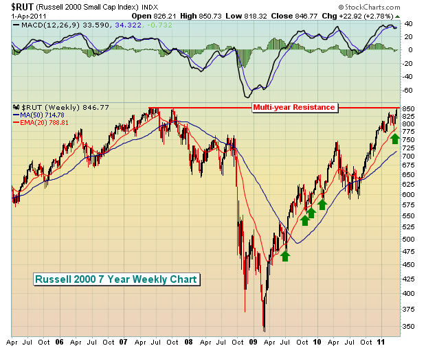
The above shows clearly that we had a short-term pullback to test a key uptrending 20 week EMA. The test was successful and now we see the rally picking up steam once again. The lesson to learn here was that the long-term bull market run was tired, needed a break, and received one by pulling back in acceptable technical fashion and bouncing EXACTLY where it needed to. The daily charts, if you recall, were much more bearish looking, but it's important to keep one eye on those longer-term charts as well. The green arrows on the chart above highlight the successful 20 week EMA tests during this long-term uptrend.
As for market sentiment, I've written plenty at StockCharts about the equity only put call ratio (EOPCR). I use a short-term moving average of this ratio and compare it to a longer-term ratio. The purpose? To identify the "pendulum" swings of traders' emotions in terms of relative complacency and relative pessimism. This ratio has an uncanny ability to sense key turning points in the market and it did it once again at the recent bottom as relative pessimism soared. Take a look:
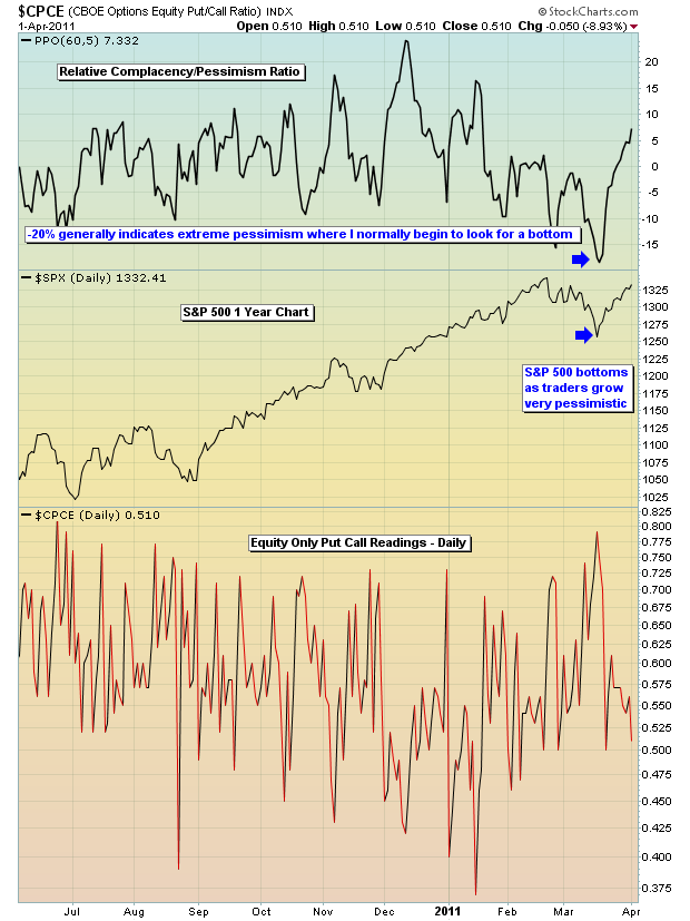
As the EOPCR approached panicked levels (which I consider -20%), the S&P 500 made a sudden rush back to the upside, confusing most technicians and traders. While nothing in the market provides us guarantees, the EOPCR is one self-developed tool that needs to be watched very carefully for tops and bottoms. It's so important that I provide it to our members every day in our morning Market Chatter.
The market is very complicated. But I try to take as simplistic a view as possible to keep my sanity. Listening to all the talking heads on a regular basis can leave you completely exhausted and confused. We must follow the technicals and "clues" that the market provides us in order to better gauge the highest probability of the market's next move.
I discuss many of the subtle secrets of the market in my FREE Traders Boot Camp series. CLICK HERE to register.
During the very first week of the Boot Camp series, I was asked by participants to have a live webinar to discuss all of the topics of the boot camp in more detail and I'll be doing just that next Saturday, April 9, 2011 from 9am to 12pm EST. If you'd like more information, CLICK HERE.
Happy trading!
Questions about regarding the quick/sharp rally off the March 16th low. They are numerous, and they consist of a number of troubling circumstances that call into question the veracity of the rally. One of the areas that is troublesome is the Banking Index ($BKX), for any rally worth its salt much have the banks/financials as a strong backdrop. Therefore, we must consider whether the BKX will prove to be the "canary in the coal mine" for impending broader market weakness, or whether BKX is simply lagging at this point and will play catch up and outperform. We view the former as the more likely outcome.
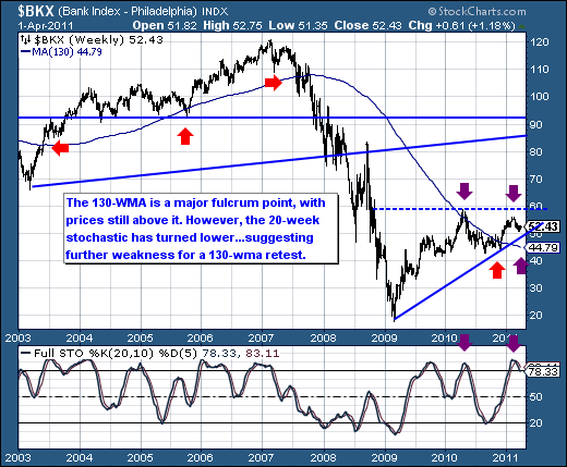
Before looking at the weekly BKX chart, we should note that BKX is up a mere +0.3% YTD versus the S&P 500 +6.7% gain. Quite a bit of under-performance to be sure, and certainly troublesome as noted before. Moreover, the weekly BKX chart shows prices are weakening off its February high in tandem with the overbought 20-week stochastic turn lower. This would suggest further weakness towards the 130-week moving average support level. If a decline such as this were to develop in full, then the resultant loss would be on the order of -15% from current levels. Certainly the broader market would be in throes of a decline for this to materialize.
In ending, a lower outcome is likely in BKX given the weekly technicals; and also given that out of all the S&P sectors, only the Energy and Industrial sectors are out-performing the S&P 500 this year. This generally comes during the latter stages of a market recovery. Therefore, broader market caution is advised.