Hello Fellow ChartWatchers!

Believe it or not, StockCharts.com was founded 12 years ago on May 15th, 1999. To celebrate, we are running our Spring Special from now until the end of May. What is our "Spring Special"? I'm so glad you asked...
From now until the end of May, if you place an order for 6 months of any service, we'll give you a 7th month for free. If you place a 12 month order, we'll give you 2 additional months for free!
As old-timers know, the best time to subscribe or renew an existing account is now, during one of our specials. Because our prices are already very affordable, when we run any kind of special, it is something that everyone should take advantage of.
IMPORTANT NOTE: Existing members don't have to wait until their account is about to expire in order to take advantage of this special! If you renew now, we'll simply add the additional time to your expiration date regardless of when that date is.
Here are some answers to some questions you might have about our Spring Special:
Q: I'm an existing member with less than 12 months to go before my account expires. What should I do?
A: If you are happy with our service, my strong advice is to renew now for 6 or 12 months and take advantage of the special. It's the most cost-effective way to ensure that you have access to all of our subscriber features. For example, by ordering one year of our "Extra" service now, you will save $99.35 (28.4%) over the cost of paying month-to-month.
Q: I'm an existing member with more than a year to go before my account expires. What should I do?
A: We typically run two specials per year. While we can't guarantee when our next special will be, we often hold a special around the December holidays. That means you can choose to either renew now in order to lock in the pricing or wait until December.
Q: I'm not a subscriber yet but I'd like to try out your service and possibly take advantage of your special pricing. What should I do?
A: Follow these steps to test out our service and then, hopefully, take advantage of our Spring Special:
1.) Immediately sign up for 1 month of our "Extra" service. Our 1 month subscription comes with a 7-day money back guarantee which means that you'll have 7 days to test drive our service and see if it is what you expect.
2.) If you don't like our service, just let us know within the first 7 days. We'll refund your money completely.
3.) If you like our service, you can then place a renewal order for either 6-months or 12-months of service before the end of May in order to lock in our Spring Special rates. We'll simply add the additional months on to the end of your original subscription.
Q: I have a coupon code from your Long-Term Subscriber Loyalty Program. Can I use that coupon along with the Spring Special?
A: Absolutely! Combining their Loyalty Discount with one of our 12-month Specials is how loyal, long-term members can get the biggest savings. Just be sure to enter your coupon code into the order form when placing your 12-month renewal order.
Q: I recently renewed and am now frustrated that you are running a special.
A: Don't panic. There's a good chance that you received our Special deal without realizing it. Check your confirmation message to see exactly how many months you received.
Existing Members: Click here to place a renewal order now.
New Members: Click here to learn more about our different service levels
Don't delay. Our Spring Special will be over before you know it.
- Chip
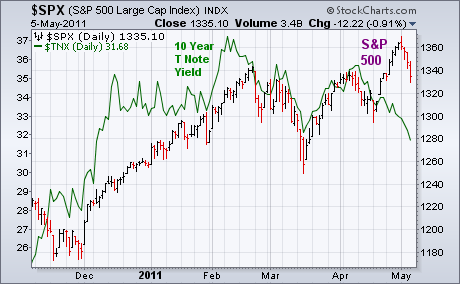
Bonds have benefited from the plunge in commodities. Several bond ETFs have rallied to the highest levels in months. Rising bond prices are pushing bond yields lower. And that may be a warning for stocks. That's because bond yields (which are a barometer of economic strength) have been positively correlated to stocks. The chart below, for example, shows the S&P 500 bars and the 10-Year T-Note Yield (green line) moving up together until April. Since mid-April, however, bond yields started dropping and have now fallen to the lowest level in five months. That divergence between falling bond yields and rising stocks isn't likely to continue. If bond yields are falling because of fears of economic weakness, that should start to pull stocks lower as well. My morning message today also showed some other technical divergences on the S&P 500 which are warning signs. I also wrote recently that the type of sector rotation we've seen since April out of energy and basic materials and into defensive groups like consumer staples, healthcare, and utilities is usually associated with a market correction.
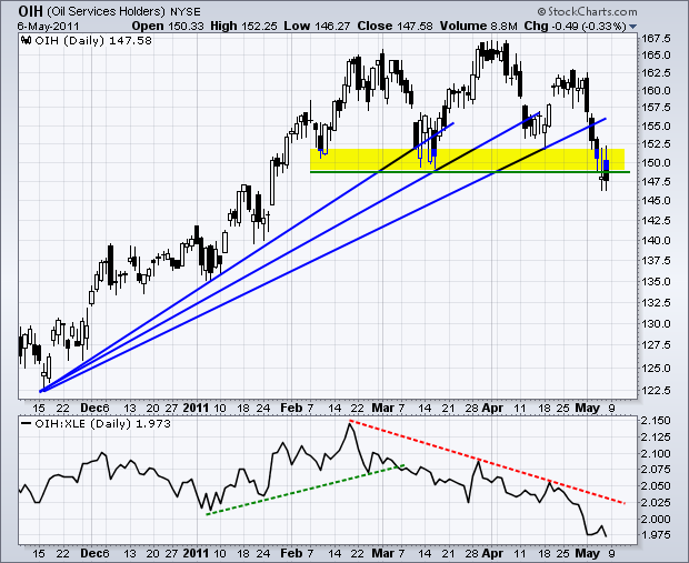
The Oil Service HOLDRS (OIH) is leading the energy sector lower with a break below the March lows. There are two bearish patterns working on the OIH price chart. First, OIH hit resistance in the 162.5-167.5 area with three reaction highs and then broke below support with a sharp decline this week. Even though a picture perfect triple top or head-and-shoulders pattern did not emerge, the essence of a distribution and breakdown is clearly there. Second, the ETF broke the third of three fan lines with this weekâs decline. These successive breaks affirm an increase in selling pressure leading to the breakdown.
Click this image for a live chart.
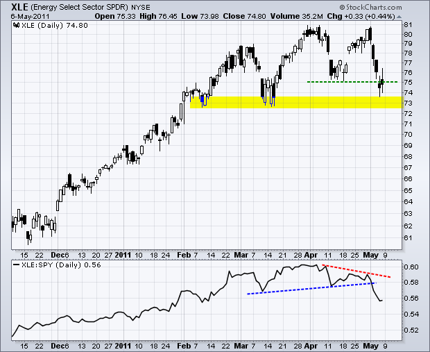
The indicator window shows the OIH:XLE ratio plot. OIH outperforms when this ratio rises and underperforms when this ratio falls. Also known as the Price Relative, this ratio peaked in late February and moved to multi-month lows this week. All told, the medium-term outlook for the Oil Service HOLDRS has turned bearish with this weekâs technical signals. The late April highs mark the first resistance area to watch for a reassessment. For reference, the second chart shows the Energy SPDR (XLE) breaking double top support this week, but still above the February-April lows.
Click this image for a live chart.
On Monday, May 9, Citigroup (C) stock will undergo a 10-for-1 reverse split. What this means is that 10 shares of C will be merged into one share, and holders of C will own one-tenth as many shares, but each share will be worth ten times the value of pre-split shares. Most people understand the concept, but many do not realize that a reverse split is essentially a negative event.
Let's take a look at the Citigroup monthly bar chart. Ugh! In about two years it went from an all-time high of 51.54 to what was probably an all-time low of 97 cents. In the two years since the low it has not been able to get above 5.00 except for brief periods.
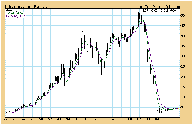
I don't know the detail on Citigroup per se, but typically reverse splits are done to jigger the price up to a "respectable" level. For example, many investment funds are not permitted to buy stocks that are under a certain price, like 5.00, so after the reverse split C will open on Monday at around 45.00 (10 times Friday's close). All historical data are adjusted as well, so the chart will look just as ugly, only with much more downside potential. (Geeks Note: Whereas pre-split prices are multiplied by 10 for the reverse split, volume is divided by 10 so as to keep the price-volume relationship consistent.)
As a general rule reverse splits are not beneficial to future prices of the stock. Let's face it, Citigroup's chart tells us clearly that, whatever was wrong with the company at the top, is still a problem. Also, a stock trading this close to zero benefits from what I call "ground effect", meaning that the zero line tends to create a support zone several points above it. Reverse splitting the price up from 4.50 to 45.00 removes that support and allows more room (i.e 45 points downward) for the market to discount the stock price in order to reflect how bad off the market thinks the company really is. Yes, the price will be at a level where fund managers will be able to buy it, but will anyone want to?
It was a little more than one year ago - in April 2010 - that I began warning about a potential top approaching. We now know what happened in May and June of that year. Well, the warning signs are mounting again and, barring technical changes, we could be in for a very rough summer.
Where does the market stand? Well, tell me if you're looking short-term or longer-term and I'll give you two different answers.
Let's start short-term. When I look at a six month chart of the NASDAQ, I see nothing but bullish signs. There was a very bullish continuation pattern in play - an inverse head & shoulders. While a head & shoulders pattern after an uptrend is a potential topping pattern, the "inverse" head & shoulders carries very bullish implications upon breakout. Check out the chart on the NASDAQ below:
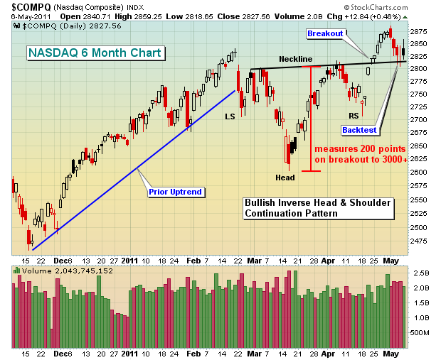
After the breakout, last week's pullback should not be viewed bearishly as these types of patterns often show backtests of the breakout area before moving higher. It gets back to that old technical analysis adage "broken resistance becomes support". And the beauty of patterns is that they have defined measurements. This inverse head & shoulder pattern "measures" to the 3015-3020 area so the NASDAQ clearly has the "potential" of another push higher.
So where does the bearishness come in?
Well, I have a number of reasons, but let's focus on just one for this article. The April rally was led by defensive sectors and that's a no-no during bull markets. Think about it for a second. When you feel bullish about the market, do you rush in to buy Colgate (CL) and Kraft Foods (KFT)? These are "consumer staples" stocks. I know the saying "put your money where your mouth is", but I don't think it applies here. Don't misunderstand me. I'm a huge fan of eating and fresh breath. But if you're bullish, you'll normally want to buy the stocks that generate a bigger return. You're willing to take MORE risk, not less. That suggests you'd rather buy F5 Networks (FFIV) or Netflix (NFLX), technology and consumer discretionary companies, respectively. Yet these two more aggressive stocks did not participate in the latest rally and neither did many with similar characteristics.
Take a look at this relative chart:
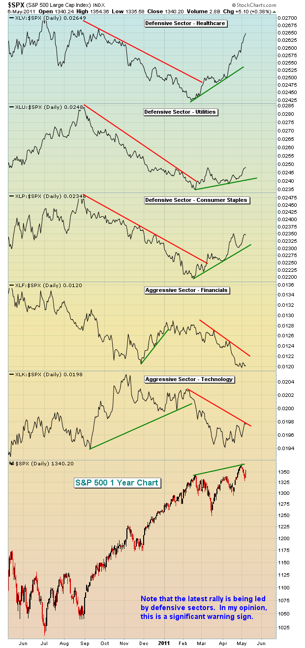
It's quite clear to me that when the bull market was in full swing, aggressive sectors led the rally while defensive sectors lagged. This is what I refer to as a "healthy" advance. But note what happened from the mid-February high to the late April high. Defensive groups have emerged as the relative leaders. Money is rotating out of riskier stocks and into the more conservative ones. This suggests a risk-off trading strategy that does not give me the warm and fuzzies as we look ahead. CNBC and the like just look at the numbers, see fresh two year highs and proclaim the bull market perfectly intact. I believe this to be a very serious warning sign that merits close attention, if nothing else.
Could the market march a little higher given those bullish inverse head & shoulders patterns? Absolutely! Is the move sustainable? Given current "under the surface" conditions, not likely. Protect yourself accordingly.
I recently authored a Trader's Boot Camp that was very popular. Many participants suggested more in-depth analysis of the MACD. I am pleased to announce a new topic-specific Boot Camp dealing exclusively with the MACD. If you want to learn about the MACD or just sharpen your skills with helpful hints and strategies, you're invited to sign up for this FREE series of e-mails and annotated charts. CLICK HERE to register and for more information.
Happy trading!