Hello Fellow ChartWatchers!
This week's newsletter features some great Bullish vs. Bearish discussions including some Elliot wave analysis from John Murphy. I also wanted to take time to remind everyone that our Spring Special will end shortly. I really hate when people write in to us after a special ends because they missed it. Please don't put yourself in that position! Remember: everyone can take advantage of our special - both members and non-members. Even if your account doesn't expire for a while, you can still renew NOW to get the extra month of service.
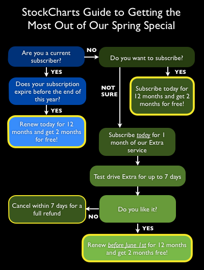
And here's a handy dandy flowchart to help you decide if the Spring Special is right for you:
Don't miss out! To subscribe, click here. To renew, click here.
The special ends on May 31st so don't wait.
- Chip
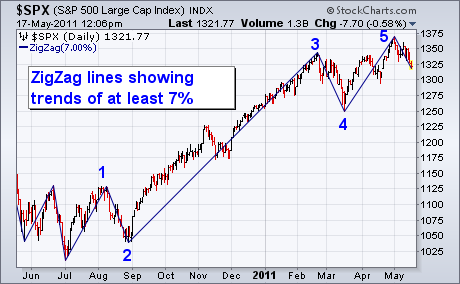
Determining Elliott Wave counts can be very subjective. One way to make it little easier is to employ a "ZigZag"overlay on the price chart. [The ZigZag is located in the same Overlays menu that includes moving averages]. The idea of the ZigZag overlay is to apply a percentage filter on market trends. The default setting is 5% which means that only price moves of at least 5% are shown. Anything smaller than 5% is ignored. You can change the percentage filter to make the lines more or less sensitive. I increased the ZigZag filter to 7% in Chart 1 to show the two 7% corrections from last August and this March without upsetting the 5% line count. The lines help eliminate some of the subjectivity when counting market waves. Chart 1 shows five clear lines since last summer's bottom. Three up lines and two down lines. [The numbers were added by me]. Elliott Wavers know that five-wave advance is usually a signal that an upmove has been completed and that correction within the uptrend is likely. I've also recently shown a number of negative divergences on daily and weekly indicators like RSI. Why that's important is that fifth wave negative divergences are usually more serious warnings of a market correction.
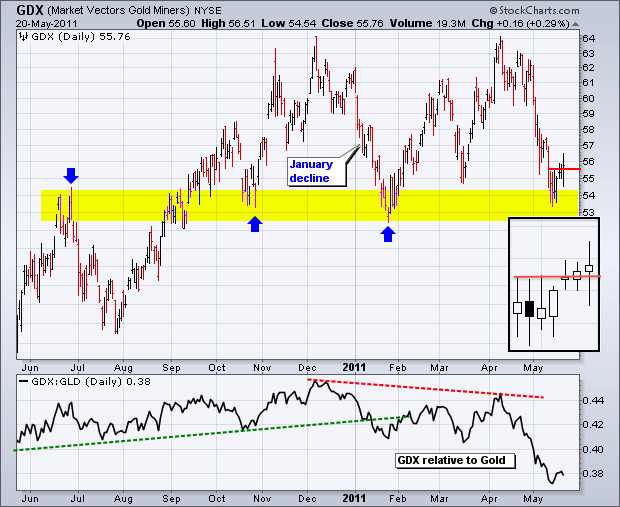
After getting slammed with a 10+ percent decline in May, the Gold Miners ETF (GDX) hit support and bounced over the last few days. As the chart below shows, this is no ordinary support level for GDX. Support in the 53 area stems from broken resistance and at least two reaction lows (October-January). There is also a reaction low around 55 in mid March. The ETF is finding some buying interest at support with a bounce the last few days. The black box highlights the last seven daily candlesticks. The first two are **spinning tops**, which affirm support. There was a mini-breakout with the move above the spinning top highs. Failure to hold last weekâs low would be put the big support zone in jeopardy again. The second chart shows the **Junior Gold Miners ETF (GDXJ)** testing support from reaction lows extending back to mid November.

Click these images for live charts.
A reader recently called me a perma-bull, which is amusing, since by nature I'm usually disposed toward bearishness. I will, however, remain bullish until our mechanical timing model switches from a buy. The model will be bullish until the 20-EMA for the S&P 500 crosses down through the 50-EMA. We can see on the chart below that those moving averages are converging, but there is plenty of room before a crossover will take place.

While the model provides discipline, we are still permitted to look at indicator charts and speculate about the future. For example, on the chart above we can see a rising wedge pattern, which is a bearish pattern that usually resolves to the downside. There is still room and time for prices to bounce around inside the wedge, and the rising trend line is still holding, so this is not strongly conclusive.
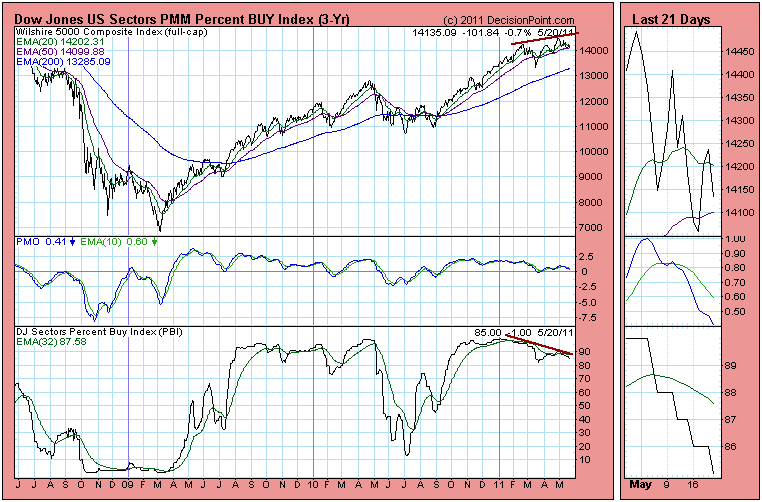
Below is a Percent Buy Index (PBI) chart for the broad market. It shows the percentage of buy signals for the 100 Dow Jones market sectors. While it is still at a relatively high reading, there is a negative divergence between the PBI and the price index. This shows that the price advance is being undermined because fewer sectors are participating.
The next chart is the weekly bar chart of the S&P 500 Index. The concern here is that the weekly PMO has topped and is falling below its EMA (green line). There is also a negative divergence between the two PMO tops and the price tops. This is really bearish.
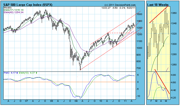
Bottom Line: The S&P 500 has not yet given the fatal sign of breaking down through the rising trend line drawn from the August 2010 low, but there are internal indicators that are giving strong evidence that an important top may have been made on May 2. That is to say that we could have begun a substantial correction, or the bull market may be over.
Issues are mounting and the pressure is definitely weighing on the bulls. While we haven't seen any major breakdowns to confirm several bearish signs, you should be approaching the market with caution in my opinion.
In my last article, I discussed one of the warning signs - the significant outperformance of defensive sectors as traders become much more risk-averse. History tells me that it's time to be cautious when money rotates exclusively to defensive groups.
Let's talk about two more problems.
First, there are clear long-term negative divergences across all of our major indices on their respective weekly charts. There's also one on the Dow Jones Transportation Index and another on the Dow Jones REIT Index. The REIT index is one of the few financial sub-sectors that has been performing well. Take a look below at the NASDAQ weekly chart:
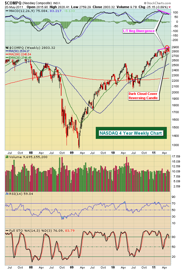
When MACD's move higher with price, I look for pullbacks to the 20 week EMA to hold as support. But when slowing momentum surfaces, as evidenced by lower MACD readings on higher highs in price, those 20 week EMAs become much more susceptible to bear attacks. Generally, the odds of 50 week SMAs increase in order to "reset" the MACDs back near the centerline. So as we look at the NASDAQ chart above, note that the 50 week SMA currently resides at 2534 and is rising. Over the next several weeks, I will be very surprised if we don't see a test of this moving average, at a minimum.
Weekly negative divergences don't necessarily mean a bear market is approaching, but that is one possibility that we need to consider. Price reaction off the 50 day SMA test, volume trends, sentiment, and other indications all factor into making that assessment.
Another problem the bulls face is the relative performance of financial stocks. The following chart shows the relative performance of financials and the overall performance on the S&P 500:
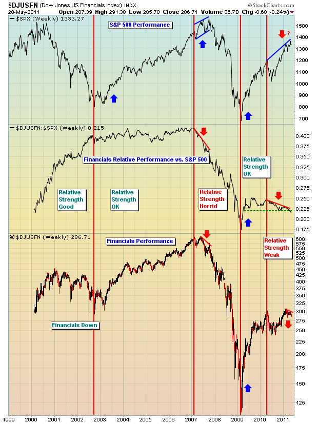
This is quite a compelling visual and helps to explain why I view it so often. And it makes complete sense. When fnancials are unhealthy and underperforming, banks cut their lending despite what they say. How can our economy continue to expand when access to capital is denied or limited? Look at how the relative performance of financials turned south in 2007 just before the S&P 500 followed suit. With financials again struggling badly on a relative basis, this could once again signal significant weakness ahead on the S&P 500. If you're a bull, you really want to see financials regain some relative strength and SOON!
I've had incredibly positive feedback for our MACD Boot Camp so thanks to all those who registered. It won't likely remain available for long, so if you haven't checked it out, do yourself a favor and sign up. It's FREE! CLICK HERE for easy registration.
I'll also be discussing my proprietary Equity Only Put Call Ratio (EOPCR) on Thursday of this week as part of our ongoing monthly Online Trader Series educational events. The EOPCR has been a huge part of my success in identifying market tops and bottoms. I'll be describing my methodology and explaining how it works. This one is really a must-see for swing traders. If interested, you can CLICK HERE to register for this online event.
Happy trading!
Since the end of April, the broader market as defined by the NYSE Composite Index has been in a corrective mode. However, the question remains as to whether this corrective process will continue in the weeks and months ahead, or will it come to a halt with the materialization of higher highs. We stand on the side of a correction in the months ahead.
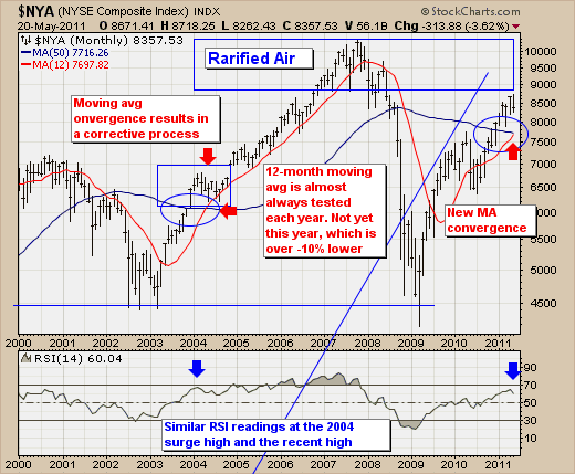
To this end, the NYSE monthly chart illustrates a simple, yet elegant reason for the corrective process to continue: the 50-month and 12-month moving averages are converging. In the past when this has occurred - note the 2004 convergence - prices began to falter in the months leading up to these moving averages actually crossing. The very same circumstance is occurring today, and it also occurs with the 14-month RSI hitting very close to the very same level as in 2004. Moreover, we should note that the 12-month moving average is very rarely not tested at anytime during a year, which given the market has completed nearly 5-months of trading...gives us 7-months for it to be tested. At present, it stands a bit more than -10% current market levels, and we could very well see prices and the 12-month converging by late-summer of early fall.
Therefore, the risk-reward is skewed towards lower prices in the months ahead, which fits nicely with the seasonal patterns. But at this point, we only look for this correction to test moving average support before prices move higher - perhaps in response to a need to QE-3 if the economy continues to falter such as it is today.