Hello Fellow ChartWatchers!
Recently we introduced a new cycle analysis tool in our ChartNotes annotation tool - the Cycle "Sine Wave" tool. This tool helps you look at various period cycles on your charts. It can be used on any chart in a wide variety of ways but many people people will probably use it to look for cycles on long term charts.
To use the tool, create a SharpChart and then start our ChartNotes annotation tool by clicking on either of the "Annotate" links below the chart. Once ChartNotes is running, you can click once on the old "Cycle Lines" button in the top toolbar. After you click, a second button will appear below your mouse with a Sine Wave icon on it. Click that button to select our new "Sine Wave" tool.
Once the tool is selected, simply click and drag to create great looking cycle charts. Here's an example:
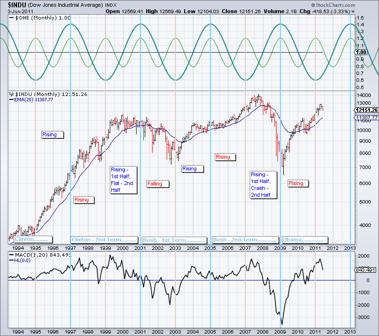
(Click to see a live version of this chart.)
This example is designed to explore the fabled 4-year Presidential stock market cycle. The theory behind this cycle is that presidents implement difficult economic measures soon after taking office and implement economy stimulating measures before the next election to make voters happy.
The chart above is a very quick look at whether or not that phenomenon has played out over the course of the last 15 years. Again, this quick analysis shows that the start of the 2nd term for both Clinton and Bush played out counter to cycle expectations with the markets rising instead of falling.
I encourage everyone to play with these tools and explore other cycle phenomena. If you find something great, think about sharing it via your Public ChartList. I can't wait to see what you come up with.
- Chip
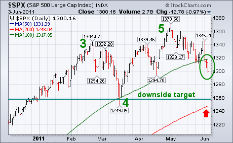
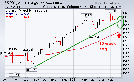
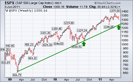
S&P 500 VIOLATED MAJOR UP TRENDLINEby John Murphy | The Market Message Thurday's message showed the S&P 500 threatening two important support lines. Unfortunately, both have been broken. Chart 1 shows the SPX closing below its 100-day average (green line) for the first time since last August. The weekly bars in Chart 2 show the SPX ending well below an up trendline drawn under its August/March lows. Those downside violations leave little doubt that the market has entered a downside correction. The most logical downside target at this point is a drop to the March low near 1250 which also happens to coincide with the 200-day (40-week) moving averages which are the red lines in the two charts. There are at least three reasons why the March low is so important. First, it's the next major support level (and represents the bottom of Wave 4 in an Elliott Wave sequence). Second, it coincides with the 200-day moving average which is a major support line. Chart 3 shows another reason. The 1250 level represents a test of a two-year up trendline drawn under the 2009/2010 lows (see arrows). That means that prices need to stay above that level to keep the two-year bull market intact.
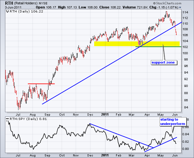
With economic indicators and employment statistics coming up short this week, retail stocks came under considerable selling pressure. Led by weakness in Wal-Mart and Home Depot, the **Retail HOLDRS (RTH)** is down some 7% the last few weeks. Chart 7 shows RTH breaking the trendline extending up from early September. RTH is clearly in a short-term downtrend with the next big support zone in the 102-104 area. As far as the long-term trend is concerned, note that a major topping pattern has yet to take shape. We have yet to see a Double Top, Head-and-Shoulders or some other distribution pattern unfold. Moreover, we have yet to see a major support break. This means it is still too early to label the big trend down on this chart.
Click this image for a live chart.
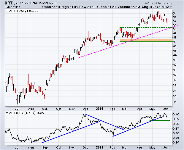
The second chart shows the Retail SPDR (XRT) taking a hit over the last three days. The ETF is poised to test support just above 50. This support level stems from the November trendline and broken resistance. The Price Relative (XRT:SPY ratio) has yet to break down either. The ratio flattened the last two months with the early May low marking support. A break below this level would indicate relative weakness in XRT.
Click this image for a live chart.
For over three months the market has been chopping around and making very little progress. In the process internals have been weakening, a fact that is reflected in the signal table below. In our Decision Point Alert Daily Report we track mechanical timing signals on 27 market and sector indexes. In addition to the broad market indexes, we track the nine SPDR sectors and their equal weighted counterparts, which normally perform differently than the cap-weighted indexes.
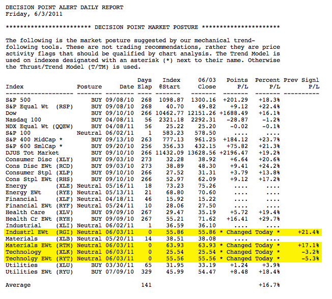
Of those 18 sector indexes 10 have switched from buy signals to neutral over the last few months. Four had signal changes today. The technology buy signals that just closed were only 5.5 weeks old and were the result of whipsaw that typically occurs during the topping process.
Let's remember that the sector SPDRs are actually formed by breaking the S&P 500 stocks into nine sector groups. While the S&P 500 is on a buy signal, we can see that it is being supported by only four of the nine sectors -- Consumer Discretionary, Consumer Staples, Health Care, and Utilities. Let's look at those charts, remembering that their current buy signals will be closed when the 20-EMA crosses down through the 50-EMA.
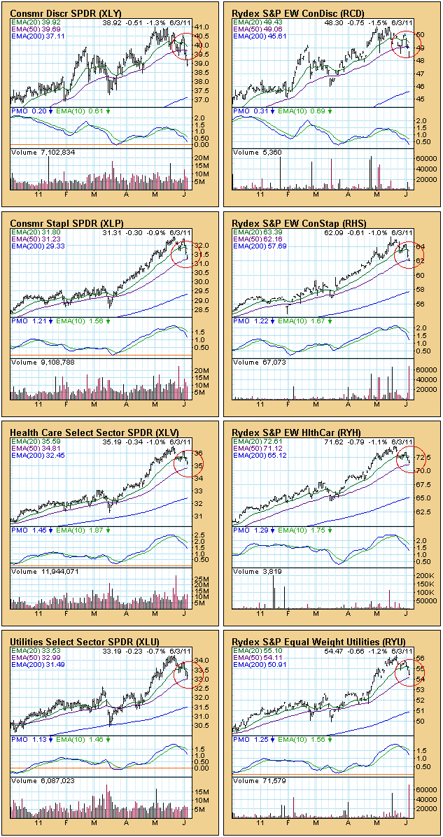
Consumer Discretionary is looking a bit shaky, but the rest of the charts show good separation between the 20/50-EMAs.
Bottom Line: We are seeing a gradual breakdown by sector within the S&P 500. While most of the remaining buy signals will have some durability, there are fewer sectors supporting the index than there are pulling it down.
COMPLACENCY CONFIRMS A TOPby Tom Bowley | InvestEd Central There are many sentiment indicators that can be followed but the two I most closely follow are the Volatility Index (VIX) and the Equity Only Put Call Ratio (EOPCR). There are sentiment gauges that tell you how investment letter newswriters "feel" about the market. Personally, I'd rather just see where the money is going. I don't need anyone to tell me how they feel. I have unique ways of following both the VIX and the EOPCR, so I thought now might be a good time to discuss one application of each.
My last two articles discussed significant warning signs in the market. I've been communicating this bearish bias regularly to our members at Invested Central. Last week, we saw a bit of confirmation as prices moved substantially lower and major moving averages were taken out in the process. The damage could be seen across all sectors.
The VIX and the EOPCR were among the warning signs as well. Stock prices and the VIX tend to move inversely to one another. As stock prices rise, the market generally grows more complacent (less volatile) and the VIX falls. Well, take a look at key price support on the VIX since 2007:
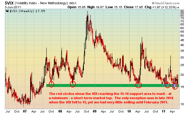
The trip back to 15 support suggested a possible bounce and a bounce higher in the VIX is usually accompanied by a market selloff. Last week's selling began right on cue if you follow the VIX. After approaching 15, the VIX popped and the market sold off IMPULSIVELY.
Complacency was also found in the EOPCR. In fact, since the CBOE began providing us data for the equity only put call ratio in October 2003, never had the 60 day moving average of the EOPCR fallen to the level it saw in February 2011. Check this out:
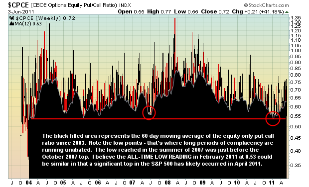
Sentiment alone will not provide us all the evidence we need. It's similar to a jury trial where the defendant can be placed at the scene of a crime. That certainly provides the possibility that the defendant is guilty, but the jury would need more evidence to convict. In the case of the stock market, the preponderance of evidence suggests we've just witnessed a significant market top. On Tuesday, I hosted a State of the Market webinar for our Gold members, highlighting all of the bearish evidence accumulated to date. It's quite alarming. CLICK HERE for more information on viewing this timely and powerful webinar.
We also continue to receive great feedback from our MACD Boot Camp, which is a FREE learning series designed to help you better understand the MACD, its uses, trading secrets, and its limitations. If interested in registering, CLICK HERE.
Happy trading!
In the past 10-months, the commodity markets have rallied rather substantially on the back of the QE-2 campaign. But, we would be remiss if we didn't point out that Natural Gas did not participate, with prices below the August levels extant when Fed Chairman Bernanke announced that QE-2 was a probable event. However, recent price gains in "natty" have given us reason to believe that it shall play "catch-up" in the weeks and months ahead, with money coming out of higher priced commodities and going into this laggard.
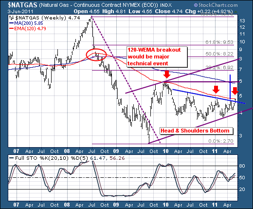
Technically speaking, the inverse "head & shoulders" bottom was confirmed last week with a close above neckline resistance. This level has proven its merit in recent weeks, thus the breakout is considered material. This, when considering the high probability of a 120-week exponential moving average breakout - all argue for sharply higher prices towards the $7 to $8 range from a current $4.74...or a gain between +48% to 70%.
Therefore, one can either use the Natural Gas futures or the Natural Gas ETF (UNG) to participate in the rally. Our choice at present is UNG.