There are several new indexes at StockCharts.com that everyone should check out. They are our new "Theory" indexes that contain artificial, idealized versions of four important chart patterns - a sawtooth reversal pattern ($THSAW), a sine wave pattern ($THSINE), a "perfect" Elliott Wave pattern ($THEW), and a good approximation of an "ideal" Head and Shoulders reversal pattern ($THHS).
Here's a comparison of an annotated version of $THEW along with a snapshot of an "ideal" Elliott Wave taken from our friends at ElliottWave International:
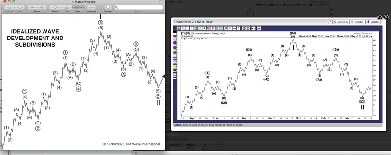
As you can see, $THEW is extremely similar to the version of EWI. The image on the right also demonstrates our recent "Elliott Wave Annotations" tool that is now built into ChartNotes. The numbers and letters on that chart were added very quickly just using single clicks of the mouse.
It's important to keep in mind that all of our Theory indexes (i.e., indexes that start with "$TH") are artificial. They are there to help you study indicator behavior. They are not tradable. They do not represent actual indexes or securities of any type. So what good are they? Here are just some of the things you can do with them:
1.) Watch how the patterns develop over time
Each day we add a little bit more of the pattern to the right side of the chart. Remember, the right side is where everyone has to live in order to make money. So what does a Head and Shoulders pattern look like as it is emerging? Now you can see with $THHS.
2.) Watch how different indicators behave as the patterns develop
Can a MACD be used to confirm the development of a perfect Ellott Wave pattern? What does the Aroon indicator look like during a rounding top? How do Bollinger Bands behave near the right shoulder of a Head and Shoulders pattern? All of these questions (and many more) can be easily answered with our $TH indexes.
3.) Compare current stock behaviors to the ideal
Overlay $THEW on top of the chart of a real stock to see how it compares to the "ideal" Elliot wave pattern. Ditto for all of our other $TH charts.
Let me know if you discover something else wonderful you can learn for these things.
- Chip
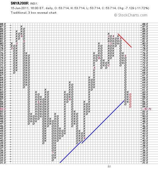
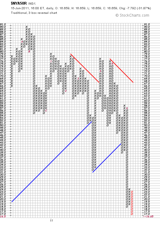
Last Thursday's message showed the point & figure version of the % NYSE stocks above their 200-day moving average in a downside correction. I suggested that the first sign of improvement would be a three-box reversal to a rising X column. We got that this week, but it proved short-lived. That's the bad news. The good news is the p&f chart now gives us a clearcut chart point to use to spot any market upturn. A traditional p&f buy signal requires a rising X column to exceed a previous X column. This week's high point was at 60. That means that the $NYA200R needs to hit 61 to signal a possible upturn. Why this indicator is worth watching is that virtually all major US stock indexes are now testing their 200-day moving averages and major chart support along their March lows. Chart 2 shows the % NYSE stocks above their 50-day averages still in a downtrend but dropping into oversold territory below 20%. That more volatile measure needs to rise to 25 to signal a possible bottom.
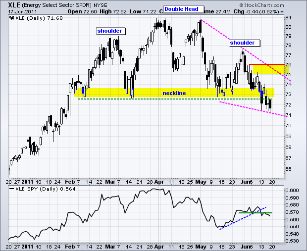
The Energy SPDR (XLE) has been one of the weakest sectors this month. In fact, the chart shows XLE breaking support from a large Head-and-Shoulders reversal pattern. The left shoulder peaked in March, the head peaked in April and the left shoulder peaked at the end of May. With a 7% decline the last 13 days, the ETF broke below the lows extending back to February. This confirms the pattern and targets a move to around 65. The height of the pattern (81 â 73 = 8) is subtracted from the support break (73 â 8 = 65) for a target.
Click this image for a live chart.
At this point, traders need to be careful that the right half of the Head-and-Shoulders pattern does not evolve into a mere falling wedge. Currently, the wedge is clearly falling with no signs of strength. A move above the wedge trendline and resistance at 76 would reverse this fall and put the bulls back in control.
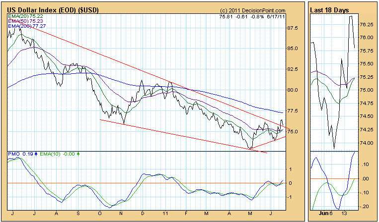
While the U.S. Dollar Index didn't do so well Friday, it is getting ready to generate a Trend Model buy signal. Note on the chart below that the 20-EMA is less than a hair away from crossing up through the 50-EMA, which will mechanically generate the buy signal. Note also that the Index broke above the top of a descending wedge formation. Friday's decline, so far, was the expected snapback to the line, which is now support. Unless there is more followthrough to the downside, I'd have to say this chart is bullish.
Now let's look at the chart of the Dollar Index Bullish ETF (UUP), which is supposed to track the Dollar Index. Note that the price barely penetrated the overhead resistance on an intraday basis, and failed to close above it. More interesting is that the price relative line has a gradual downward slope and a steep drop in the last three weeks. This means that UUP is normally weaker than the Dollar Index, and it has been exceptionally weak more recently.
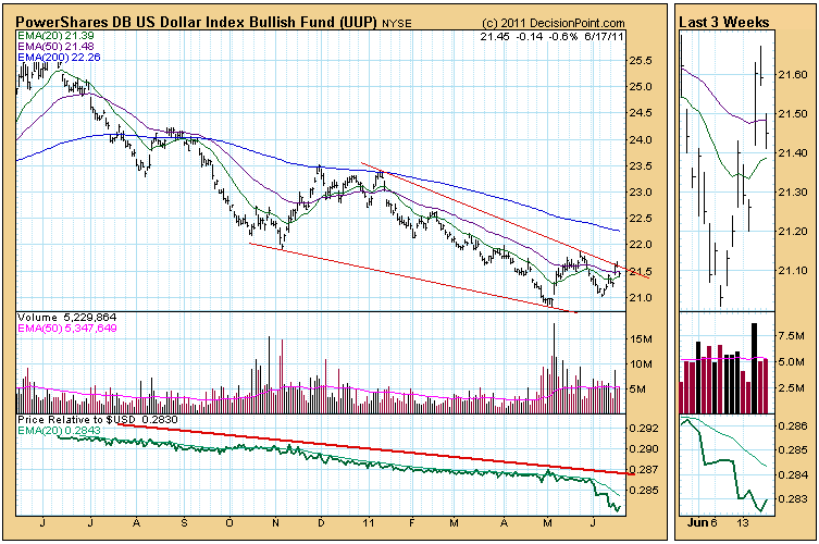
So what should we believe, the Index or the ETF? The ETF trades on supply and demand like a stock. The Dollar Index simply tracks the U.S. Dollar's strength against a basket of currencies. If I'm going to try to forecast the future path of the dollar, I'll use the Dollar Index chart. If I'm trading the ETF, I'll use the UUP chart.
Is UUP giving us advance warning that things are about to go south for the dollar? Possibly, but for now I'll believe the Dollar Index, because UUP has historically underperformed the Index. If the Index continues higher, UUP is certain to follow.
For more clarification, let's look at the Dollar Index weekly chart. The price breakout looks pretty solid, and the PMO has crossed up through it EMA. We should have positive expectations unless this picture changes.
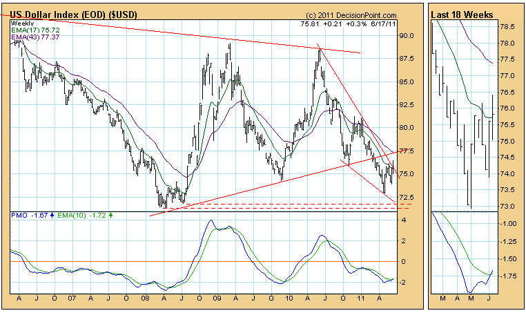
Bottom Line: The Dollar Index has been performing well for about six weeks, and technically we expect it to continue for a while. UUP doesn't look as promising, even though it is supposed to track the Dollar Index, so we would take our trading clues from the UUP chart. I think this conflict could be resolved as early as next week.
Traders are expecting the horrible market we've seen thus far in June to only get worse. The VIX is the ticker symbol for the Chicago Board Options Exchange Market Volatility Index. It measures implied volatility of S&P 500 index options, or the "expectations" of market action over the next 30 days. The formula takes into account current market prices for all out-of-the-money calls and puts for options expiring in one to two months. The goal is to determine how much premium traders require on option plays. If traders believe higher volatility is in order, then options are priced accordingly with higher premiums.
But therein lies the problem.
Throughout history, higher volatility is associated with weak stock market prices. As the VIX spikes, equity prices drop. Last week, we saw a significant breakout in the VIX and that generally means only one thing for traders - equity prices moving lower. Look at the breakout in the VIX:
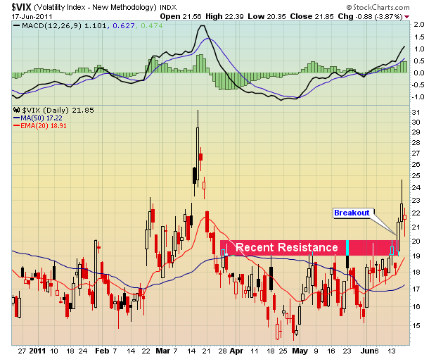
Two weeks ago, I mentioned that the VIX had tested key support in the 15-16 range and showed how the VIX had risen on multiple occasions off that support. That VIX strength coincided with market weakness nearly every time and was one of the reasons I had grown more pessimistic about the direction of the stock market recently. Well, the breakout of the VIX beyond resistance only makes me feel more bearish. In addition to declining prices, we now have confirmation that traders are growing more fearful. Price breakdowns + trader fear can equal UGLY market action so remain on your toes.
Taking another look at that VIX chart above, an obvious question surfaces. The VIX rose in March to the 31.00 level, yet the S&P 500 managed to climb to new highs in April. Bulls might ask why is this time any different? Can't we simply move to new highs in July? My answer is that the bearish backdrop was not totally in place in April. If you recall, money flowed into DEFENSIVE sectors in April, telling us it was more of a flight to safety, not another move higher in a bull market. Defensive sectors led the April advance. The three best performing sectors in April were healthcare (+6.43%), consumer staples (+5.35%) and utilities (+4.05%). Financials actually fell in April (-0.06%). That was NOT a healthy advance.
If you're looking for strength in the market now, you'll be hard-pressed to find any. Technical breakdowns litter the charts. It's not likely traders on the long side will remain committed past a few days or a couple percent. And sellers are going to be stacked at key resistance levels like those 20 day EMAs going forward.
I believe the trading environment has turned much more bearish. I discussed the warning signs in the last few articles. These signs have now been confirmed and the summer ahead could be VERY rough indeed. As volatility and fear elevate, trading strategies change. High volatility leads to emotional trading. And any time we get emotion involved, poor trading decisions usually follow.
I will be leading our monthly Online Traders Series webinar, "The Psychology of Trading - What You Must Know NOW" in order to help our members navigate what will likely prove to be a very difficult trading environment in the days, weeks and possibly months ahead. If you'd like more information, CLICK HERE.
Shorting stocks has become a solid option in order to profit from a downtrending market. While I prefer being bullish the market, I have no problem whatsoever recognizing shorting opportunities and seizing them. 11 of our last 12 Charts of the Day have been winners, 10 of which have been short candidates. One of those winning short trades is described in detail, from setup through the cover. CLICK HERE to view it.
Happy trading!