Hello Fellow ChartWatchers!
Today I'm pleased to announce another major upgrade to StockCharts.com. We've just added end-of-day data for US futures contracts as well as end-of-day spot prices to our system. The data is available for free to everyone. When you combine that with our recent addition of London, Euronext, and German stock data, you'll discover that over the course of the past two months, we added over 2,500 new, free symbols to our database - the largest expansion we've ever had (and we're still not done...) Here are more details on each of these two important changes:
THE RETURN OF OHLC DATA FOR OUR COMMODITY INDEXES
Last month when we completed our transition from our old data vendor to our new data parter, Interactive Data, we discovered that the Open, High, and Low values we had been getting for our various end-of-day commodity indexes like $GOLD and $USD didn't match the values we were expecting to see. Because of those data consistancy issues, we changed those indexes into "Close-only" datasets something that proved to be very unpopular with many of our users. (Frankly we were very surprised by the amount of negative feedback we received at that time.)
At the time we made the change, I wrote the following in my blog:
"It has always been StockCharts.com's intention to add legitimate, tradable futures data to our website at some point. It is still our intention to do that. [...] We are continuing to look for possible "middle-ground" solutions which would allow us to provide, for example, delayed spot prices for popular commodities."
Today's good news is that we have been able to acquire the data we need to provide end-of-day, OHLC spot prices for all of our commodity-based indexes. This means that you are now able to create daily bar and candlestick charts for $GOLD, $SILVER, $COPPER, $NATGAS, $USD, $WTIC and more AND that the data is based on actual futures trading data straight from the futures exchanges. Check it out:
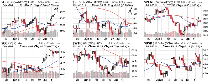
(Click on the chart to see a live version of these charts.)
Important Note: This change means that we have fundamentally changed the nature of our commodity-based indexes. They are no longer based on "Continuous Contract" calculations. They are based on actual trading data. The historical data on these charts has been replaced with Spot price data and that may have altered previously saved charts - especially those with annotations as well as P&F charts. We apologize for any issues this change has caused but hopefully everyone will agree that having data based on actual trading is a much better approach.
Speaking of actual trading data...
END-OF-DAY CHARTS FOR FUTURES CONTRACTS
In addition to updating our commodity indexes, we've added end-of-day data for many important Futures contracts to our system. That means that you can now chart, for example, the daily changes in the August Gold contract or the December contract for the US Dollar or the contract for Light Crude Oil in June of 2012.
Here's a list of the US Futures contracts that we currently support:
^CL - Light Crude Oil
^DX - US Dollar Index
^GC - Gold
^HG - Copper
^HO - Heating Oil
^NG - Natural Gas
^PA - Palladium
^PL - Platinum
^RB - Gasoline
^SI - Silver
(For those of you who are not familiar with futures, the complete ticker symbol for a futures contract is the prefix - listed above - plus a one letter character that represents the month that the contract expires in plus the last two digits of the year the contract expires in. For example, the complete symbol for August 2012 Natural Gas is ^NGQ12.)
We will be adding currency contracts and contracts for financial instruments like the S&P eMini over the course of the next couple of weeks. To get an up-to-date list of the contracts we provide, use of Symbol Search tool and search for "^" (or just click here).
Again, all of these symbols are based on end-of-day data and are thus free for everyone to use. These charts should be valuable to casual and longer-term futures traders as well as equities traders that want to keep up with the details of the futures markets. Enjoy!
- Chip Anderson
P.S. I know that the active futures traders out there are now probably wondering "When will StockCharts have intraday and/or real-time futures charts?" Unfortunately, the answer to that is still unclear. I can tell you that it's not going to happen in the near future. There are many technical and legal hurdles that still need to be overcome. The good news is that these end-of-day charts have laid much of the technical groundwork necessary for us to provide intraday commodities data at some point in the future. Stay tuned...
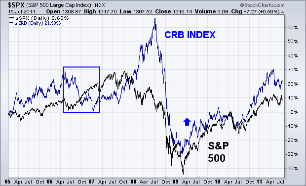
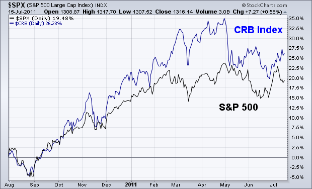
The positive link between stocks and commodities doesn't always exist as shown in Chart 1. There have been periods in the past when they've trended in opposite directions like the second half of 2006 (see box). Stocks also have a history of peaking before commodities. Chart 1, for example, shows commodities rallying throughout the first half of 2008 as stocks started to tumble. Commodities eventually peaked in the middle of 2008. Since then, however, stocks and commodities have been closely linked. That's been especially true since the spring of 2009 when both bottomed together (see arrow). Chart 2 shows the close correlation between the two markets that has existed since last August when both turned up. The chart shows both correcting together in early March and rallying through April before peaking together at the start of May. Both have bounced since late June. If the upturn in commodities is for real (and it seems to be), that may carry good news for stocks as well. That depends of course on two things. One is that commodities keep rising. The other is that positive link between the two markets remains intact.
While this bull market has rallied +105% from the 2009 low (basis the S&P 500), I have had a sense that there was something "squishy" about it. One thing was the absence of convincing volume, something analysts have been complaining about since the bull market began. Recently, when looking at our Blue Chip 152 Top 10 Index, I found some surprising evidence of just how dysfunctional this bull has been.
The Blue Chip 152 is a list of stocks that includes the stocks in the S&P 100, the Dow 65, and some Nasdaq favorites. Some years ago I got the idea to track the top 10 relative strength stocks, believing that this would provide a a short list of stocks that would always be upside winners. Boy was I wrong about that. Just look at the chart.
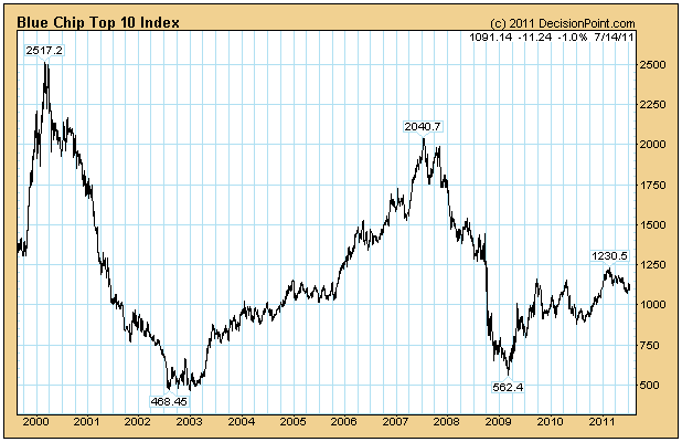
While the Top 10 have tended to perform better than the SPX in bull markets, they perform far worse during bear markets. The reason is simple. Market leaders tend to retain their leadership in bull markets -- once a stock rotates into the Top 10, it will stay there quite a while until it is forced out by a stronger stock, which in turn persists in its leadership position.
In bear markets the story is very different because the majority of stocks are are in decline. Stocks with high relative strength are just not declining as fast as other stocks. As a stock enters the Top 10, it is likely that it is peaking, rather than being in the middle of a strong up move, so the Top 10 stocks as a group are more likely to be moving into accelerated down moves.
Here are some charts of the Top 10 and the S&P 500 which allow us to compare bull market gains and bear market losses. Note that during the 2002-2007 bull market the SPX gained +105% versus +336% for the Top 10. Now compare that with with current bull market gains of +105% for the SPX (already equal to the last bull market) and +119% for the Top 10 (way behind its performance during the last bull market). While the Top 10 is ahead, it is really lagging its normal performance. The reason for this is that there is faster rotation in and out of the Top 10, which is caused by weaker than normal performance of the leaders.
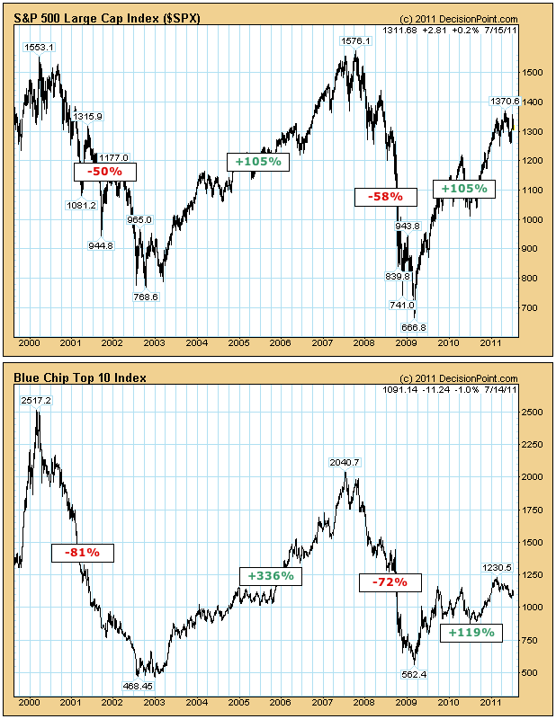
Bottom Line: If your impression of this bull market has been that it doesn't "feel right", your impression is not without basis. The Blue Chip Top 10 Index shows us that the leadership has been weak and lacking in persistence compared to the previous bull market.
Gerald Appel created the MACD in the late 1970s. It's a momentum oscillator that serves to gauge the strength and direction of a trend, but what I find most useful is its ability to predict a reversal. If you like to short weak stocks, I can't blame you. Beware, however, the long-term positive divergence on the MACD when it appears. Before I provide a couple examples of how the MACD predicts reversals, let me briefly explain how the MACD is calculated. I'm a numbers geek, so I NEVER blindly follow an indicator. I need to know how an indicator is calculated and why it works. Then I have to test it. The MACD really isn't that complicated and the charts at StockCharts do almost all of the work for you. Once you understand the basics, the technical picture becomes clearer. Like anything else, though, you will need to practice and experiment with it before committing to it.
The MACD is the difference between two exponential moving averages (EMAs) using closing prices. That's it. Here's a quick example using Google's (GOOG) chart at Wednesday's close:
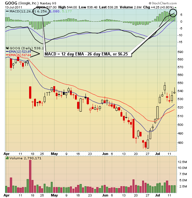
That's the basic definition and calculation. It's really not difficult. You're simply watching how two moving averages relate to one another over time. The beauty of the MACD, however, is watching what happens in many instances when prices continue trending in a certain direction, but the MACD moves in the opposite direction.
Check out two instances in the last 8-9 months where the MACD provided stern warnings on Intel (INTC):
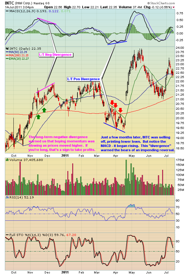
Again, I'm not necessarily going long INTC at the first sign of a long-term positive divergence, but I'm certainly not sticking around on the short side. The MACD warns us of slowing momentum - both buying and selling - and it's worth paying attention to.
If you want to sharpen your skills with the MACD, I'll provide you two ways to do it. Invested Central offers a FREE (and highly educational) MACD Boot Camp that discusses various topics relating to the MACD. I'm also hosting our monthly Online Trader Series (OTS) event, "Implications of Long-Term Positive and Negative MACD Divergences" on Thursday, July 21, 2011 at 4:30pm EST. CLICK HERE for details.
Happy trading!
At times, it is best to step back and take a longer-term viewpoint of the markets; and today we'll examine the Russell 2000 Small Caps (RUT). Quite simply, RUT has having difficulty moving past its all-time highs forged in October 2007; and in the process - have caused the major indicators to flash "caution" as the 9-month RSI hit above the 70-level, while the distance above the 30-month moving average rose to above 20%. In the past, these types of indicator readings have allowed for "mean reversion" lower processes to take place back to the 30-month moving average, while the RSI trades lower towards the 50-level. This would be a normal correction in a bull market; and it may be the "pause" that refreshes before the next leg higher unfolds. But make no mistake, a mean reversion exercise would mean nearly a -20% decline from current levels...very scary, but sufficient to put the bull back on firmer footing.
