Hello Fellow ChartWatchers!
ChartStyles are basically "templates" of charts. They contain everything about the chart except the ticker symbol. Members of our Basic and Extra services can save multiple ChartStyles into their accounts for quick access later. Consider the following example:
Let's say that you have been reading the newspaper and a story on Amazon (ticker symbol: AMZN) catches your eye. You'd like to do some research on AMZN's price movements - what's the best way to start?
Step One is to just go to StockCharts.com, enter AMZN in the Quick Chart box and click "Go!". That will give you a SharpChart of AMZN in your "Default" ChartStyle for your account. If you've never changed your Default style, you'll see a daily candlestock chart with RSI and MACD indicators.
While your Default chart is helpful, you'll want to do more in-depth research. Let's say that you also want to see the long-term view, the short-term view, a trending-or-oscillating study, and maybe a Renko study.
While you can change the settings below the chart to create each of these things, that gets tedious after awhile. There has to be a better way, right? That "better way" are ChartStyles. By taking the time to create and save each one of those different studies into your account as a ChartStyle, you can then pull up those settings instantly with just one or two clicks.
For example, here are the steps to create and save a "trending-or-oscillating study" as a ChartStyle:
Step 1 - Create a Chart with the Settings you Want
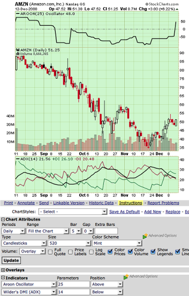
In this case, I added the Aroon Oscillator and Wilder's ADX studies to a standard candlestick chart. Both indicators can help you determine if a stock is "trending" or "trading" (i.e. oscillating sideways) which is very useful in determining which buy/sell signals to use. (See our ChartSchool articles on those indicators for more info.)
Step 2 - Make Sure your Settings are "General Purpose"
Before saving a ChartStyle you want to take a moment and review your settings to ensure that they will work with other ticker symbols at other times. Specifically, you want to avoid using "Start/End" Range settings that have specific dates in them - those dates may not be valid when you use this ChartStyle several months from now. You also want to avoid using Price indicators that include the chart's main ticker symbol - those settings won't make sense when you apply this style to a different ticker.
Step 3 - Add the New ChartStyle to Your Account
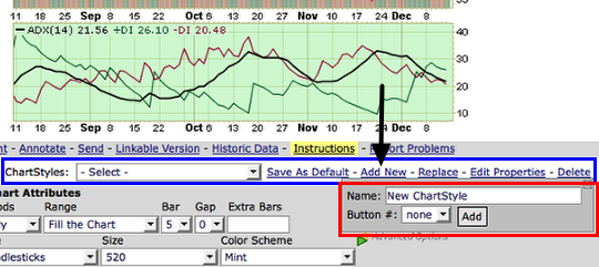
Just below the chart is the "ChartStyle" line - I've outlined it in blue in the picture above. It contains all of the links you need to create and control your ChartStyles. Right now, we are trying to add a new ChartStyle to our account, so we need to click the "Add New" link (the black arrow). When we click that link, a popup area appears below it - that's what I've outlined in red above.
Let's call our new ChartStyle "Trend/Oscillate Study" - simply enter that in the "Name" field and click the "Add" button to create the new ChartStyle. (I'll talk about the "Button" field in my next article.)
Step 4 - Test the New ChartStyle
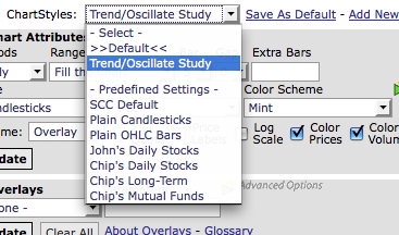
We can use the "ChartStyles" dropdown to test our new style. It contains all of our saved ChartStyles as well as our ">>Default<<" style and seven predefined styles. To test our new style, first select the "SCC Default" setting from the dropdown. You should see the standard RSI/MACD chart appear. Then select "Trend/Oscillate Study" and our Aroon/ADX chart should reappear. Success!
You can now apply that study to ANY ticker symbol just by selecting that entry from the ChartStyles dropdown. I bet you can think of 10 more studies that you'd like to create. Why wait? Go for it. Every ChartStyle you create makes StockCharts that much more powerful for you. Enjoy!
If you get confused by any of this, click the yellow "Instructions" link for more information.
--Chip
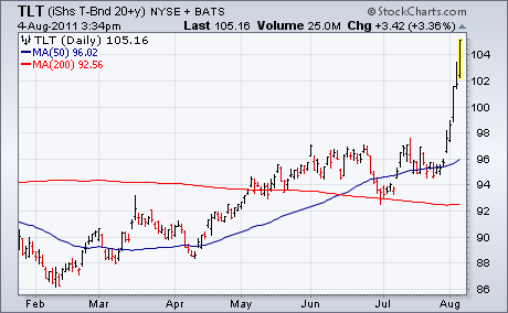
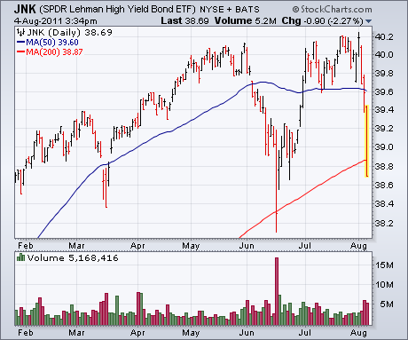
With global stocks and commodities in a rout, most U.S. bonds are surging again. Chart 1 shows the T-Bond 20+Year iShares (TLT) continuing its recent surge (as bond yields tumble to the lowest level in a year). The only exception is high yield corporates. Chart 2 shows the Lehman High Yield Bond ETF (JNK) falling more than 2% and breaking its 200-day moving average. We've pointed out several times in the past that junk bonds are more closely tied to stocks than to bonds. Right now, junk bonds are following stocks lower.
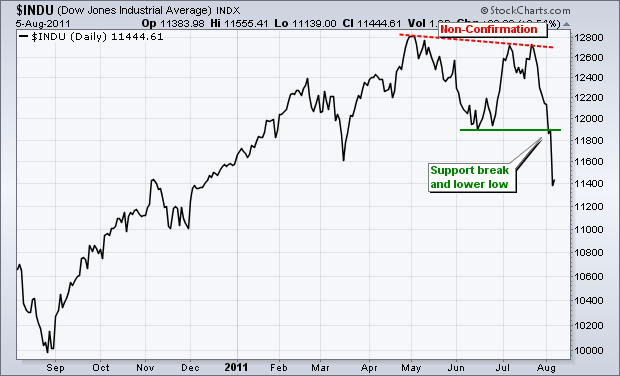
Based on the writings of Charles Dow, Dow Theory utilizes the Dow Industrials and Dow Transports to generate buy and sell signals for the broader market. The market trend is up when both forge higher highs. The market trend is down when both forge lower lows. A non-confirmation is present when only one forges a higher high or lower low.
The first chart shows the Dow Industrials within a clear uptrend from late August to early May. This uptrend started to falter when the Average failed to exceed its prior high and formed a lower high in July. A clear trend reversal occurred this week as the Average broke below its June low.
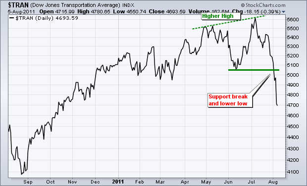
The other chart shows the Dow Transports with an uptrend from August until early July. Notice the difference? The Dow Transports exceeded its May high to forge a higher high in July. The Dow Industrials failed to confirm this new high in the Dow Transports. This non-confirmation was a warning sign, but not a sell signal. The Dow Theory sell signal did not materialize until both Averages broke below their June lows. How long will this sell signal remain in effect? Until there is a Dow Theory buy signal with higher highs in both Averages. There is no timeframe for these signals. They are simply in force until proven otherwise.
READER COMMENT: I have written to you before regarding your comments on volume ("where is the volume?â) which imply that volume "confirms" a move. To me, like many others, volume no longer means anything, or at least not what it used to mean.
See the recent speech by Andrew Haldane at the International Economic Association Sixteenth World Congress, Beijing, China, 8 July 2011, courtesy of the the Bank of England; the speech addresses trading volumes here and Europe in the last decade, with special reference to the Flash Crash.
Q: Where is the volume? A: It is whatever the quant algorithm says it will be---at least until the algorithm changes.
The speech can be found at http://www.bankofengland.co.uk/publications/speeches/2011/index.htm. It is the 08.07.11 speech, entitled The Race to Zero.
RESPONSE: First let me recommend that our readers read the referenced speech. It offers great insight into the Flash Crash, and offers the conclusion that there is still nothing that can stop another one. This is a conclusion to which I had come because of the absence of anything but speculation on the subject.
If I understand correctly, you assert that high-frequency trading (HFT) has changed the nature of volume and has rendered useless. In part I agree -- I don't think volume has the same strength of meaning as when we were all charting with a pencil on graph paper, and we were able to say with some certainty that expanding volume confirmed the price move. Now we have to say that this may or may not be the case.
Nowadays I don't necessarily look for volume to confirm daily moves, because volume doesn't play a primary role in my decision making, but overall I do expect a bull market to have a level of volume that reflects broad market participation. Specifically, I watch a number we call Percent of Average Daily Volume. This is the result of dividing the 250-EMA of daily volume (the average of about a year's volume) by today's volume.
Here is a chart of the 2003-2007 bull market. Note how consistently the volume bars exceed the 250-EMA of volume line. Also, volume steadily expanded from the bottom to the top.

Now, here is a chart of the 2009-2011 bull market. Note the frequency with which the volume bars failed to reach the 250-EMA line, and the persistent down slope of the volume bars over the last two-and-a-half years. This has been the source of my complaint about volume. It has reflected that something was wrong (at least radically different) internally.

The final chart makes your point regarding HFT. Note that the volume for this bull market has actually been much higher than that of the prior bull market. So while I have been asking, "Where's the volume?", it is because of daily evidence that volume has been contracting away from the 200-EMA. I failed to look at the bigger picture.

Bottom Line: The 2009-2011 bull market was a confusing creature based upon consistently weak volume relative to the 250-EMA of volume, and because of gradually fading volume as prices rose higher. Absolute volume is now much higher than in the past because of HFT, which can represent as much as 80% of daily volume; however, in my opinion, the downslope of volume is still an indication of fading participation and is useful input for our analysis.
If you recall, stocks were mired in an ugly bear market from 2000 through 2002. At the end of that bear market, however, the S&P 500 staged a huge advance, running specifically from 789 in March of 2003 to 1163 by March 2004. After that big climb, there were several scary points during the ensuing decline. Take a look at what transpired back then:
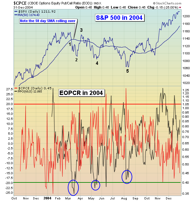
The key points were as follows:
(1) In March 2004, a swift selloff took the S&P 500 below its 50 day SMA with a lot of force and the 50 day SMA rolled over.
(2) A reversal was seen 2-3 weeks later in late March as relative pessimism reaches an extreme level (-20%+).
(3) The next rally carried the S&P 500 above its 50 day SMA, but a break above recent highs was never achieved.
(4) The next low occurred about six weeks later, until once again relative pessimism marked a short-term bottom.
(5) Another bounce followed, again printing a lower high.
(6) One more selloff followed until sentiment again approached what I consider to be extreme pessimism.
The pattern in 2011 is a work-in-progress, but it seems to be following almost an identical path. Have a look:
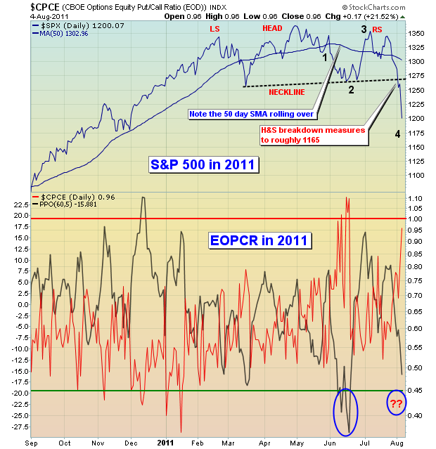
Check out the key points:
(1) In late May, a swift selloff took the S&P 500 below its 50 day SMA with a lot of force and the 50 day SMA rolled over.
(2) A reversal was seen 2-3 weeks later in mid-June as relative pessimism reaches an extreme level (-20%+)
(3) The next rally carried the S&P 500 above its 50 day SMA, but a break above recent highs was never achieved.
(4) The next low is occurring now, about six weeks later, as we await relative pessimism to likely mark another bottom.
(5) and (6) have not occurred yet, but are likely.
In addition to similar paths in 2011 vs. 2004, market participants today must also deal with a HEAVY volume breakdown of a head & shoulders pattern. Bounces will be likely, but strength can be shorted in the near-term, especially if the neckline of the head & shoulder is approached. Measurements vary by index, but I'd look for 1150-1175 on the S&P 500, at a minimum.
Declines always seem to take place so much quicker than advances, and there's a reason for it. When the selling volume becomes too large, market makers temporarily cease their role as liquidity providers, leaving fewer buyers. In fact, as traders, many of these market making firms join in on the sell side, swamping buyers and creating an avalanche effect.
Later this month, I'll be discussing the effect of market makers and the impact they have on traders like you and me. Without a thorough understanding of the forces that take place in the stock market, successful trading is likely to remain a mystery. If you're interested in gaining a better understanding of market makers, you can CLICK HERE to register for this event.
Happy trading!
Last week, and so far this week the stock market has traded rather dismal to be sure, with the S&P 500 trading lower in 8 of the past 9 trading sessions. However, regardless of this weakness, we've begun to see slow, but sure movements beneath the surface that warrant our trading attention. To wit, the S&P Energy sector appears ready to resume its upward trend against the S&P Consumer Discretionary sector. In other words, Energy is expected to outperform Consumer Discretionary. As for our chart target: we could very well see the ratio trade upwards of 2.3 to 2.4 in the months ahead.
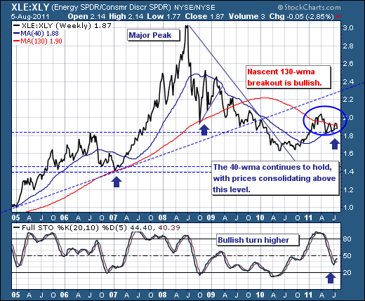
From a technical point of view, let's note that prices have consolidated in bullish fashion since January-2011, and have done so with prices faltering from the longer-term 130-week moving average and back into the more medium-term 40-week moving average. Moreover, this bullish consolidation implies higher prices ahead towards the 2.3 to 2.4 level beneath trendline resistance, especially given the ratio continues to hold at the 40-week moving average. But the gains could be even more material given prices will have broken out above the larger 130-week moving average, solidifying the trend higher for months and perhaps years ahead. Lastly, the 20-week stochastic has turned higher in bullish fashion through its trigger point; confirming momentum is rising.
Therefore, given the developing evidence: we believe being equal buyers of energy stocks and equal short sellers of consumer discretionary shares makes sense...regardless of market direction. The beauty lies in the relative trade.
Good luck and good trading,
Richard Rhodes