Hello Fellow ChartWatchers!
Last week, we hosted over 300 enthusiastic StockCharts.com members here in Seattle for ChartCon 2011. John, Arthur and myself cannot say enough about the great people we met. Thanks again to everyone that participated. Here's a link to more reviews and photos of the event.

One of the key goals of ChartCon was to build a sense of community amoung the participants. That began happening almost immediately during the first day and continued throughout the conference. As part of that process, we announced a new resource for all StockCharts users that will allow them to ask each other for assistance - the StockCharts Answer Network (s.c.a.n.) at http://scan.stockcharts.com.
If you have a question that you'd like to ask other StockCharts users, s.c.a.n. is the way to do it. It rewards people that ask relevant questions. It rewards people that provide great answers. And it does so in a way that ensures it will be a great resource for all StockCharts users for years to come.
To ask a question on s.c.a.n., just click the "Ask a Question" button. You'll need to create an account on the s.c.a.n. server (those accounts are separate from StockCharts' accounts) as part of the process but don't worry, s.c.a.n. is completely free to use and has the same rock-solid privacy policy that StockCharts.com does.
It is in your best interest to take a little bit of time and make sure your question is well explained and is something that the StockCharts user community can actually help with. Questions like "How can I...?" and "Is there some way to...?" are usually answered very quickly. Questions like "Why...?" and "What should I buy?" will probably fall flat.
It's also important to remember that billing issues, feature requests and bug reports are best sent directly to the StockCharts Support team since other end users can't really help with those issues.
My initial hope is that s.c.a.n. becomes a great source of answers for all StockCharts users - and not yet another site filled with irrelevant, spammy, off-topic questions. However, we don't control what happens to s.c.a.n. - you do! Let me say that again:
S.C.A.N. WILL BECOME WHATEVER YOU LET IT BECOME!
You - not us - are the curators of s.c.a.n. You have to power to reward great questions and great answers. You have to power to discourage spam, vagueness, misleading information, and irrelevantness. But in order to help, you must participate. You must ask great questions. You must provide great answers. And you must vote for greatness.
So, help us help you by joining s.c.a.n. today!
- Chip
P.S. Be sure to read and understand the s.c.a.n. FAQ before posting or answering questions. Also, be sure to search to see if your question has already been asked.
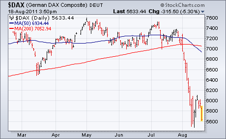
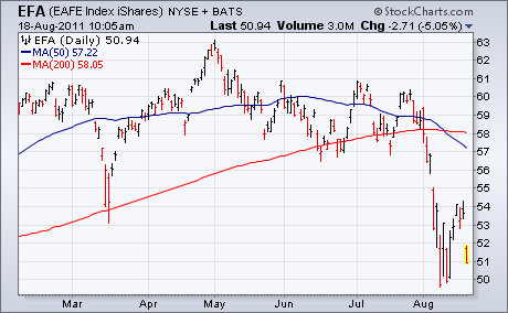
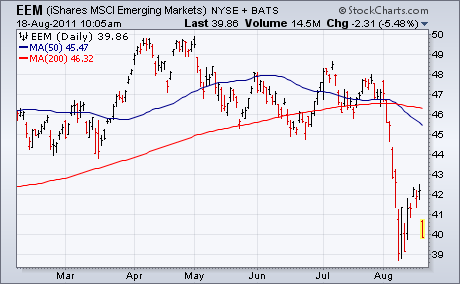
GERMANY LEADS GLOBAL STOCKS LOWERby John Murphy | The Market Message A 5% drop in German stocks is contributing to heavy selling in Europe which has spread to the U.S. Chart 1 shows the German DAX falling 5.3% to make it Europe's biggest loser. Most other European stocks are down 4%. Chart 2 EAFE Index iShares (EFA) gapping 5% lower after meeting resistance at its March low. Chart 3 shows Emerging Market iShares (EEM) gapping lower as well. Not surprisingly, U.S. stocks are following foreign markets lower. It certainly looks like the recent short-term bounce has run its course. Money coming out of stocks is moving into gold and Treasuries. Most other commodities are falling along with stocks. It looks like a bad day ahead for stocks.
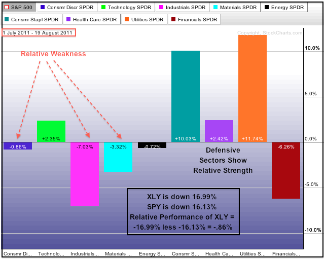
Selling pressure since July 1st pushed the Consumer Discretionary SPDR (XLY) from a market leader to a market laggard. These Sector PerfCharts show the performance for the nine sector SPDRs relative to the S&P 500. The percentage change shown is the relative change, which equals the percent change in SPY less the percent change in the sector SPDR. If XLY is down 16.99% and SPY is down 16.13%, relative performance for XLY would be -.86% (-16.99 less -16.13 = -.86). Sectors with positive bars are outperforming SPY, while sectors with negative bars are underperforming. The first Perfchart extends from May 13th to July 1st. Notice that the Consumer Discretionary SPDR, Industrials SPDR and Basic Materials SPDR are outperforming the broader market (SPY). Also note that the Consumer Staples SPDR is underperforming, while the Healthcare SPDR and Utilities SPDR are slightly outperforming.
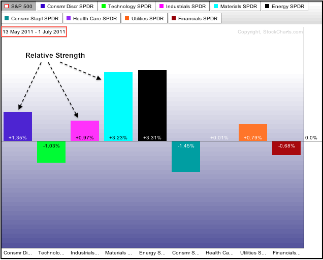
Click this image for a live Sector PerfChart
Flash forward to the most recent 35 day period and there is a drastic change in the relative performance PerfChart. First, notice that the Consumer Discretionary SPDR moved from relative strength to relative weakness. The Industrials SPDR, Basic Materials SPDR and Energy SPDR also moved from positions of relative strength to relative weakness. Second, notice that the three defensive sectors now show relative strength. All sectors are down over the last 35 days, but utilities, consumer staples and healthcare are down less than the market. This shows a clear preference for defense, which is bearish for the broader market. The Technology ETF is a bit of an anomaly as it moved from relative weakness to relative strength. This indicates that the sector may lead if and when the market does bounce.
LONG-TERM SELL SIGNALSby Carl Swenlin | DecisionPoint.com On 8/2/2011 our mechanical Thrust/Trend Model generated a medium-term NEUTRAL signal for the S&P 500 Index just in time to avoid the market break on 8/4. (Neutral means to be market neutral -- in cash or fully hedged.) After the breakdown we believed we had entered a bear market, but we had to wait for the long-term component of the Trend Model to generate a mechanical SELL signal to make it "official", which it did as of 8/17/2011.
A long-term sell signal is generated when the 50-EMA of a price index crosses down through the 200-EMA (generally known as the Death Cross). At Decision Point we don't consider the long-term sell signal to be a demand for action. Rather it is a flag that says, "Hey, folks, we're in a bear market now. Act accordingly."
Below is a daily bar chart of the S&P 500 with the recent crossover circled on the right. Just to show that it is not a perfect indicator, I have also annotated on the left two 50/200-EMA crossovers that occured in August and September of last year, both of which were bad signals.
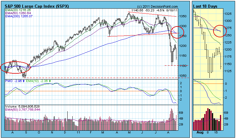
Am I concerned that this latest signal will be wrong? Not really. Its value is primarily in that it tells us to adjust our expectations from bullish to bearish. In a bull market it is best to stay positive and expect bullish outcomes, even during corrections. In a bear market, if we expect negative resolutions, we will be right most of the time.
It is a long-term sell signal, but it doesn't mean to go 100% short on the day of the signal, rather we should look for short- and medium-term opportunities to go short to develop. This is where we have a margin of safety when working with these long-term signals -- we look for opportunities. If we don't find many, our exposure will be limited.
Reviewing major market indexes I see that we have long-term sell signals on The S&P 500, S&P 100, NYSE Composite, Russell 2000, Wilshire 5000, S&P 400, and S&P 600. We are still waiting for the Dow, Nasdaq, and Nasdaq 100 indexes, but their prices are well below their 50-EMA and 200-EMA, which means sell signals are virtually inevitable.
A recent CNBC article urges: "Don't Fear the 'Death Cross' in This Fast-Moving Market". In other words, keep right on thinking like a bull. That's just silly. We have objective evidence that the market has entered a bear phase, so we should take that evidence at face value until the evidence changes. The fact that we ahd two bad signals in 2010 is no reason to ignore the current signal because the model has a pretty good record over time. In 2010 Timer Digest ranked Decision Point #4 for Long-Term timing over a 10-year period, with a gain of +77.64% versus a loss of -4.74 for the S&P 500. (Past performance does not guarantee future results.)
Bottom Line: Long-term SELL signals abound on the major stock indexes, which means we are by our definition in a bear market. It is now time to pass our analysis through a bearish screen, to assume that most surprises will be to the downside, and to look for opportunities to sell short. This is a perfect example of technical analysis being a wind sock, and we have no choice but to plan our approach accordingly. If the wind changes, we will adjust.
If the stock market were a mental health patient, it would have been committed by now. Major trend changes are occurring at points of wild volatility and extreme fear. I've written many times in the past about my favorite sentiment indicator - the equity only put call ratio (EOPCR). I take a different approach in measuring relative complacency and fear by using short-term and long-term moving averages of the EOPCR and expressing that difference using the PPO oscillator (thanks Chip!). When the market sells off with the velocity it displayed recently, multiple technical support levels are wiped out without hesitation. Market makers go on "vacation" as I like to call it. It's as if technical indicators are meaningless. Enter sentiment indicators.
It makes complete sense to me that when you're dealing with a wildly emotional market, that the only reliable type of indicator to predict a market reversal would be sentiment-based. Therefore, I always urge our members to follow the relative pessimism levels and only consider acting when the market reaches pre-determined relative fear levels (-20% on the chart below).
In my last article, I mentioned that I'd be looking for relative pessimism to mark the next bottom. Take a look at how it did exactly that:
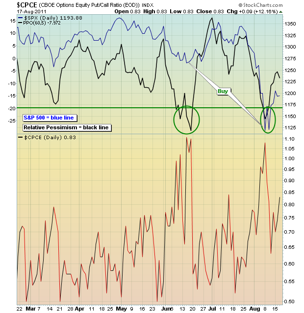
Please note that the above chart was as of Wednesday's close. It would need to be updated for the activity on Thursday and Friday. Also, intraday charts using this ratio can be misleading, so make sure you look at this AFTER the market closes.
On Tuesday, August 23rd, I will be hosting the next in our Online Trader Series. These events are highly educational and designed to equip our members with the knowledge necessary to trade the stock market with success. The upcoming event, "The Effect of Market Makers on Trading", will provide a background of the role of market makers and delve into the relative pessimism ratio of the EOPCR. Market makers exacerbate the emotional swings in the stock market. If you want to use this information to better your trading strategy and success, you can register for this event by clicking here.
Happy trading!
THE BEGINNING OF A BEAR MARKET?by Richard Rhodes | The Rhodes Report The recent volatility is enough to make one step back, put your money aside - and reassess. In fact, this is what both institutional and individual investors have done over the past 3-weeks as money withdrawn from funds has significantly increased - even more so than at the March-2009 panic low. Perhaps this is part and parcel of the "death of equities" genre that is needed for the next bull market to begin; but for now...the pullout appears prescient.
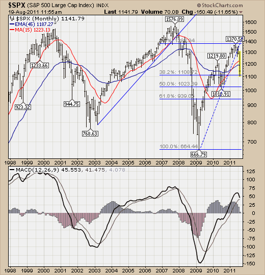
Technically speaking on the S&P 500 index, we should point out that two of our longer-term moving averages were violated in bearish fashion - the 15-month and 45-month moving averages. In fact, there are only two occurrences of the 45-month moving average being broken since 1980, which rather interestingly occurred during the past two bear markets - which suggests a bear market has indeed begun. In each of the previous cases, the S&P 500 bottomed -27% and -33% below this level. At present, the S&P stands a mere -4% below this level, which would lead one to believe that another 20% to 25% decline is in order. This is serious stuff to be sure.
Therefore, rallies are to be sold until further notice. If we are wrong, then we would use a breakout above the 15-month as a sign that new highs are ahead. But that isn't the preferred viewpoint at present.