Hello Fellow ChartWatchers!
With headlines like "Rally in Trouble?", "Start of Correction?" and "VIX Stalls" you'd think that our technical analysts were trying to tell you something...
Regardless of what John, Arthur, Carl and the rest of the gang is hinting at, things could not be more bullish here at StockCharts with regards to a great crop of new features that that can help you get even more value for your online charting dollar.
Things like our new Market Summary page layout and our ChartCon DVD pre-sale are covered later on in the "Site News" section of this newsletter. So I wanted to take a second and talk about the Heikin-Ashi support we added last week.
The "what-what" support?
Heikin-Ashi charts look very similar to regular candlestick charts, but there are several significant differences. Heikin-Ashi candles filters out some noise in an effort to better indicate the prevailing trend. In Japanese, Heikin means "average" and "ashi" means "pace." Taken together, Heikin-Ashi represents the average-pace of prices.
Heikin-Ashi Candlesticks are not used like normal candlesticks. Dozens of bullish or bearish reversal patterns consisting of 1-3 candlesticks are not to be found. Instead, these candlesticks can be used to identify trending periods, potential reversal points and classic technical analysis patterns.
Let's compare a normal Candlestick chart with its Heikin-Ashi equivalent:
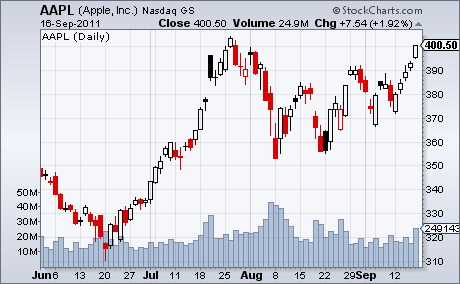
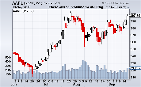
(The Heikin-Ashi chart is on the bottom. Click charts for live versions.)
Notice that the Heikin-Ashi chart doesn't contain the gaps that the regular candle chart has. Also notice that lower shadows are generally missing from the rising candles and upper shadows are missing from the falling candles. All of these characteristics stem from how Heikin-Ashi candles are constructed. For the gory details, please see our ChartSchool article.
The key takeaway is that Heikin-Ashi candles reduce raw volatility in favor of indicating the overall trend more clearly.
Just another tool to add to your charting arsenal.
Enjoy,
- Chip
P.S. People have asked if we can scan for Heikin-Ashi chart patterns. The Scan Engine doesn't currently support Heikin-Ashi charts because, fundamentally, Heikin-Ashi charts use different data than the OHLC values that the Scan Engine is designed to work with. Unfortunately, that isn't going to happen any time soon.
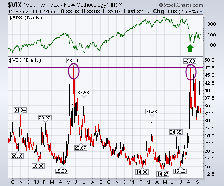
Two Thursdays ago (September 1) I wrote about the CBOE Volatility (VIX) having reached previous resistance formed during the spring of 2010 near 48. The chart below shows that the VIX has backed off from that overhead barrier which has helped stabilize the stock market (green arrow). In fact, the only time that the VIX moved significantly above the area around 48 was during the 2008 market meltdown when it reached 90. So this is an important test of whether the market is just in a normal downside correction or something more serious. Needless to say, a VIX close above 48 would have very negative implications for the market.
I also wanted to let everyone know that we've updated the StockCharts Market Summary page to better reflect the indexes, ETFs, and market indicators that I review on a regular basis. StockCharts subscribers can hear an audio message I recorded last week that goes over those changes by clicking on the Market Message tab at the top on any page on our site.
- John
The S&P 500 peaked in early July and declined sharply into early August. There has been a rebound from this low, but all sectors are still down since July 8th â except one. The Utilities SPDR (XLU) is the only sector SPDR showing a gain since July 8th. The first PertChart shows absolute performance for the nine sectors and the S&P 500 over the last 50 days. The S&P 500 is down 8.51% and the rest of the sectors are down from 2.84% (Consumer Staples) to 16.53% (Finance). The Utilities SPDR (XLU), which is the highest yielding SPDR, is up .65% since July 8th. It ainât much, but it is better than a loss.
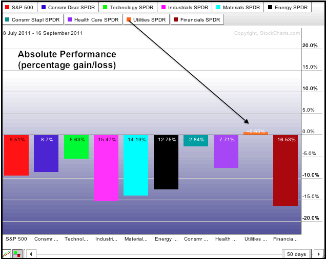
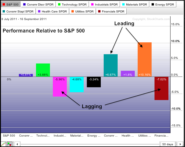
Click this image to see a live chart.
The second PerfChart shows the performance for these sectors relative to the S&P 500. Click the S&P 500 tab to move between absolute and relative performance. Sectors that are down less than the S&P 500 or up show positive relative performance. Sectors down more than the S&P 500 shows negative relative performance. Finance and industrials are leading the way lower and showing relative weakness. The consumer staples and utilities are holding up the best and showing relative strength. This shows a defensive oriented market that prefers safety and yield over return.
Take care,
- Arthur
In the last month or so gold has formed a double top that could be the start of a much needed correction for the metal.
Specifically the chart below shows an Adam & Eve double top. The first top is sharp and spiky, and the second is more rounded, depicting a labored attempt to reach the previous highs.
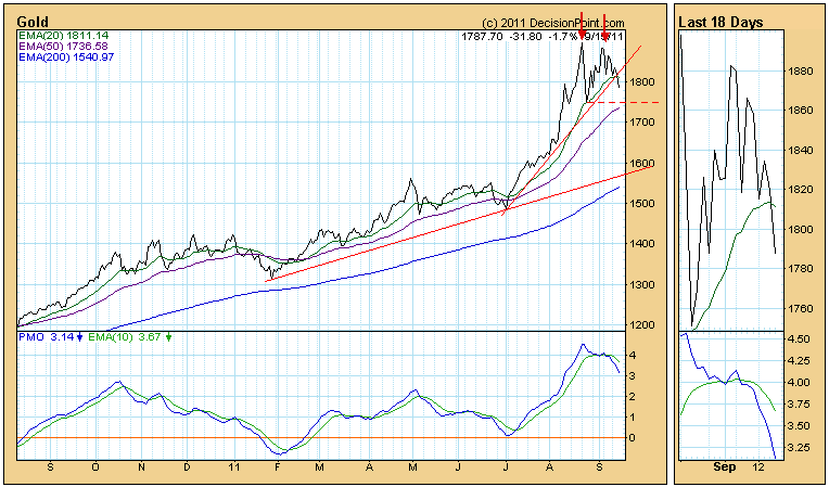
A neckline is drawn across the July price low, showing the support level that needs to be penetrated in order for the formation to "execute" (trigger expectations of lower prices). If it does execute, the minimum downside target would be about 1600. This target is estimated by measuring the distance between the first top and the neckline, and then projecting the same distance from below the neckline. It is interesting to note that the less accelerated rising trend line drawn across the January and July lows is rising at a rate that could provide support around 1600 if the correction proceeds. A steep rising trend line has been penetrated, increasing our expectation of further decline.
Gold is in a bull market, so bearish formations are less likely to execute; however, the parabolic rise seen on the monthly bar chart below is strong evidence that a correction is necessary -- a vertical ascent is not sustainable.

A typical resolution for a parabolic ascent is a total collapse back down to the level of the basing pattern that preceded it, but, given the fundamentals supporting gold, I think other options are more likely. A healthy correction like the one in 2008 is an outcome that would satisfy the need to stunt the vertical advance. Another outcome would be a high-level consolidation, which is where prices move into a trading range, in this case say, between 1600 and 1900 over a period of years, but, again, I think the fundamentals argue against that.
Bottom Line: I wouldn't dare say that gold can't continue higher, but the recent vertical movement of gold cries out for a correction to digest the advance. The recent formation of a double top gives us hope that a correction is beginning.
Take care,
- Carl
P.S. Be sure to read the Site News section of this newsletter for a special coupon that you can use to get a FREE MONTH of DecisionPoint.com service!
I'm not buying this rally - not yet anyway. This past Sunday night, I calculated max pain for the ETFs that track our major indices. After staring at the numbers, I wondered "can they do it again"? By "they", I meant the market makers. You see, a month ago while I was in Seattle at StockCharts' ChartCon conference, an astute member of ours pointed out mid-week (August 10th) that max pain was WAY above current prices. In options lingo, this simply meant there was a TON of net in-the-money put premium on the table just as EXTREME pessimism was kicking in. Take a look at the chart below:
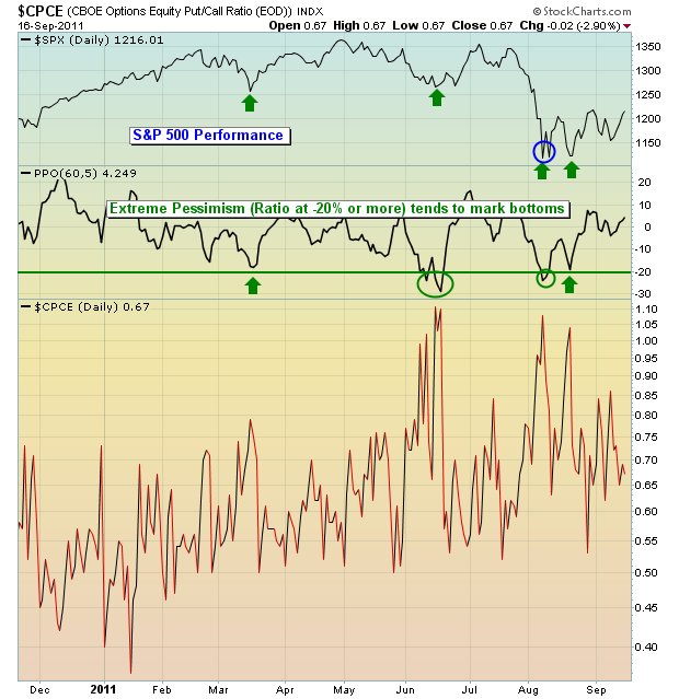
The green arrows highlight the EXTREME levels of pessimism. Notice how each of these extremes marks a bottom on the S&P 500? I've been noticing it for years, which is why sentiment analysis should be a big part of every trader's arsenal. Now take a look at the blue circle highlighting the S&P 500 bottom the second week of August. In addition to extreme pessimism, max pain suggested a SIGNIFICANT upward move was likely based on the imbalance of equity calls and equity puts. Extreme pessimism hit the -20% threshold on August 8th. The S&P 500 bottomed on August 9th. More importantly, the S&P 500 rallied over 100 points from the August 9th low to the August 17th high. I think that qualifies as a SIGNIFICANT upward move. Chalk up more TARP for the financials (market makers).
So there I was last Sunday night, wondering if it could possibly happen again. Could the "Goldman Sachs of the world" help to direct prices higher, thus minimizing option payouts for a second month in a row. Depending on the index ETF I was looking at, potential gains for this past week were anywhere from 3% to 12% to eliminate net in-the-money put premium. Needless to say, I really wasn't surprised to see our major indices tack on from 4-6% last week. Call it manipulation, coincidence, or even another round of TARP for the financials if you like, but the bottom line is that many financial companies were able to make/save a BOATLOAD of money.
Knowing this, it's difficult for me to give the bulls their due in assessing the technical health of this rally. I'm very skeptical. Some parts of it look for real. It's hard to ignore the huge rally of semiconductors as they tend to be a leading indicator of economic activity. Check out this chart:
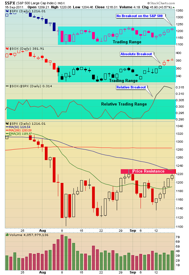
Semiconductors broke out on both an absolute and relative basis and I REALLY like to see that. It's an "under the surface" type of development that can lead to much bullishness in the weeks and months ahead. But I need to see more. I rarely take index moves at face value, instead looking for "under the surface" signals to either corroborate or contradict what I'm seeing on the indices.
Happy trading!
- Tom
CURRENT S&P 500 RALLY IN TROUBLE?by Richard Rhodes | The Rhodes Report Over the past 6-weeks, we've seen the S&P 500 trade in a large sideways pattern between 1220 and 1100; we find this eerily reminiscent of a bearish pattern that will resolve itself to new lows. Certainly this is our viewpoint; and we believe the supporting technicals in the US Dollar Index ($USD)confirm our belief.
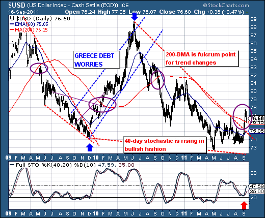
Quite simply, the USD rises when there is "stress" in the world as market participants move towards safety. Over the past year or more, USD has been in a downtrend, but that downtrend now appears to be over. Note the wide girth bullish wedge coupled with the breakout above the 200-day moving average. Our real focus is upon the 200-day, for history has shown that breakouts or breakdowns of this important, yet simple standard moving average - indicate a change in trend. This is what we see on the chart now, and thus it begs many questions?
Certainly the first should be that given the Euro is roughly 60% of the USD, then what should we make of the European debt crisis and shall it spiral out of control far worse than anyone is expecting at this point given the USD looks poised to make another run towards the 87-89 zone? Those trading USD now have the wind at that back from a technical perspective. This has negative implications for the stock market - regardless of last week's 5-day rally.
Thus, the current S&P 500 rally looks in trouble; and one must look to be aggressive in short positions.
Good luck and good trading,
Richard