Hello Fellow ChartWatchers!
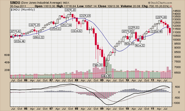
Simpler is usually better and that is definitely true when you are looking for a chart to put the month of September into perspective. Voila!
Members can click the chart to see a live version.
The Dow finished September over 6% lower than the previous month. That's the 5th straight month $INDU has moved down - and it did so on above average volume. MACD momentum is still headed down having just crossed its signal line. Don't get fooled by all the over-analysis going on these days in the main stream financial press, the technical picture is simply not that good right now.
OUR THREE MOST COMMON SUPPORT QUESTIONS
1.) Why am I seeing filled red and filled black candlesticks on your charts?
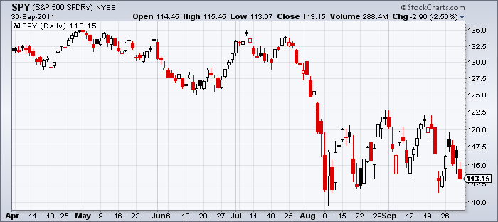
Usually with our default candlestick settings, filled candles will be colored red. Filled black candles appear when the a stock gaps up overnight (opening mich higher than yesterday's close) but then falls during the day but still manages to close higher than it did yesterday. In that case, the stock moved higher when comparing the close to yesterday's close HOWEVER it moved lower when comparing the close to the open. The candle is filled because the close is lower than the open, but it is colored black because the close is higher than yesterday's close. The chart above shows several examples.
By the way, the opposite situation leads to hollow red candlesticks - but we don't get many questions about them because they are not as noticeable. There are at least 8 on the chart above.
These "contradictory candles" often happen when the market is unsure about the stock in question and can indicate an upcoming change in direction. Recent market indecision has made them plentiful on the chart above.
2.) Why is your historic data different from the data on some other website?
We adjust our historic data to eliminate the artificial, misleading effects of splits, dividends and distributions on our charts. For more information, check out this video explanation I gave at our recent ChartCon conference in Seattle.
3.) How can I overlay things on your charts?
To overlay things, you need to use the "Position" dropdown that's associated with each indicator on our charts. Normally, "Position" is set to either "Above" or "Below" which means that the indicator will appear either above or below the price bars in its own separate area. Notice however that there are two additional settings for "Position" - "Behind Price" and "Behind Ind."
"Behind Price" means that the indicator will appear in the price panel area as an overlay. "Behind Ind." means that the indicator will appear in the same panel that previous indicator is using.
I urge you to experiement with those two settings - they are the keys to creating some really powerful charts.
- Chip
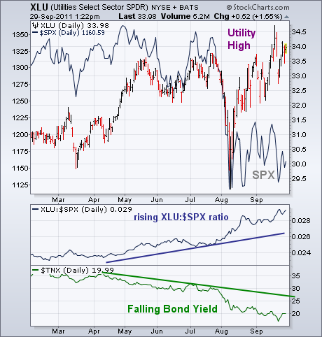
Utilities have emerged as the year's strongest sector. The chart below shows the Utilities Sector SPDR (XLU) trading near a new 52-week high while the S&P 500 (solid line) is closer to a new lows. The rising XLU:SPX relative strength ratio (below chart) also shows the superior performance of utilities this year. That's not surprising since utilities are a defensive stock group that usually attracts money during a market downturn (as do staples and healthcare). But there's another dynamic driving money into utilities -- falling bond yields. The falling green line shows the 10-Year T-Note Yield (TNX) falling all year. With bond yields having fallen below 2% for the first time in 60 years, the utilities' yield of 4.3% looks pretty attractive. Falling bond yields are also symptomatic of economic weakness which is bad for the rest of the stock market. In a climate of a weak stock market and falling bond yields, utilities offer a relatively safe haven. People still have to use electricity in good times and bad. And, as I suggested a couple of weeks ago, defensive stocks do better when the VIX is rising.
Just a quick reminder to all StockCharts subscribers. Be sure to visit the "Market Message" area of our website at least once a week. In addition to seeing all of our Market Message articles, you'll find additional commentary from Arthur Hill, an audio update from myself, and video versions of things by Arthur.
- John
After hitting resistance at a key retracement this month, the Technology ETF (XLK) fell with what looks like a continuation of the bigger downtrend. First, notice that the ETF formed a massive Triple Top that extends from January to July. XLK became oversold with the July-August breakdown and then retraced 61.80% with the bounce back to the 25.25 area. Even though XLK moved back above broken support, a 61.80% retracement is normal for a counter trend bounce.
This advance looks like a Rising Channel on the daily chart and a Rising Flag on the weekly chart. These are also typical for counter trend advances. Regardless of the pattern interpretation, a move below the lower trendline and the late September low would signal a continuation of the July-August decline. This would target further weakness towards the 21 area. Using a Flag or Measured Move technique, the length of the prior decline (26.75 â 22.50 = 4.25) is subtracted from the September high for a target (25.25 â 4.25 = 21).

Click this image for a live chart.
The technology sector showed relative strength in September and was the market leader. The indicator window shows the Price Relative moving higher since late June. The Price Relative is the XLK:SPY ratio. This ratio rises when XLK outperforms SPY and falls when XLK underperforms SPY. Even though the Price Relative remains at high levels, a breakdown in this leading sector would be quite negative for the broader market.
GOLD MINING STOCKS VERSUS GOLDby Carl Swenlin | DecisionPoint.com QUESTION: Carl, I have read a lot of articles recently indicating gold miner stocks should go up and outpace gold. So far nothing but a drop in goldminers. Would it be possible for you to show charts of GDX and GDXJ with your comments on one of your daily posts? Thank you for a great website.
ANSWER: Back in the day before precious metals ETFs, gold mining stocks were considered a convenient surrogate for exposure to precious metals. The XAU (Gold & Silver Mining Index) is composed of large-cap members of this group. First let's compare a long-term chart of the XAU with one of gold. Note that the XAU and gold ran pretty close together from 1984 until about 2000. Then from the lows of 2000 gold rallied about +1400% versus only +125% for the XAU. (The Price Relative line has been trending down since 1996.) An interesting point is that both indexes had major corrections in 2008 -- about -70% for the XAU and -25% for gold.
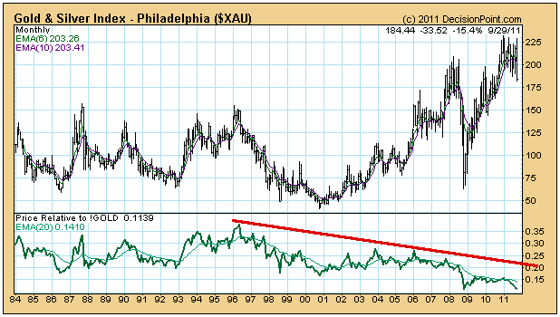
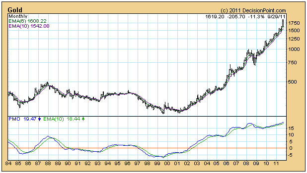
I think we can say that in the past there has been a passing similarity in price movement between the two indexes, but it has been a similarity in direction, not magnitude. Why the difference in performance? Well gold is a commodity, and gold stocks are, well, stocks in companies that mine gold. As stocks they carry all the baggage of the companies they represent, and they tend to be affected by the movement of the broad stock market as well.
As an aside, let me say that I have a strong dislike for gold mining stocks as trading/investing vehicles. They tend to trade in broad, volatile trading ranges, and they defy my attempts at trend following. This can be seen on the charts of the two ETFs you requested.
As for specific issues, GDX recently had a failed breakout attempt, a bull trap, and is about to challenge the bottom of the one-year trading range. GDXJ has executed a classic head and shouders pattern and has a minimum downside target of about 22.25.
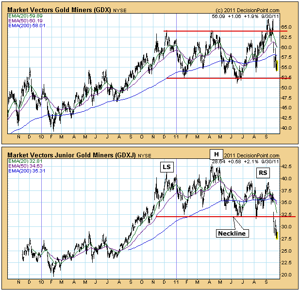
Bottom Line: The price of gold is already 'baked into the cake' of gold mining stock prices. There could be some future management initiatives that may take better advantage of higher gold prices as regards the bottom line, but I wouldn't count on a major rise in gold stocks driven by a move to correct the lag in gold stocks versus the price of gold.
There are plenty of opinions available on stocks, sectors and markets. Take them all with a grain of salt, then look at the chart!
The weekly moving average convergence divergence (MACD) has always been a favorite indicator of mine. It provides a "big picture" outlook of the market and helps me take a step back from the day to day swings of the market. With the Volatility Index (VIX) in the stratosphere and closing close to 43 on Friday, the whipsaw action is quite unnerving. Taking a step back and looking at the big picture helps to ease some of that daily stress and makes it easier to focus on an appropriate trading strategy. I realize the MACD is only one indicator, and it won't always be right, but it does increase the odds of a particular move and helps me determine when it makes sense to take on more risk.
Below is a chart of the S&P 500 on a weekly basis for the past 5 years:
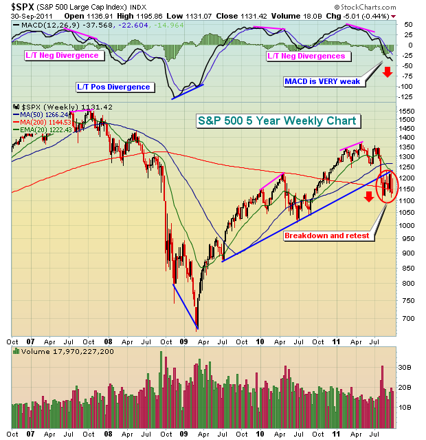
Note that all the MAJOR moves over the past 5 years were preceded by either a long-term positive or negative divergence. Currently, the weekly MACD is pointing straight lower and is clearly bearish. This tells us that the 12 week EMA is diverging from the 26 week EMA, a sign of accelerating bearish momentum. While it's not impossible for the market to bottom during such accelerating bearish momentum, I'd say it's rather unlikely.
There are a number of critical "below the surface" types of signals - like the weekly MACD - that will tell us ahead of time when the market has bottomed or is approaching a bottom and is poised to move higher. Those signals are a MUST for anyone who seriously trades the market. I've developed a new educational video series that will enable you to spot these reversals BEFORE they happen. CLICK HERE to register for this series.
Happy trading!
- Tom
HAS GOLD REACHED ITS PEAK?by Richard Rhodes | The Rhodes Report The month of September has not been kind to Gold; and the question before everyone is whether or not gold has seen its highs for an intermediate period or whether a brief pause before higher highs are forged. We are of the opinion of the former rather than the latter, but we remain gold bulls â but from probably lower levels than most are looking for at this juncture in the cycle.
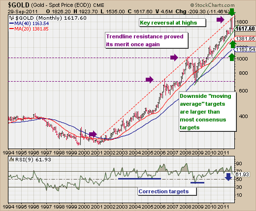
From a technical perspective, we should note that Gold has forged a âmonthly bearish key reversalâ pattern to the downside. Now, monthly reversals tend to much more important than daily or weekly varieties and we think of this one as no different. Having said this, many analysts are looking for Gold to hold the $1535 lows forged recently, but we are looking for something a bit lower â to perhaps between the 20-month and 40-month moving averages at $1382 and 1164 respectively. In doing so, this would not destroy the bull market whatsoever, but it would be a âgut wrenchingâ period for the âsuper gold bullsâ, of which we know many. The last major correction took place under the aegis of the 2007-2009 bear market for stocks and commodities, and saw gold prices fall over the course of 9-months from $1053 to $681 or -35%. And putting pencil to paper and using the recent highs at $1924â¦and dropping prices by -35%...we get a round number of $1250â¦which is square within our target range.
Therefore, while we do like Gold long-term â there is a technical case to be made that a larger correction is unfolding upon which we can be aggressive buyers sometime next year. But for now â it would seem wise to stand aside and allow the market to wreak havoc upon those late longs.