I am extremely happy to announce that StockCharts.com is now working with the good folks at Security Research Company (S.R.C.) to bring you high-quality historical financial charts based on their huge database of financial information. In case you are not familiar with SRC's work, they've been publishing their amazing charts since they started back in 1933(!) primarily in printed form and more recently in online format. You can learn more about SRC by clicking this link.
The first result of our new association with SRC is an amazing new wall chart that is only available to StockCharts.com users like you. Called the "New Century" chart, this huge printed chart lets you trace the history of the stock market back to 1906 via the Dow, the S&P 500, the NYSE and later the NASAQ. It includes recessions, presidents, major historical events, and the gross domestic product of the US for comparison purposes. Here's a thumbnail:
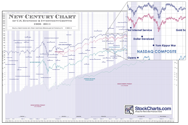
Did I mention this thing is big? 24" tall by 36" wide makes is perfect for framing and displaying anywhere.
Now, this poster normally goes for $89.00. However, because this is the start of a new relationship between SRC and StockCharts.com, we got permission to offer it at an amazing discount for THIS WEEKEND ONLY! If you order this chart before Tuesday, it will only cost you $29.95 plus $4.95 shipping. Click here to order your copy today.
(I'm sorry I sound like a car salesman here but I really love big historical charts and this really is an amazing deal that I hope everyone takes advantage of.)
Anyway, regardless of if you get this wall chart or not, everyone can look forward to more great collaborations between SRC and StockCharts.com in the weeks and months to come. Some of the things we are working on will be truly stunning. I can't wait to show them to you. Stay tuned...
- Chip
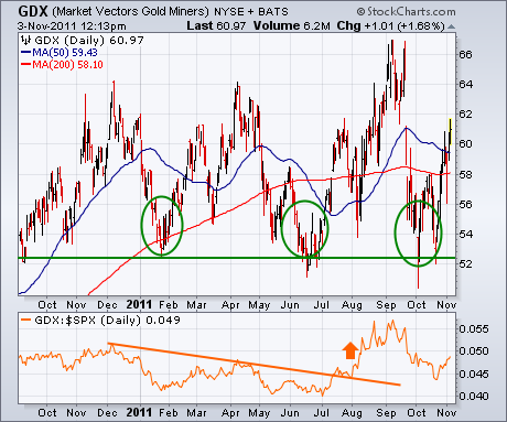
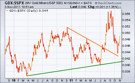
GOLD STOCKS START TO SHINE AGAINby John Murphy | The Market Message My Market Message from Tuesday of last week (October 25) wrote about new signs of strength emerging from an oversold gold-mining group. It showed the Market Vectors Gold Miners ETF (GDX) bouncing off chart support along its 2011 reaction lows (see circles in Figure 1). In Thursday's trading, the GDX has moved back above its 50- and 200-day moving averages for the first time in three months. The GDX/SPX relative strength ratio (below Figure 1) is starting to bounce again as well. The upturn in the ratio took place in early August when the stock market started to weaken. After pulling back during the October stock market rally, the ratio is starting to bounce again. Chart 2 shows a longer version of the GDX/SPX ratio. The rising green trendline shows that the longer-range trend of the ratio is still up. The breaking of the falling trendline drawn over the December/April highs is also a positive sign.
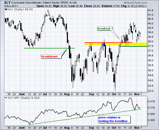
Earlier this week I noted that the Nasdaq 100 ETF, the Russell 2000 ETF and the S&P 500 ETF were testing broken resistance. The October surges produced breakouts and it is important that these resistance breakouts hold. Basic technical analysis teaches us that broken resistance levels turn into support. Failure to hold these breakouts would be a sign of weakness. Looking at the key offensive sectors, I see similar support levels from broken resistance. These levels are holding so far and these SPDRs have established similar support zones with the lows of the last few weeks. The offensive sectors include consumer discretionary, technology, finance and industrials. In particular, I am focusing on the consumer discretionary and technology sectors. The first chart shows the Consumer Discretionary SPDR (XLY) breaking a resistance zone around 38 and this zone turning into a support zone. A break below 37.5 would reverse the October upswing and question the validity of the October breakout. The indicator window shows the Price Relative trending higher. Notice that this indicator is testing trendline support. A break would indicate that the consumer discretionary sector was moving from leader to laggard. The second chart shows the Technology SPDR (XLK) with similar characteristics.
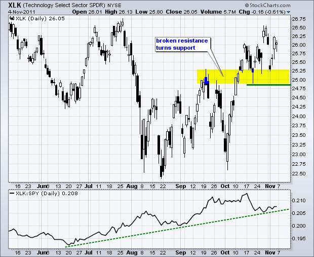
Click this image for a live chart.
Good trading,
Arthur Hill CMT
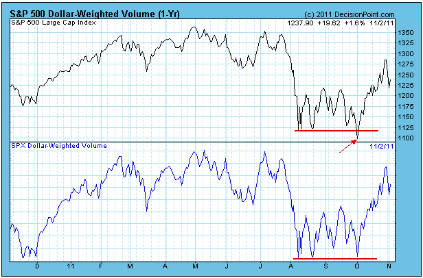
DOLLAR-WEIGHTED VOLUMEby Carl Swenlin | DecisionPoint.com Over 10 years ago I developed an indicator called Dollar-Weighted Volume (DWV). It could be that I reinvented the wheel, but I am not aware of anyone else who uses this indicator. DWV is variation of On-Balance Volume (OBV), which was developed by Joe Granville. DWV is calculated by multiplying the daily volume of each stock in a given market index by the closing price, then adding (or subtracting, if the stock closes down) the result to the cumulative total of DWV for the index. The resulting indicator is an expression of the trend of money rather than just volume.
DWV is a short-term indicator. On the chart below we show the SPX version, and you will note that the DWV and the price index run pretty close together, with tops confirming tops and bottoms confirming bottoms. What we look for are positive/negative divergences and for instances where volume doesn't confirm price, meaning that volume either leads or lags price. When this happens, look for a change in the short-term price trend.
The annotation on this first chart shows how DWV failed to make a lower low along with price (negative divergence), indicating that DWV was beginning to dry up during the selloff.
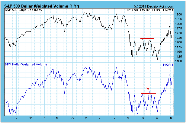
The annotations on the next chart shows price making a lower top compared to DWV making a higher top. This represents a minor blowoff as prices fail to respond to higher volume. This goes contrary to the belief that volume leads price.
The next chart shows a minor blowoff to the downside in June. More recently we have price making a low beneath the prior low, but this is not confirmed by DWV (positive divergence). This implies that price will continue trending upward in the short term (days to weeks).
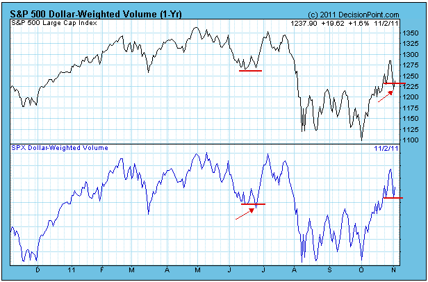
I think that DWV is only good for short-term comparisons because it has an upward bias over the longer term. Note above that the December price lows are higher than the August through October price lows, whereas the comparable DWV lows are equal. That could be interpreted as a positive divergence, but it could simply be a symptom of the upward bias. The long-term chart below clearly demonstrates the upward bias.
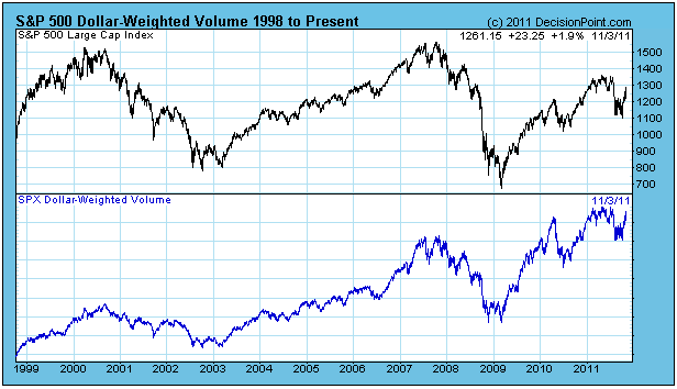
Bottom Line: Dollar-Weighted Volume is a unique indicator because it expresses volume in terms of dollars, and it can be a handy tool for identifying short-term price trend changes. Beside giving us positive and negative divergences, it can also alert us to times when blowoff conditions exist, cases when leading volume is actually signalling a trend reversal.
FINANCIALS STILL HOLD THE KEYby Tom Bowley | InvestEd Central When you review the history of the stock market, you see that financials tend to hold the key for whether a stock market advance is sustainable or not. The long-term chart below still raises questions about the sustainability of not only the October rally, but also the multi-year rally off of 2009 lows. Why? Well, mainly because the relative strength line of financials has been in a downtrend since August 2009. Check out the chart below:
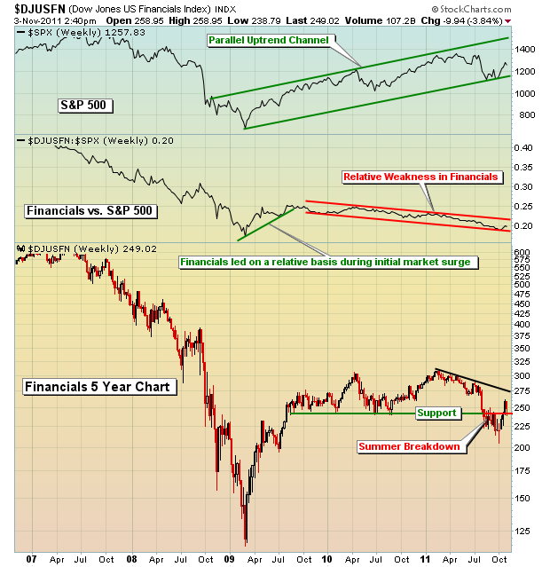
From the March 2009 lows until the end of August 2009, the S&P 500 rose from a low of 666 to a high of 1021. Roughly 60% of the rally off the 2009 lows occurred during that brief stint while financials were in a leadership role. During that rally and in less than six months, the S&P 500 rallied 53% while the Dow Jones US Financial Index gained 125%. The huge rally in financials carried the entire stock market on its shoulders. Since that time, the S&P 500 has continued to push higher, but it's been a struggle with a cumulative gain of little more than 20% over the past 26 months. During that 26 month stretch, the DJUSFN is basically flat. So, in my view, it comes down to one thing:
Where are the financials heading in the short-term?
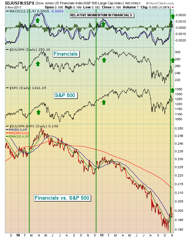
While the longer-term chart of the DJUSFN above looks ominous, the short-term chart of financials has improved drastically. In fact, during the last three weeks of October, financials were the top performing sector. The MACD of the relative ratio between financials and the S&P 500 has just crossed the centerline showing that the relative strength of financials is gaining momentum. The last two such signals have preceded very bullish moves in both financials and the S&P 500.
Check this out:
In my Friday blog, I highlighted a financial that could be poised to benefit from future bullishness in the financial sector. Feel free to check it out by clicking here.
SUSTAINED RALLY IN THE FUTURE?by Richard Rhodes | The Rhodes Report Quite simply, the past 5-week rally has been breathtaking, but it remains to be seen whether it has "legs" of whether it does not. It is of our opinion, that it "does have legs", and it does so given the Financials (XLF) are rallying...but more importantly - the Homebuilders (XHB) are leading the rally. And, we think the XHB shall continue leading and actually do better than anyone anticipates at this juncture.
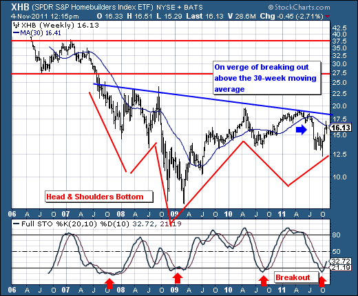
The "head & shoulders" bottom on the weekly chart is very clear; although it is not yet confirmed. However, the 30-week moving average is on the verge of being given, with the 20-week stochastic turning higher through it's trigger point. Again, in the past, this has resulted in a sustained rally - and if neckline resistance is violated as we believe it shall be - then targets in the range of $27.50 to $37.50 come into view. This is certainly not the consensus view, but as they say - "every dog has its day."
Therefore, any weakness broader market in the days ahead can be used to consider long positions.