Hello Fellow ChartWatchers!
This past August, something special happened in Seattle. Over 350 charting enthusiasts gathered for the first ever ChartCon conference. They listened as John Murphy, Arthur Hill and myself discussed technical analysis in depth, demonstrated their own analysis techniques and explained how to use the core features of StockCharts.com. (They also had a ton a fun in the evenings!). Click here to see what the attendees thought of their conference experience.
I am now thrilled to officially announce that we will be holding the second annual ChartCon conference next August in Seattle!
ChartCon 2012 will build on the lessons of ChartCon 2011. There will be great presentations by John Murphy, Arthur Hill and myself but we will also be joined by the rest of our ChartWatchers contributors - Carl Swenlin, Richard Rhodes and Tom Bowley! Each presentor will focus on the topic "How I analyze the markets using StockCharts" and they will all include lots of demos.
In addition to great presentations, we'll have some great evening events including a gala dinner at the Boeing Museum of Flight. One of the wonderful things about ChartCon 2011 was the interactions between attendees and we want to make sure that happens again in 2012.
For more information, including dates, pricing, a detailed agenda, and our spouses-attend-free policy, please click here. You'll also find a link there where your can register for the conference.
Don't delay - ChartCon 2011 sold out in less than one month.
Speaking on behalf for the presentors, we'd love to meet you in Seattle next August and help you get the most out of StockCharts. I guarantee that you'll learn several new ways to use technical analysis and StockCharts to make better investing decisions.
See you then!
- Chip
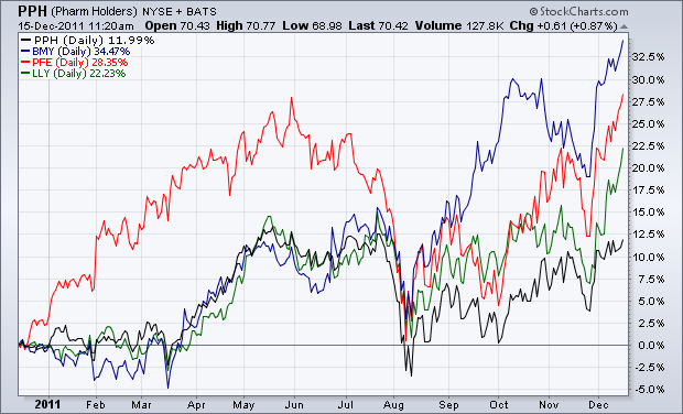
The chart below shows the three strongest drug stocks in the PPH this year. All three have recently achieved upside breakouts. They include Bristol Myers (blue line), Pfizer (red line), and Eli Lilly (green line). The black line is the PPH. As you can see, the three drug leaders have outperformed the group as a whole. That makes them the strongest stocks in the strongest industry in one of the market's strongest sectors. BMY is the strongest of the three (+34% for the year) and is trading at the highest level in ten years. Pfizer (+28% for the year) is breaking out to the highest level in four years. Lilly (+22% for the year) is trading at the highest level in three years. By comparison, the PPH is up 12% for the year (versus 8% for the XLV and -3% for the S&P 500).
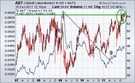
Another big drug stock that may be on the verge of a huge bullish breakout is Abbott Labs. The weekly bars in Chart 2 show that the stock has been essentially in a sideways holding pattern since 2008. That may be about to change. ABT appears poised to exceed its 2008 high around 54 which would put the stock at a new record high. The stock's relative strength (solid) line turned up during the spring and is still rising. The odds for an upside breakout are greatly increased by the fact that other drug stocks are doing the same.
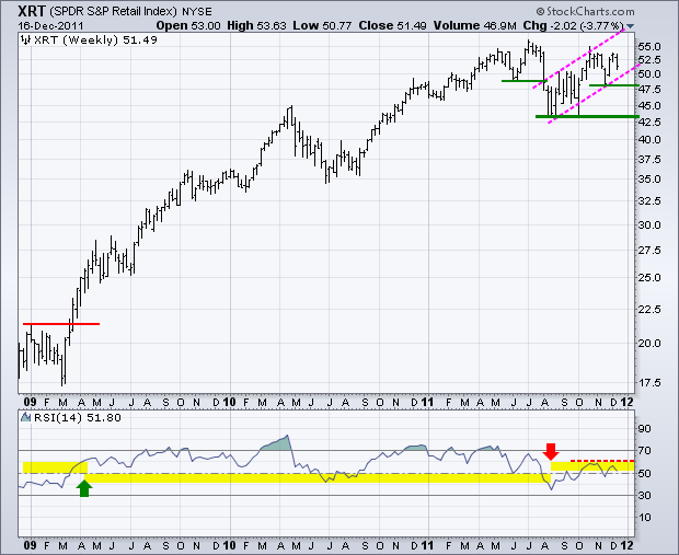
The Retail SPDR (XRT) remains one of the strongest ETFs in the market. As a core part of the consumer discretionary sector, retail is one of the most important industry groups and Christmas is perhaps the most important season. A lot is riding on the consumer this holiday season. The chart below shows XRT bouncing off support in the 42.5 area and working its way back above 50. A rising channel has taken shape with support marked at 47.50. The bulls are in good shape as long as prices hold this rising channel. A move below 47.5 would break channel support and argue for a continuation of the summer decline. This would be a bearish development for retailers, the consumer spending outlook and the broader market.
Click this image for a live chart.
The indicator window shows 14-period RSI. Notice that RSI broke above 60 in April 2009 to turn momentum bullish. Once bullish, RSI oscillated between 40 and 80 during the bull run. Andrew Cardwell, a noted RSI expert, notes that RSI oscillates in bull zones and bear zones. A bull zone extends from 40 to 80, while a bear zone extends from 20 to 60. Notice that RSI moved below 40 with the summer breakdown and is now hitting resistance in the 50-60 zone. This puts RSI in a bear zone and sets up a big test for momentum. A break above 60 would turn momentum bullish again, while a break back below 45 would be bearish.
Good trading -- Arthur Hill CMT
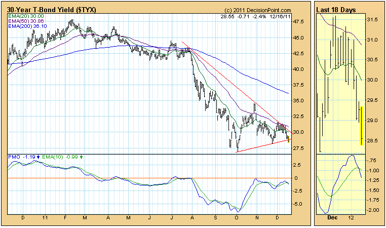
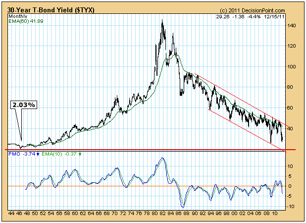
The 30-year bond yield has dropped below three percent many times this year, dropping as low as 2.694% in October. It has been trending up since then, but today it looks as if the October low could be retested.
On the daily bar chart below we can see that the rising bottoms line has been penetrated at the time this intraday snapshot was taken. This is not a decisive break, but it is a logical one, since the triangle formation is a continuation pattern, and a continuation of the larger down trend should be expected.
To determine if the October low has historical credibility as long-term support, let's look at monthly chart going back to 1943. As we can see, the long-term support is just above 2%. Hoisington Investment Management Company in their Third Quarter 2011, Quarterly Review and Outlook stated, "In view of the United States extreme over-indebtedness, we believe that 2% is a an attainable level for the long treasury bond yield." Technically speaking, 2% looks attainable and likely.
Why would anyone want to commit their money for 30 years at 2% to 3%? Because U.S. treasuries are considered to be safer than other options, which is amazing given that we are borrowing 42 cents of every dollar we spend. Doesn't sound safe to me. I guess it speaks more to the sorry state of the global economy.
I always find myself turning my attention to "next year" in the stock market as we enter the December holiday season. On many fronts, 2011 has been the most challenging year in equities that I've ever seen. Sure, the losses in 2008 and the fear that accompanied those losses were worse, but there were many signs in 2007 and 2008 that told us a weak market was dead ahead. 2011 has been particularly difficult because many technical signs have changed mid-stream. For a week or two, it appears we have one type of market only to find the next week it's completely different. November 2011 was the perfect example. There was a clear breakdown on our major indices as we fell beneath critical price support and moving averages. The MACD fell beneath its centerline and the momentum was clearly bearish. Then central bankers around the globe aided the bulls and the recovery was just as astonishing as the selloff. Take a look:
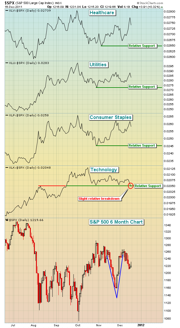
The second half of November was simply crazy - huge breakdown followed by huge recovery.
Also included on the chart above is a comparison of the three defensive sectors - healthcare, utilities and consumer staples - and one of the aggressive sectors (technology), all of which have recently held up quite well on a relative basis. The problem? On Friday, technology broke down beneath a relative support level that previously held in both October and November. This doesn't necessarily mean the market will move lower, but it certainly doesn't help. By contrast, look at the relative strength lines of our defensive sectors. Every one continues to print higher highs and higher lows, suggesting that the flight to safety and the "risk off" environment is alive and well. I'd like to see this "below the surface" message change, but so far it's been a no-go.
Need more proof of the "risk off" environment? Let's pull up a one year chart of the 10 year treasury yield:
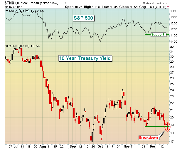
The yield moves opposite of treasury prices. Therefore, a breakdown in the yield means money is flowing INTO treasuries, a safe haven for investors. On Friday, the yield closed at its lowest level since early October as money poured into treasuries. The scary part is that treasury yields have led the S&P 500 by the nose for the last several years. It's difficult to be overly bullish equities at a time when money continues to find its way into treasuries.
Despite all the negative signs emerging, sentiment is quickly turning into a short-term positive. The VIX closed at its lowest level since early August on Friday. From an historical perspective, it remains elevated, but it is within the confines of a general downtrend since August. A VIX that trends lower is normally a friend of the bulls. A more powerful short-term bullish signal could be emerging in the form of my relative pessimism ratio. With the information gleaned from the CBOE and the powerful charting tools here at StockCharts, I developed the following chart that has a very solid track record in predicting SHORT-TERM reversals. I am emphasizing "short-term" because this indicator tells us when sentiment has moved too far in one direction. Once it unwinds, the market is free to move in either direction. So please keep in mind two things - (1) past results NEVER guarantee future success and (2) this is a short-term indicator by nature. With that in mind, check out the following chart:
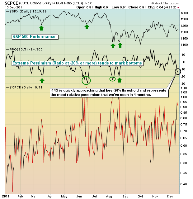
It will take more bearishness in options land on Monday to push this relative pessimism level to a -20% level, which is the level where we've previously seen market reversals. But everyone should be aware that we're getting close as the ratio of puts to calls on a relative basis are higher than at any time since early August.
On Tuesday, December 20th, I will be leading my 2012 Market Outlook webinar, discussing areas of potential strength and weakness in the months ahead. It will be educational, in addition to informative, and I'd love for you to join me. CLICK HERE for more details.
HAPPY HOLIDAYS and happy trading!