Hello Fellow ChartWatchers!
Happy 2012! During his ChartCon 2011 presentation on Intermarket Analysis, John Murphy presented a great chart showing the state of Sam Stovall's Sector Rotation model as of July 2011. Let's take an interactive look at how things have changed since that time.
First off, a quick review: Stovall's model says that the stock market tries to anticipate the business cycle which results in certain sectors outperforming the market at different points of that cycle. By reversing that process, we can determine where we are in the two cycles by seeing which sectors are out performing the rest of the market. Here's the diagram that shows those cycles and sectors:
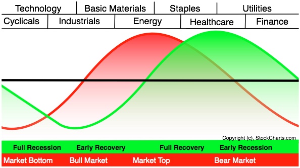
So the order - moving from Market Top to Market Bottom and back to Market Top again - is:
- Energy
- Staples
- Healthcare
- Utilities
- Finance
- Cyclicals (aka Consumer Discretionary)
- Technology
- Industrials
- Basic Materials
If you want to know where the market is going next, you need to study the relative performance of those sectors while keeping that order in mind.
Fortunately StockCharts.com has a great tool for doing just that, our S&P Sector PerfChart. You can find a link to that tool in the middle of our home page just below the list of "Consistently Popular" ticker symbols. Since this is going to be an interactive look at sector rotation, you might as well take a moment, open a new browser window, find that link now, and click on it. (Printing out this article might also be helpful.)
So... what point are we currently at in the sector rotation model?
Here is what you should see when our S&P Sector PerfChart first appears:
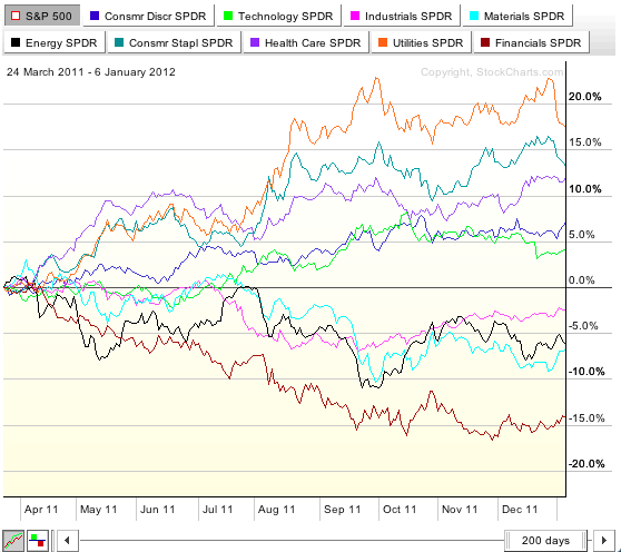
It's a bit messy at the moment - we'll clean it up in a second - but this is showing you the percentage performance of the nine S&P Sector ETFs over the past 200 days RELATIVE TO the S&P 500 Large Cap Index. The S&P 500 index is both hidden (see the white box beside its name in the upper left corner?) and the "baseline" for the chart - meaning that the performance of the S&P 500 has been subtracted from the performance of the other lines. (The fact that its name is surrounded by gray indicates that the S&P 500 is the baseline.)
So, for example, this chart says that over the past 200 days the Utilities ETF (orange line) has outperformed the S&P 500 by roughly 17.5% while the Financials ETF (brown line) has underperformed $SPX by about 14%.
So, how can we relate this chart to Stovall's sector rotation model? With one simple click. Take your mouse and click on the "Histogram Mode" button in the lower left corner of the chart. It's the button that looks like this:  You should then see this chart:
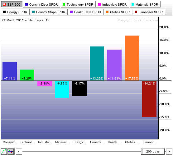
Notice that the bars on this chart are in the same order as the sectors in the Sector Rotation model. In fact, in a perfect world, these bars would form a cycle wave similar to what we show on Sector Rotation picture above. That rarely happens but this picture is still very useful. What is it telling us?
It is telling us that the three key RECESSIONARY sectors - i.e. Consumer Staples, Healthcare, and Utilties - have outperformed the other sectors significantly over the past 200 days. Those sectors are clearly shown on this chart to be doing better that the rest. Based on this chart, we could conclude that the economy is still mired in a recession and the stock market can be expected to head lower as a result.
But there's a "catch" to Sector Rotation analysis. Did you spot it yet? Why use 200 days? Does simply looking at the performance of S&P 500 stocks between March 24, 2011 and now give us a complete picture of things? Of course not.
The timeframe that you choose to look at is critical when doing Sector Rotation analysis. There are three general approaches for selecting a good timeframe:
- Choose a standard interval like 200 days. 100-days and 45-days are also commonly used as are 12-months and 6-months.
- Choose an interval with "significant" calendar-based start and end dates such as Year-to-Date, a fiscal quarter, or January 1st to June 30th.
- Choose an interval that spans "significant" changes in the market. We'll use this approach in just a moment.
As you might remember, three days before John gave his ChartCon talk in August of 2011, the stock market had a significant drop and the market started behaving differently. You can see that on your Sector PerfChart by following these steps:
- Click on the "Line Mode" button in the lower left corner of the chart to show us the lines again.
- Click on the gray "S&P 500" button in the upper left corner of the chart to show us the absolute performance lines rather than the performance relative to $SPX.
You should now be looking at this chart:
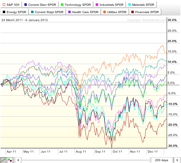
Notice how the sector lines appear to diverge differently after the August 10th drop? That's a signal to us that something may have changed and we should look at the period from then until now to see if anything did change.
If you are following along at home, click the words "S&P 500" in the upper left corner of the chart to re-enable baseline mode with $SPX as the baseline.
Next we want to move the starting date of the chart from "24 March 2011" to "10 August 2011". You can change the date with your mouse however it is much more precise to change dates using your keyboard. Here's how:
- Click your mouse once anywhere in the middle of the chart (this is a precaution to make sure that your keyboard is "connected" to the PerfChart tool).
- Press and hold down the SHIFT key on your keyboard.
- Press the RIGHT ARROW key on your keyboard once. You should see the starting date of the chart (upper left) change to "25 March 2011" and the duration slider (lower right) change to "199 days"
- Now, with the SHIFT key still held down, press and hold the RIGHT ARROW key until the start date says "10 August 2011". Again, this is a slower but more accurate way to change the date.
Your chart should now look similar to this:
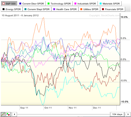
Now, let's "zoom in" on just the recession-oriented sectors. Click on the small, colored boxes at the top of the chart to turn off the lines for Consmr Discr, Technology, Industrials, Materials, Energy and Financials. You should end up with something like this:
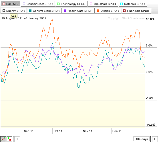
So this shows us the while Staples, Healthcare and Utilities are still in positive territory, they have not been as strong during this time period as they were over the 200-day period. That might be good news for the market as these sectors need to weaken before another bull market can begin. We need to dig deeper however before we can make that conclusion.
Now, let's add each one of the other sector lines back onto the chart one at a time and see if any other stories emerge. Click on the small box for the Financials SPDR. The brown line for the Financials should reappear:
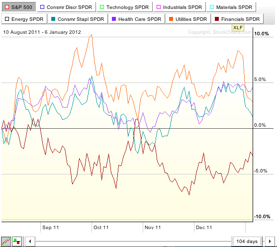
The Financials are still underperforming. An optimist might point to the uptrend in December, but that still has a ways to go in order to prove itself. Now click on the small brown box again to turn off the Financials line, then click on the small box for "Consumr Discr SPDR" (aka the Cyclicals):
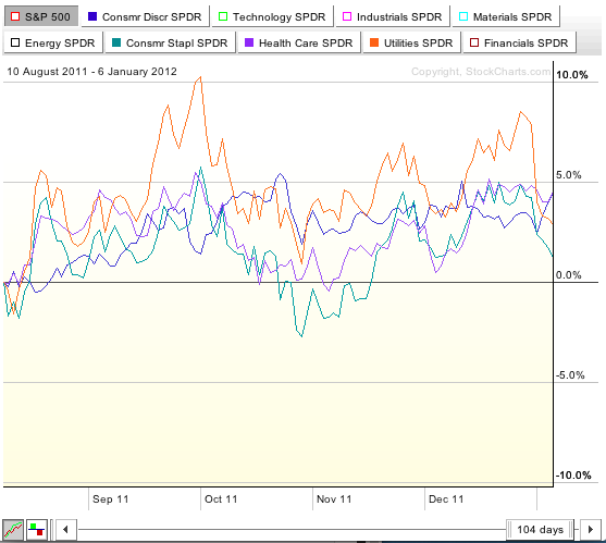
Now this is more promising. The Cyclicals have to strengthen in order for any market bottom to be taken seriously and what the blue line on this chart is saying is that things are s-l-o-w-l-y getting better in terms of consumer spending. The progress is fragile however and not strongly convincing.
Now turn off the blue Consumer Descretionary line and turn on the green Technology line. You'll see that Tech stocks are all over the place and, on average, have moved sideways over the past 100 days.
Turn on the pink Industrials line and you'll see that it is a bit of a conundrum. It's been relatively strong over the past 100 days which goes against what our Sector Rotation model says should be happening. Industrial stocks should not be consistantly strong until a recovery is well under way. It is not that unusual for these kind of things happen however when doing Sector Analysis. You - a human being - need to consider all of the evidence and decide "Is there something other than sector forces that could be causing this 'rogue' sector behavior?"
The light blue line for Basic Materials is very weak - which is what our model expects. The black Energy line has been very volatile during this period - something that's not unexpected since the market is rotating away from that sector.
All of this information points to an economy that is trying to recover but hasn't really gotten started yet. These lines and the relationships between these sectors needs to be watched closely over the next couple of months to see if more signs of recovery appear or to see if things regress.
Recently, several people wrote in and said that they were not renewing their StockCharts subscriptions because "the market is not worth watching right now." I couldn't disagree more strongly. NOW is the time to be watching the market like a hawk because if things do pick up, your first signal will come from technical charts like these.
Take care,
- Chip
P.S. To hear John's 2011 ChartCon presentation for yourself - along with a ton of other great presentations - pick up a copy of the ChartCon 2011 DVDs from our online store.
The Nasdaq 100 ETF (QQQ) is showing relative strength this year with a triangle breakout and surge above its early December high. On the daily candlestick chart below, QQQ surged in October and then consolidated in November-December. This consolidation started wide in November and then narrowed in December as a lower high and higher low formed. This yearâs triangle breakout signals a continuation of the October surge with the 2011 highs in the 59-59.5 area marking the next resistance zone. The gap and the lower trendline of the triangle mark support in the 55-55.5 area.

Click this image for a live chart.
The indicator window displays the price relative (QQQ:SPY ratio), which shows the performance of QQQ relative to the S&P 500 ETF (SPY). QQQ outperforms when this ratio rises and underperforms when this ratio falls. Notice how QQQ underperformed from mid October to late December. The ratio turned up at the end of December and broke the trendline extending down from the October high. This upturn shows the QQQ is outperforming SPY in 2012 - all four trading days of it!
Happy New Year and Good Trading,
Arthur Hill CMT
After reaching an all-time high in August, gold has corrected about -18%, but a recent bounce prompts us to take a closer look to see if the correction could be over. The most encouraging technical evidence is on the weekly chart.
Note how the recent low occurred just above the long-term rising trend line. From the beginning of the correction I thought that this trend line was a logical downside target. Whether or not the bounce off this line is the beginning of a new up leg destined to take out the August highs, has yet to be determined.
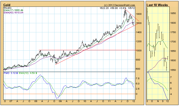
The fact that the support has held is very positive, but the weekly PMO (Price Momentum Oscillator) configuration is still negative -- falling below its EMA, and still somewhat overbought.
Shorter-term the daily PMO below is oversold and has bottomed, but the price line has encountered resistance at the 200-EMA.
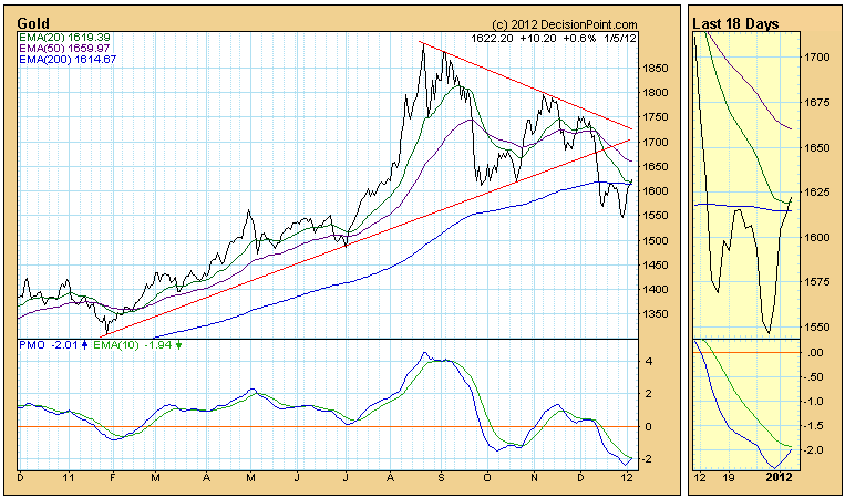
Our Trend Model for gold is currently neutral (in cash or fully hedged), and a new buy signal will not be generated until the daily 20-EMA crosses up through the 50-EMA. That will probably take a few weeks if prices continue to rise.
Bottom Line: The correction has been of sufficient depth and duration that the bounce off long-term support presents a short-term buying opportunity for those anxious to exploit the next leg up, assuming that there will be one; however, not enough tumblers have fallen into place to justify anything but very tight stops.
High volatility is generally associated with declining equity prices. The inverse is true as a declining level of volatility emboldens the bulls. Therefore, I follow the VIX continually to get a sense of DIRECTION. Clearly, the volatility index (VIX) has been trending lower over the past few months. So it should come as no shock that the fourth quarter of 2011 produced the best quarterly results on the Dow Jones in more than a decade. But one week into 2012, the VIX is hitting support. Check out the chart below:
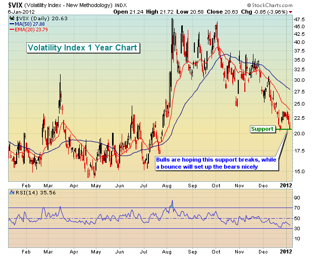
A rising VIX is bad news for bulls. And after the huge move lower in the VIX, it hit support on Friday. A simple bounce off oversold VIX conditions would likely lead to selling in equities just as we near resistance on a couple key indices. The following shows the near-term resistance that the bulls are facing on the S&P 500 as a new trading week unfolds:
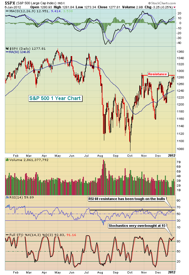
It seems that each time that stochastics and RSI hit 90 and 60, respectively, the bulls run into trouble extending the rally. Currently, that's where both of our momentum oscillators reside.
A key sector in the S&P 500 is financials and the performance of the banking industry is important to the overall health of the market. Banks have also touched a critical resistance level that will need to be negotiated if the recent rally is to continue. Take a look:
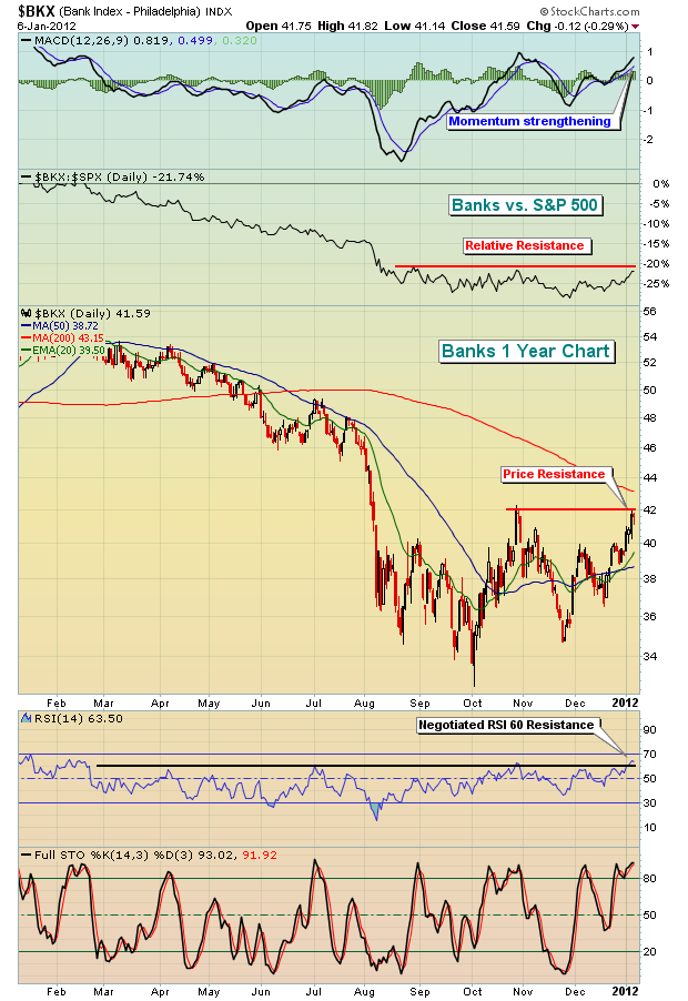
The banks have an opportunity here, as they did in late October, to build on strengthening relative momentum. Banks failed in October, but will they be able to sustain their recent strength? The MACD once again has crossed above the centerline, which hasn't happened often the past several months. But more important than improving relative strength is the potential of an actual price breakout above key price resistance. A price-volume breakout trumps all other technical indicators in my opinion. Therefore, keep a very close eye on the 42 resistance level on the Bank index.
Many traders enjoy the prospects of higher returns by trading leveraged ETFs. While I believe their use should be limited, there are occasions when significant support or resistance are hit where they make sense from a reward to risk perspective. Given the level of resistance on the Dow Jones US Financial Index, we could be approaching a time to look at the UYG or SKF, depending on whether a breakout is made or not. I've made the argument for considering a position in these financial juiced ETFs and am happy to share it with you. Click here for more details.
Happy trading!
The downside violence in the Gold market as abated for the the time being given the reallocation and repositioning for the New Year. There are many the recent drop is sufficiently of the cathartic-type that will send prices to all-time highs, for we all know that "all the current roads lead to inflation - at some point" as the worlds' central bankers continue to print money. However, we are of the opinion that gold prices have further downside work to do before a strong bottom is formed that will indeed be sufficient for higher highs.
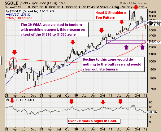
Our opinion stems from the gold chart, and the fact that gold has clearly broken below its 30-week moving average. In the process of doing so, a "head & shoulders" top pattern was confirmed, which now measures lower into $1280-*to-$1300 zone. This is currently where the 150-week moving average, which is where the 2008 correction feel to and then turned prices higher. Another interesting historic technical metric, the percentage below the 30-week moving average in which gold generally bottoms is between -12% and -17% below it - which would put prices in the range of $1476 to $1392. This zone was not tested on the most recent decline, so there is likely more downside forthcoming. .
Therefore, we are most interested in the 150-week moving average, and where it trades as time goes forward.