Hello Fellow ChartWatchers!
Early last year, we added Dr. Alexander Elder's Impulse System to our SharpCharts charting package and it has proven to be quite popular. This is the system that colors the price bars red, green or blue depending on two criteria that Elder feels are very important:
1.) Is the 13-day exponential moving average moving higher or lower?
2.) Is the MACD Histogram moving higher or lower?
If both of those conditions are true, the corresponding price bar is colored green (indicating bullishness). If both of those conditions are false, the corresponding price bar is colored red (indicating bearishness). If the signals are mixed, the price bar is colored blue (indicating uncertainty).
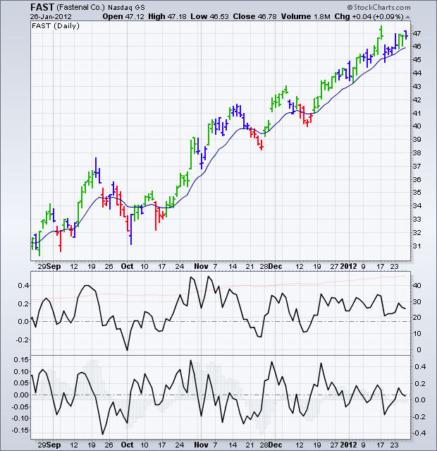
Here's an example of an Elder Impulse System chart:
(Click the chart to see a live version)
As you can see, prices for FAST have generally moved higher after the first green bar appears (at least for a couple of days) and lower after the first red bar appears (again, at least for a couple of days). The bullish moves that started on October 18th and December 18th are particularly impressive.
(How did I find FAST as a good bullish example? Easy - its SCTR number was over 99!)
Some people have asked if we could change the Elder Impulse System's parameters or provide more insight into what is happening when the bars are blue. If we change the system's parameters, then it would no longer be the Elder Impulse System. That said, it is possible to create your own system with your own parameter by using the two indicators that I've included at the bottom of the chart above.
The first indicator shows the slope of the 13-day EMA. It was created by plotting a MACD with parameters of 13,0 (faint red line) and adding the Slope overlay (black line) on top of it. If the black line is above zero, the 13-day EMA is rising. If the line is below zero, that EMA is falling.
The second indicator shows the slope of the 12,26,9 MACD Histogram. If the black line is above zero, the histogram is rising. If it is below zero, the histogram is falling.
Notice how when both indicator lines are above zero, the corresponding price bars are colored green by the Elder system. Similarly, when both lines are below zero, the corresponding price bars are colored red. That confirms that these indicators are working for the standard Elder Impulse System parameters.
OK, now that you've seen how the indicators on that chart correspond to the colors on Elder's Impulse system, you can - if you are a StockCharts member - change the parameters of those indicators to create your own custom version. The colors of the bars won't change - instead you can visually determine when both indicator lines are up and when both are down.
Alternately, you can use the chart above to see what is happening when the Elder bars are blue. That may help you anticipate whether the bars will next turn green or red.
The Elder Impulse System is described more in our ChartSchool area. It was originally described in the book Come Into My Trading Room. All of Dr. Elder's terrific books on trading can be seen here.
- Chip
Note: The original version of this article incorrectly stated that the first criteria compared prices to the 13-day EMA. Instead, the slope of the 13-day EMA is used.
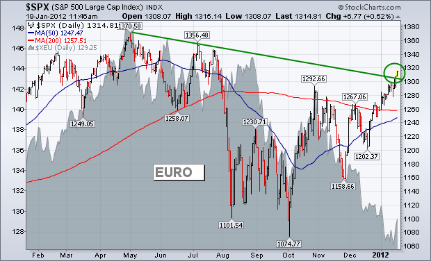
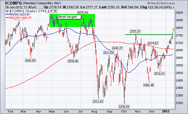
The U.S. stock market continues to lead the rest of the world higher. Charts 1 and 2 show the S&P 500 and Nasdaq Composite Indexes clearing their fourth quarter highs, which puts them in position to challenge the highs formed last summer and spring. The S&P is also clearing a eight-month down trendline (see circle). The fact that both indexes have been able to rise in the face of a rising dollar (falling Euro) is also impressive (see gray area in Figure 1). That raises a number of intermarket possibilities. One is that the market's "inverse" relationship to the dollar is changing. Another possibility is that the dollar rally is nearing an end (and the Euro is starting to bounce). Another possibility is that Euro weakness is making the dollar look stronger than it really is. One way to determine that is to look at the performance of other foreign currencies which are acting much better than the Euro.
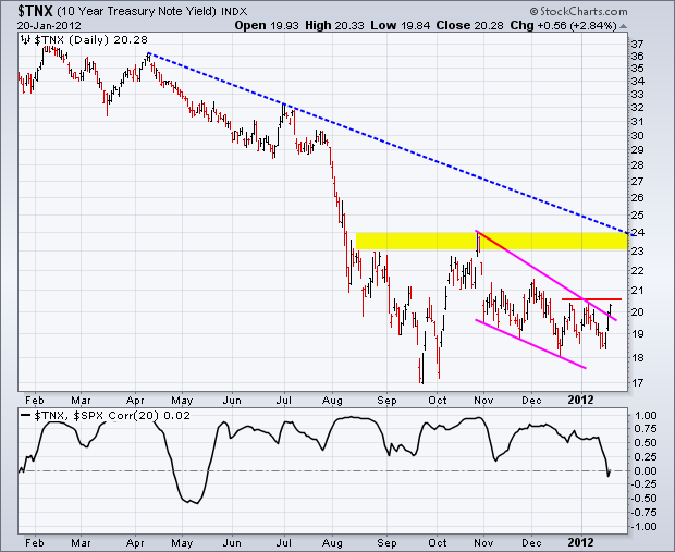
The FOMC meets next Tuesday-Wednesday and will make its policy statement Wednesday afternoon. With stocks surging and recent economic reports buoyant, the bond market may be looking ahead to this meeting with trepidation. The first chart shows the 10-year Treasury Yield ($TNX) rising sharply the last three day. Treasury bonds rise when treasury yields falls. Overall, the chart shows $TNX forming a trough at 1.7% (17) in late September and surging in October, which is when the stock market surged. Note that long-term treasury yields and the stock market were positively correlated most of the last 12 months. This means they moved in the same direction most of the time. Turning back to the price chart. The 10-year Treasury Yield ($TNX) declined with a falling wedge in November-December and held above its October low. $TNX found support just above 1.8% the last few weeks and surged back above 2% this week. Despite this surge, $TNX remains just short of a breakout. Further strength above the early January high would produce a breakout to signal a continuation of the October surge. This would target a move towards the next resistance zone around 2.3-2.4%. This would be bullish for stocks - provided the positive correlation between stocks and treasury yields continues. Note that treasury yields and treasury bonds move in opposite directions. Therefore, an upside breakout in the 10-year Treasury Yield would be bearish for the 20+ Year T-Bond ETF (TLT).
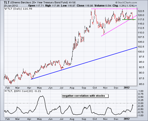
Click this image for a live chart.
Good trading,
Arthur Hill CMT
The market rally on Wednesday was driven in part by a surge in housing stocks, which was triggered by a favorable housing report. Since the fundamentals of the housing market are not too thrilling, regardless of short-term gains, my curiosity was piqued and I pulled up some charts.
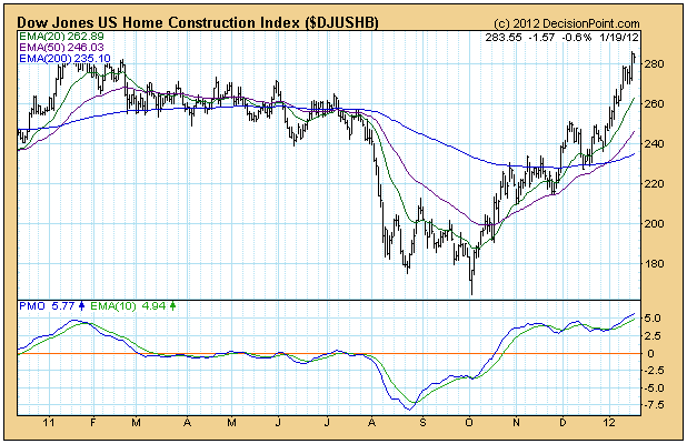
The daily chart of the Dow Jones US Home Construction Index, which is one of a set of 100 Dow Jones US sector indexes we track, shows that Wednesday's rally was a small extension of a +78% up move that began after the Index hit rock bottom in October 2011. This is good but how does this rally present in a larger perspective?
I would normally zoom back to a weekly bar chart, but in this case the monthly bar chart is much more helpful, and the current rally looks rather insignificant compared with what has gone before. First, between 2000 and 2005 there was a parabolic advance of about 1,000%, perfectly depicting the frenzy of the housing bubble. Then between 2005 and 2008 we can see all the air coming out of the bubble. Since the bottom in 2008, the Index has entered what is called a basing pattern, and it typically becomes a "long base" because it can go on for many years.
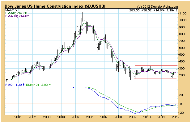
Bottom Line: The purpose of the base pattern is to work out the excesses of the parabolic rise and collapse that preceeded it, a process that normally takes many years to complete. The range annotated on the chart probably represents the range of movement for the Home Construction Index for the next decade or more. There is money to be made playing the range, but I don't expect the top of range to be significantly exceeded any time soon.
Ok, I'll admit I'm being a little dramatic. But everyone should know how I feel about my favorite sentiment indicator - Relative Complacency/Pessimism. One month ago as the market was dropping, I wrote about how relative pessimism was building and how that could limit the downside action. Well, today the reverse is true. On Thursday, we printed .48 on the equity only put call ratio (EOPCR), the lowest reading in nearly one year. I don't grow too concerned by one day's swing towards call buying, however. I get concerned when it continues to happen and the short-term pendulum swings too far in the direction of optimism, or complacency. That's where we stand now. The 5 day moving average of the EOPCR is now at .56, an historically low level. Below is a chart that uses the EOPCR to chart the relative complacency/pessimism ratio and you can follow how the S&P 500 reacts to the sentiment pendulum swinging back and forth:
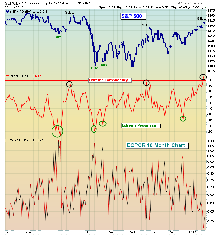
While I didn't mark the December low as a "BUY" point because it never quite reached the extreme relative pessimism that I look for, the sentiment pendulum had clearly swung towards pessimism and that's a warning sign if you're on the short side. As relative pessimism grew, the RISK of being short grew and as 20/20 hindsight now shows us, shorting at that time would have been EXTREMELY painful. The lessons learned by trading on the side of the masses are expensive. Sentiment does not provide us a guarantee of market direction. Rather, it helps us to evaluate the risk of a particular trading strategy. And sentiment, by itself, does not mark long-term tops and bottoms. It is MUCH more useful to an active trader than to a long-term buy and holder.
Now go back to the chart above and take a look at where the relative complacency level currently stands. The stock market has not been this complacent in the last year. Is this marking a near-term top? From my extensive studies on the subject, relative complacency is not as a reliable in marking tops as relative pessimism is in marking bottoms. I'm not a psychologist, but I imagine that fear is bigger motivator than greed. Having said that, however, I think it's important that those on the long side simply understand that the RISK of being long is growing. There are no guarantees of a top. As I tell our members often, the only thing I can guarantee is that I'll be wrong sometimes. You can etch that one in stone. If you're looking for perfection, you'll have to look elsewhere, because I'm far from it. But what I can recognize is the "under the surface" market signals that can help us evaluate the risk of our trading strategy. If you're long or going long at this level, just understand the much higher risk levels associated with it. The market may push higher here, but it'll have to do so with someone else's money, not mine.
The secret to trading success is having the "conviction" to play what you see, but the "discipline" to admit a mistake before it gets too costly. Some traders are always looking to be right, to justify every trade by showing a profit. They won't let go of the losers and admit they're wrong. The best traders, however, know how to balance the enthusiam of the start of every trade with the key elements of risk management. You should never lose sight of the risk you're taking. This not only applies to the types of stocks or ETFs that you're trading, but also the macro environment in which you're trading.
The intermediate- to longer-term picture looks somewhat better technically than the short-term, where we're obviously overbought. There is a VERY strong correlation between how the S&P 500 performs in January vs. how it performs during the balance of the year. I'll be discussing this historical phenomenon in my next Online Traders Series event, "The January Effect" scheduled for Tuesday, January 24, 2012.
Those interested in receiving a long-term annotated (all the buy and sell signals) chart of my relative complacency/pessimism study and how the S&P 500 has reacted to those sentiment swings in the past, CLICK HERE. In addition, you'll find more details about Tuesday's event, which will likely be sold out.
Happy trading!
Since the beginning of the year, we've seen both Gold ($GOLD) and her sister metal Silver ($SILVER) rally; but we've seen Gold under-perform during this rally. This is exactly what should take place in a metals bull market. But that said, the Gold/Silver Ratio remains at a very critical area in our opinion, for up to this point - it has tested its overhead 600-day moving average and turned lower. Again, this supports a metals bull market, for silver is the leader; and history bears this out.

But what if this changes,? Rightly or wrongly, we are concerned about whether this is simply a correction from the 600-day, upon which another assault and perhaps breakout above this level is about to take place. If so, then the current good bullish feeling in the metals market shall dissipate rather abruptly, with traders running for the hills as the probability would be higher that Gold would then test the $1300-$1350 zone where the 150-week moving average crosses (this dynamic was shown in the CWW publication two weeks ago).
Therefore, in taking into account where Gold prices are today at $1665, and the position of the ratio - we would need to see gold rally strongly over the 30-week moving average at $1687 - AND - we would need to see silver outperform. If these two circumstances were to take place, then we would expect new highs in both Gold and Silver in the months ahead.
Good luck and good trading,
Richard