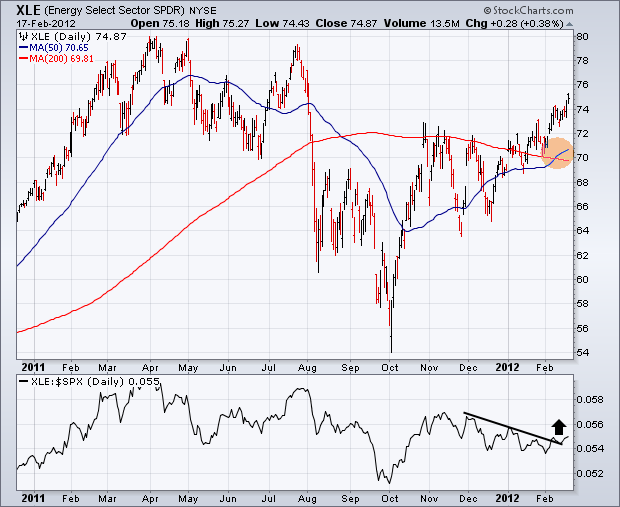
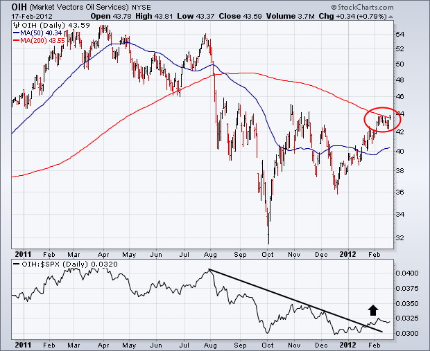
Energy shares were this week's strongest market sector. That's the first time we've seen relative strength by the energy sector in three months. Chart 1 shows the Energy Sector SPDR (XLE) trading at the highest level in seven months. [A "golden cross" has also been formed by the 50-day average rising above the 200-day (gold circle)]. The line along the bottom is the XLE/SPX ratio, and shows it breaking a three-month down trendline. That's a sign that money is starting to move into this sector more aggressively. Chart 2 shows the Market Vectors Oil Services ETF (OIH) very close to breaking through its 200-day average (red circle). Its relative strength ratio (below chart) is also starting to rise.
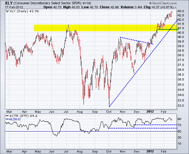
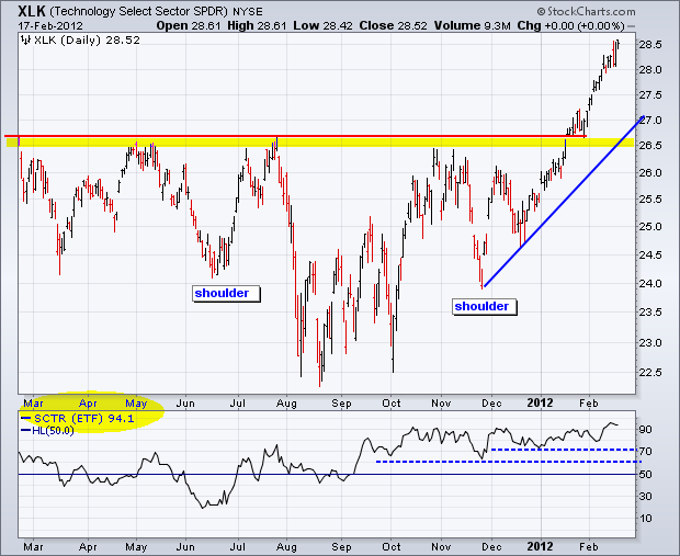
Of the nine sector SPDRs, the Consumer Discretionary SPDR (XLY) and the Technology SPDR (XLK) have the highest StockCharts Technical Rank (SCTR). The SCTR for the Industrials SPDR (XLI) is in a close third. High SCTR scores indicate that these sectors show excellent relative strength and market leadership.
Click this image for a live chart.
The first chart shows the Consumer Discretionary SPDR (XLY) breaking above its 2011 highs in January and extending further in February. While the advance is getting overextended, this key sector is by no means weak. Broken resistance turns into the first support zone around 41. The indicator window shows the SCTR plot. In general, the security shows some relative strength when above 50 and some relative weakness when below 50. Notice that this indicator has been above 60 since early October and above 70 since late November. The SCTR is currently at 89, which indicates that this sector shows exceptional relative strength.
Click this image for a live chart.
The second chart shows the Technology SPDR breaking resistance from a large inverse head-and-shoulders pattern. Broken resistance turns first support in the 26.50 area. The SCTR moved above 60 in mid September and never looked backed. It has held above 70 since late November and is currently above 90, which makes it the leading sector. You can see all scores on the SCTR table page and read more about SCTR in our ChartSchool.
News headlines are usually more confusing than helpful, especially when trying to determine if stocks are overvalued, fairly valued, ot undervalued. At any given time there will be those who simultaneously claim that stocks overvalued and undervalued. Of course, they all have their own methodologies, which (surprise, surprise) support their point of view.
We have always asserted that the most consistent and even-handed way to value stocks is based on their GAAP P/E (price to earnings ratio) relative to the normal historical range. The real P/E for the S&P 500 is based on "as reported" or GAAP earnings (calculated using Generally Accepted Accounting Principles), and it is the standard for historical earnings comparisons. The normal range for the GAAP P/E ratio is between 10 (undervalued) to 20 (overvalued).
Market cheerleaders invariably use "pro forma" or "operating earnings," which exclude some expenses and are deceptively optimistic. They are useless and should be ignored.
The following are the most recently reported and projected twelve-month trailing (TMT) earnings, quarterly earnings, and price/earnings ratios (P/Es) according to Standard and Poors. The 2011 Q4 estimate is based upon 82% of companies having reported. The P/E values are based upon the S&P 500 closing price of 1343 on February 15.

The current P/E of abput 15 falls right in the middle of the historical range of 10 to 20, so we can say that stocks are fairly valued. As technicians we like to show a chart to give perspective. The red, blue, and green lines show where the S&P 500 (the black line) would be if it were overvalued, fairly valued, or undervalued. Note how overvalued the market became in the late 1990s and early 2000s. That is where our troubles began. Then there was the earnings crash on 2009, which completely distorted the range markings. With earnings returning to all-time highs the P/E range is more realistic, and we can reasonably say that stocks are fairly priced.
The distortions shown above might cause one to wonder if the normal range concept really has any validity. The long-term chart below demonstrates that it does. It also demonstrates how screwed up the market has been since the late 1990s as compared to the 70 years that preceded that period.
Bottom Line: The TMT GAAP P/E ratio is an objective measure of valuations, although it is a lagging indicator. Currently, earnings have returned to the normal trend, which is up over the long-term, and the price versus the normal P/E range relationship appears to be back in a rational configuration. Therefore, with a P/E of 15, we can say that stocks are fairly valued. This doesn't tell us where prices are headed, but it does support a bullish argument that prices could go higher before they become overvalued (P/E of 20).
It takes time and patience for continuation patterns to play out. Many traders grow frustrated, especially after the stealth move higher ends because of the time involved for continuation patterns to form. The current bull market in gold has lasted more than a decade and there are few technical signs of it ending now. First, let's take a look at a 12 year weekly chart to step back and grasp the overall picture:
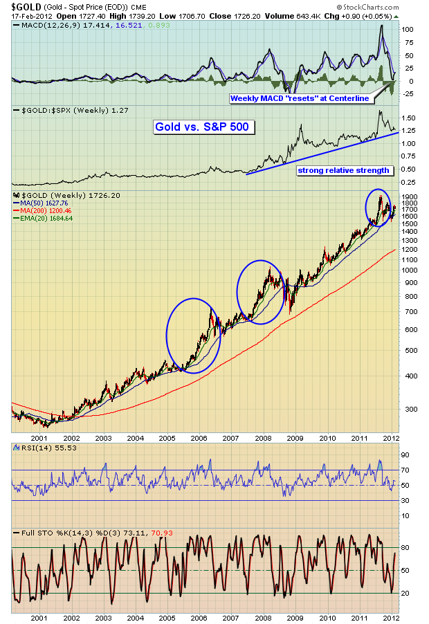
You can see from the blue circles above that every "stealth" move higher has been followed by a longer than usual consolidation period. And that makes sense. There needs to be a cleansing period where a whole new group of longs participate as weaker hands let go of their positions. The other technical observation is that the current consolidation phase has allowed a VERY stretched MACD to move back down to test its centerline. This means that gold's 12 week EMA essentially equaled its 26 week EMA. A lot of the overbought conditions have been relieved. Another observation is that every time gold has seen its weekly RSI dip beneath 50 and its weekly stochastic fall to 20 or below, that combination has resulted in a very strong buy signal.
Now let's take a look at the current pattern on a daily chart:
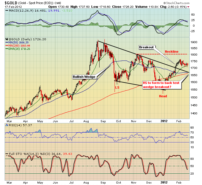
There are a couple of different interpretations which would lead to differing methods of accumulation and risk management. Obviously, we have a bullish wedge breakout, but also have the prospects of an inverse head & shoulders pattern that would measure to 2075 in time. Perhaps an inverse right shoulder will form on a back test of the wedge breakout? Either way, this pattern looks bullish and I'd be a buyer of gold.
I've provided a few technical reasons why I believe gold is going higher. Fundamentally, I believe gold will be higher because Fed Chairman Bernanke wants to inflate our way out of the financial crisis and the resulting economic weakness. The next big issue is going to be inflation, I have no doubt. If you've listened to Bernanke, you know the Fed will do EVERYTHING it can to avoid a deflationary environment. They will continue to expand the Fed's balance sheet. QE 3 is coming so get ready. Ultimately, there will be a price to pay and it's going to come in the form of inflation. What do you think is going to happen to gold prices as inflation is sparked? Inflation may stay historically low for the next couple years, but it is NOT going to remain low. I rest my case.
I'm featuring the GLD as our Chart of the Day for Tuesday, February 21, 2012, where I highlight various entry and exit points to satisfy just about every trader's style. CLICK HERE if you'd like more information.
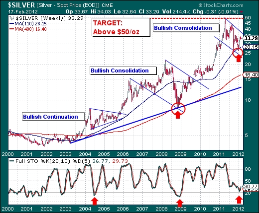
With all the press centering in upon Gold gains recently +10%, Silver has risen by +19% - thereby outperforming the yellow metal by +9%. Silver - the poor man's good; now looks rather ripe for trading once again. This is as it should be in a metals bull market - silver should always outperform gold. And the manner in which the technicals are shaping up in both absolute and relative terms - we should see both gold and silver move to new highs and not return to the lows forged on 12/30/11 at $1567 and $27.88 respectively.
In our opinion, we shall be playing silver form the long side, for the techncials are rather compelling. First, the weekly Silver chart shows a series of continuation patterns or bullish consolidations that have all lead to new highs. And, each one began with the 20-week stock at oversold levels. In fact, the first two times this occurred, silver rallied for 2-years plus and gained in the multiple of 100%s. Next, let's note the current price has held the 110-week moving average. which it has done on a number of occasions, and then rallied rather strongly. We expect this current test amid the bullish consolidation to take silver price upwards of $50/oz or more - a minimum gain of +34%, which is really rather paltry by past rallies, but one that has the potential to go much much higher.
Therefore, we are left to wonder what shall trigger such buying in the metals and silver in particular. Will be be turmoil in the Middle East? The Euro falling apart? Faster-than-expected economic activity around the world? New rounds of QE? They are all good questions, and perhaps an amalgamation would probably be the most likely scenario.
